The foyer is the architectural handshake of the home—a brief, high-stakes introduction that sets the cadence for everything that follows. Yet, for many of us, this introduction feels more like a structural apology. We are often met with the ‘tunnel effect’: a long, constricted corridor that feels more like a transition to be survived than a space to be savored. When searching for narrow entryway ideas, the reflex is often to focus on furniture—a slim console here, a mirror there. But the true alchemy of spatial expansion lies not in what sits on the floor, but in how we manipulate the volume above our heads. By mastering the architectural optics of ‘The Through-Line,’ we can visually double the width of a narrow foyer, turning a cramped passage into a grand, light-filled portal.
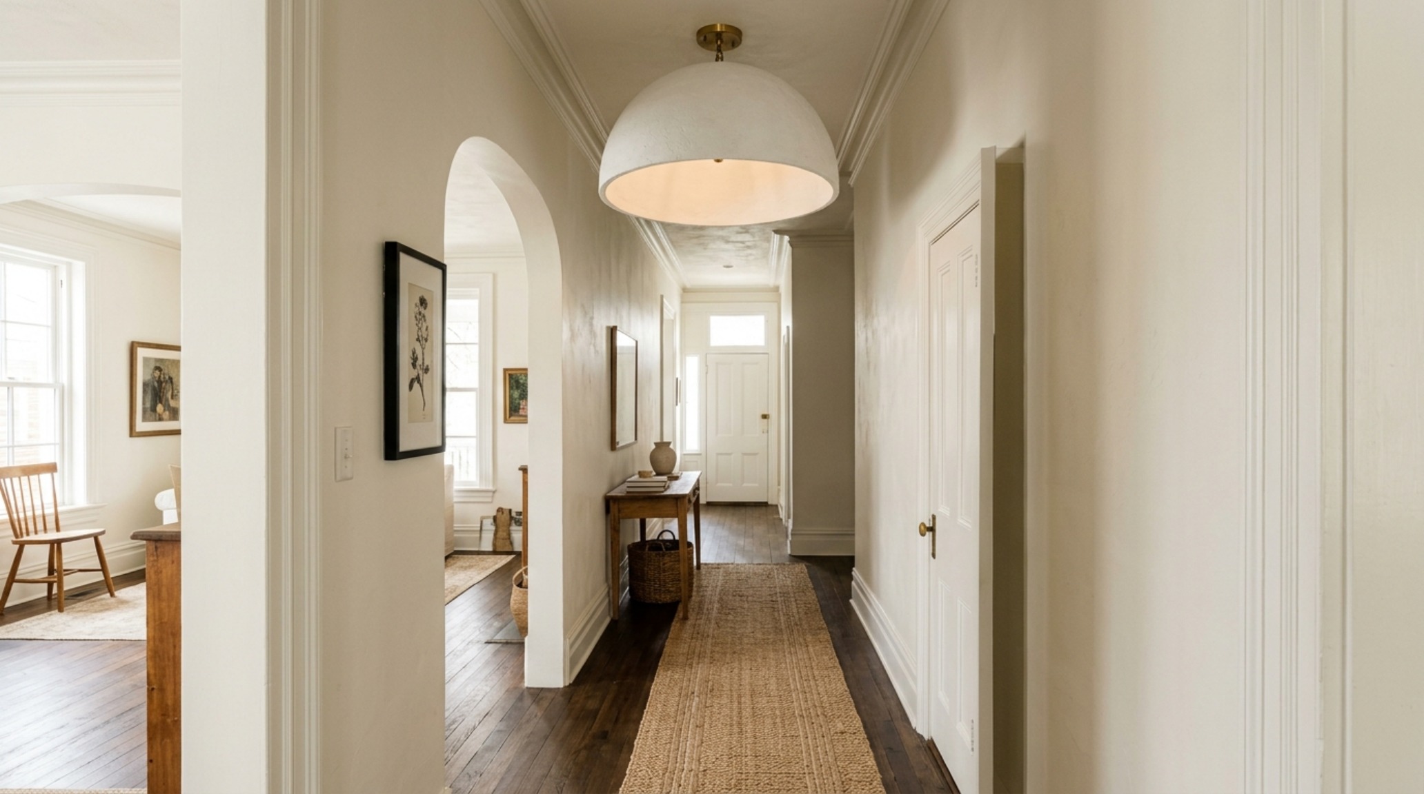
The Through-Line: Rewiring the Sightline
In architectural terms, a sightline is the unobstructed path of a viewer’s eye. In a narrow entryway, the eye typically rushes toward the end of the hall, reinforcing the sensation of a tight, linear squeeze. To combat this, we must introduce what I call ‘horizontal friction.’ This is achieved by anchoring the gaze with strategic lighting that pulls the eye outward toward the walls, rather than just down the length of the floor.
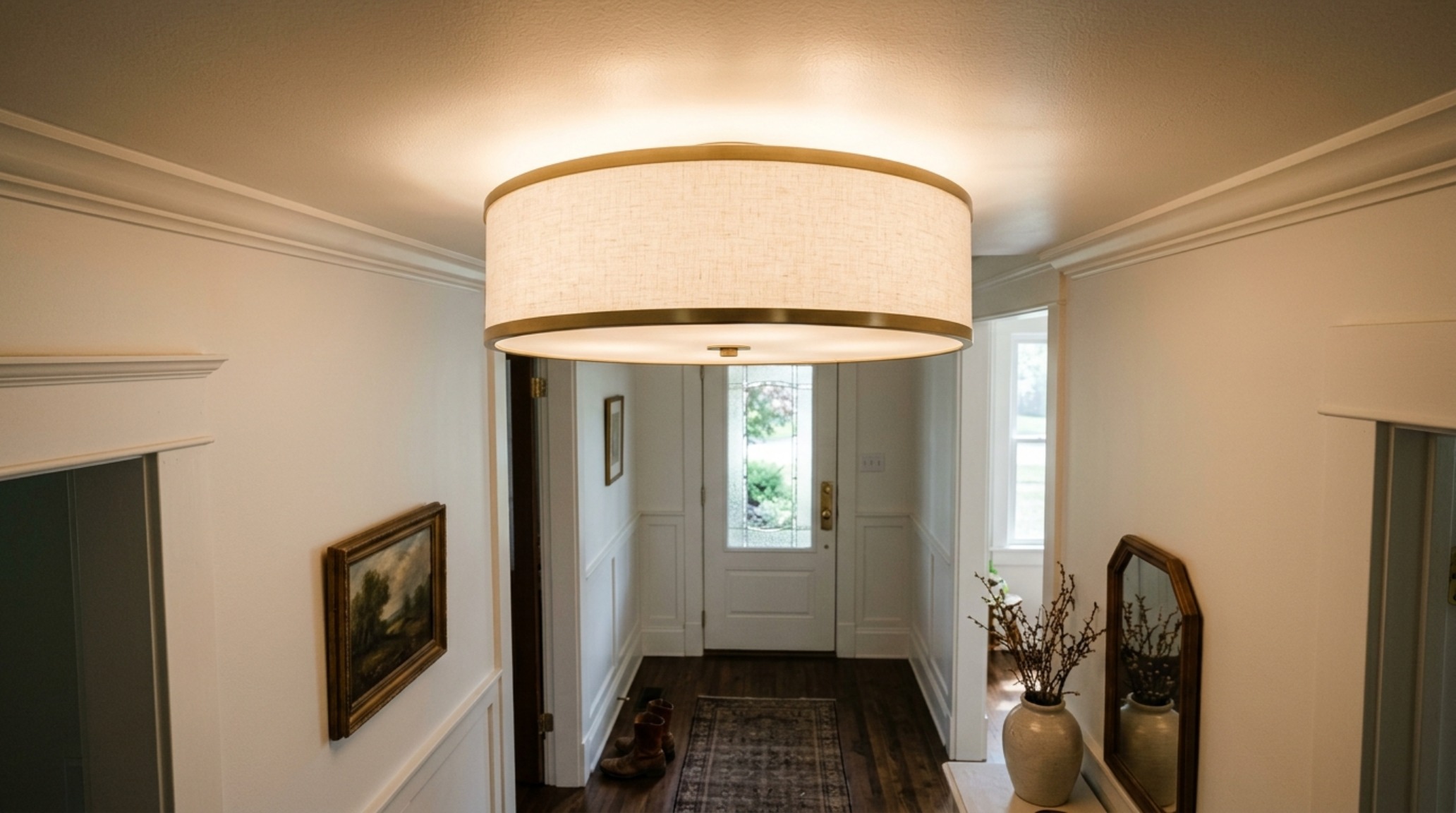
The secret weapon is the oversized, low-profile semi-flush mount. Conventional wisdom suggests that small spaces require small fixtures. This is a fallacy that leads to cluttered, ‘bitty’ design. Instead, a large-scale fixture—perhaps a 24-inch diameter disc or a sculptural plaster dome—creates a horizontal plane that pushes against the vertical constraints of the walls. It creates a ceiling vista, a point of expansive rest that makes the corridor feel like a room in its own right.
The Math of Scaling a Foyer Entryway Light
When selecting a foyer entryway light, designers use a specific ratio to ensure the fixture commands the space without overwhelming it. A standard formula is to add the width and length of the room in feet; that sum, in inches, is your ideal fixture diameter. However, for narrow corridors, we intentionally ‘break’ this scale. If your hallway is 4 feet wide, a 16-inch fixture feels standard. But by moving to a 22-inch or 24-inch low-profile mount, you create a sense of ‘over-scaling’ that suggests the space is wider than it is. The key is the ‘low-profile’ aspect—keep the fixture within 8 to 12 inches of the ceiling to maintain a minimum 80-inch head clearance, ensuring the spatial flow remains uninterrupted.
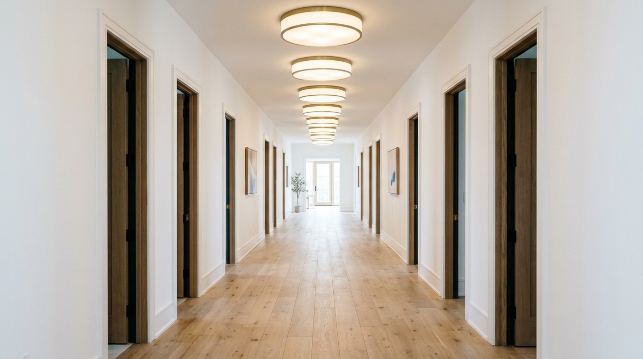
The Portal Effect: Blending Entryway into Living Zones
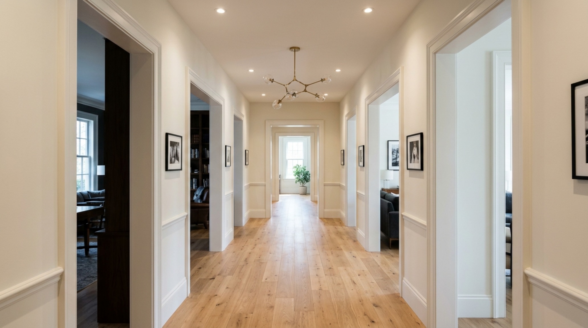
One of the most effective narrow entryway ideas involves the ‘Portal Effect.’ This is the use of architectural cased openings to frame the transition from the entryway into the main living zone. By widening a standard doorway into a broader, floor-to-ceiling aperture, you blur the boundary between the tight foyer and the expansive room beyond. Lighting plays a critical role here. By placing a high-impact light source—perhaps a pair of architectural sconces—just beyond the threshold, you draw the eye through the ‘portal,’ making the foyer feel like an extension of the larger room rather than a separate, closed-off box.
“Lighting isn’t just about visibility; it’s about the emotional geography of a home. In a narrow entry, light should act as a bridge, not a barrier.”
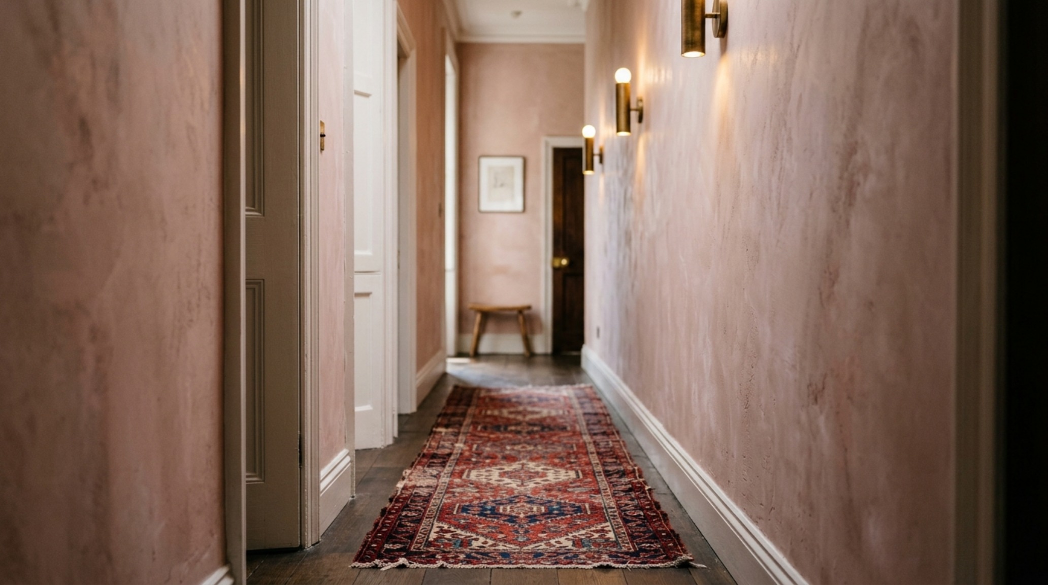
Consider the placement of wall sconces. To expand the perceived width, mount sconces at approximately 60 to 66 inches from the floor. Use fixtures with an ‘up-and-down’ throw of light. The ‘up’ light illuminates the ceiling—the ‘fifth wall’—making it feel higher, while the ‘down’ light pools on the floor, providing tactile grounding. Using a warm 2700K bulb with a high CRI (Color Rendering Index) of 90+ ensures that the textures of your walls—be it a subtle limewash or a rich linen wallpaper—are rendered with depth and authenticity.
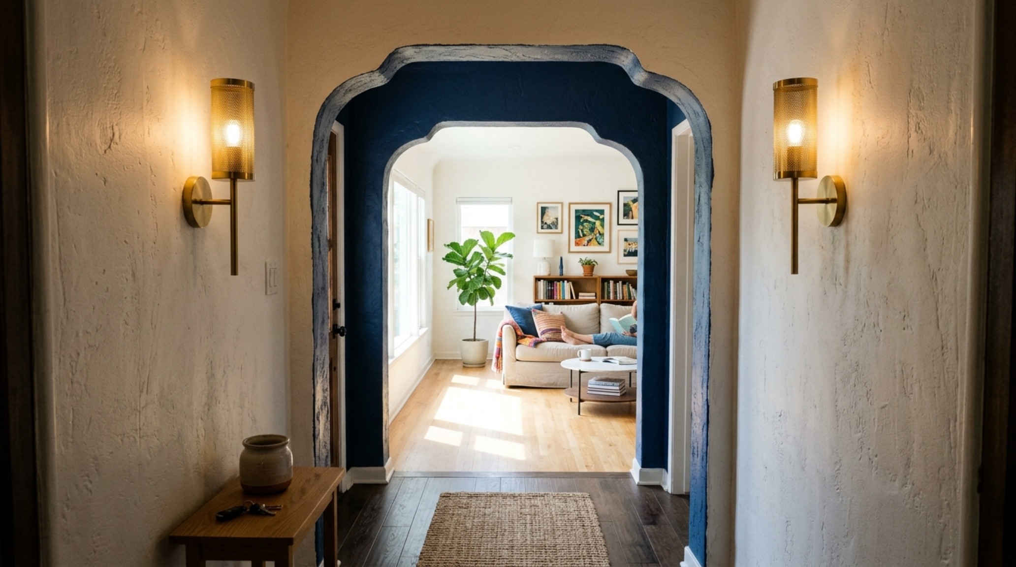
Architectural Symmetry and the Narrow Foyer Design
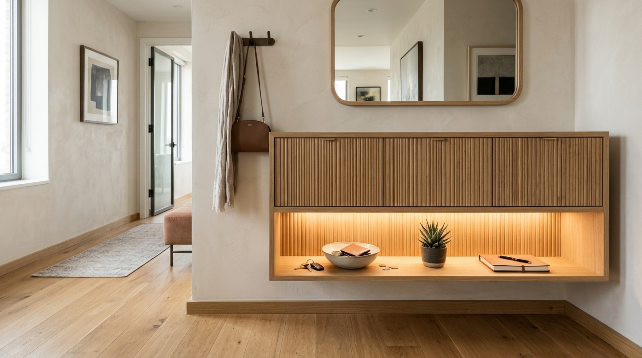
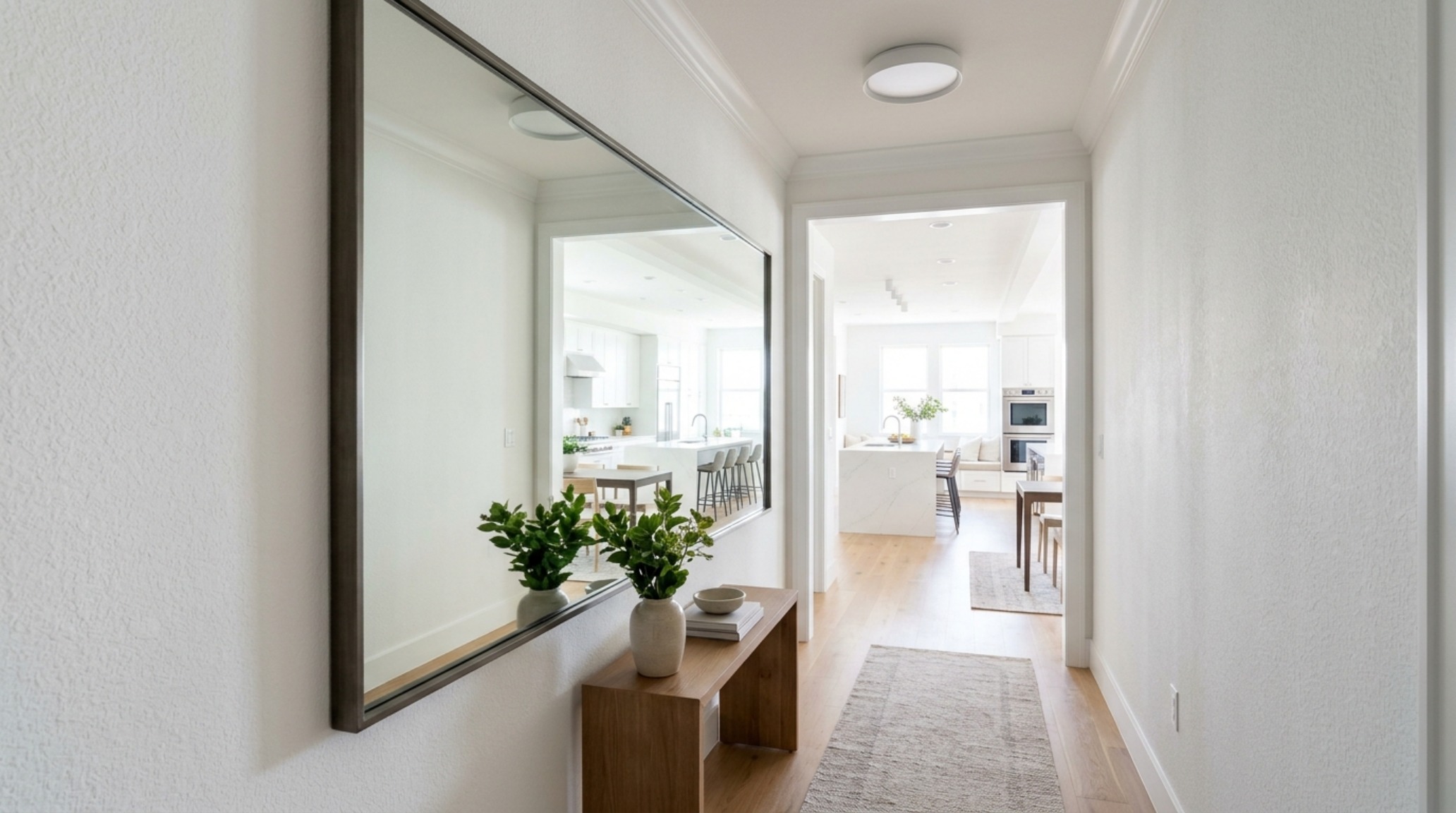
Symmetry is the brain’s shortcut to order and luxury. In a narrow foyer design, creating a symmetrical axis can distract from the lack of square footage. This is where the ‘anchor’ comes in. If you have a long wall, don’t just line it with small hooks. Create a singular, powerful moment. A narrow, wall-mounted console (aim for a depth of 10 to 12 inches to maintain a clear 36-inch walking path) centered under a large-scale round mirror creates a focal point that breaks the linear monotony.
The mirror is your most potent tool for doubling the width. However, it must be positioned to reflect light, not just a blank wall. Align it opposite a cased opening or a window to pull the exterior light deep into the corridor. When paired with a modern flush mount entryway light that features a soft, frosted diffuser, the mirror will bounce a gentle glow across the entire width of the space, erasing harsh shadows that define the corners of the room.
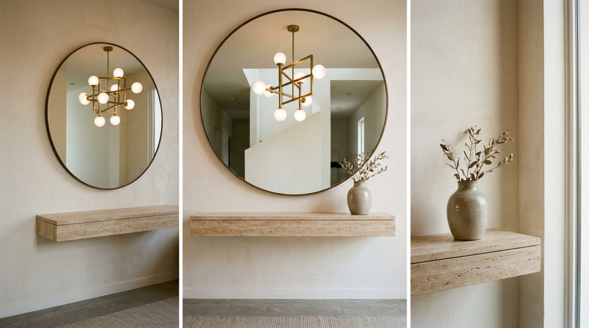
Curating Entryway Drop Zone Ideas for Spatial Flow
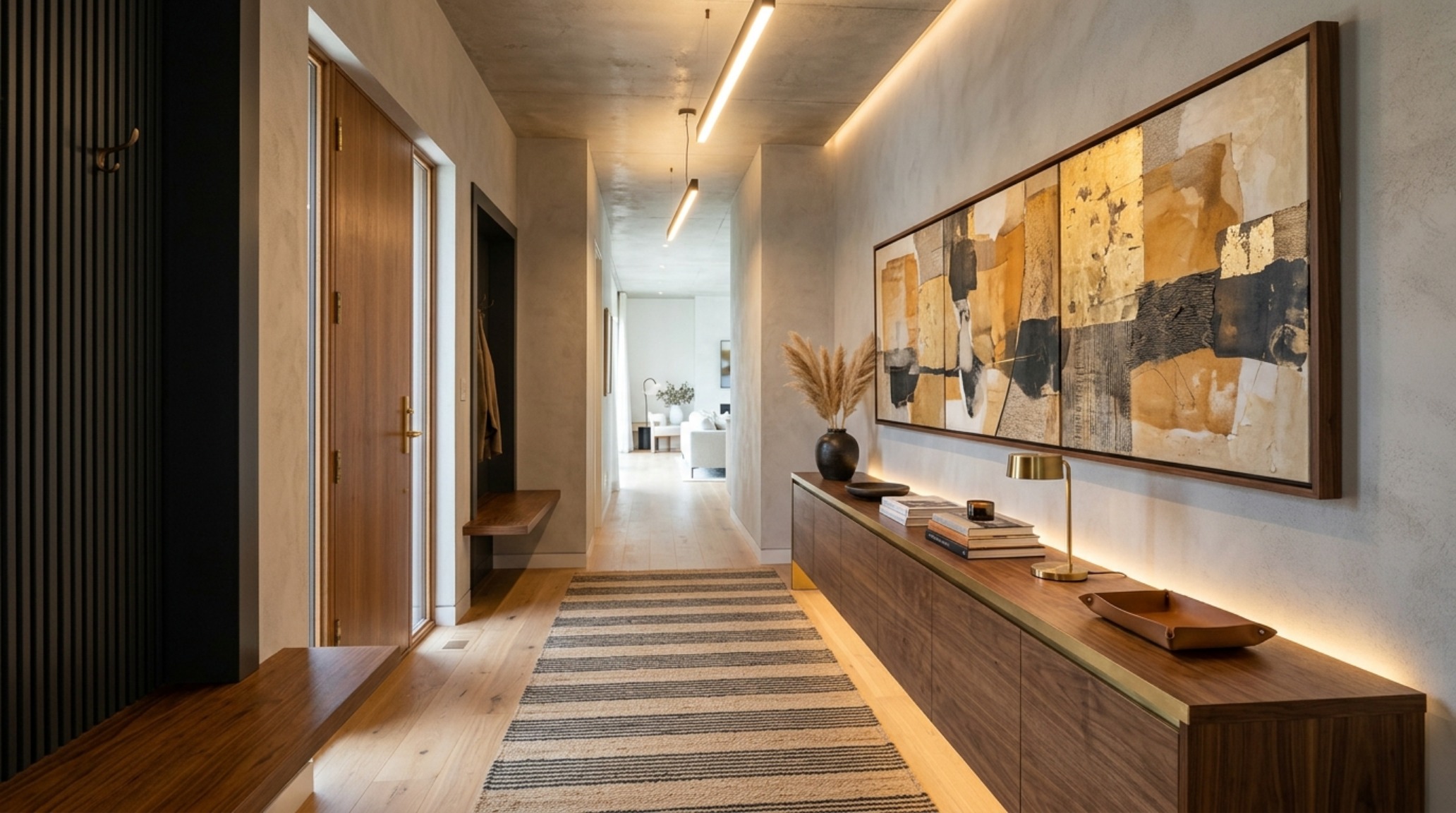
Practicality often clashes with aesthetics in small spaces. The ‘drop zone’ is a necessity, but it can quickly become a visual roadblock. To keep the entryway drop zone ideas from feeling cluttered, lean into the ‘floating’ aesthetic. Wall-hung cabinetry or a simple, thick oak shelf keeps the floor plane clear. When the floor is visible from wall to wall, the room feels wider. Avoid ‘legged’ furniture that creates a forest of vertical lines, which only emphasizes the narrowness.
Incorporate ‘Tactile Grounding’ through a narrow hallway runner rug. A common mistake is choosing a rug that is too small, which creates a ‘postage stamp’ effect. Your runner should ideally leave only 4 to 6 inches of floor visible on either side. This long, continuous line of texture acts as a visual runway, but when paired with the horizontal expansion of your lighting, it creates a balanced, rhythmic spatial cadence.
Materiality: The Language of Luxury Small Entryway Lighting
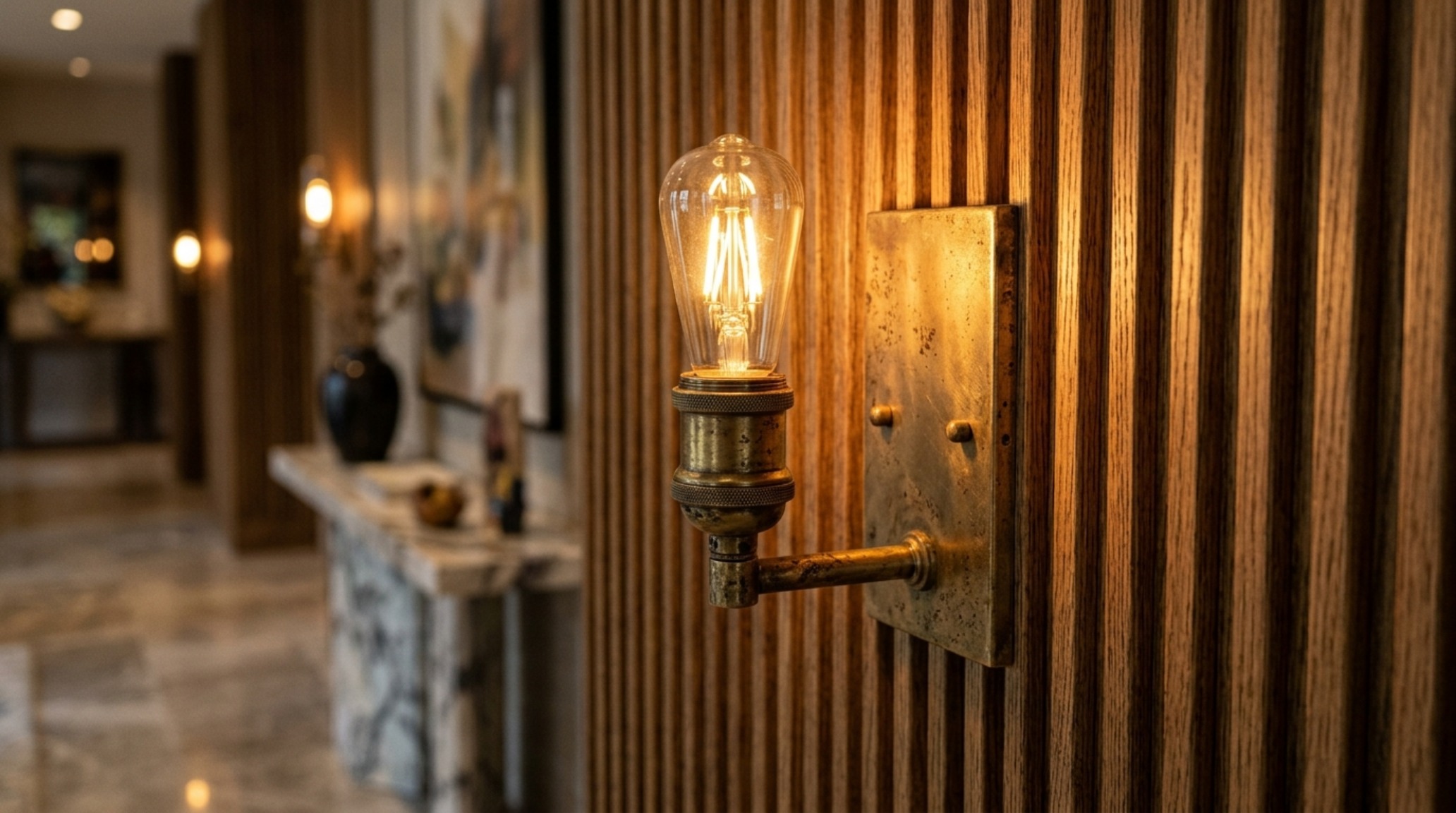
The materials you choose for your luxury small entryway lighting speak volumes. In a tight space, every detail is magnified. Move away from generic finishes and toward living metals like unlacquered brass or hand-rubbed bronze. These materials develop a patina over time, adding a sense of history and soul to the home’s entrance. For an ‘Organic Modern’ look, consider fixtures that incorporate natural textures—alabaster shades that glow with an ethereal translucency, or woven cane that casts intricate shadow patterns on the walls.
Shadow play is an often overlooked aspect of architectural lighting. In a narrow hallway, a fixture that casts a subtle, rhythmic shadow can create a sense of movement and architectural interest where none exists. This ‘atmospheric layering’—combining a central ceiling source with low-level accent lighting—creates a ‘Quiet Luxury’ vibe that feels curated rather than decorated.
The Precision of Temperature and Tone
The difference between a space that feels clinical and one that feels like a sanctuary often comes down to just a few hundred Kelvins. For foyer lighting for low ceilings, I always recommend 2700K. This temperature mimics the warm, golden hour glow of the sun and is incredibly flattering to skin tones—essential for that first moment you welcome a guest. If the space is also used for tasks, like checking mail or putting on shoes, ensure your 2700K warm white hallway lighting has a high lumen output but is paired with a dimmer switch. This allows you to transition from high-functioning ‘day mode’ to a soft, moody ‘evening glow’ that invites transition into the rest of the home.
Architectural Specification & Material Matrix
Curated tactile palette, spatial dimensions, and atmospheric lighting index for this design scheme.
Ultimately, the goal of these narrow entryway ideas is to transform a physical limitation into a design strength. By leaning into the ‘Geometry of Grandeur,’ we move beyond the utilitarian and into the experiential. We recognize that the hallway is not just a path to the ‘real’ rooms; it is the opening chapter of your home’s narrative. When you align your lighting with the natural sightlines of the house and embrace the power of over-scaled, sculptural elements, the narrowness of the foyer ceases to be a constraint. Instead, it becomes a focused, intimate prelude—a deliberate compression that makes the eventual release into the heart of the home feel all the more expansive and light-filled.
Editorial Silo • Recommended Architecture Studies
- Tactile Atmosphere: Mastering Materiality and 2700K Glow in Narrow Entryway Ideas — Archival Design Case Study
- Ergonomic Mastery: Functional & Space-Saving Small Apartment Balcony Ideas Inspired by Linda Hayslett’s Party Plaza — Archival Design Case Study
Architectural Inspiration Lookbook
A high-resolution study in spatial proportions, tactile materiality, and light choreography curated for enduring modern living.
Curated Visual Lookbook
Design Gallery & Spatial Studies
A visual curation of architectural arrangements, lighting concepts, and material palettes featured in this space.