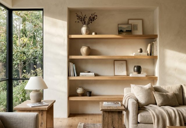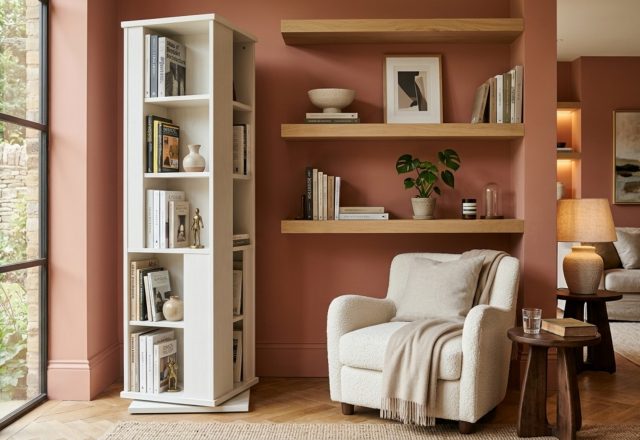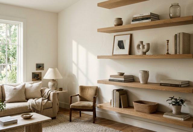
When we approach the challenge of living room floating shelves ideas, we often fall into the trap of viewing them as mere utility—a place to park a ceramic vase or a stack of novels. However, for a designer like Nate Berkus, the wall is not a storage unit; it is a structural canvas. To understand the ‘Architectural Geometry’ of a Berkus-inspired wall is to understand the delicate tension between mass and void. It is about how a thick slab of white oak interacts with the long, vertical shadow of a high ceiling, and how the absence of a shelf can be just as powerful as the presence of one. By deconstructing these geometric formulas, we can transform a standard living space into a curated sanctuary that feels both grounded and ethereal.
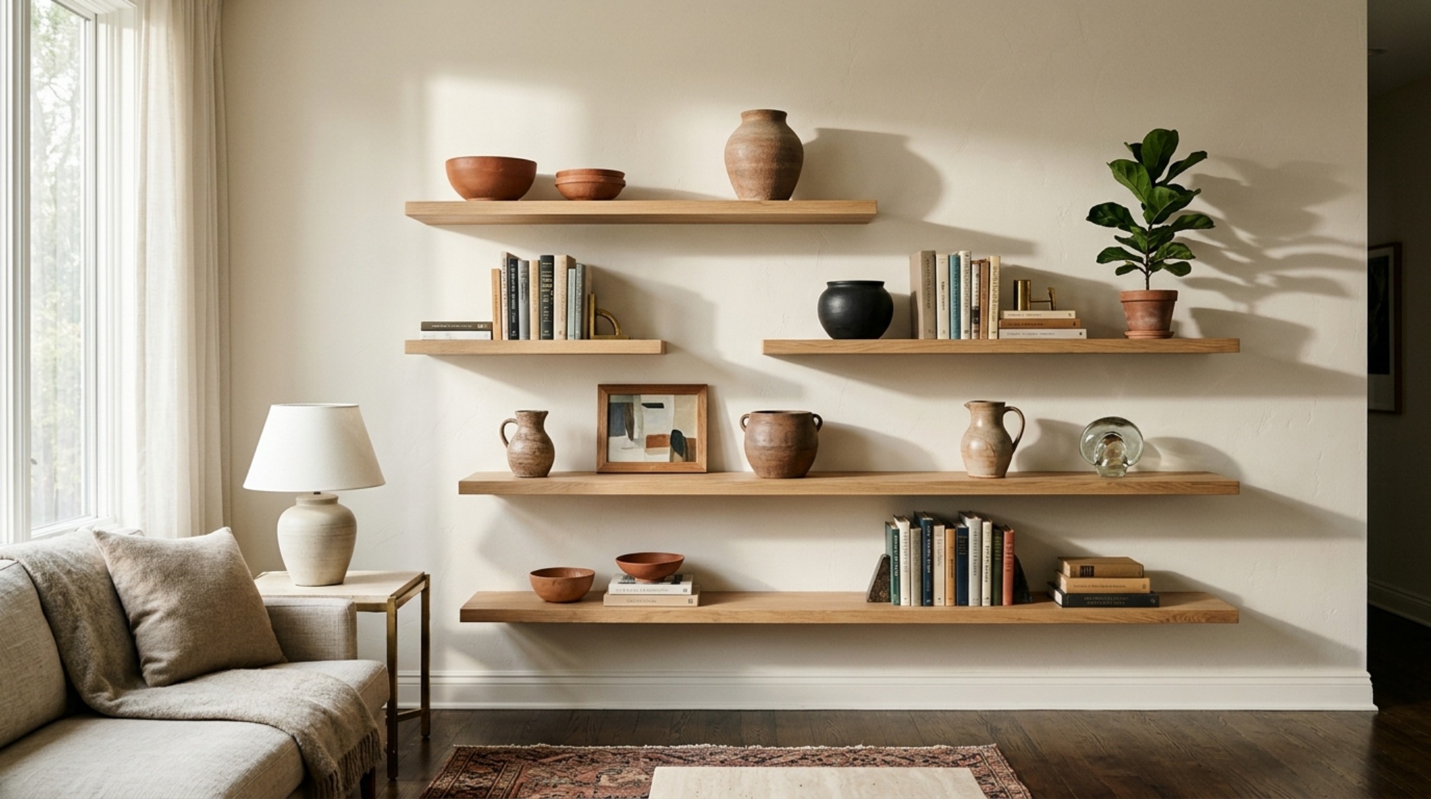
The foundation of any curated wall begins with the backdrop. There is a reason Nate Berkus and countless other top-tier designers return to Benjamin Moore’s ‘Swiss Coffee’ (OC-45) time and again. It is a nuanced off-white that possesses enough warmth to feel lived-in but enough crispness to define architectural lines. In a room flooded with 2700K warm ambient light, Swiss Coffee acts as a soft reflector, creating a subtle ‘glow’ rather than a harsh bounce. This specific backdrop is essential when implementing asymmetrical floating shelves because it allows the wood’s grain and the brass hardware’s patina to stand out without competing for attention. The wall becomes a quiet stage for the spatial cadence of the shelves themselves.
The Visual Anchor and the Power of Asymmetry
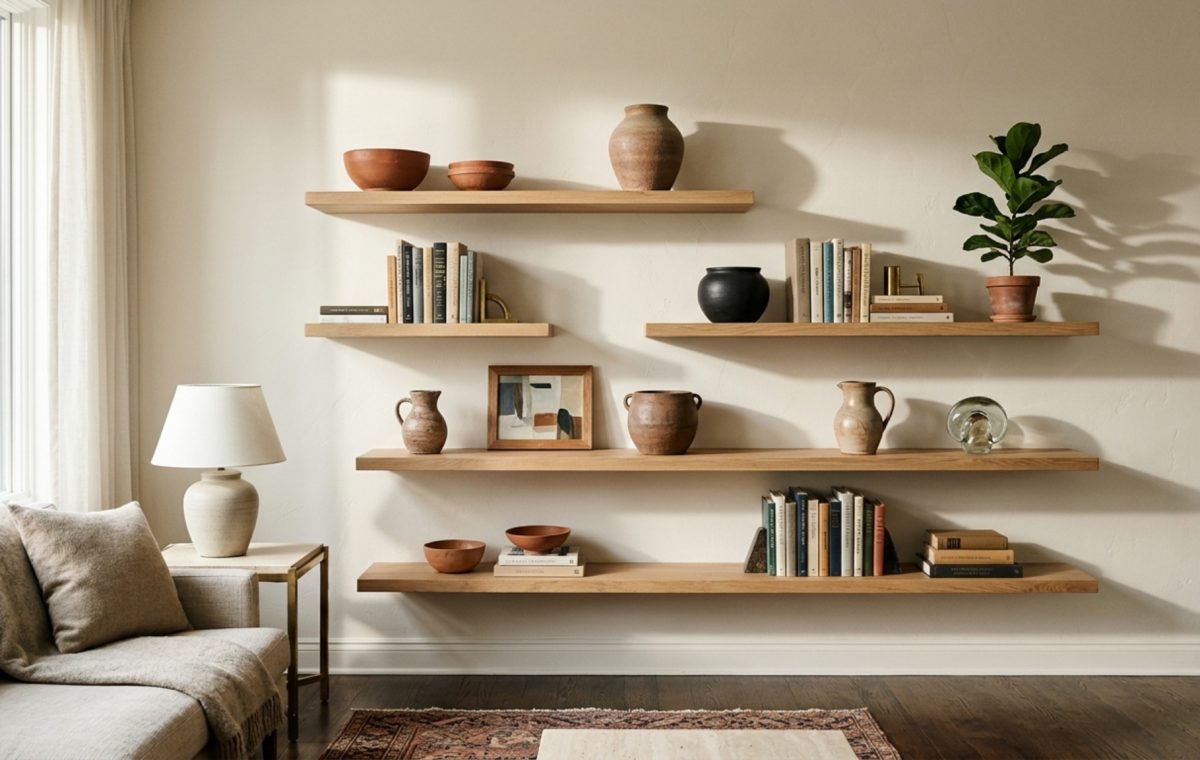
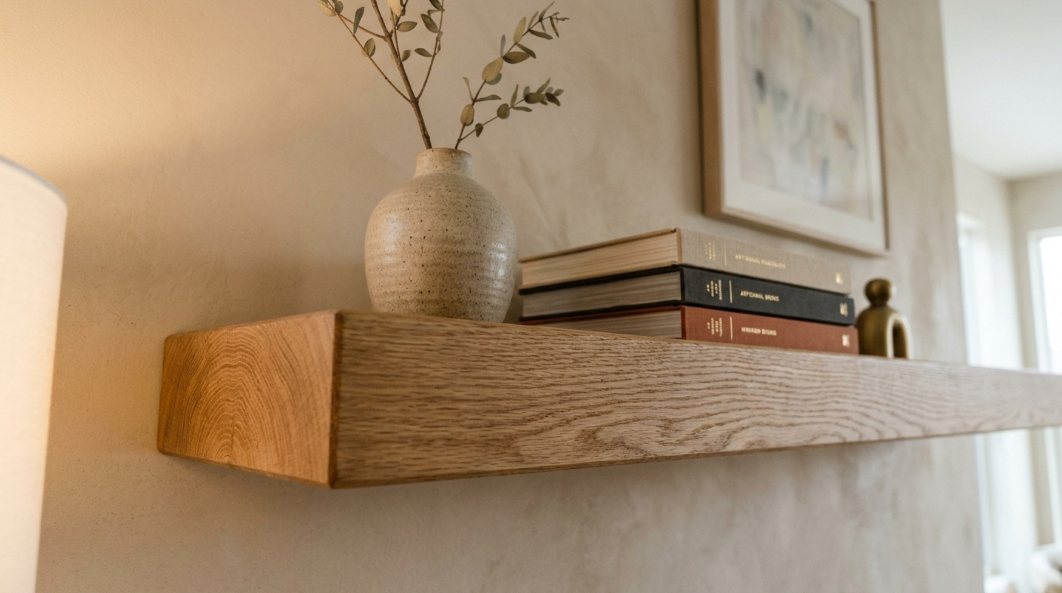
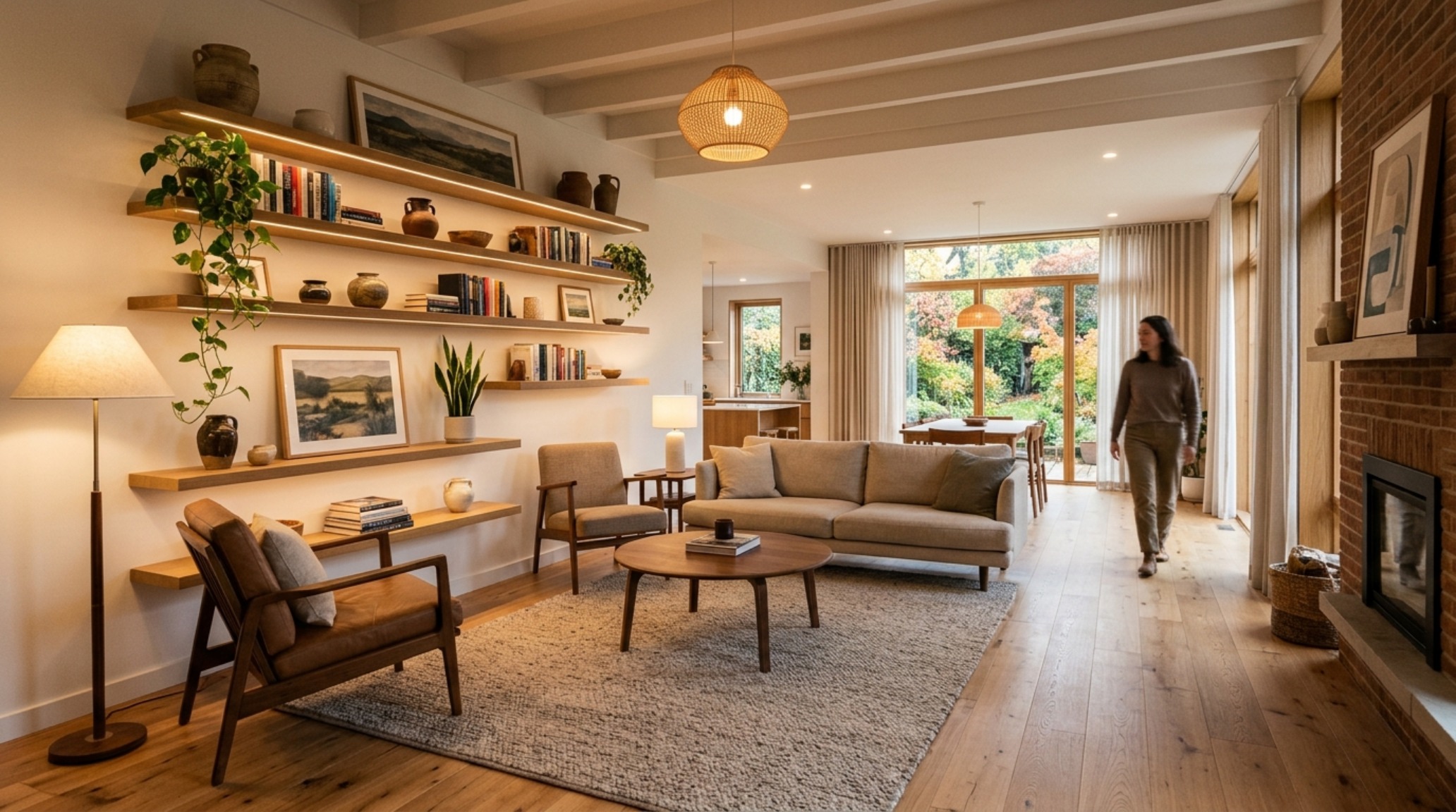
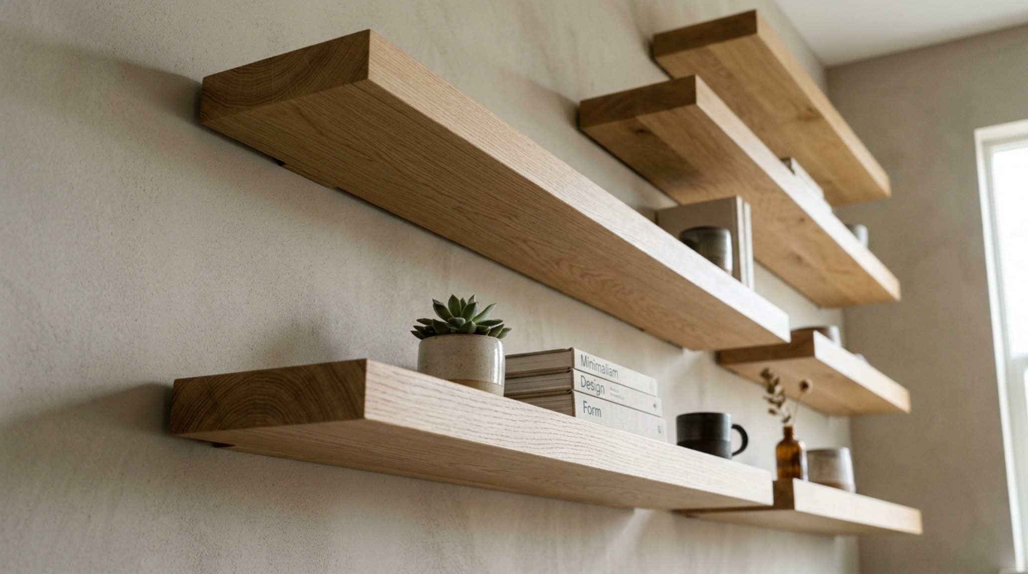
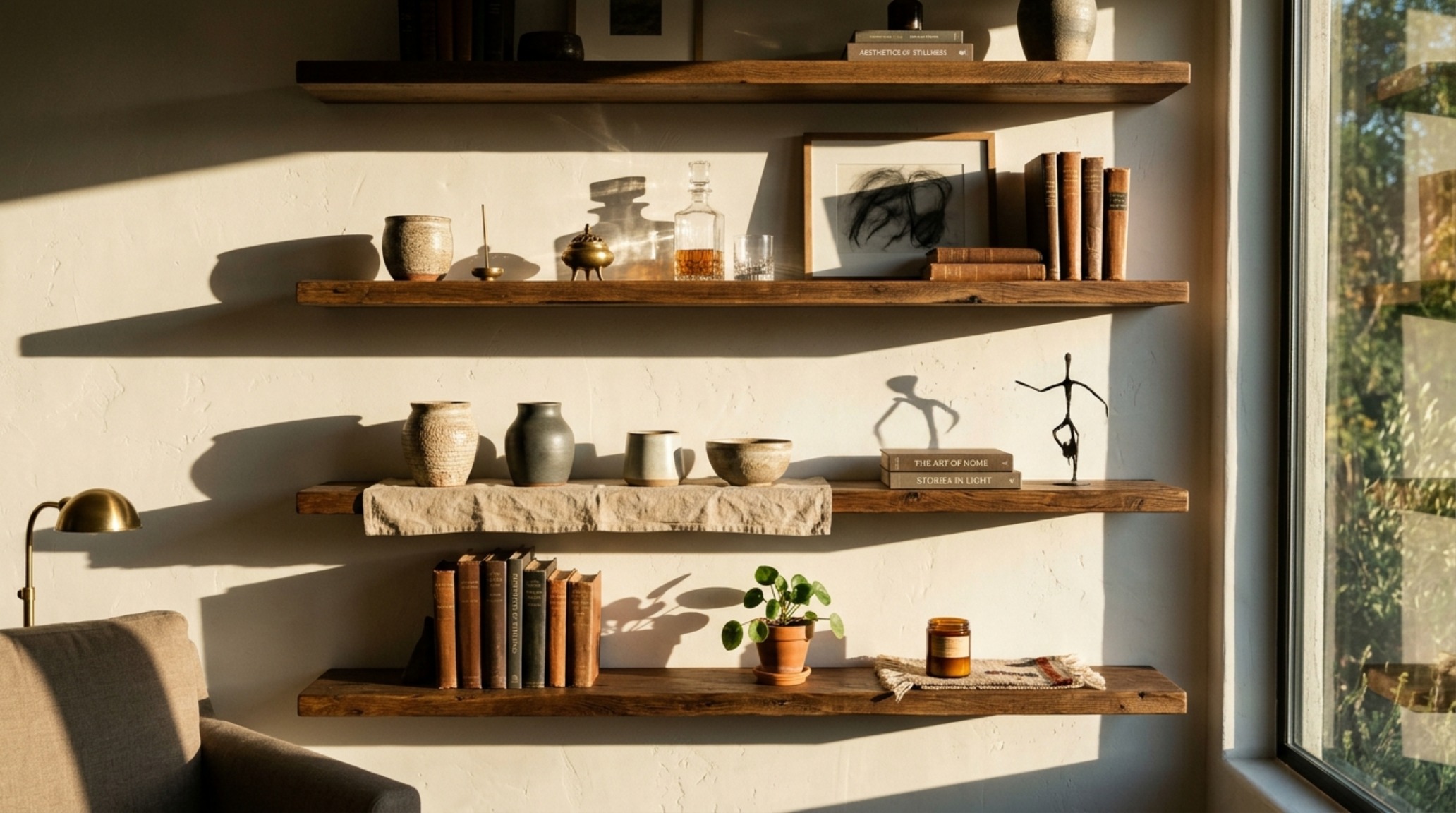
In traditional design, symmetry offers a quick path to balance, but asymmetry offers soul. When exploring living room floating shelves ideas that lean into the Berkus aesthetic, we move away from the ‘ladder’ look and toward a staggered, architectural arrangement. The key is the ‘Visual Anchor.’ This is typically the lowest or longest shelf that carries the most visual weight. Often constructed from a heavier material like 2.5-inch thick fluted white oak or reclaimed timber, this anchor shelf provides a base for the eye to rest. It isn’t just floating; it is tethered to the room’s architecture by its alignment with other horizontal lines, such as the top of a sofa back or a window sill.
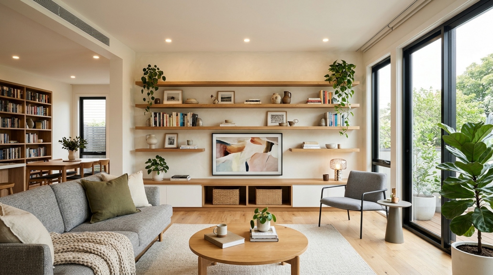
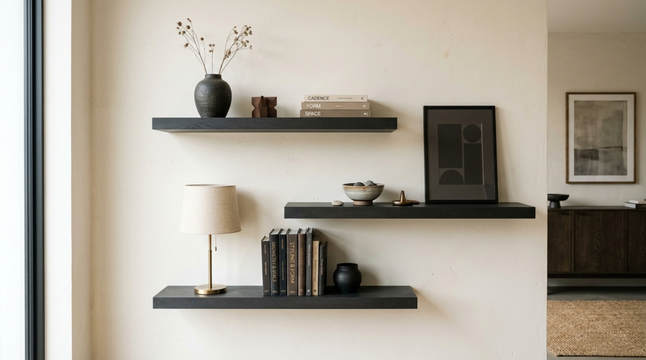
Once the anchor is established, the ‘geometric formula’ takes over. Berkus often utilizes a 60/40 weight distribution. If the left side of your wall features a long, low shelf, the right side might respond with two shorter, higher shelves. This creates a diagonal flow that forces the eye to travel across the collection rather than just scanning it. This movement is what gives a room its energy. It’s the difference between a static display and a dynamic installation. To maintain this balance, one must consider the ‘negative space breathing room’—the intentional gaps where no shelving exists. These voids are the architectural ‘silence’ that makes the objects speak louder.
The Rule of Three and Tactile Layering
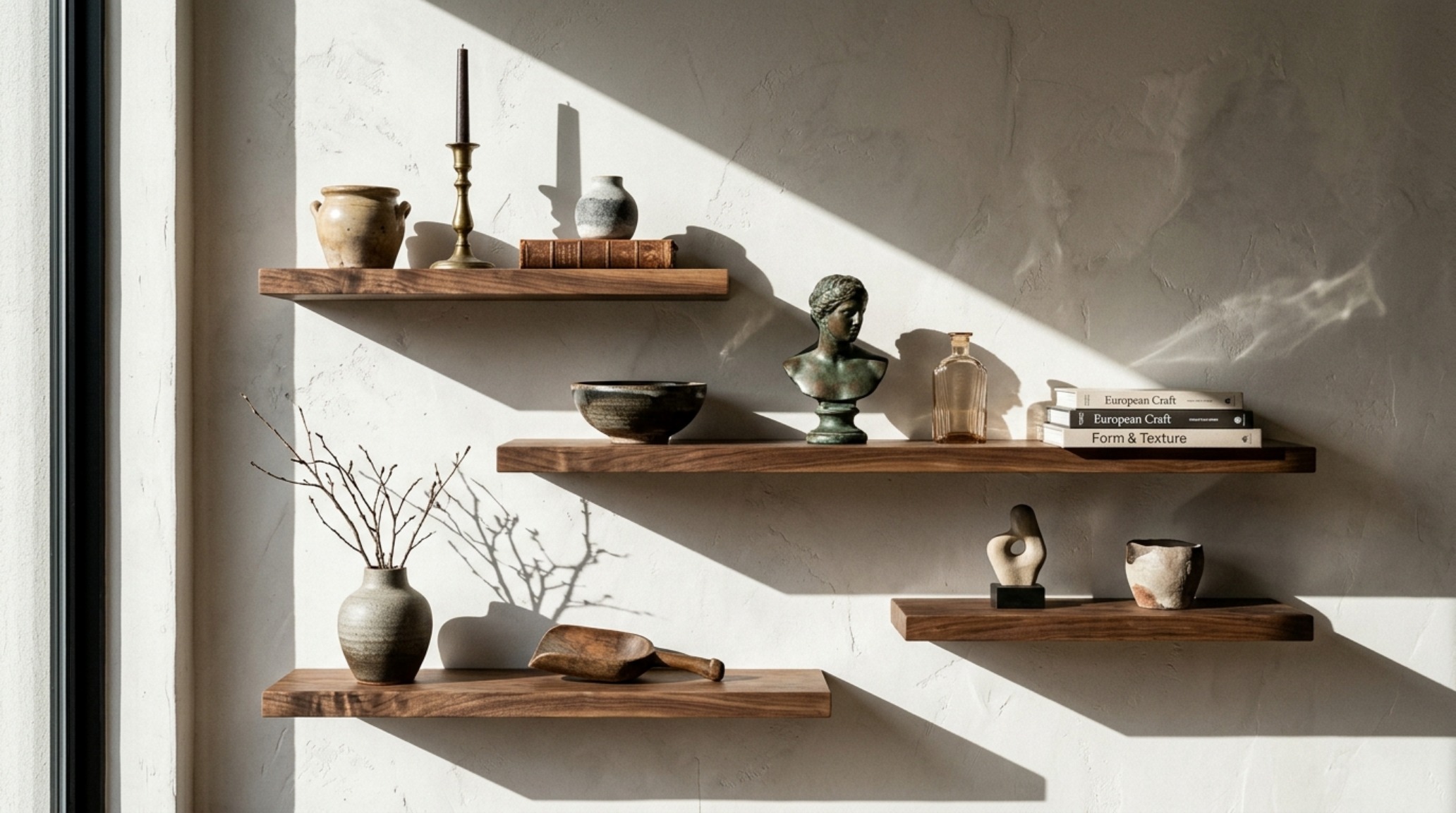
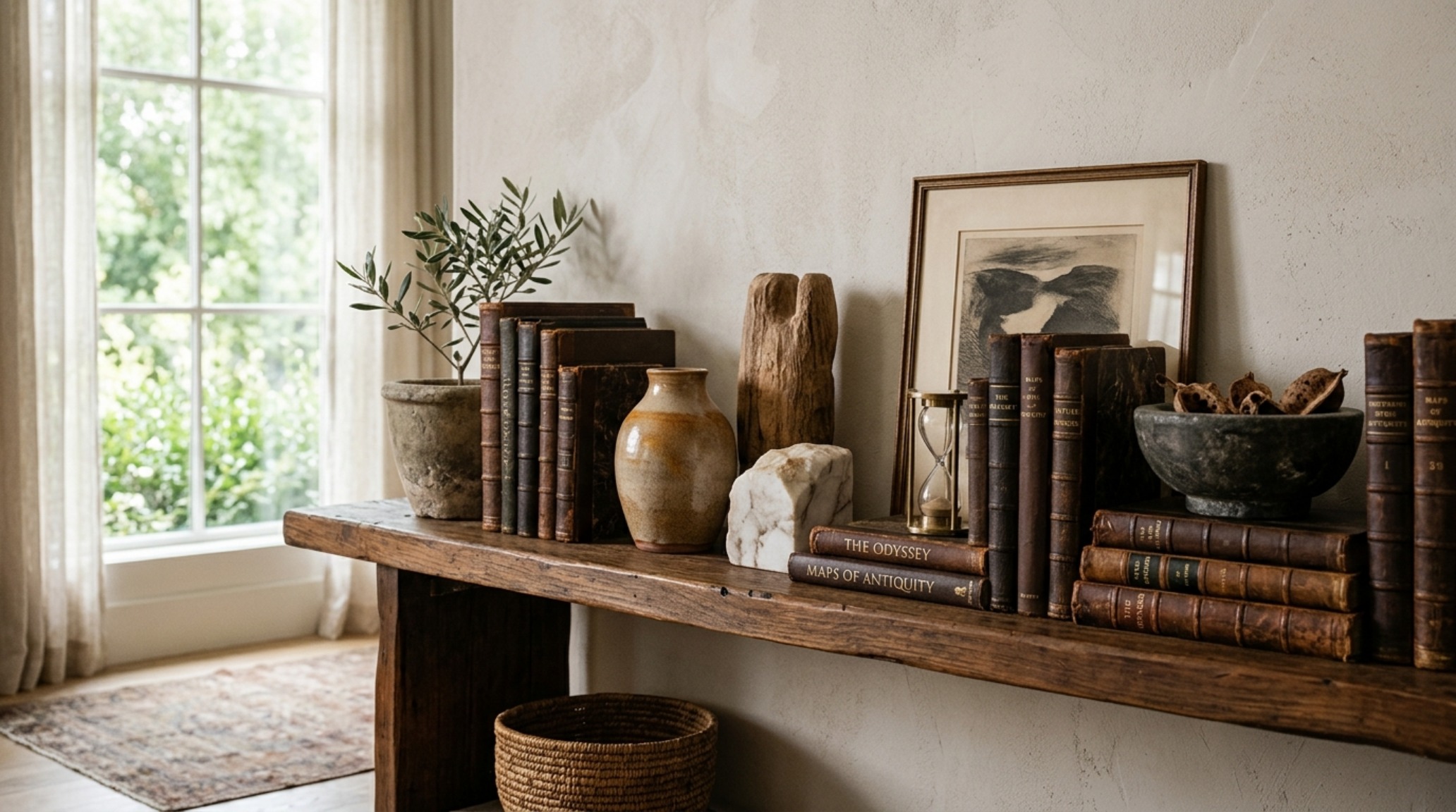
Styling is where the geometry becomes personal. The ‘Rule of Three’ is a staple in the Berkus toolkit, but in the context of architectural shelving, it’s applied with a focus on height and texture rather than just quantity. You might group a tall, matte ceramic vessel with a mid-sized vintage leather book stack and a low, heavy brass weight. These three items represent a hierarchy of scale. The brass, specifically, serves a dual purpose: it adds a ‘structural’ feel to the shelf, its weight suggesting permanence and quality. This tactile grounding is what elevates a bookshelf from a DIY project to a masterwork of interior storage solutions.
“Your home should tell the story of who you are, and be a collection of what you love—but it should also respect the lines of the room it inhabits.”
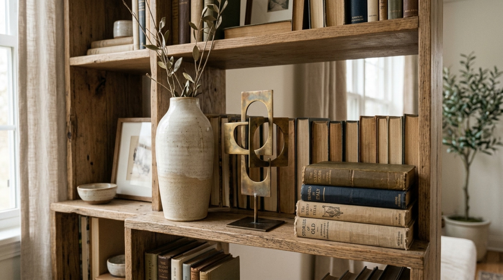
When layering objects, think about sightline alignment. For a shelf positioned at eye level (roughly 57 to 60 inches from the floor), the objects should have intricate details that invite closer inspection. For higher shelves, go for larger, bolder silhouettes that can be appreciated from a 36-inch standard walkway clearance. The goal is to create a ‘spatial narrative’ where the eye is rewarded whether it’s looking from across the room or standing directly in front of the wall. Using wood wall shelves in a living room provides a natural warmth that softens the harder edges of modern architecture, bridging the gap between the structure and the inhabitant.
Materiality: The Brass-Weighted Proportions
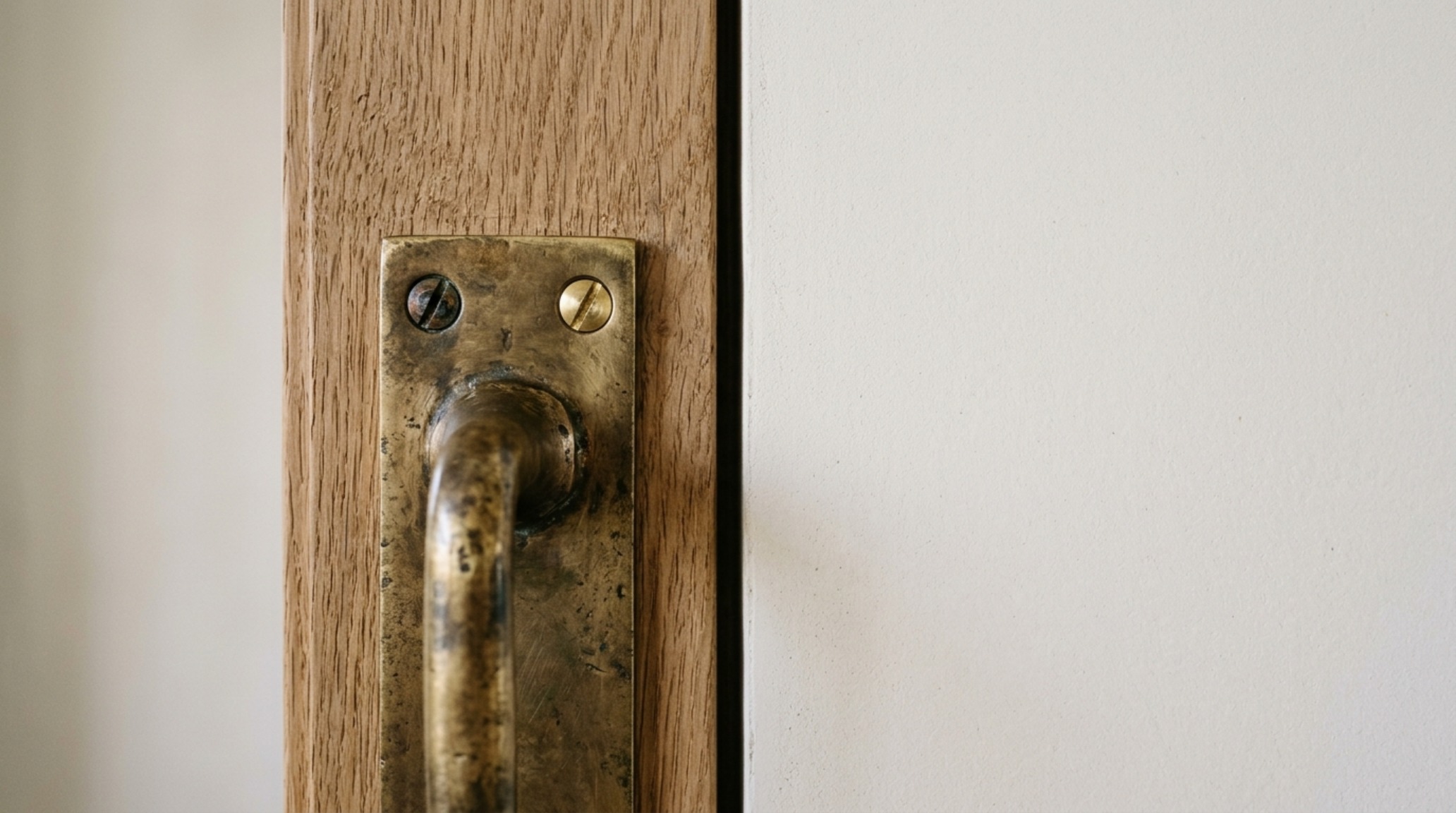
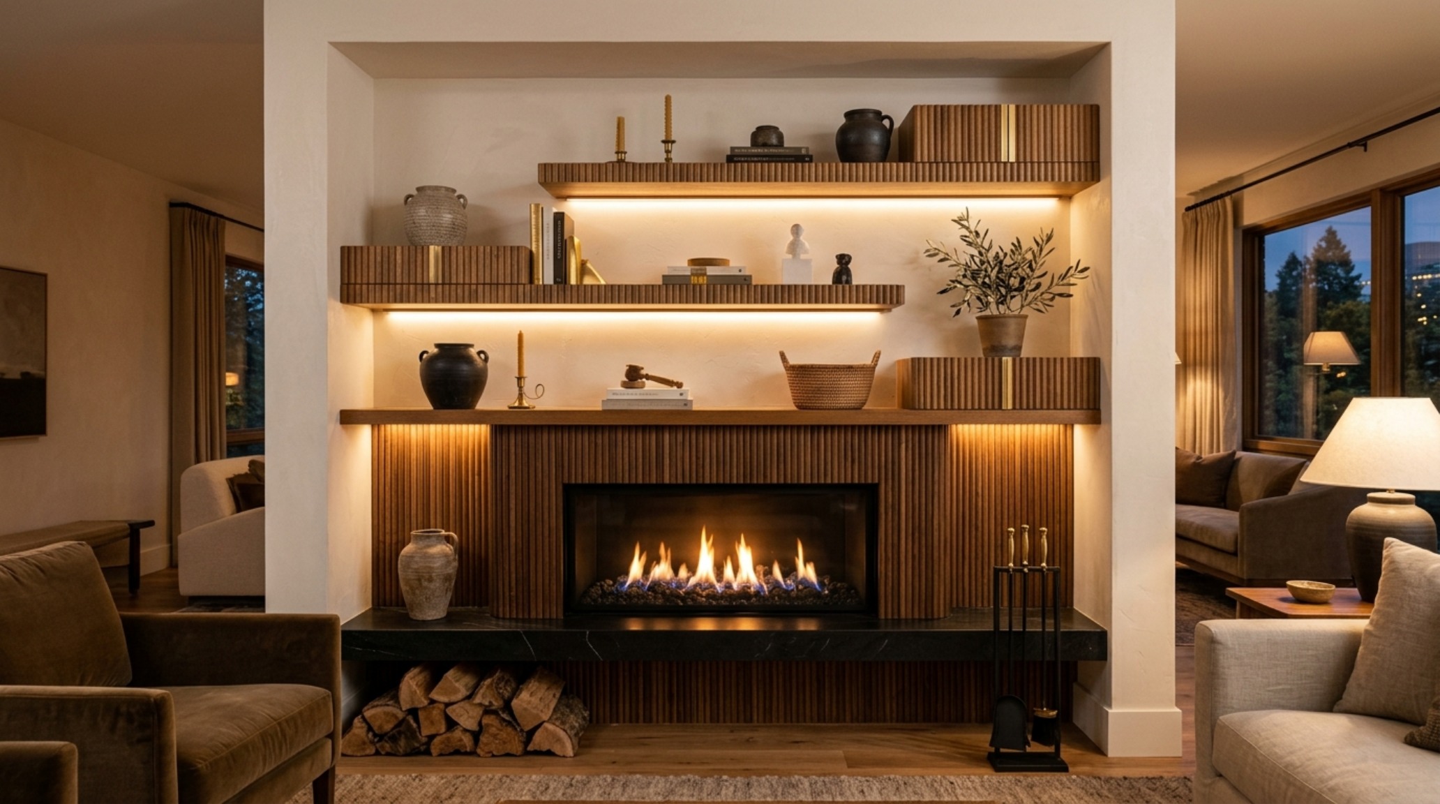
Materiality is the secret language of quiet luxury. In a Berkus-inspired setup, we aren’t just looking at wood; we are looking at the finish, the grain, and the intersection of materials. Combining natural wood with ‘brass-weighted’ elements creates a timeless contrast. Whether it’s discrete brass brackets or decorative objects with a heavy, unlacquered finish, these metallic touches act as punctuation marks. They catch the light—ideally a high-CRI 90+ directional source—and draw attention to the shelf’s horizontal plane. This interaction between the organic wood and the industrial metal is a hallmark of curated bookshelf aesthetic.
Spatial ergonomics also play a vital role. When planning your living room floating shelves ideas, you must account for the physical reality of the space. A shelf should never impede a 36-inch primary circulation path, nor should it be so high that the top surface becomes a dust trap invisible to the eye. Generally, the lowest shelf should sit at least 12 to 18 inches above a piece of furniture, such as a credenza or a sofa, to maintain a sense of lightness. If the shelves are near a dining area, ensure there is a 30-inch clearance for chairs to pull out comfortably without the guest feeling ‘loomed over’ by the shelving units. These measurements aren’t just rules; they are the framework that makes a room feel ‘right’ to the subconscious.
Shadow Play and Lighting Specifications
Lighting is the final architectural layer. To truly highlight the depth of asymmetrical floating shelves decor, one must move beyond the overhead ‘boob light.’ Berkus designs often utilize small, high-quality art lights or recessed directional spots. A 2700K warm ambient light is preferred for living spaces as it mimics the glow of a sunset, enhancing the rich tones of oak or walnut. By positioning a light source slightly off-center, you create ‘shadow play’—the shelf casts a soft shadow on the Benjamin Moore Swiss Coffee backdrop, giving the entire installation a three-dimensional, sculptural quality. This is how you move from ‘storage’ to ‘architecture.’
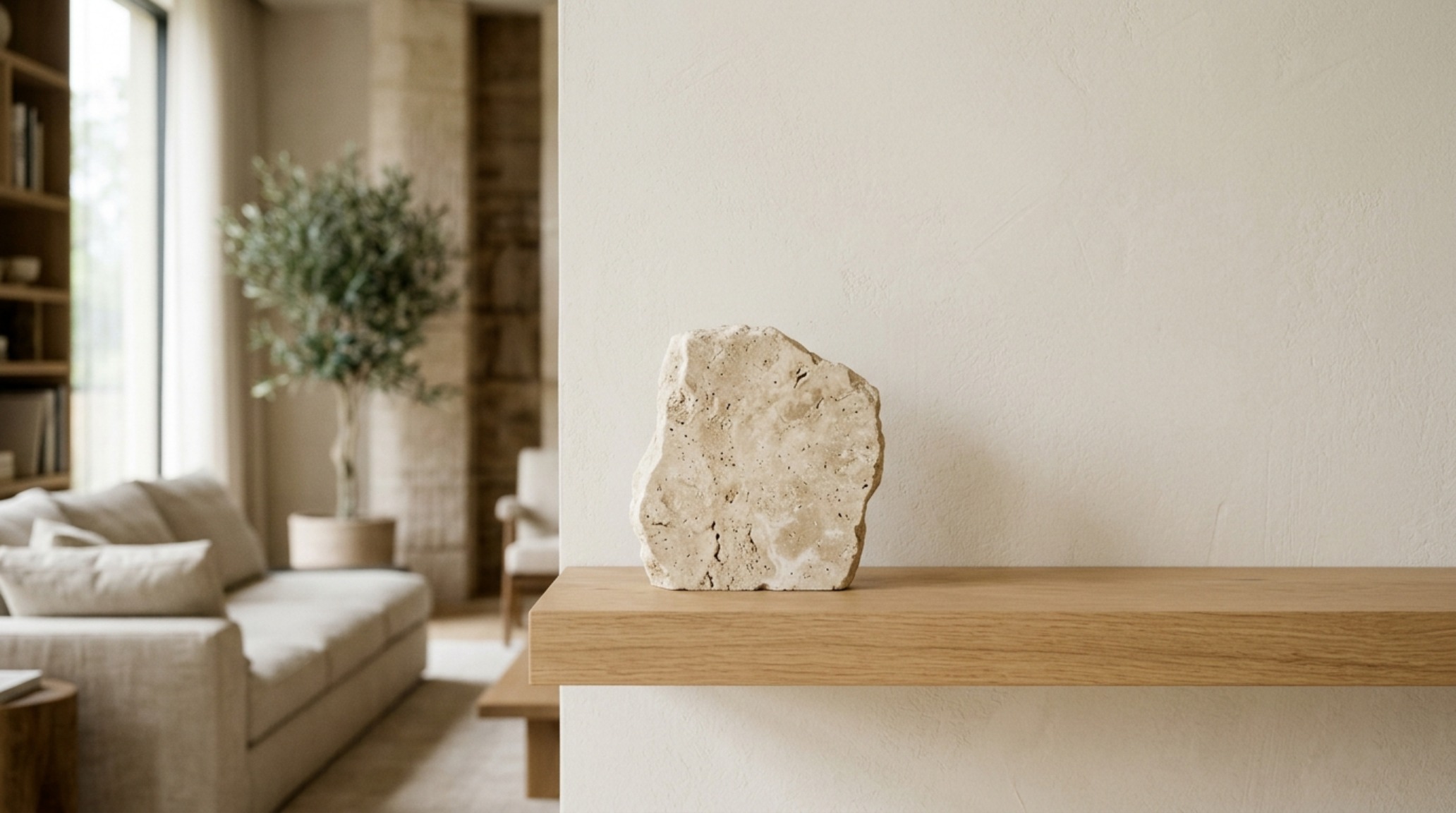
Finally, consider the curation of the objects themselves. A Berkus-styled shelf is never ‘full.’ It is edited. Each item is chosen for its architectural shape or its personal history. A piece of honed travertine stone resting on a shelf adds a cool, matte texture that contrasts beautifully with the warmth of wood. Minimalist shelf layering techniques suggest that you leave room for the architecture of the objects to breathe. Don’t be afraid to leave a third of a shelf empty. This ‘quiet’ space allows the viewer to appreciate the grain of the wood and the precision of the shelf’s installation. It is a confident design choice that signals sophistication.
Architectural Specification & Material Matrix
Curated tactile palette, spatial dimensions, and atmospheric lighting index for this design scheme.
Ultimately, the architecture of a curated wall is about creating a sense of permanence and personal history in a world of fleeting trends. When you apply Nate Berkus’ geometric formulas to your own living room floating shelves ideas, you aren’t just organizing your home; you are refining your environment. By balancing the visual weight, choosing materials that age gracefully, and respecting the structural lines of your space, you create a wall that feels less like a furniture choice and more like a fundamental part of the building’s soul. It is an invitation to slow down, to look closer, and to inhabit a space that is as thoughtfully composed as it is lived-in.
Editorial Silo • Recommended Architecture Studies
- The Vertical Expansion: High-Function Living Room Floating Shelves Ideas for Urban Alcoves — Archival Design Case Study
- Sensory Library Luxe: Integrating Living Room Floating Shelves Ideas with Viral Prime Day Rotating Bookshelves — Archival Design Case Study
Architectural Inspiration Lookbook
A high-resolution study in spatial proportions, tactile materiality, and light choreography curated for enduring modern living.
Curated Visual Lookbook
Design Gallery & Spatial Studies
A visual curation of architectural arrangements, lighting concepts, and material palettes featured in this space.