The Anatomy of a Well-Styled Console
Most hallways suffer from neglect. They become catch-alls for mail, keys, and random clutter. Yet this transitional space sets the tone for your entire home. Console table styling requires restraint rather than an accumulation of decorative objects. When you look at a balanced vignette, symmetry plays a massive role, but absolute perfection feels sterile. You need deliberate friction to make the arrangement feel lived-in.
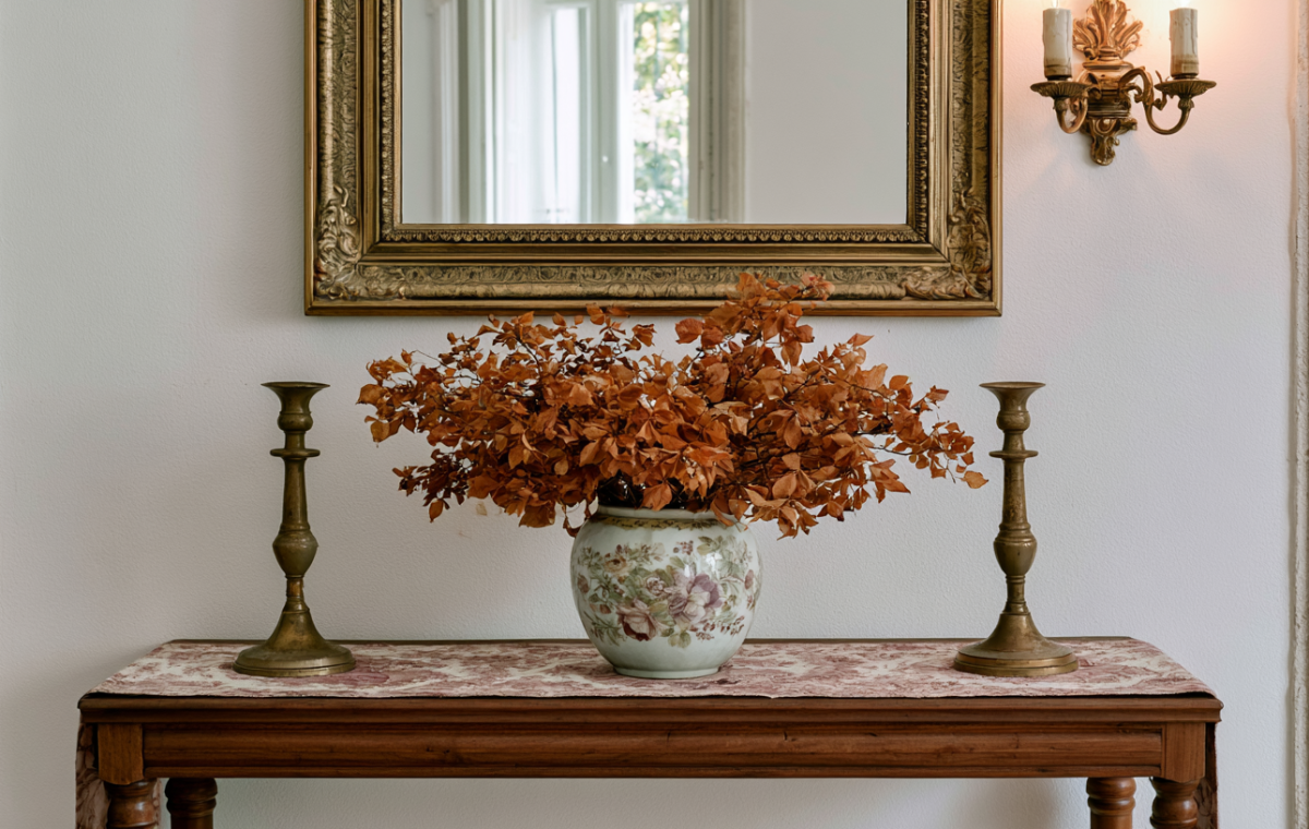
Take the setup pictured above. A heavy, ornate gold-leaf mirror anchors the visual weight on the wall. Below it, a warm wooden console grounds the lower half of the composition. Instead of fresh flowers that demand constant upkeep, dried foliage fills a painted ceramic vase. Those crumpled brown leaves bring an earthy, autumnal permanence to the room. It is low maintenance with high visual impact.
Balancing Height and Proportion
Proportion decides whether your entryway looks curated or cluttered. Tall elements draw the eye upward, making ceilings feel higher. Notice the flanking brass candlesticks sitting on either end of the wooden surface. Their slim profiles offer verticality without blocking the wall space or competing with the grand mirror overhead. A common mistake involves placing items of uniform height together. Varying your vertical layers creates necessary visual rhythm.
Textural contrast matters just as much as scale. Smooth glass, polished brass, rough dried plant matter, and weathered wood all speak different material languages. If everything has a glossy finish, the eye slides right off the surface. Mixing aged patinas with organic shapes builds depth.
- Use an oversized wall mirror to reflect natural light and double the perceived space.
- Ground your central vessel with a textured table runner or cloth underneath.
- Stick to a restrained color palette drawn from nature rather than bright plastic accents.
- Keep landing surfaces functional by leaving small negative spaces open.
Good design is not about filling every square inch. It is about letting the breathing room tell the story.
Avoiding Common Styling Pitfalls
Overcrowding remains the number one killer of good interior composition. When every inch of a table wears a trinket, the eye gets exhausted. Allow negative space to do heavy lifting. Another frequent trap is ignoring lighting temperature. Wall sconces placed near mirrors should cast a warm, ambient glow rather than a harsh clinical glare. If your hallway lacks natural windows, investing in proper layered lighting changes everything.
How do you currently handle the drop zone near your front door, and what small change could elevate it tomorrow?
Editorial Lookbook & Photo Collection