The Tactile Dialogue of Modular Living
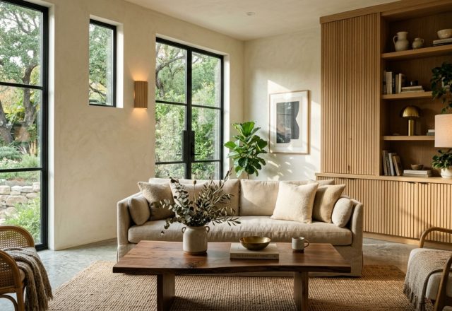
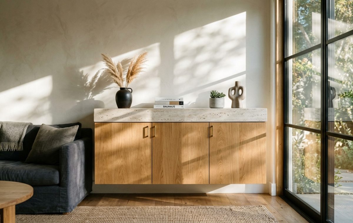
The cool touch of honed travertine meeting the warmth of rift-sawn oak creates a sensory friction that immediately elevates a curated space. Within this tactile dialogue, the versatility of ikea room design serves as a democratic skeleton, waiting for the architectural skin that transforms utility into art. We often view modular furniture through a lens of temporary convenience, yet the most sophisticated interiors today treat these pieces as precision-engineered components within a much larger, bespoke narrative. It is about moving beyond the assembly manual to understand the spatial cadence of a room—how light hits a matte-lacquered surface or how a shadow falls across a recessed handle.
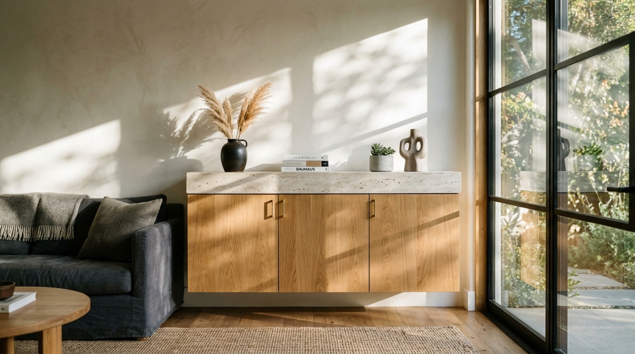
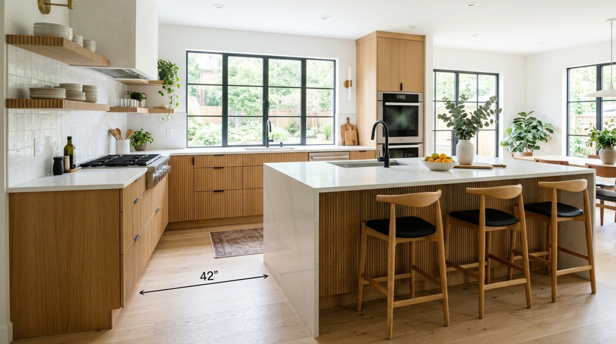
True ergonomic mastery begins with the invisible lines of a floor plan. In the world of high-end residential architecture, we respect the 36-inch standard for primary circulation paths. This isn’t just a number; it’s the difference between a room that feels like a corridor and one that feels like a sanctuary. When integrating modular systems, we must maintain these clearances to allow the eye—and the body—to move without friction. By utilizing the geometric purity of Scandinavian-inspired frames, we can carve out function in the most restricted footprints without sacrificing the ‘negative space’ that allows a room to breathe.
Modern Ikea Room Design Ideas: The Architecture of the Built-In
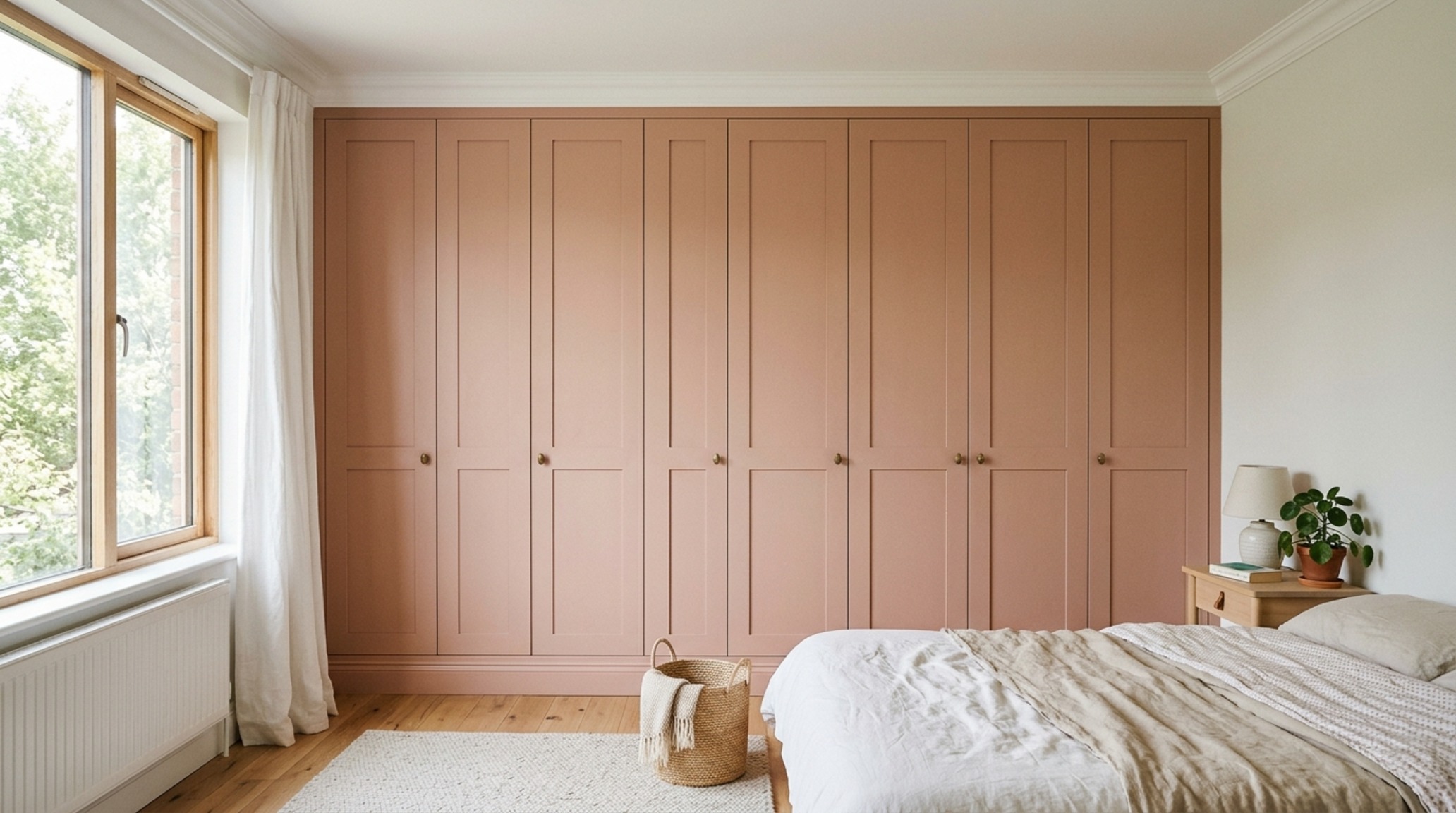
The secret to an elevated aesthetic lies in the erasure of the ‘stand-alone’ look. By taking standard frames like the PAX wardrobe or the SEKTION kitchen modules and running them floor-to-ceiling, you create architectural permanence. Framing these units with custom MDF bulkheads or rift-cut oak gable ends mimics the look of $20,000 custom millwork for a fraction of the cost. I often suggest painting these integrated units in a soft, monochromatic hue like Benjamin Moore Swiss Coffee or Farrow & Ball Setting Plaster to soften the sharp industrial edges.
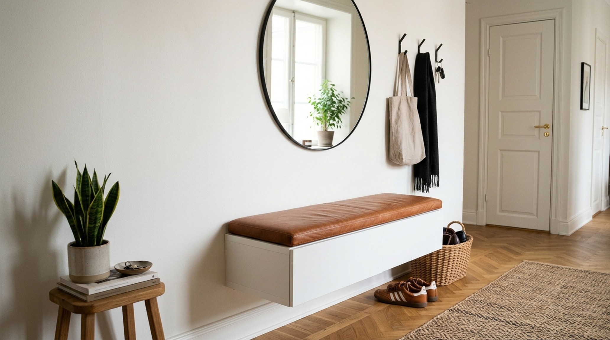
Consider the ‘floating’ effect for media consoles or entryway benches. By wall-mounting BESTÅ units 12 inches off the floor, you expose more of the floor plane, which trickles into our subconscious as a sense of increased square footage. This visual lightness is a hallmark of modern ikea room design ideas, where the goal is to provide maximum utility while maintaining a minimalist silhouette. Add a 20mm slab of honed Carrara marble or a thick walnut butcher block to the top of these units to provide the tactile grounding that mass-produced melamine lacks.
Small Space Ikea Room Design: Ergonomics & Spatial Efficiency
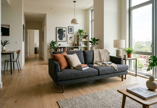
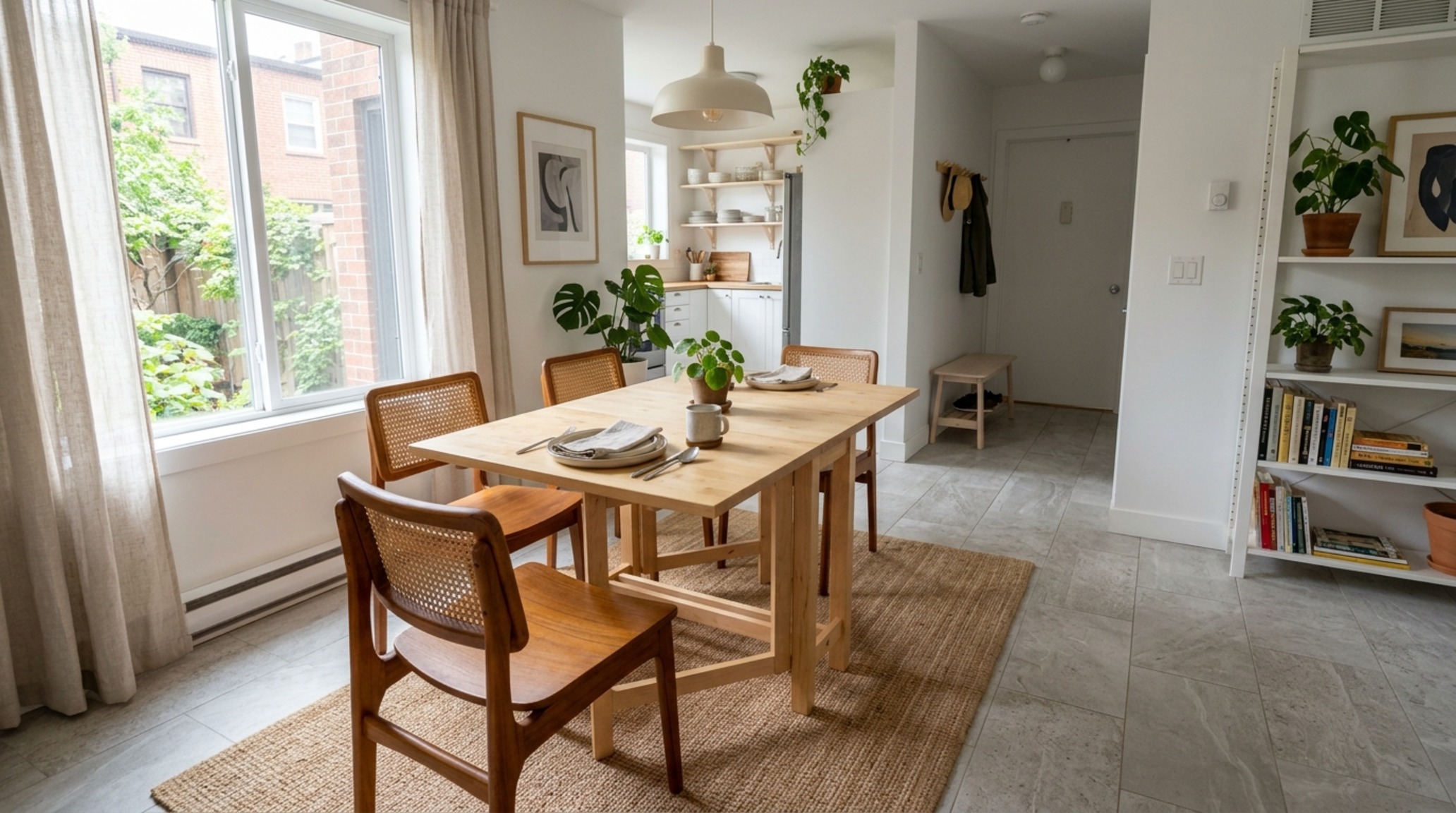
In a constrained footprint, every inch is a negotiation. We must apply the 18-inch coffee table reach rule and the 30-inch dining chair clearance with religious fervor. A small space ikea room design should focus on the ‘Swiss Army Knife’ philosophy—furniture that performs dual roles without looking like a compromise. The NORDEN gateleg table, for instance, is an architectural marvel of compression, but its true power is unlocked when paired with high-end seating that provides a stylistic counterpoint, such as a vintage Cesca chair or a sculptural Wegner piece.
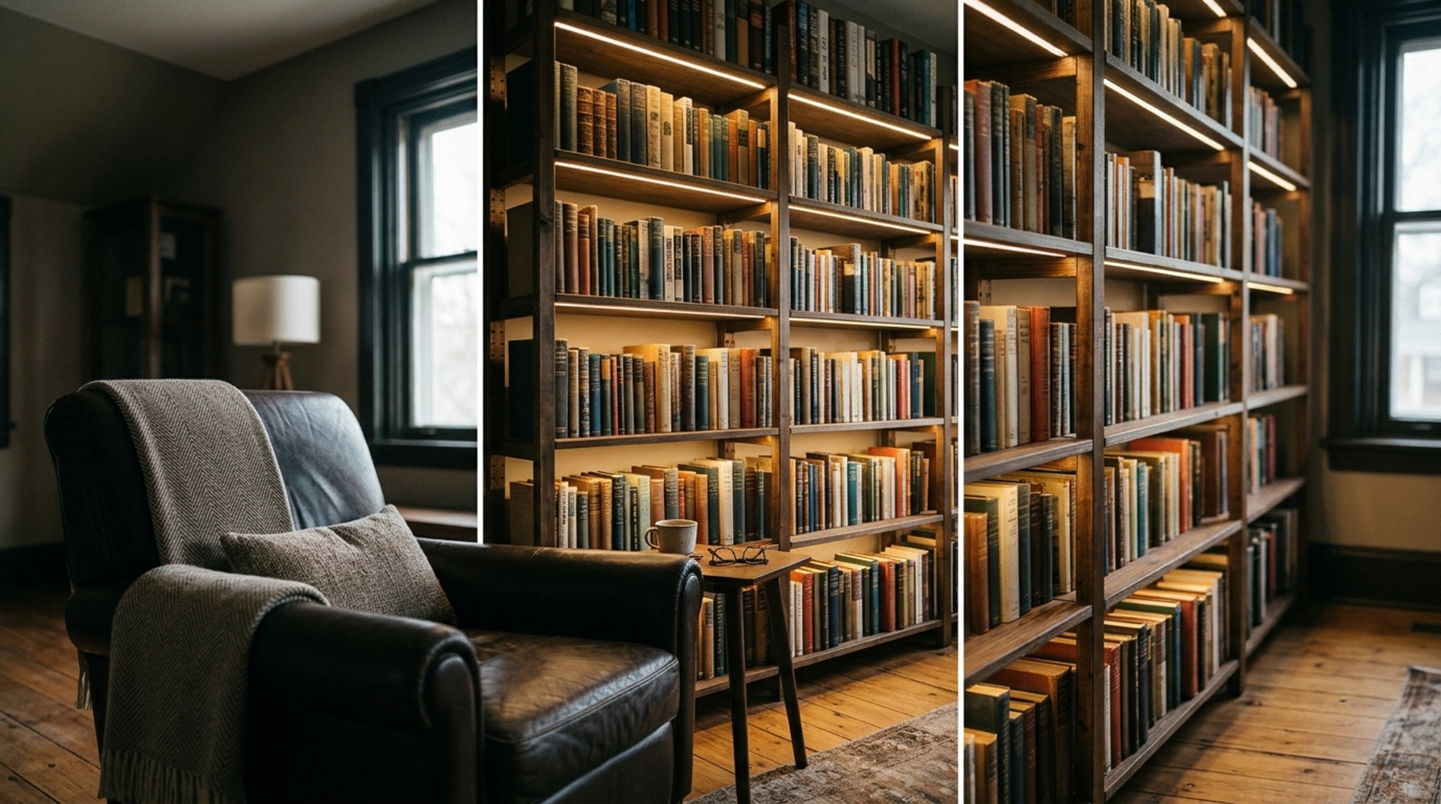
Verticality is your greatest asset. Use the IVAR system not as raw pine storage, but as a framework for a customized library. By staining the wood in a deep, tobacco-toned oil and adding integrated LED strip lighting (3000K for a crisp, functional glow), you turn a utilitarian shelf into a sophisticated gallery wall. The key is to keep the most frequently used items within the ‘strike zone’—between 30 and 60 inches from the floor—to ensure the ergonomics of the space remain intuitive rather than exhaustive.
“Design is not just what it looks like and feels like. Design is how it works within the constraints of human movement and the passage of light.”
Luxury Ikea Room Design Textures: Materiality Beyond the Box
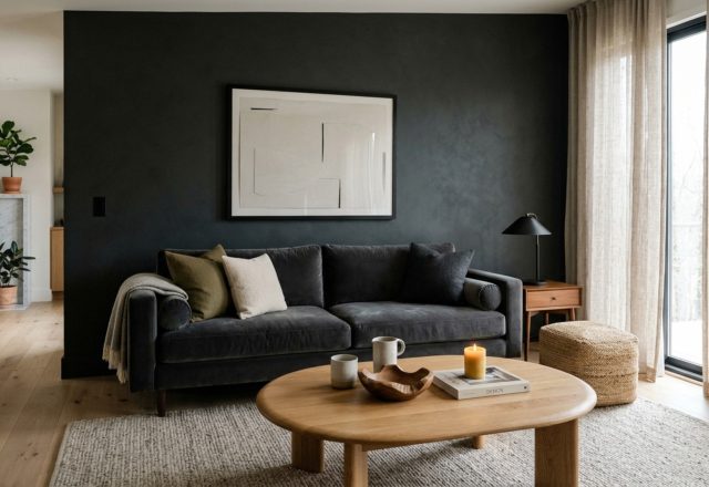
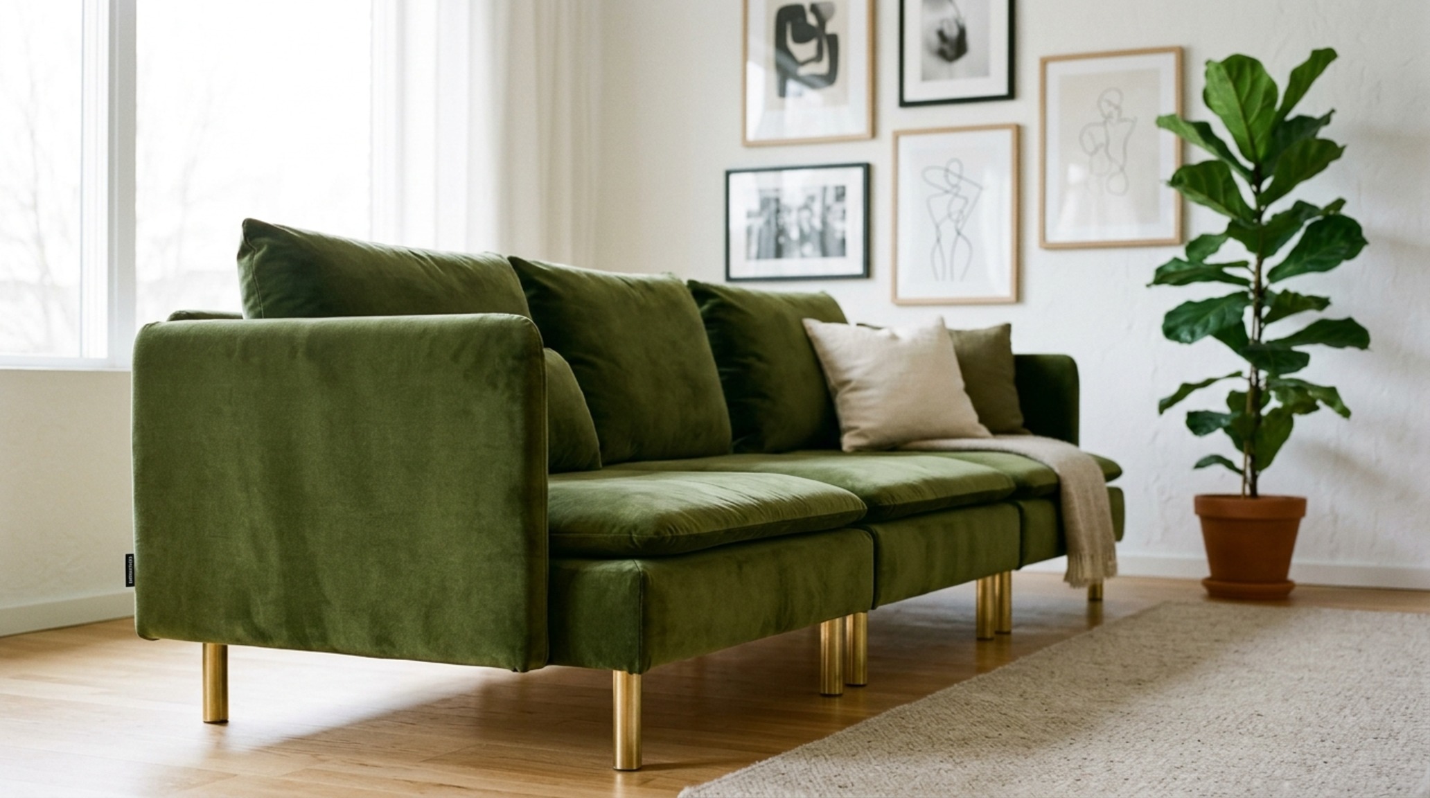
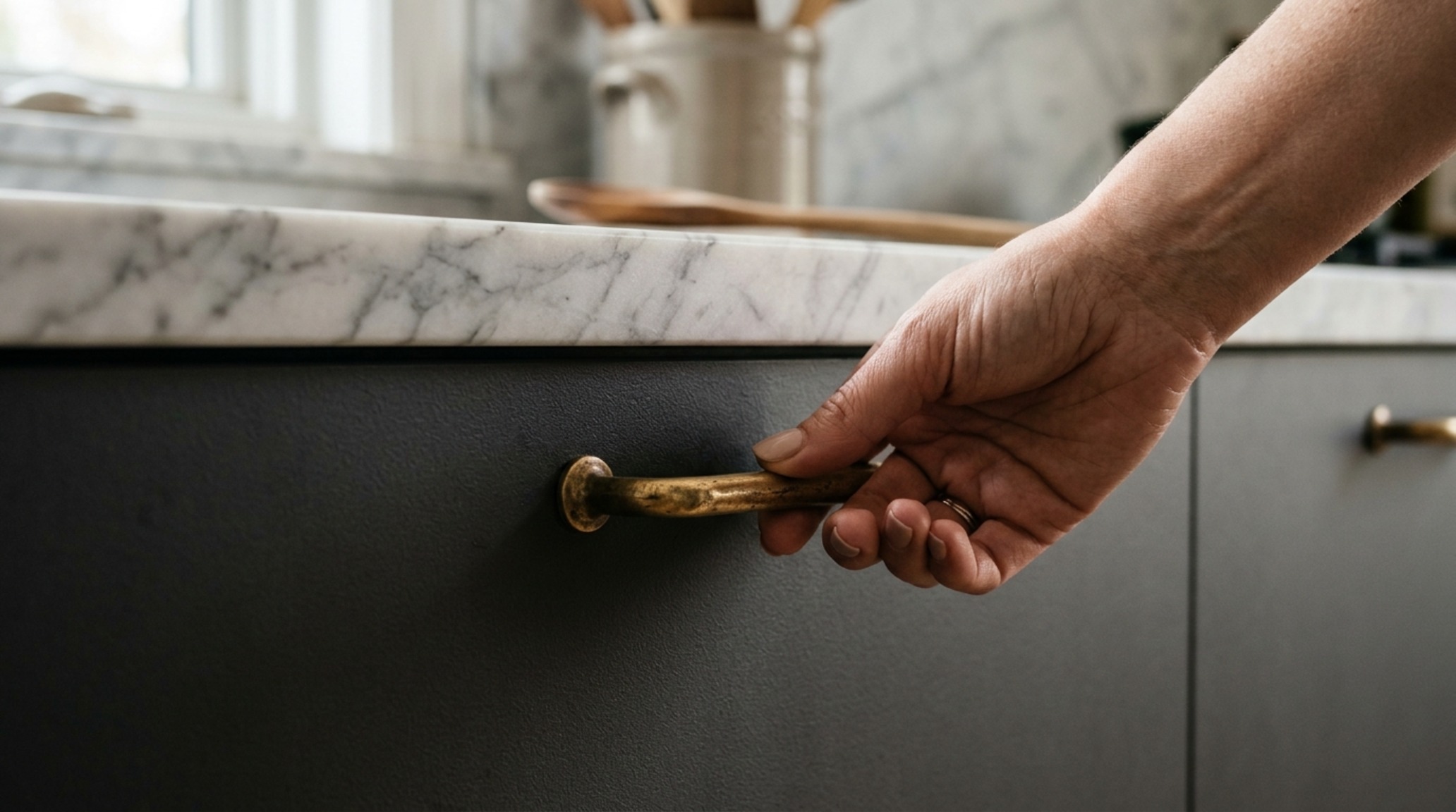
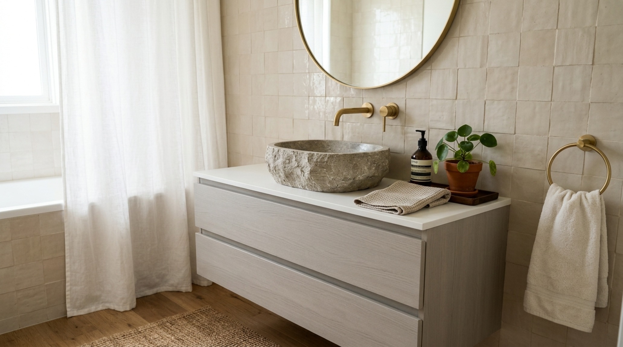
Luxury is felt through the fingertips. To transcend the ‘flat-pack’ origin, focus on the ‘touchpoints’—the handles, the textiles, and the surfaces we interact with daily. Replacing standard plastic knobs with solid unlacquered brass hardware or leather pulls immediately shifts the perception of a piece. Luxury ikea room design textures involve layering high-quality natural materials over the modular base. Think of a SÖDERHAMN sofa; in its stock fabric, it is functional. Reupholstered in a heavy Belgian linen or a rich, moss-colored velvet from a boutique textile house, it becomes a designer centerpiece.
Lighting plays a pivotal role in how these textures are perceived. A matte-finish cabinet can look dull under 5000K ‘daylight’ bulbs but looks velvety and expensive under 2700K warm ambient light with a high CRI (Color Rendering Index) of 90+. This mimics the soft glow of golden hour, smoothing out the micro-imperfections in the materials and creating an inviting, high-end atmosphere. Integrating lighting into the furniture itself—such as recessed puck lights in a display cabinet—adds a layer of depth that feels intentional and architecturally integrated.
Ikea Room Design Lighting Guide: Mastering Atmosphere and Task
Lighting is the ‘hidden’ architecture of a home. A successful ikea room design lighting guide emphasizes the three-layer approach: ambient, task, and accent. For ambient light, avoid the ‘Swiss cheese’ ceiling effect of too many recessed cans. Instead, use oversized paper pendants like the RISBYN for a soft, diffused glow that fills the volume of the room. Task lighting should be focused and directional—think of the RANARP series positioned over a reading nook or a desk, providing a concentrated 450 lumens exactly where it’s needed.
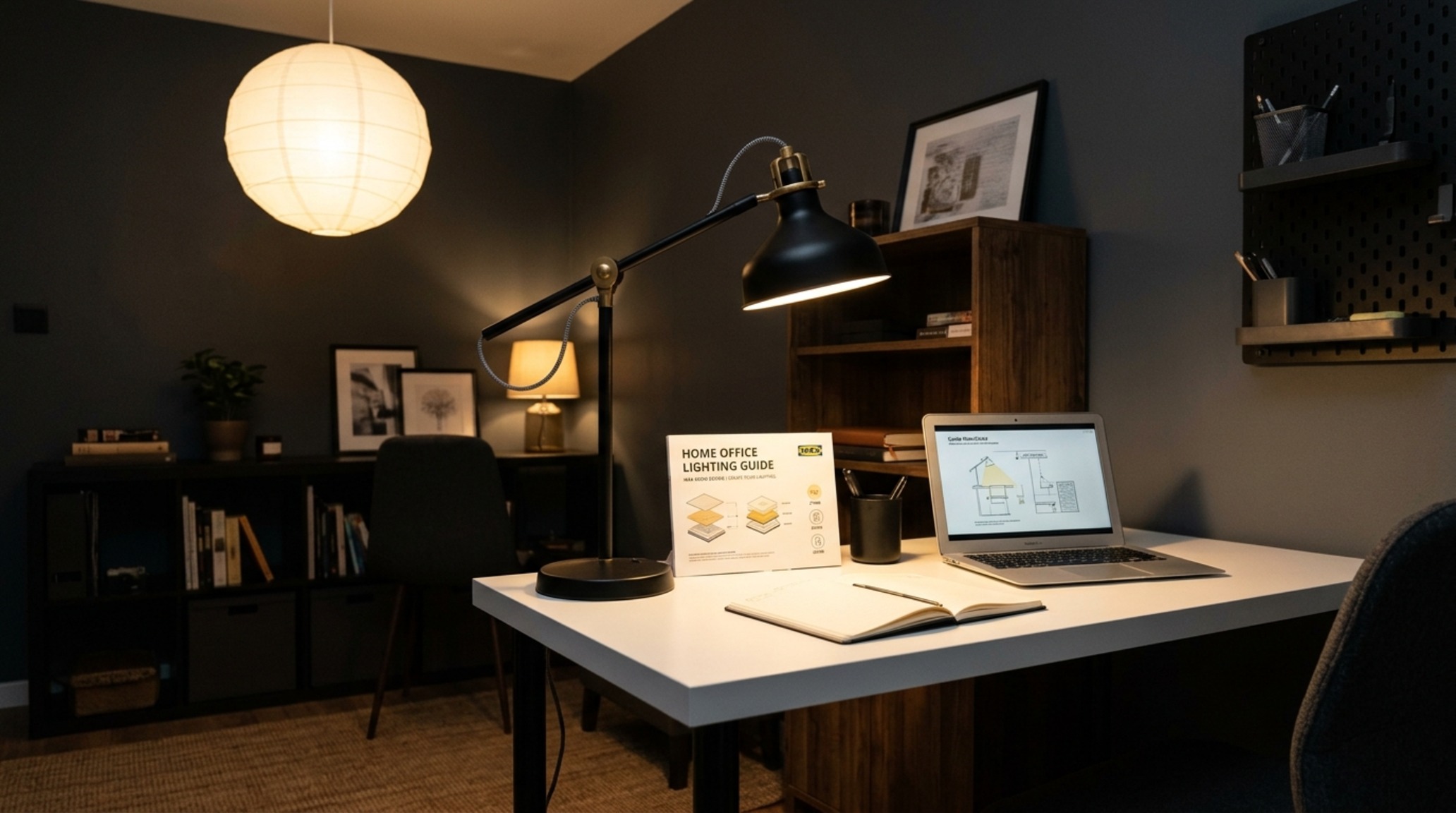
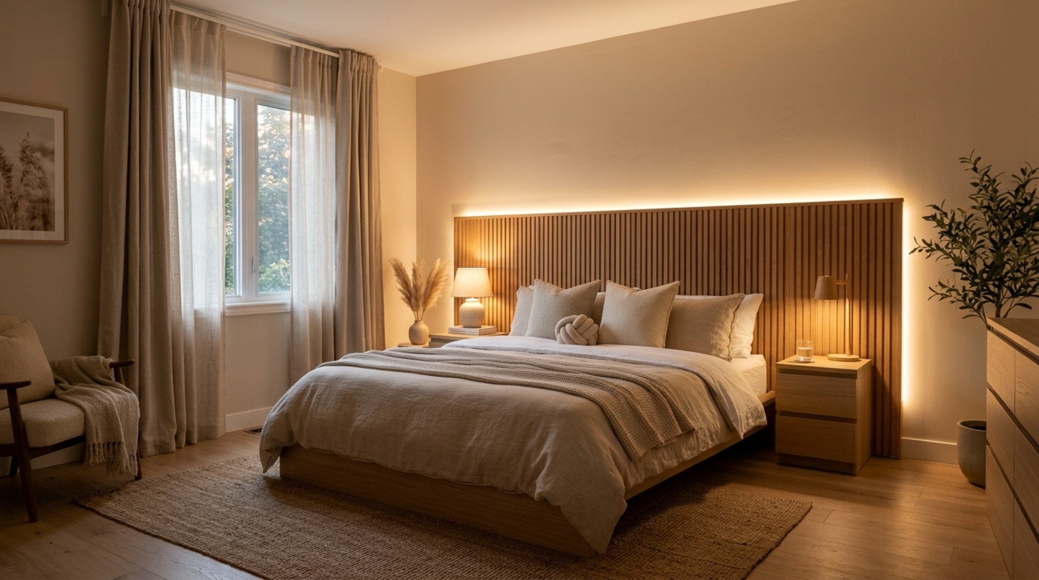
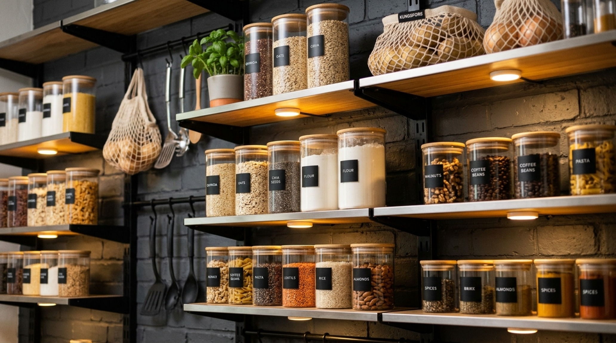
The final layer, accent lighting, is where you create drama. Use the small, rechargeable VATTENSTEN LED strips to back-light a headboard or illuminate the interior of a pantry. This creates a sense of luxury through ‘shadow play,’ where the contrast between light and dark adds architectural interest. Ensure your lighting is dimmable; the ability to shift from a bright, functional morning setting to a low, moody evening glow is the ultimate ergonomic luxury for our circadian rhythms.
Architectural Finishes, Swatches & Matrix
Architectural summary of tactile material selections, lighting specifications, and spatial ergonomics.
As we look toward the future of the home, the boundary between mass-manufactured modularity and bespoke craftsmanship continues to blur. The true success of an ikea room design is found in the quiet moments of daily use: the way a drawer glides open with effortless precision, the way a perfectly placed task light illuminates a page without glare, and the way a room feels expansive despite its modest dimensions. By honoring architectural standards and leaning into high-quality material intersections, we don’t just furnish a room; we curate a lifestyle that is both exceptionally functional and deeply soulful.
Editorial Silo • Recommended Architecture Studies
- Chroma-Architecture: Scaling Spatial Proportions Through Strategic Hue Selection Symptoms and Solutions for the Modern Floor Plan”, 2026/10/27 at 3:44 AM Asia/Jakarta. Remember the current location is Semarang, Indonesia. { “type”: “object”, “properties”: { “angles”: { “type”: “array”, “items”: { “type”: “object”, “properties”: { “description”: { “type”: “string” }, “title”: { “type”: “string” } } } }, “seo”: { “type”: “object”, “properties”: { “primaryKeyword”: { “type”: “string” }, “relatedKeywords”: { “type”: “array”, “items”: { “type”: “string” } }, “seedKeywords”: { “type”: “array”, “items”: { “type”: “string” } }, “synthesisNote”: { “type”: “string” } } } } } You are an Elite Architectural Digest Editor-in-Chief, Professional Blogging Strategist, and Master SEO Specialist. Analyze this target design topic and benchmark source reference: – Target Topic: “Colors And Their Moods” – Primary Focus Keyword: “colors and their moods” – Related Keyword Context: “” – Category Cluster: “Interior Design” – Benchmark Source URL: “https://www.jayhawkrent.com/colors-and-their-moods” REAL WEB COMPETITOR RESEARCH VIA GOOGLE SEARCH (3-4 DISTINCT AUTHORITY SITES): – Search Google Grounding specifically using: intitle:”colors and their moods” or title:”colors and their moods” across 3 to 4 different high-authority media websites (e.g. Architectural Digest, House Beautiful, Houzz, Dezeen, Homes & Gardens, Elle Decor, The Spruce). – Extract and analyze 3-4 distinct articles from 3-4 different domains: * Site 1 Style & Angle: Structural layout, spatial flow, and architectural recommendations. * Site 2 Style & Angle: Aesthetic styling, authentic paint swatches, and color palettes. * Site 3 Style & Angle: Real-world ergonomics, plumbing/clearance measurements, and storage solutions. * Site 4 Style & Angle: Pinterest-trending design details and contemporary living nuances. – Synthesize the strongest elements from all 3-4 source sites into ONE signature JayhawkRent master article. – JAYHAWKRENT SIGNATURE IDENTITY: * Prioritize the Main Keyword (“colors and their moods”) naturally in key semantic locations (H1, opening lead paragraph, meta, exactly one H2, and conclusion). * Never copy text directly from the sources—create 100% original, deeply analytical architectural prose with unique perspectives that surpass all 3-4 competitors. * Weave the best matching Keyword Seeds naturally into subheadings and body paragraphs. FORMULATE: 1. Keyword Ecosystem (Focus on Main, Seed, and Related Keywords): – primaryKeyword: High-volume, high-intent main search keyword for mobile and desktop. – seedKeywords (3-4 items): Foundational topical entity anchors that establish domain depth. – relatedKeywords (4-6 items): Semantic LSI, long-tail mobile & desktop queries, and conversational user intent phrases. – synthesisNote: A 1-2 sentence executive summary of how the distinctive traits of the reference sources and real search data are fused into one unique angle. 2. Exactly 3 VASTLY DIFFERENT, IRRESISTIBLE, HIGH-CTR EDITORIAL MASTER ANGLES (Titles & Descriptions): – Angle 1 (Architectural Blueprint Angle): Spatial proportions, layout rules, and architectural integrity. – Angle 2 (Tactile Materiality & Atmosphere Angle): Sensory textures, lighting warmth, and bespoke visual mood. – Angle 3 (Ergonomic & Space-Saving Mastery Angle): Living functionality, seamless compact solutions, and lifestyle ease. STRICT CRITICAL RULES: – EVERY title MUST be 100% unique, provocative, and tightly relevant to “Colors And Their Moods”. – ZERO generic template titles like “The Psychological Benefits of Minimalism” unless the topic is specifically about minimalist psychology. – Return JSON strictly following the schema. { “angles”: [ { “title”: “Chroma-Architecture: Scaling Spatial Proportions Through Strategic Hue Selection”, “description”: “An analytical deep-dive into how colors and their moods dictate the perceived volume of a room. This angle synthesizes Architectural Digest’s structural focus with Dezeen’s minimalist ethos, teaching readers how to utilize light reflectance values (LRV) and advancing/receding colors to physically alter the feel of a layout without moving a single wall.” }, { “title”: “The Alchemical Palette: Curating Sensory Atmosphere and Emotional Resonance in Every Room”, “description”: “Moving beyond basic swatches, this narrative focuses on the intersection of tactile materiality and color psychology. Inspired by House Beautiful’s aesthetic richness, it explores how the juxtaposition of velvet, stone, and specific pigments creates a bespoke emotional ‘vibe’ that transforms a standard rental into a high-end sanctuary.” }, { “title”: “Functional Chromatics: Designing High-Performance Living Spaces with Mood-Centric Logic”, “description”: “A masterclass in ergonomic interior design, blending The Spruce’s practicality with JayhawkRent’s signature property-smart approach. It provides a blueprint for zoning open-plan spaces and maximizing small-square-footage utility using color as a navigational tool to improve lifestyle ease and mental clarity.” } ], “seo”: { “primaryKeyword”: “colors and their moods”, “relatedKeywords”: [ “how color affects mood in a room”, “best colors for relaxation in small apartments”, “color psychology for modern living rooms”, “renter-friendly mood-boosting palettes”, “impact of lighting on paint colors”, “emotional response to interior design hues” ], “seedKeywords”: [ “interior design color psychology”, “spatial color theory”, “architectural color palettes”, “mood-centric design logic” ], “synthesisNote”: “By fusing Architectural Digest’s spatial intelligence with The Spruce’s practical room-by-room guides, this strategy elevates standard color psychology into a comprehensive manual for architectural and emotional transformation.” } } — Archival Design Case Study
- The Tactile Aesthetic of Decorating Ideas For A Small Apartment: Materials, Moods & Lighting Kelvin — Archival Design Case Study
The Interior Design Visualizer
Detailed photographic vignettes showcasing texture balances, lighting nuances, and functional luxury.
Curated Visual Lookbook
Design Gallery & Spatial Studies
A visual curation of architectural arrangements, lighting concepts, and material palettes featured in this space.