The era of the ‘feature wall’ has finally surrendered to something far more sophisticated and psychologically resonant. As we look toward the 2026 paint forecast, the conversation has shifted from mere aesthetics to architectural utility. We are no longer just picking a shade; we are defining the boundaries of our lives through paint color trends decor ideas that prioritize mental clarity and spatial efficiency. This is the rise of ‘Chromatic Zoning’—a strategic application of color that treats a gallon of paint with the same structural weight as a partition wall.
In the modern open-plan home, the challenge isn’t just about finding square footage; it’s about managing the cognitive load of a space that must serve as a boardroom at 10 AM and a sanctuary at 8 PM. By utilizing high-contrast earth tones and the architectural movement of color drenching, we can visually anchor furniture, conceal utilitarian storage, and create the ‘psychological doorways’ necessary to transition between productivity and rest without ever moving a brick.
The Architecture of Atmosphere: Why Tonal Design Strategies are Replacing Walls
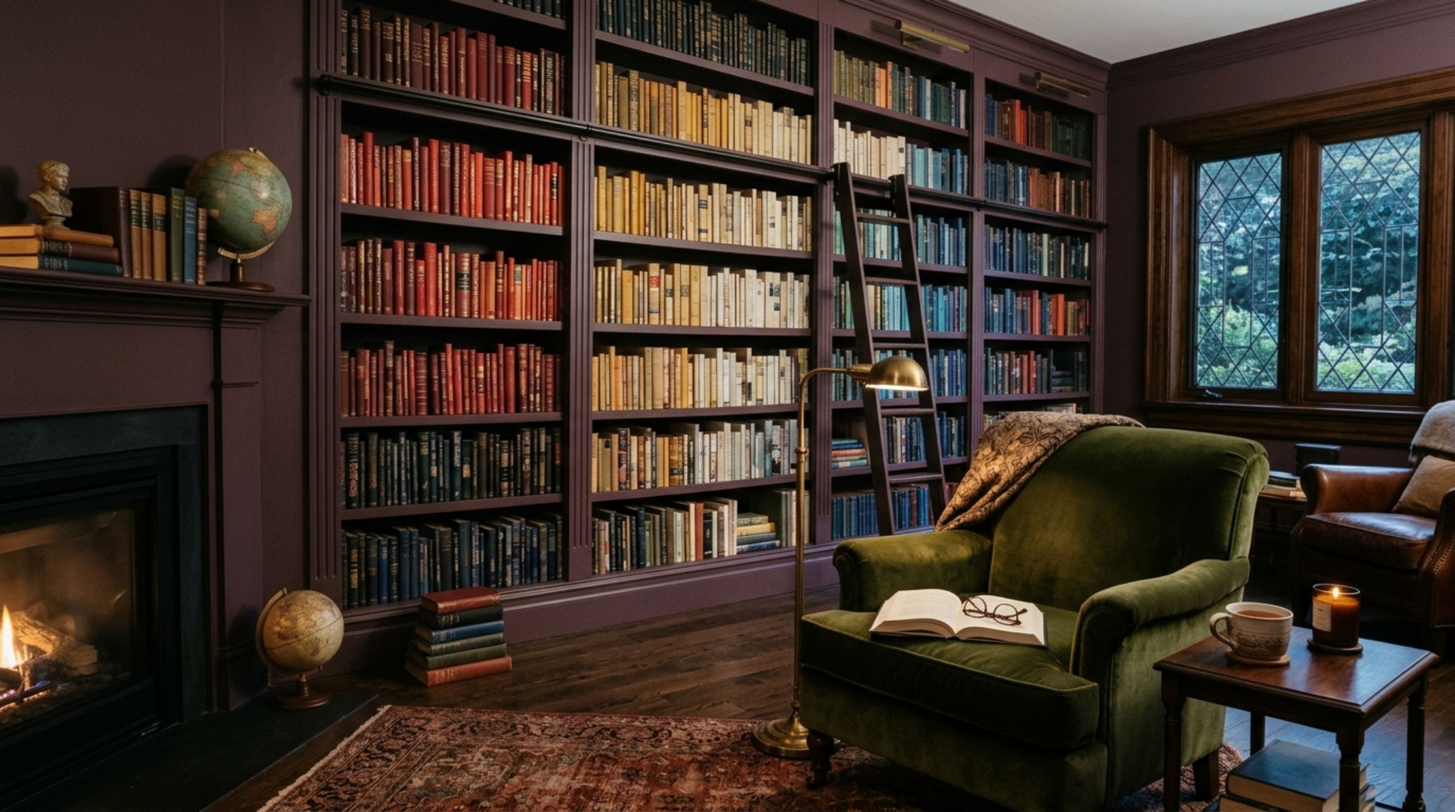
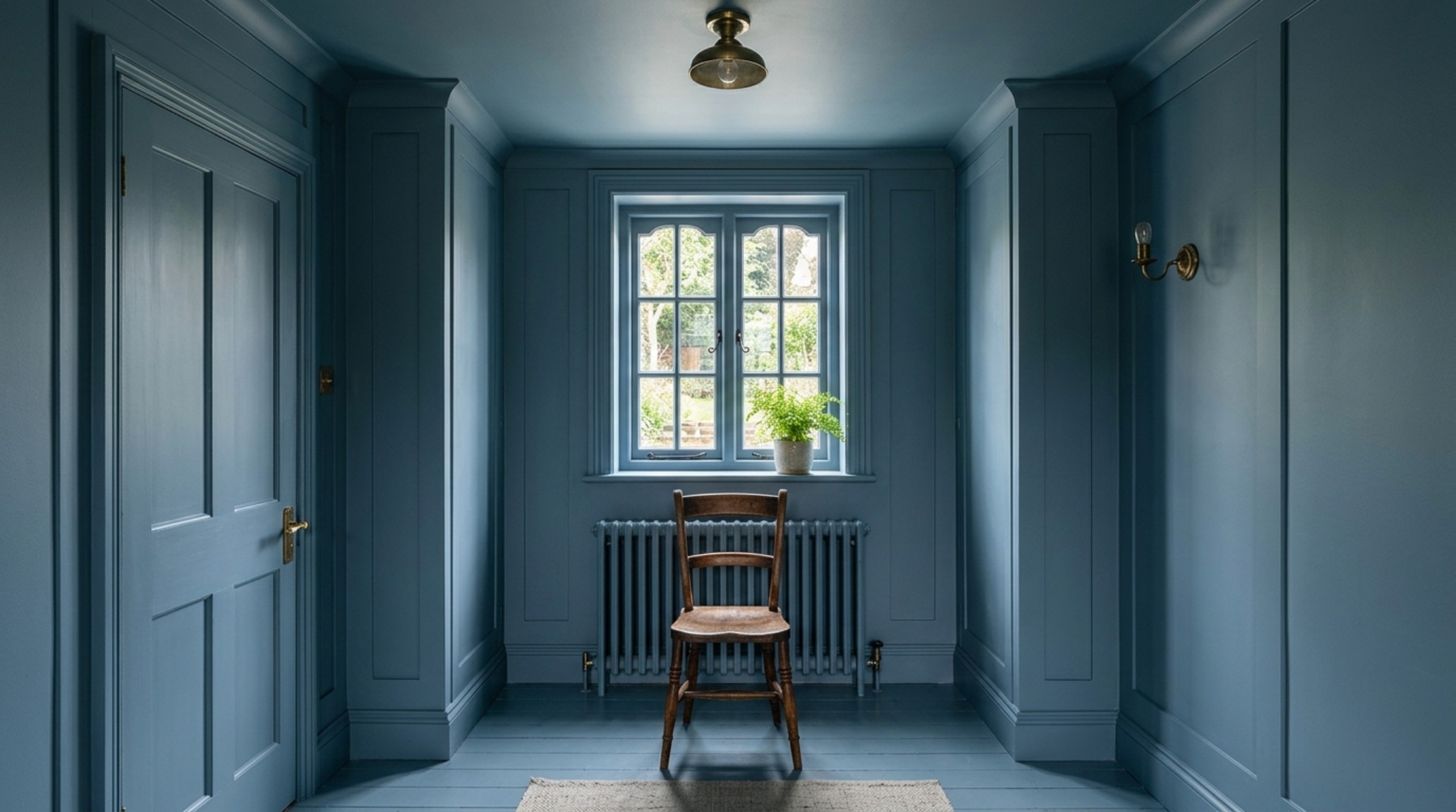
The pivot toward tonal design strategies in 2026 is rooted in a collective desire for grounding. After years of airy, perhaps too-sterile minimalism, we are seeing a return to ‘heavy’ colors—deep ochres, bruised plums, and oxidized minerals—applied with a technique known as color drenching. This involves painting the walls, trim, ceiling, and even cabinetry in the same hue to erase the visual noise of traditional molding.
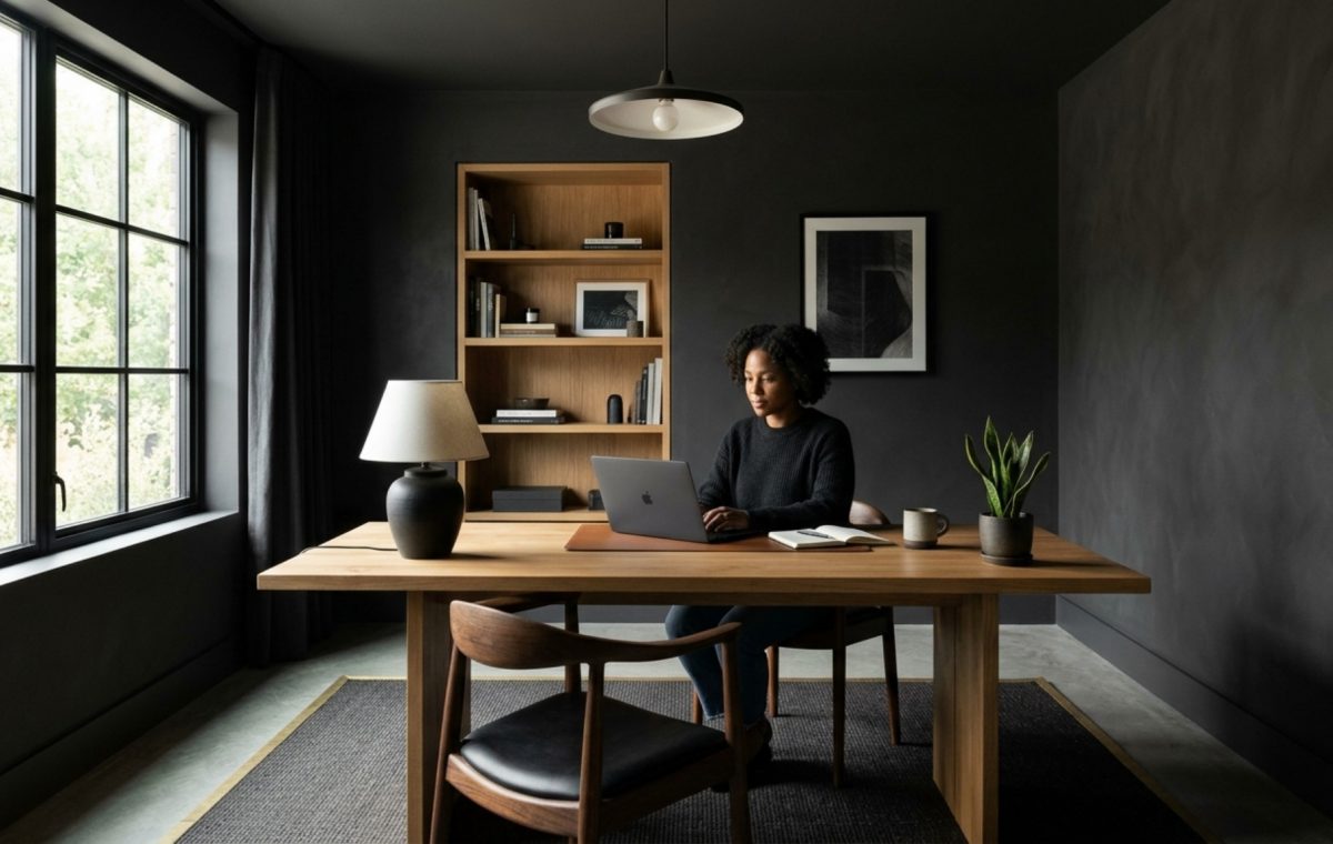
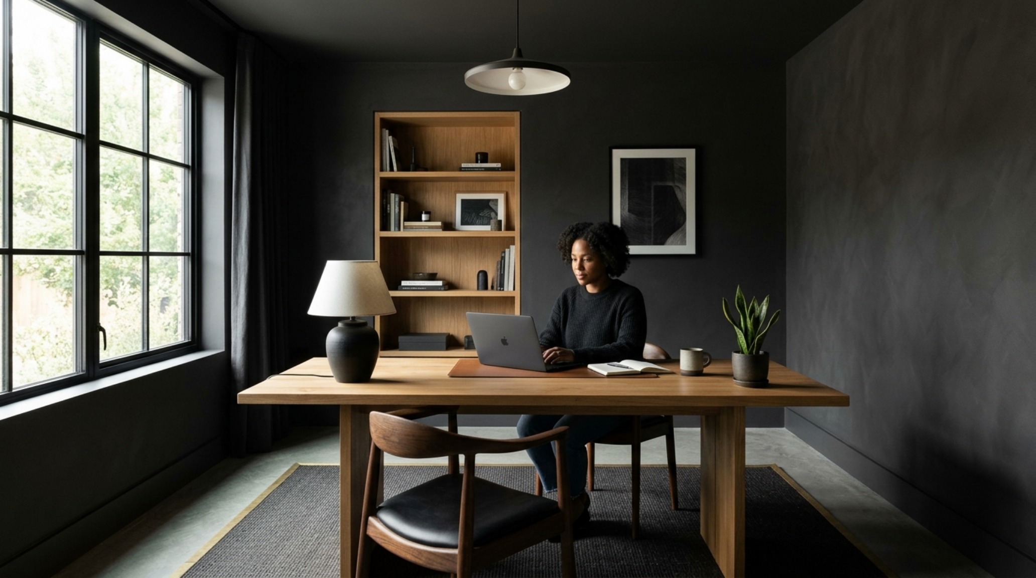
When you drench a dedicated ‘Deep Work’ zone in a saturated, receding tone like Farrow & Ball’s Railings or a custom-mixed charcoal with a hint of forest green, you create a visual vacuum that pulls the focus inward. In contrast, the surrounding ‘Restorative Nooks’ might utilize warm minimalist paint shades like Swiss Coffee by Benjamin Moore, but applied in a tactile Roman Clay finish to provide soft, diffused light. This contrast creates a physical sensation of moving from a high-focus ‘container’ into an expansive ‘breathing room.’
Defining the Deep Work Zone: High-Contrast and Cognitive Focus
To successfully implement ergonomic zoning, one must respect the rules of spatial cadence. A home office should not just be a desk against a wall; it should be a ‘node.’ By wrapping a 72-inch section of a room—including the ceiling—in a matte, light-absorbing pigment, you define a boundary. When sitting at a desk with a 30-inch depth, the surrounding dark envelope reduces peripheral distractions, essentially acting as blinkers for the mind.
This is where biophilic wall colors play a crucial role. We aren’t talking about bright grass greens, but rather the ‘under-canopy’ shades: deep moss, damp soil, and slate. These colors have a lower light reflectance value (LRV), which minimizes glare on digital screens and creates a sense of security. To keep these dark zones from feeling claustrophobic, ensure you maintain at least a 36-inch primary circulation path around the desk, allowing the ‘negative space’ to breathe.
The Art of the Invisible: Concealing Storage with Earthy Accent Wall Ideas
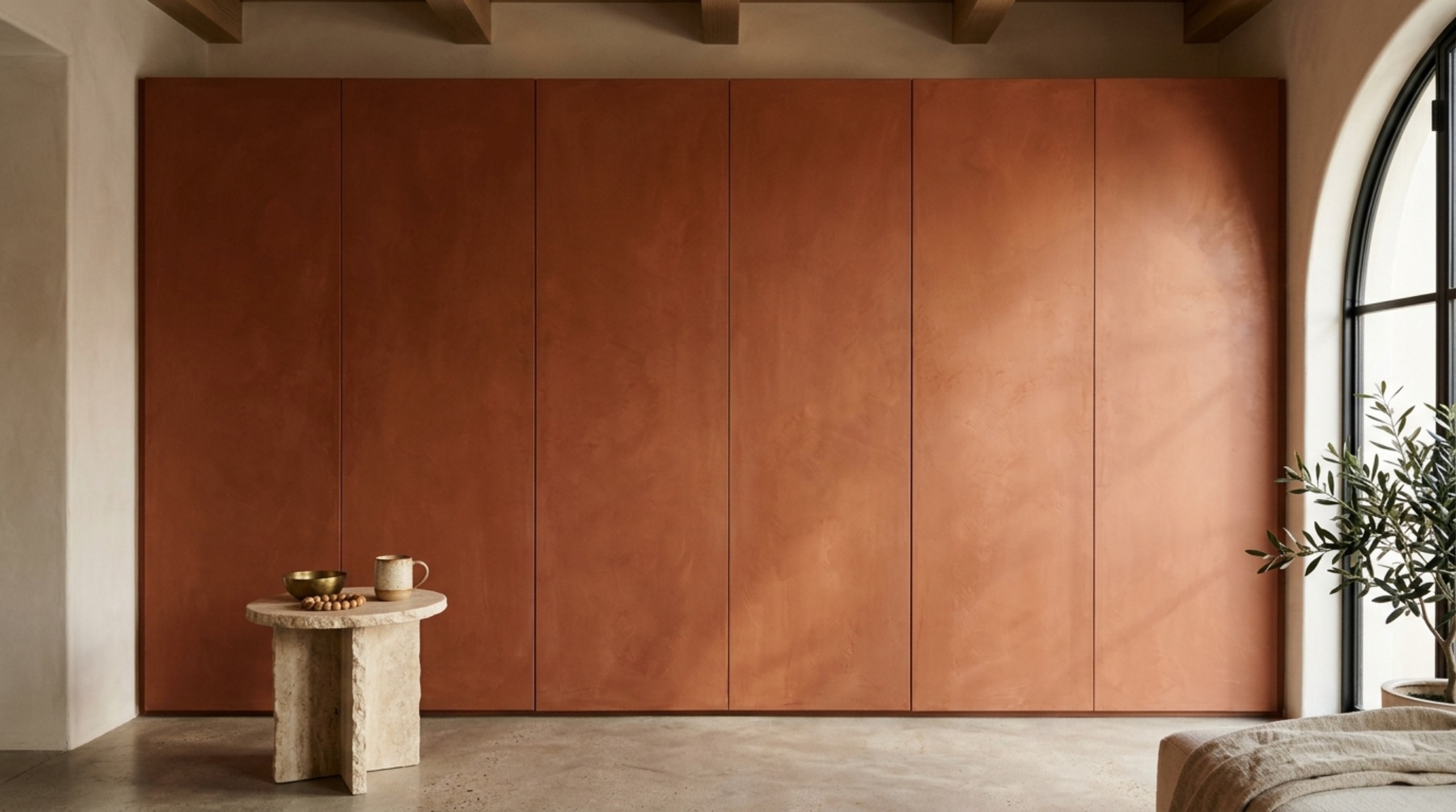
One of the most powerful applications of earthy accent wall ideas in 2026 is the ‘Visual Vanishing Act.’ Multi-functional floor plans are often cluttered with built-in storage, media consoles, and shelving. By color-drenching these elements in a deep, grounded tone—such as a burnt terracotta or a muddy umber—the hardware and seams disappear into the shadow play of the room.
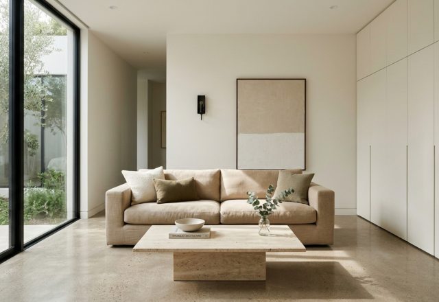
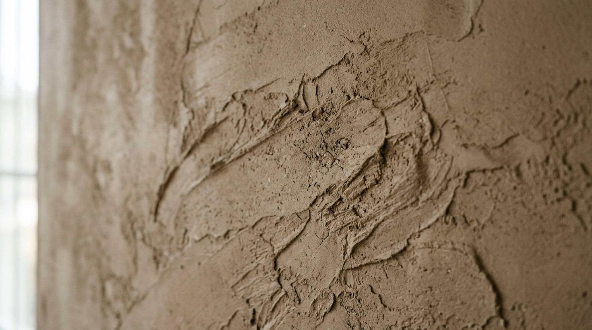
Imagine a wall of floor-to-ceiling cabinetry. Instead of standard white, which highlights every gap and handle, we use a textured limewash in a shade like Setting Plaster. The mineral variation in the finish breaks up the large surface area, while the monochromatic palette ensures the storage doesn’t compete with the 18-inch reach of your coffee table or the primary seating arrangement. The cabinetry becomes a textured backdrop rather than a series of boxes.
Chromatic Transitions: The 3000K Rule and Tactile Depth
Color is a shapeshifter, and the modern organic interior colors of 2026 require specific lighting to maintain their integrity. For grounding palettes to work, the lighting must be as intentional as the pigment. We recommend a high CRI (Color Rendering Index) of 90+ to ensure that the rich pigments don’t turn ‘muddy’ or gray under artificial light.
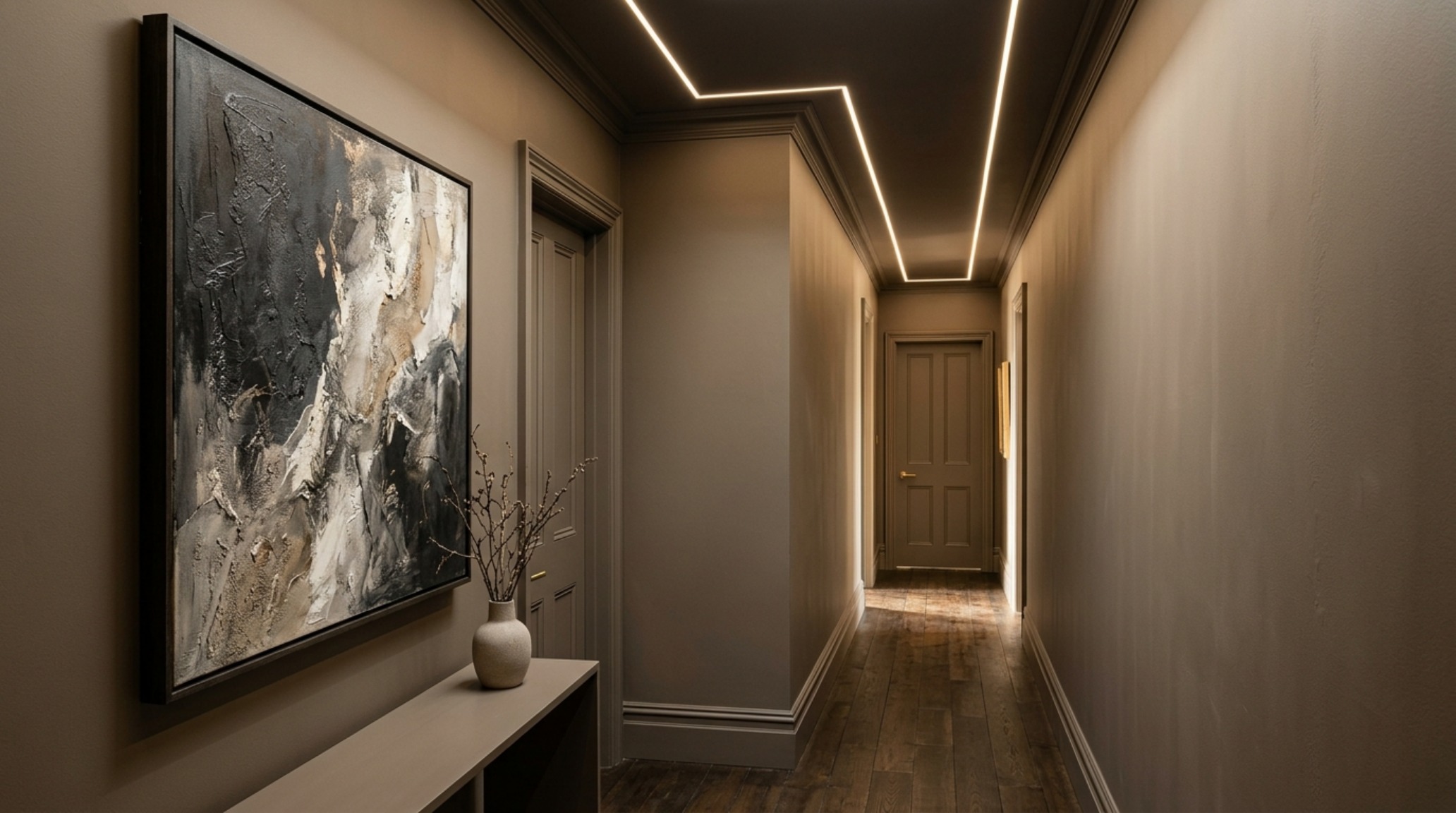
In the transition between a ‘Work’ zone (lit with 3000K task lighting for alertness) and a ‘Rest’ zone (lit with 2700K warm ambient light), the color should shift accordingly. A transitionary hallway painted in a mid-tone taupe can bridge the gap, acting as a sensory palate cleanser. Using color drenching techniques for small rooms—like a powder bath or a reading corner—allows these transitional spaces to feel like intentional pauses in the home’s narrative.
Restorative Nooks: Cozy Paint Color Trends for Bedrooms and Lounges
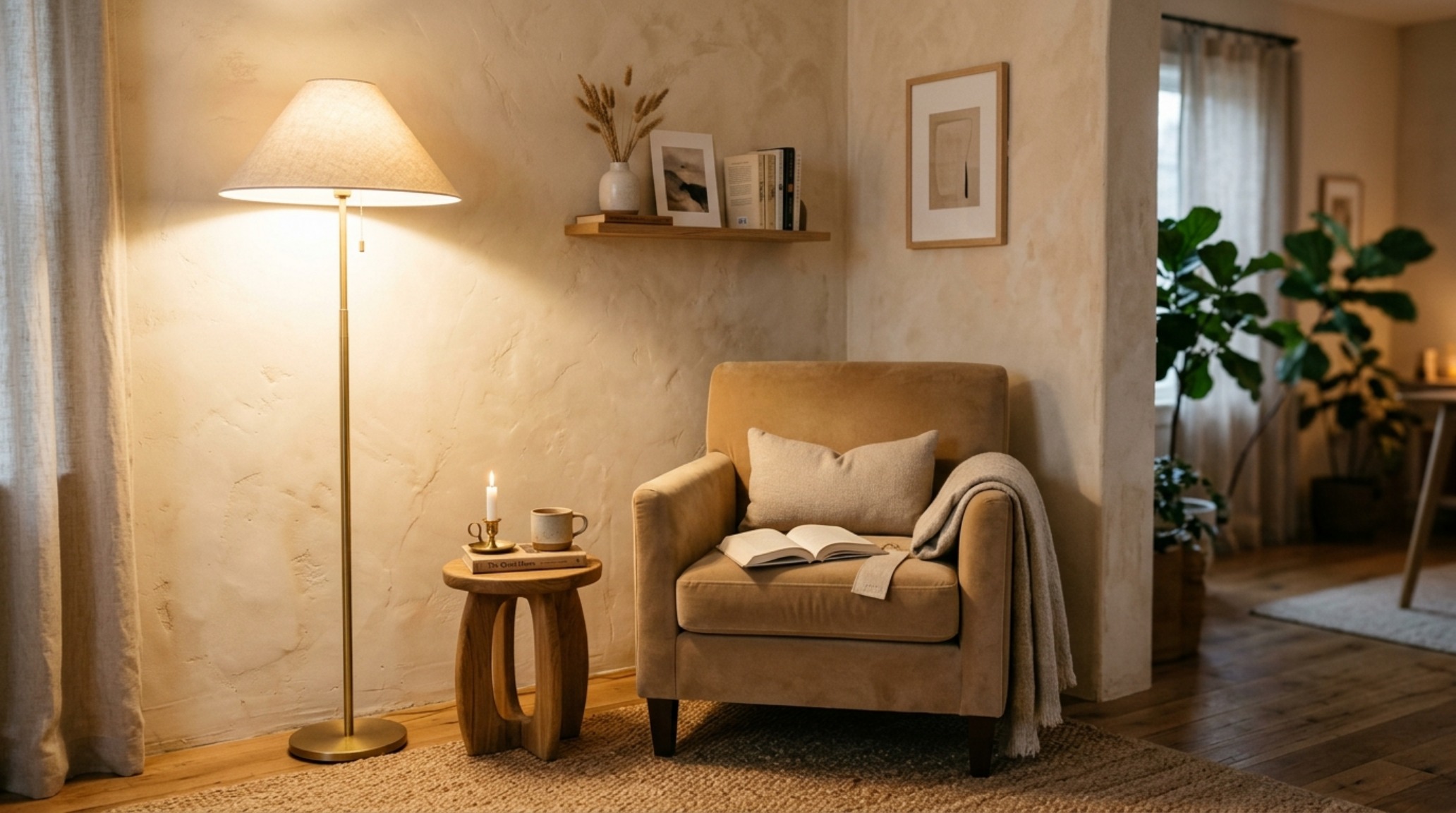
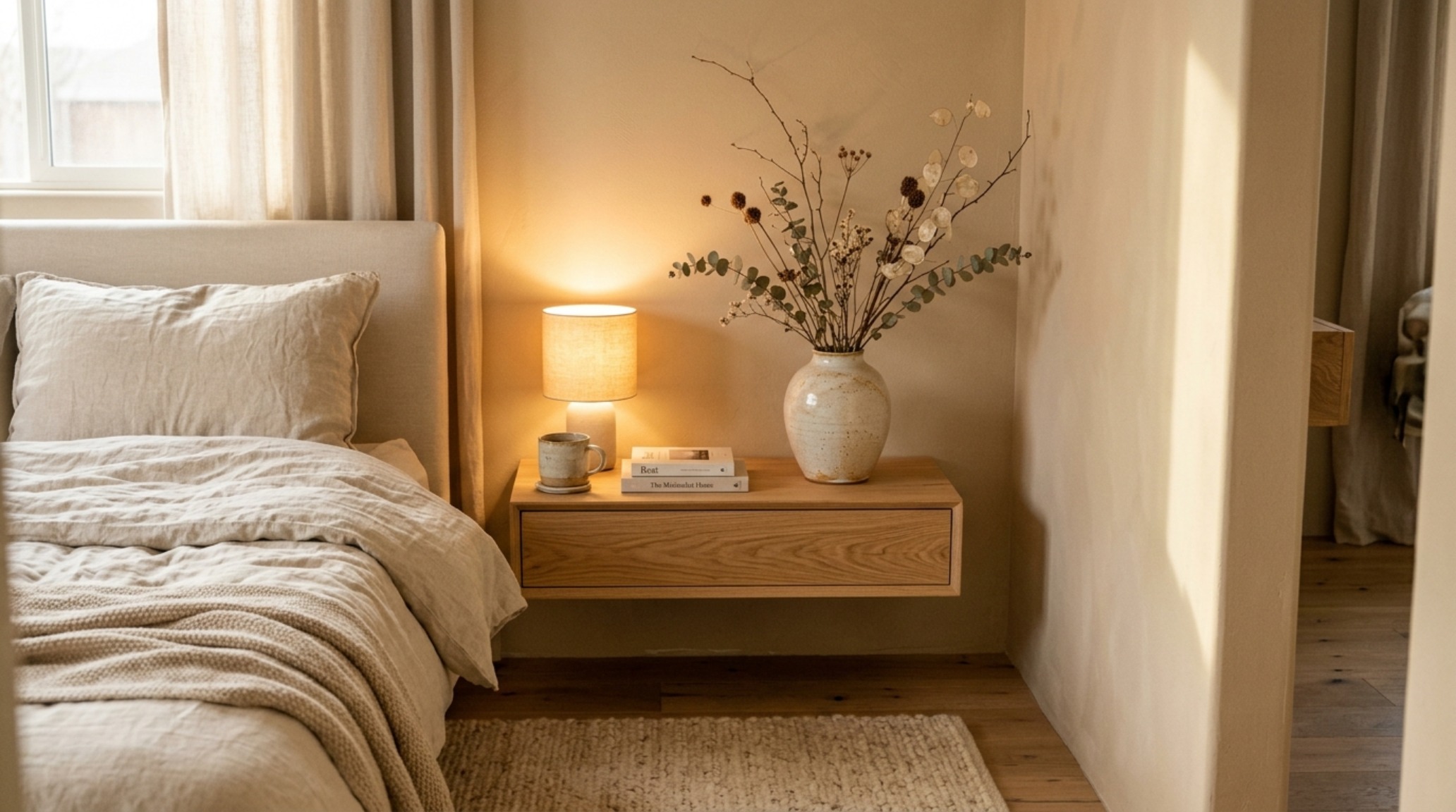
In the bedroom, the 2026 paint forecast leans heavily into ‘cocooning.’ The objective is to lower the heart rate upon entry. This is achieved through cozy paint color trends for bedrooms that utilize soft, clay-based hues. Think of the color of sun-dried silt or aged parchment. These are not ‘yellow’ whites, but ‘greyed-out’ neutrals that absorb the blue light of the evening.
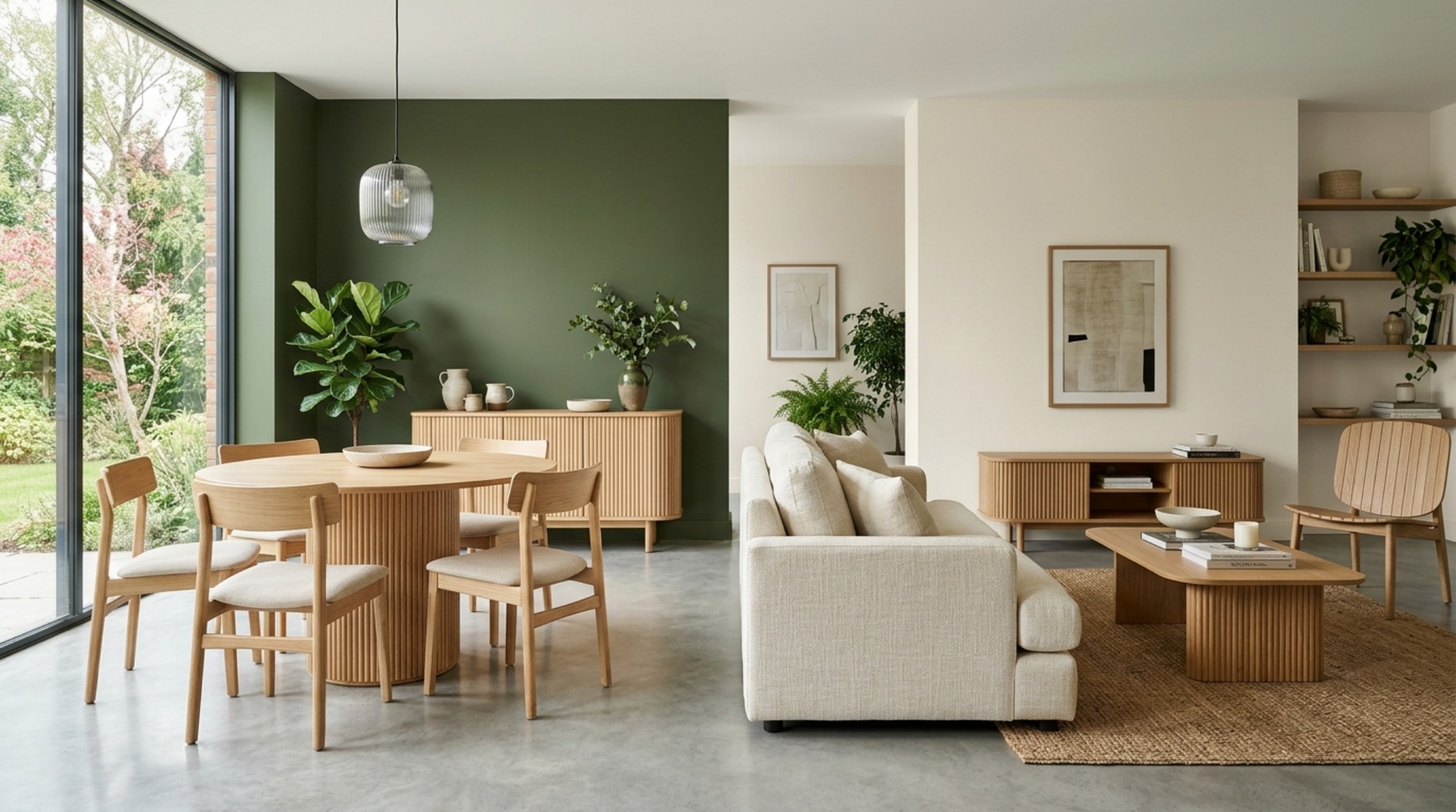
To optimize these restorative spaces, consider the 30-inch dining chair clearance rule, even in a bedroom. There should be ample ‘walk-around’ room to ensure the color feels like an embrace rather than an enclosure. When applying aesthetic paint color trends interior 2026, layering textures is vital. A flat matte wall paired with a satin trim in the exact same color creates a subtle play of light that defines the room’s architecture without introducing new visual ‘noise.’
The Specification of Serenity: Materials Meet Mineral
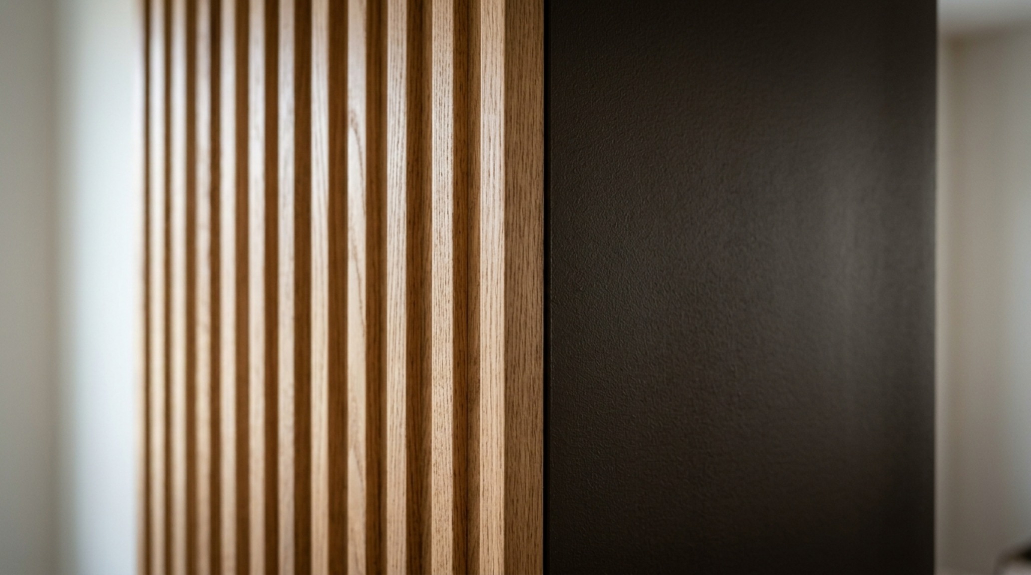
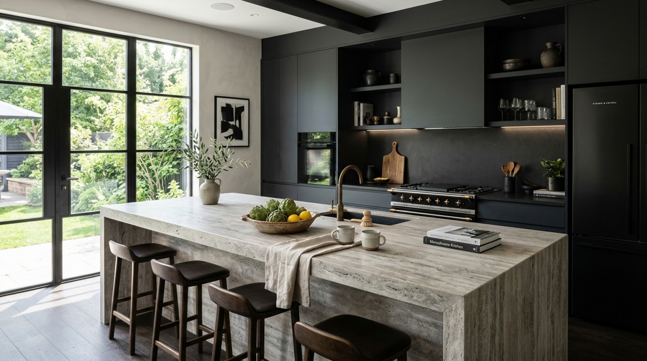
The success of these palettes relies on the marriage of color and material. A tonal design strategy is only as good as the surfaces it inhabits. Fluted White Oak panels, when stained to match a mid-century walnut or a soft greige, add a rhythmic verticality that complements the horizontal flow of a multi-functional room. Honed Travertine or matte stone accents provide the cool, tactile counterpoint to the warmth of the grounding paint shades.
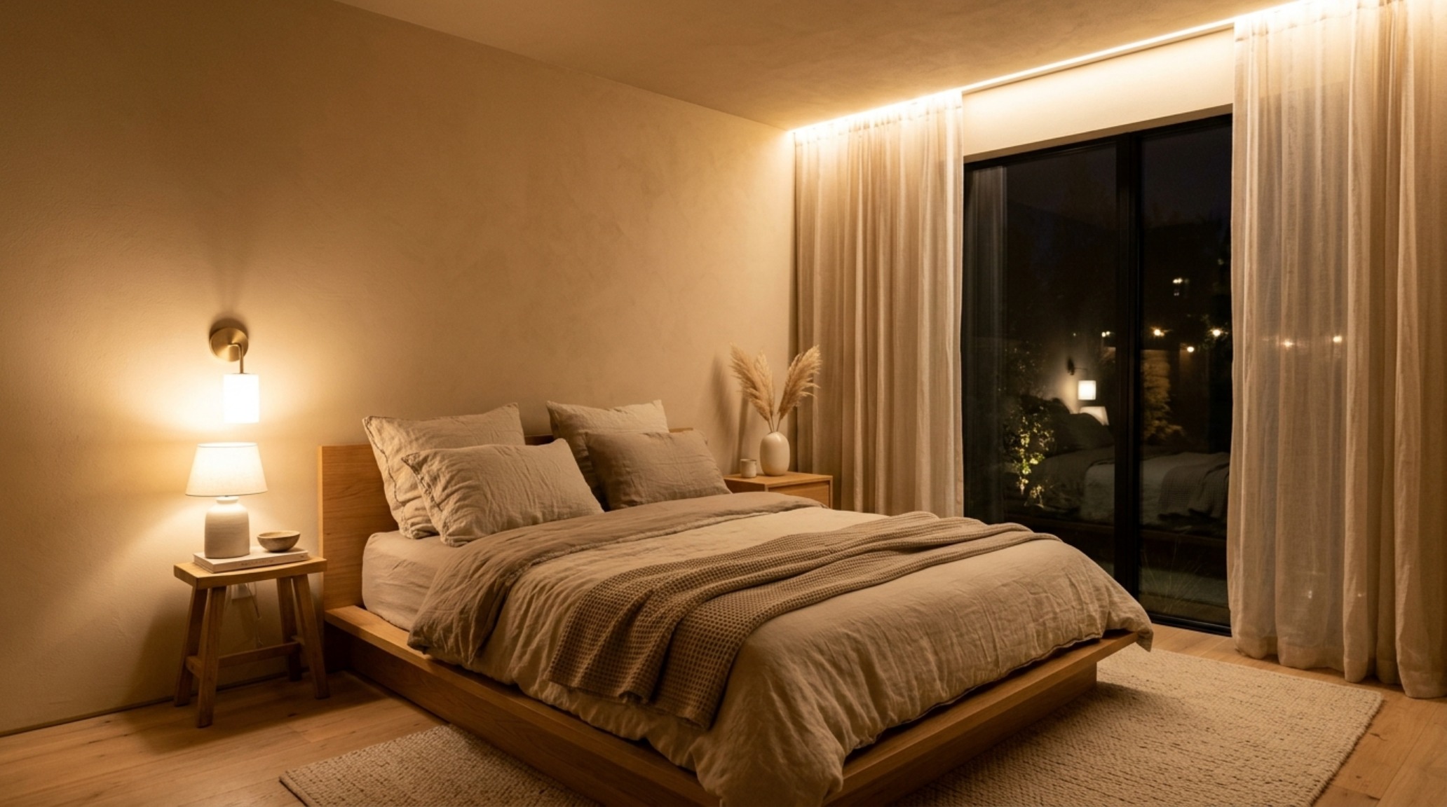
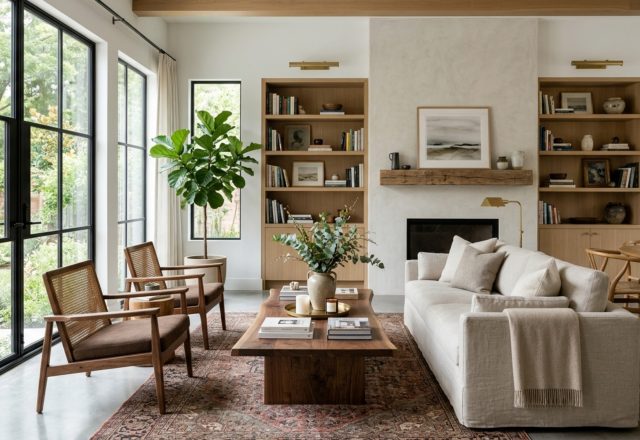
As we integrate these interior color palettes, we must also consider the ‘reach’ of the furniture. In a restorative nook, an armchair with an 18-inch high side table creates a ergonomic ‘island’ within the larger color zone. The paint color acts as the sea, and the furniture as the destination. By keeping the colors within the same family but varying the textures, we achieve a home that feels curated, not decorated.
Architectural Specification & Material Matrix
Curated tactile palette, spatial dimensions, and atmospheric lighting index for this design scheme.
Designing for the future requires a shift in how we perceive the boundaries of our rooms. By embracing these paint color trends decor ideas, we move toward a home that doesn’t just look balanced—it feels balanced. As we lean into the grounding palettes of 2026, we discover that the most effective way to expand our living space isn’t by adding more rooms, but by refining the energetic and ergonomic clarity of the ones we already inhabit. The brushstroke is the new blueprint.
Editorial Silo • Recommended Architecture Studies
- Ergonomic Mastery: Functional & Space-Saving Hacks for Flat Paint — Archival Design Case Study
- Performance-Driven Palettes: The True Cost of High-Durability Finishes for Seamless Indoor-Outdoor Flow — Archival Design Case Study
Architectural Inspiration Lookbook
A high-resolution study in spatial proportions, tactile materiality, and light choreography curated for enduring modern living.
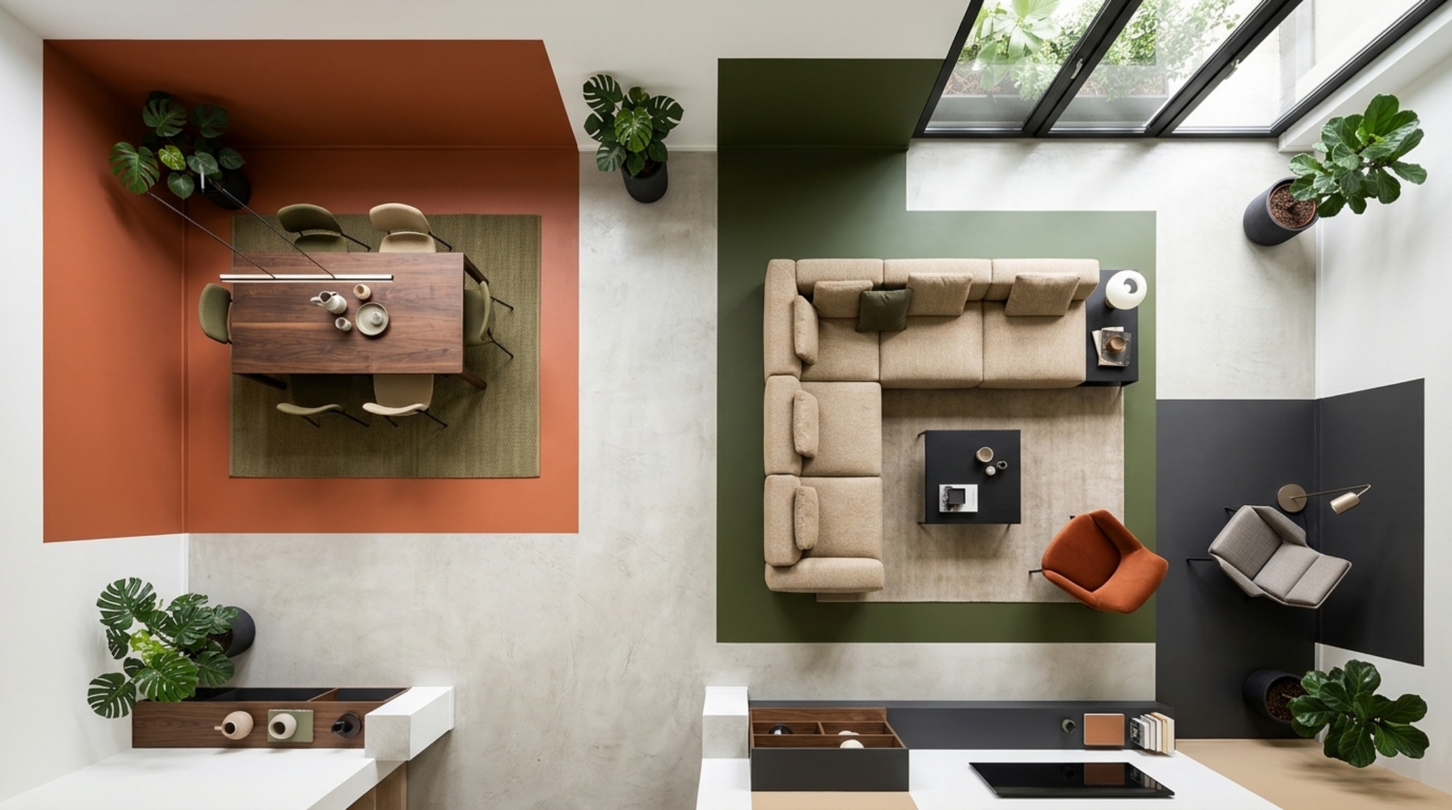
Curated Visual Lookbook
Design Gallery & Spatial Studies
A visual curation of architectural arrangements, lighting concepts, and material palettes featured in this space.