Every architectural masterpiece begins with the physics of movement. In a high-functioning kitchen, the rhythm of the room is dictated by the 36-inch standard walkway clearance—a non-negotiable measurement that ensures two people can pass without a choreographed dance. Yet, while we obsess over floor plans, the most critical spatial tension often happens overhead. Integrating designer kitchen island lights is not merely about illumination; it is about anchoring the visual center of gravity within that 36-inch flow. When a fixture is perfectly scaled, it doesn’t just light a countertop; it defines the volume of the air, acting as a structural compass for the entire open-plan living area.
The Fragmented Sightline Problem: Why Linear Island Pendants Restore Order
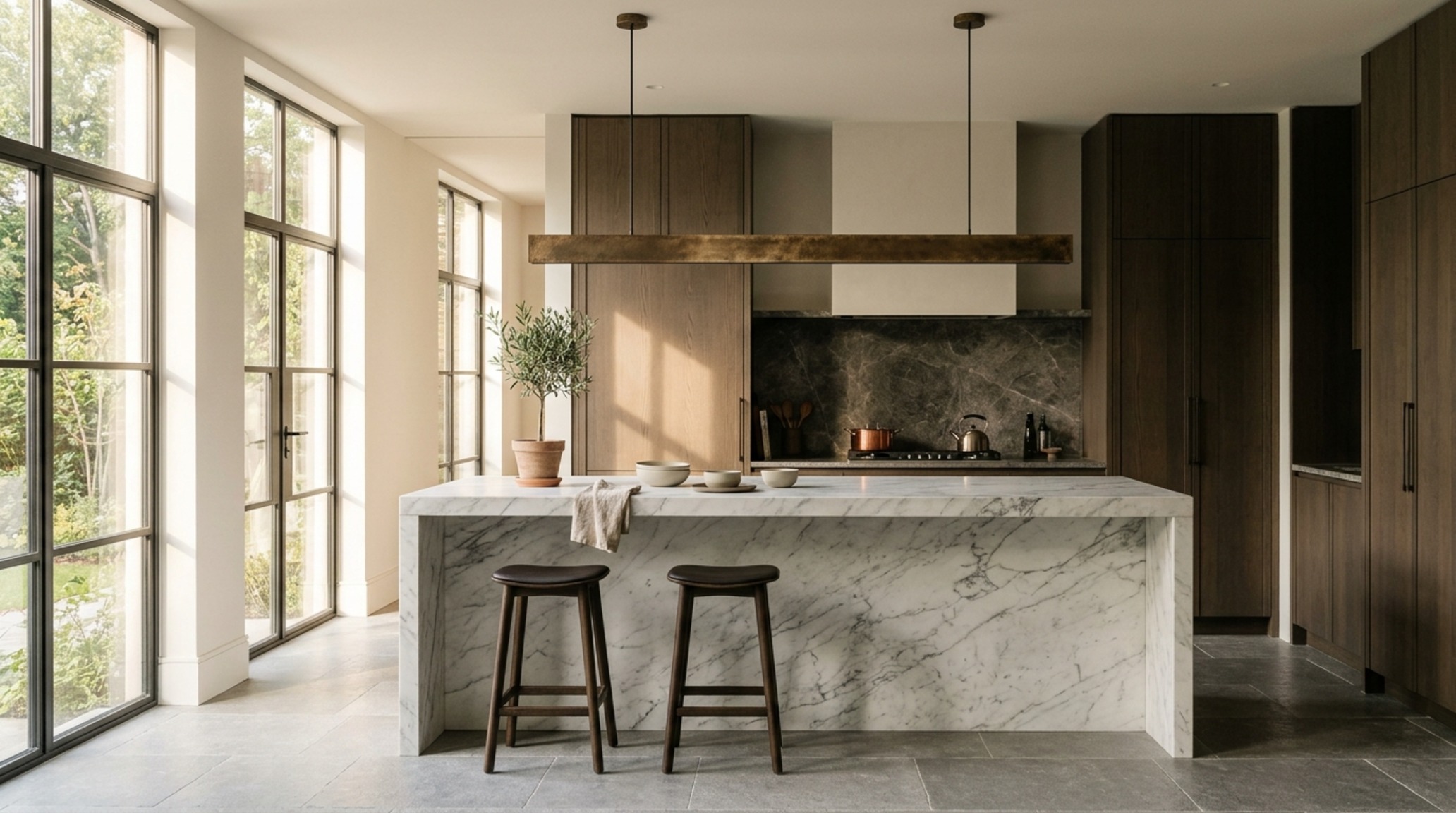
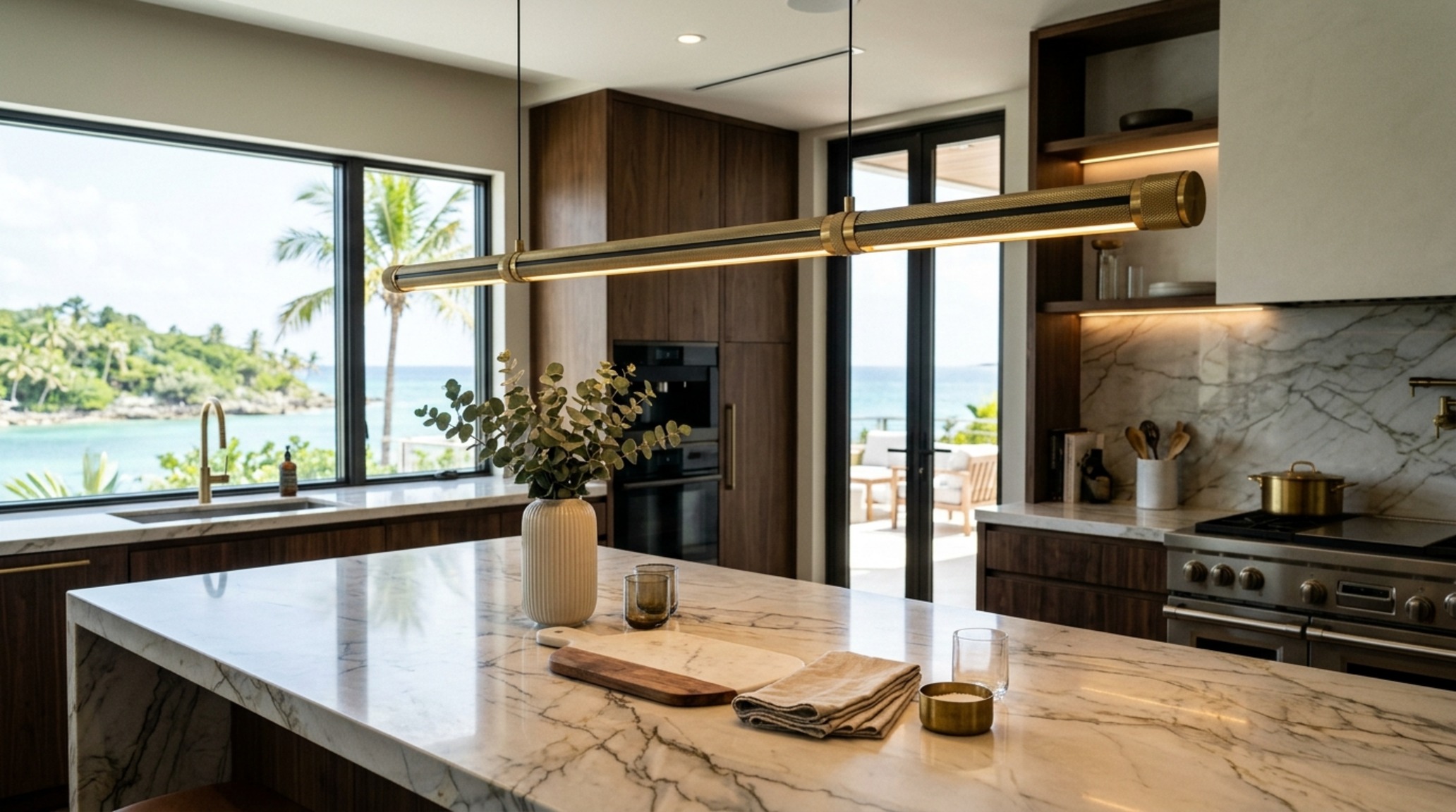
In the expansive reach of a modern great room, a common architectural failure is the visual ‘stutter’ caused by multiple small pendants that break up the horizon. When your eye travels from the living area toward the kitchen, a cluster of mismatched heights creates a sense of clutter that no amount of marble can mask. The solution lies in the architectural elegance of linear island pendants. By stretching a single, continuous horizontal plane of light, you reinforce the geometry of the island itself, creating a clean, uninterrupted sightline that makes the room feel wider and more intentional.
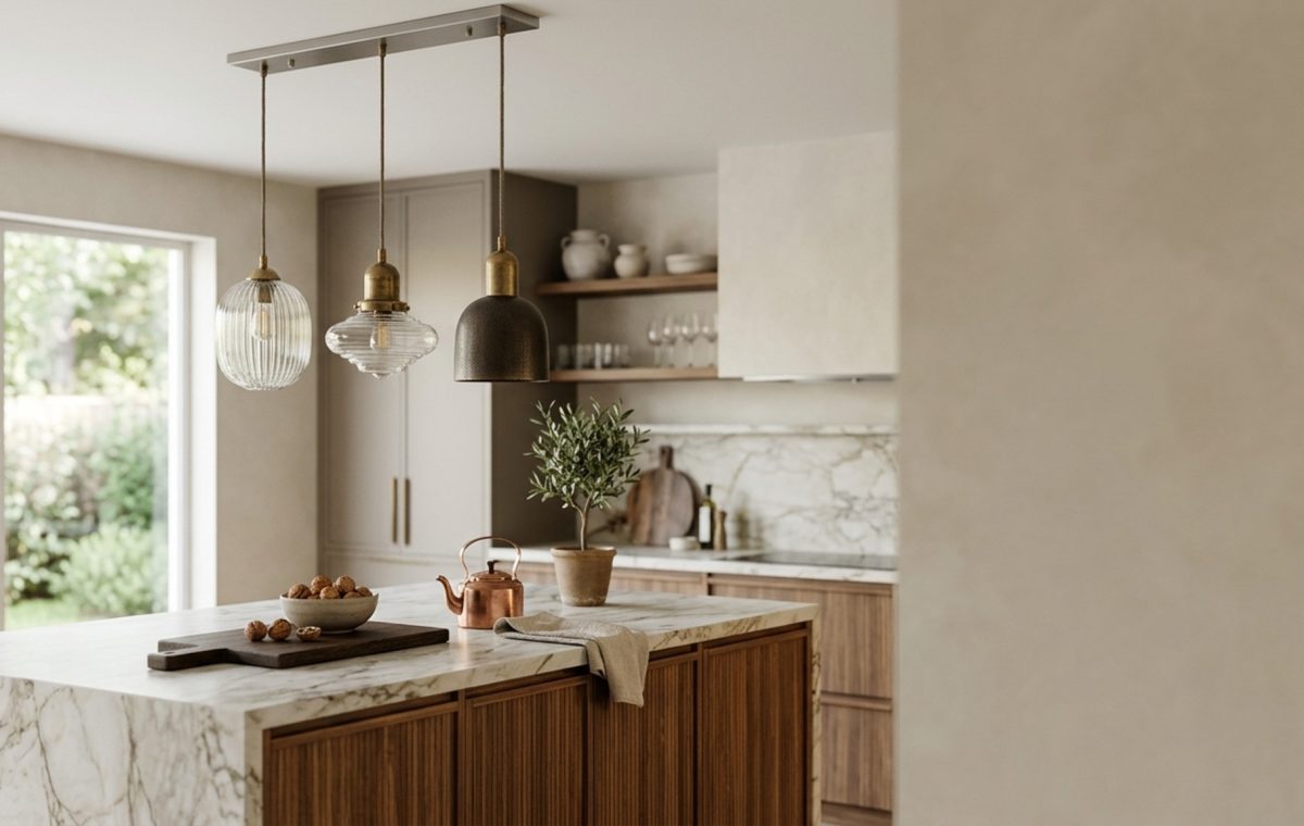
Consider a 60-inch linear silhouette crafted from burnished bronze. This isn’t just a lamp; it is a weight-bearing visual element. For an island measuring 9 feet, a linear fixture should ideally span 60% to 70% of the surface length to maintain proportion. This material trend leans into the ‘quiet luxury’ movement, where the focus shifts from the decorative to the structural. By aligning the fixture with the long axis of the stone, you create a spatial cadence that guides the eye toward the architectural highlights of the home, rather than distracting from them.
The Sterile Surface Dilemma: Softening with Brass Kitchen Pendant Lights
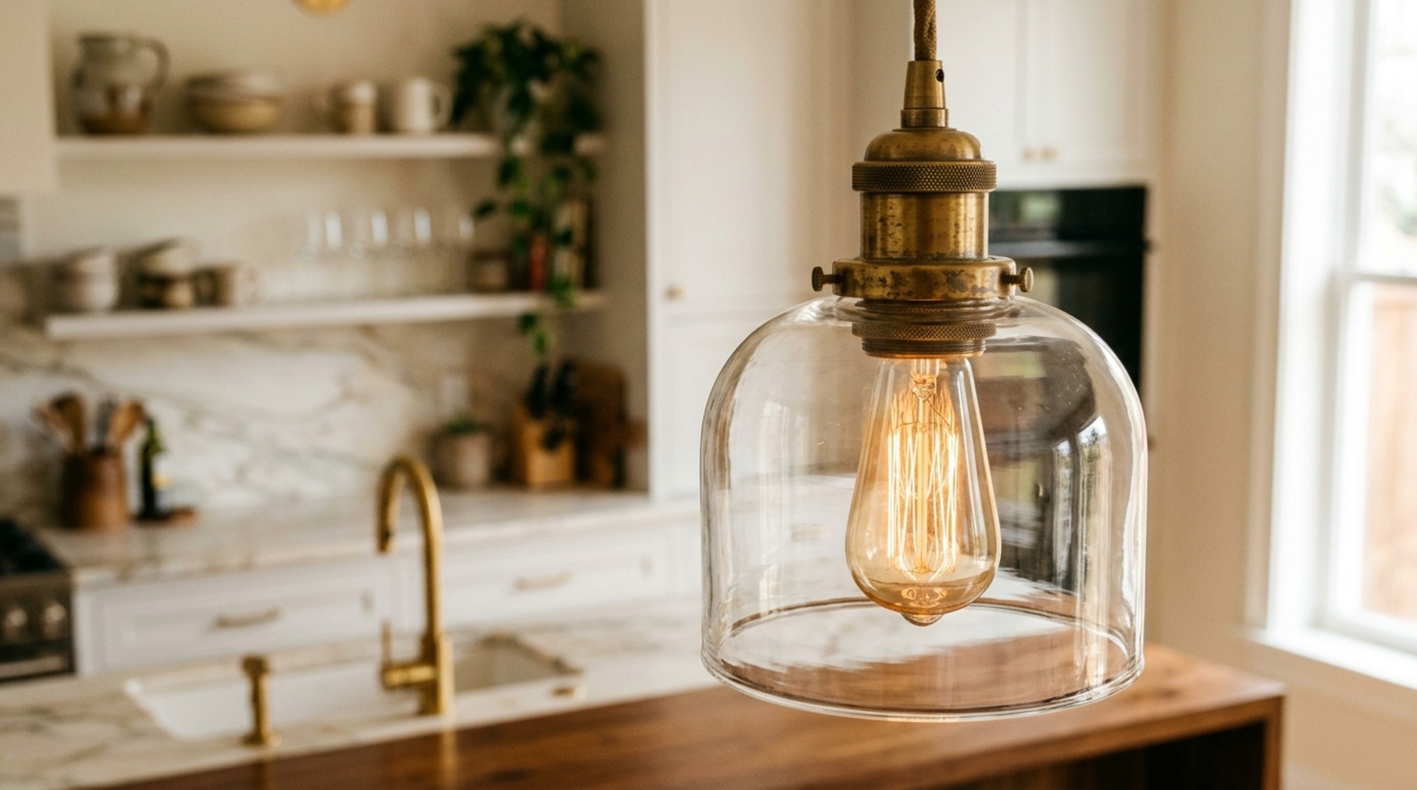
Modern kitchens often lean heavily into cold materials—quartzite, stainless steel, and polished chrome. While durable, these finishes can feel emotionally detached, turning the heart of the home into a laboratory. The solution to this atmospheric sterility is the strategic use of brass kitchen pendant lights. Unlike polished gold, which can feel dated, modern unlacquered brass or ‘living finishes’ develop a patina over time, grounding the kitchen in a sense of history and tactile warmth.
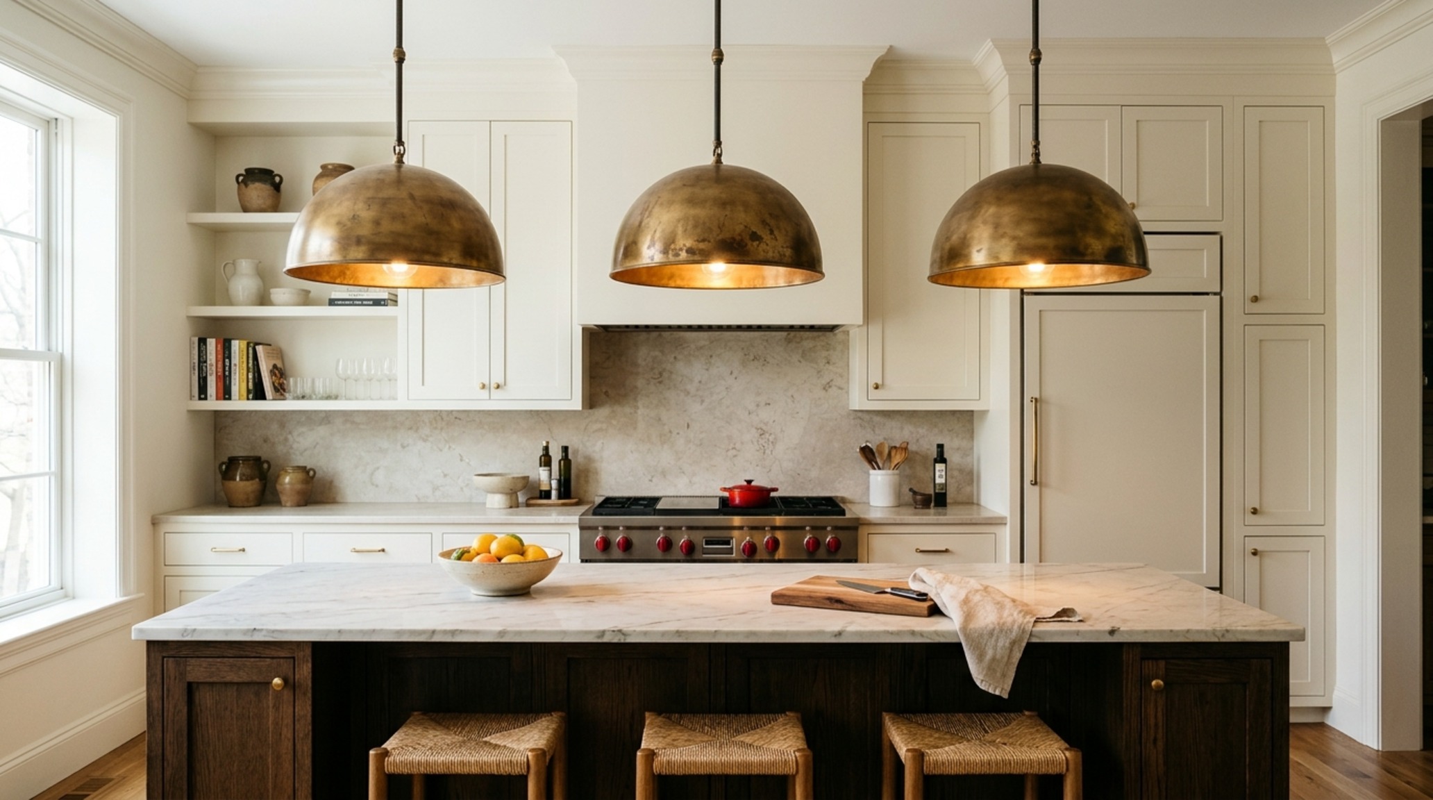
Think of brass as the ‘jewelry’ of the kitchen. When paired with a backdrop of Benjamin Moore Swiss Coffee cabinetry or a soft Farrow & Ball Setting Plaster wall, a heavy-gauge brass dome provides a necessary point of contrast. The material interacts with the 2700K warm ambient glow to produce a golden secondary reflection that softens the hard edges of a waterfall island. It is the difference between a room that is merely ‘finished’ and one that feels ‘lived-in’ and curated.
The Glare Obstruction: Finding Transparency in Glass Island Lighting
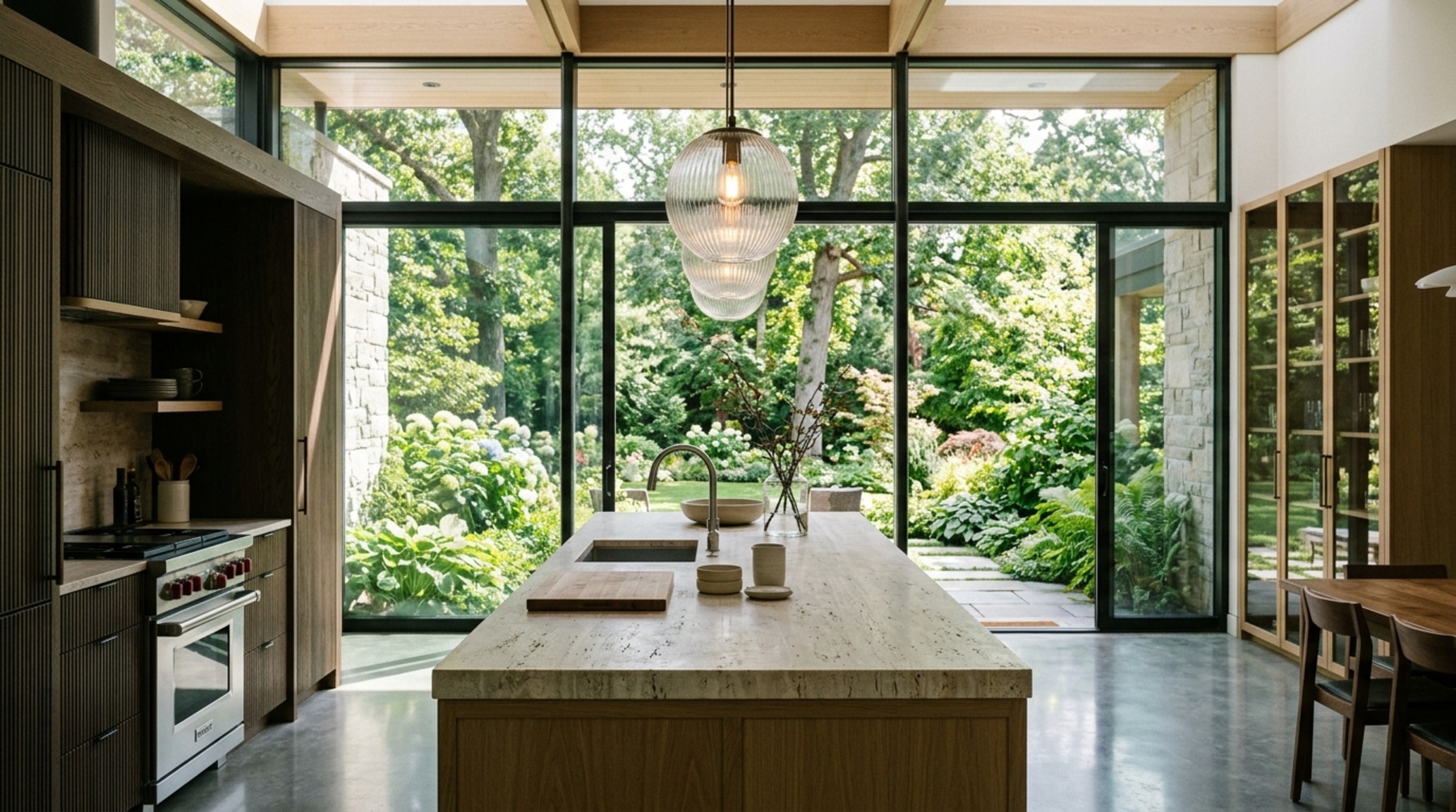
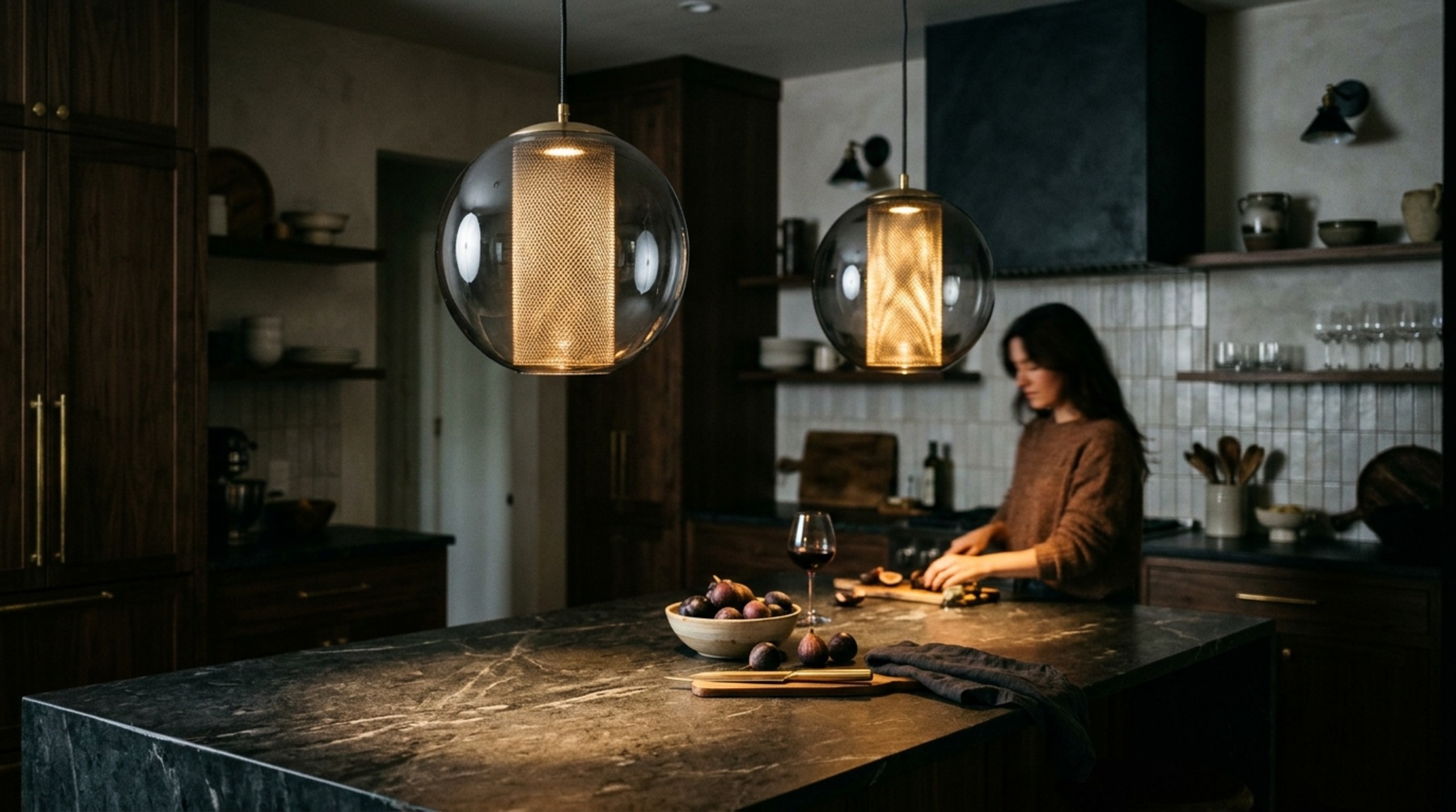
Task lighting is a functional necessity, but in a kitchen with a view or an intricate backsplash, a solid metal shade can act as a visual wall. The problem is twofold: the physical obstruction of the view and the harsh, directional glare that creates ‘hot spots’ on polished stone. This is where glass island lighting serves as the ultimate architectural bridge. Hand-blown glass, particularly in seeded or fluted textures, diffuses the light source while maintaining a transparent footprint.
We are seeing a major shift toward oversized, clear cloches and smoked glass globes that prioritize ‘negative space breathing room.’ By using a high CRI 90+ bulb within a fluted glass enclosure, you achieve a sophisticated shadow play that adds depth to the room without blocking the line of sight to the garden or the adjacent lounge. It is about the sensory experience of the material—how the light catches the ripples in the glass, mimicking the movement of water on a honed travertine countertop.
Spatial Perspectives & Material Curation
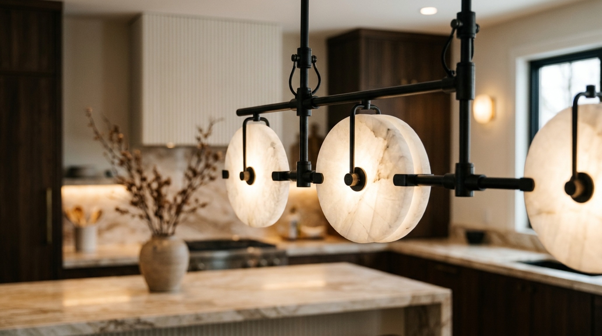
In the 2025 design landscape, the interaction between light and stone has become more nuanced. We are moving away from the ‘set’ look and toward a curated material matrix. Imagine the contrast of a matte black architectural arm holding a translucent alabaster disk. Alabaster is the pinnacle of the ‘lighting as art’ trend; its natural veining means no two pieces are alike, providing a bespoke, artisanal quality that mass-produced metal cannot replicate. This material choice solves the problem of ‘flat’ lighting by introducing organic variation into a strictly geometric space.
The Proportional Misstep: Navigating the Kitchen Lighting Height Guide
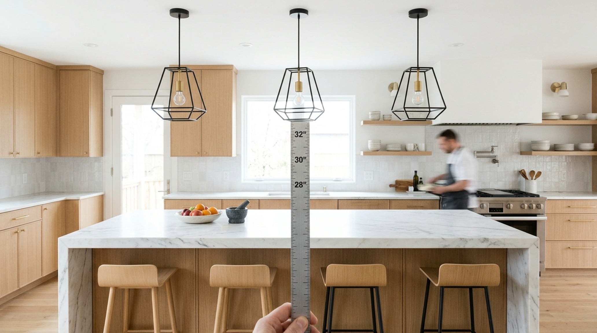
Even the most expensive fixture will fail if it is hung at the wrong elevation. The most frequent issue we see in luxury renovations is the ‘floating light’ syndrome, where pendants are hung too high, severing the connection between the light and the surface it is meant to serve. To correct this, the kitchen lighting height guide standard suggests a clearance of 30 to 36 inches from the top of the counter to the bottom of the fixture. This measurement isn’t arbitrary—it is designed to keep the light source out of your direct line of sight while seated, yet low enough to create an intimate pool of light for dining and prep work.
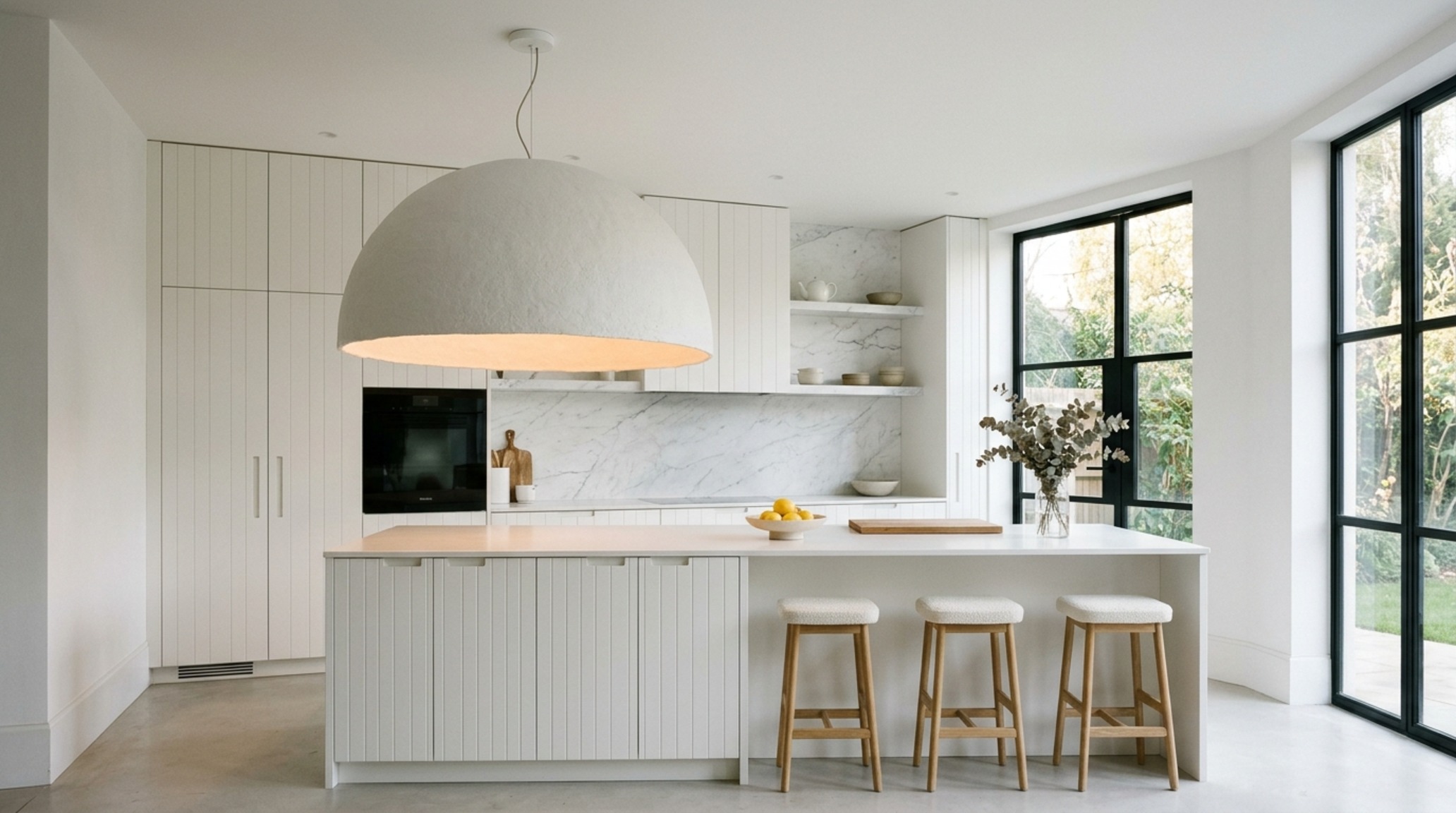
When working with 10-foot ceilings, you have the luxury of play. You can experiment with layered heights or a single, massive sculptural piece that sits exactly 34 inches above the stone. This creates a vertical dialogue within the room. If the fixture is too high, the ‘designer kitchen island lights’ lose their impact and become part of the ceiling architecture rather than the kitchen’s soul. Aligning your sightlines ensures that whether you are standing at the stove or sitting with a glass of wine, the light feels like an intentional embrace, not an overhead distraction.
The Generic Fixture Fatigue: Investing in Modern Luxury Kitchen Fixtures
In an era of fast furniture, the ‘generic’ look is a pervasive problem. Many homeowners settle for lighting that is ‘safe’ but lacks the weight and presence of true craftsmanship. The solution is to view modern luxury kitchen fixtures as architectural heirlooms. These pieces are defined by their material integrity—think heavy-gauge steel, hand-stitched leather accents, and integrated LED technology that allows for ultra-slim, sculptural forms that were impossible a decade ago.
These fixtures solve the problem of visual boredom by introducing unexpected textures. A pendant wrapped in saddle leather or a linear bar featuring knurled metal details provides a tactile grounding that invites touch. It signals that the kitchen is a space of high design, where every detail—from the cabinet pulls to the Kelvin index of the bulbs—has been scrutinized for its contribution to the whole. This is where JayhawkRent positions itself as an authority, bridging the gap between high-utility tasking and atmospheric materiality.
The Static Atmosphere: Embracing Kitchen Lighting Trends 2025
One-dimensional lighting is the enemy of a cozy home. A kitchen that is perpetually bright feels like a retail space. The most significant of the kitchen lighting trends 2025 is the move toward ‘smart materiality’ and layered dimming. We are seeing fixtures that use warm-to-dim technology, shifting from a crisp 3000K for morning coffee to a candle-like 2200K for evening entertaining. The material of the shade plays a huge role here: a perforated metal shade will cast a dramatic, starry pattern on the walls, while a silk-lined drum will provide a soft, even wash of light.
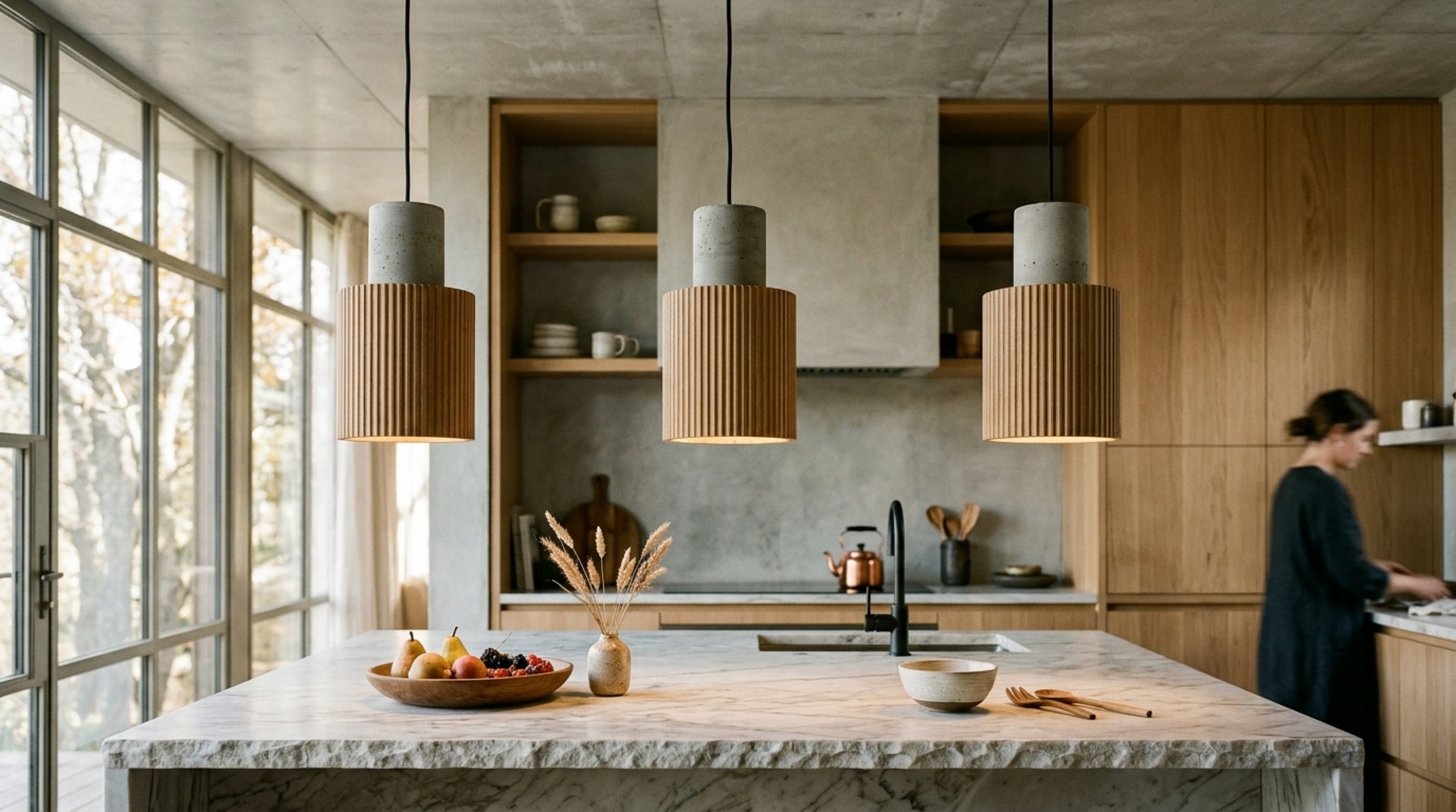
As we lean into nature-inspired textures, expect to see more terra cotta, cast concrete, and even 3D-printed organic polymers. These materials bring a ‘wabi-sabi’ sensibility to the kitchen, celebrating imperfection and the human touch. They solve the problem of the ‘over-designed’ kitchen by reintroducing a sense of the earth and the hand-made, ensuring the space feels warm and soulful even in the heart of a bustling city.
Architectural Materials, Swatches & Kelvin Index
Key structural details: paint hex codes, authentic stone and wood finishes, and lighting Kelvin index.
Before you begin your lighting journey, remember these three core pillars: ensure your 36-inch walkway clearance remains unobstructed by the visual volume of the fixture, choose a material that contrasts the existing stone to add depth, and always aim for a color temperature of 2700K to keep the atmosphere warm. When these elements align, your designer kitchen island lights transition from a simple utility to a poetic architectural statement. Ultimately, lighting is the silent narrator of a home; it tells the story of how a space is intended to be felt, experienced, and remembered long after the meal is finished.
Editorial Silo • Recommended Architecture Studies
- Comfortable Kitchen cabinets designs for small kitchens save — Archival Design Case Study
- Artistic Kitchen countertop design ideas for spatial flow — Archival Design Case Study
Architectural Vignettes Showcase
An editorial archive chronicling proportions, bespoke architectural joinery, and tranquil daylighting.

Curated Visual Lookbook
Design Gallery & Spatial Studies
A visual curation of architectural arrangements, lighting concepts, and material palettes featured in this space.