The Art of the Balanced Hearth
Most mantelpieces fail because they try too hard. They become cluttered dumping grounds for random trinkets, mail, and mismatched candles. Real curation takes restraint. If you look at a well-balanced mantel, the secret lies in asymmetrical framing. A heavy element on one side needs a lighter, taller counterpart to anchor the opposite corner.
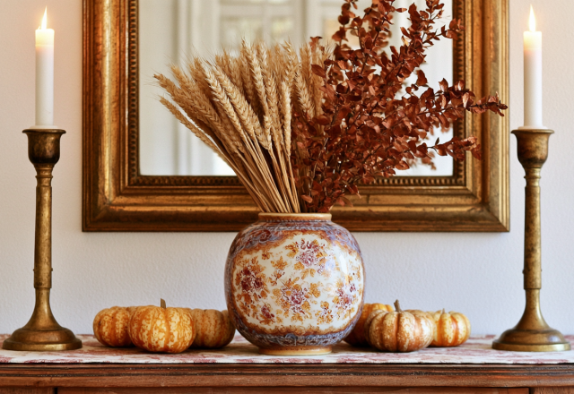
Take a cue from classic European interiors where history dictates the palette. A gilded frame holding botanical prints paired with dried hydrangeas in a ceramic vase immediately grounds a white marble surface. It looks collected over decades rather than bought in a single afternoon.
Playing with Texture and Height
Flat surfaces are boring. To fix this, vary your heights drastically. Place a pleated lamp on one end to cast a warm, downward glow across the stone. Lean an ornately framed illustration slightly off-center instead of hanging it rigidly. Let dried leaves spill naturally onto the stone shelf. Perfection kills character in interior design.
- Mix rough textures like dried foliage with smooth surfaces like marble and glass.
- Vary scale by pairing tall table lamps with low, grounded decorative objects.
- Stick to a restrained, earthy color palette of ochre, cream, and antiqued gold.
Design is not just what it looks like and feels like. Design is how it works in your daily life.
Common Pitfalls to Avoid
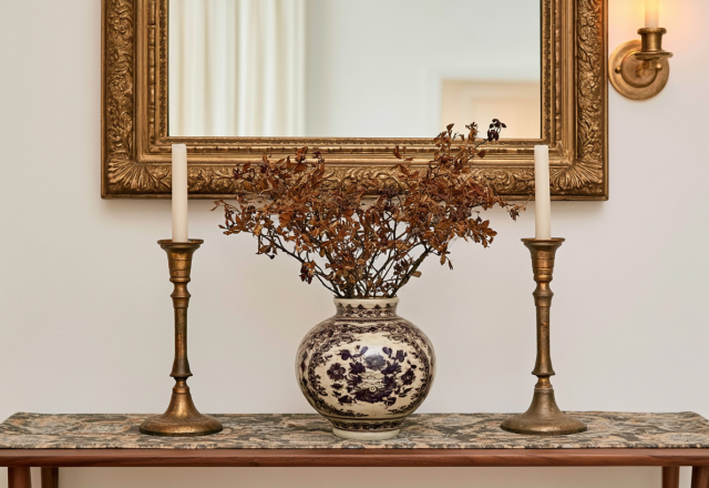
Symmetry is the enemy of soul. Do not place identical candleholders on both ends of your fireplace expecting elegance. Instead, treat your mantel as a vignette that tells a subtle story about what you love. Avoid overcrowding the center. Give your focal art piece breathing room so the eye knows exactly where to rest.
What small change can you make to your own display this weekend to bring more warmth into your space?
Editorial Lookbook & Photo Collection