The Invisible Framework: Beyond Decor
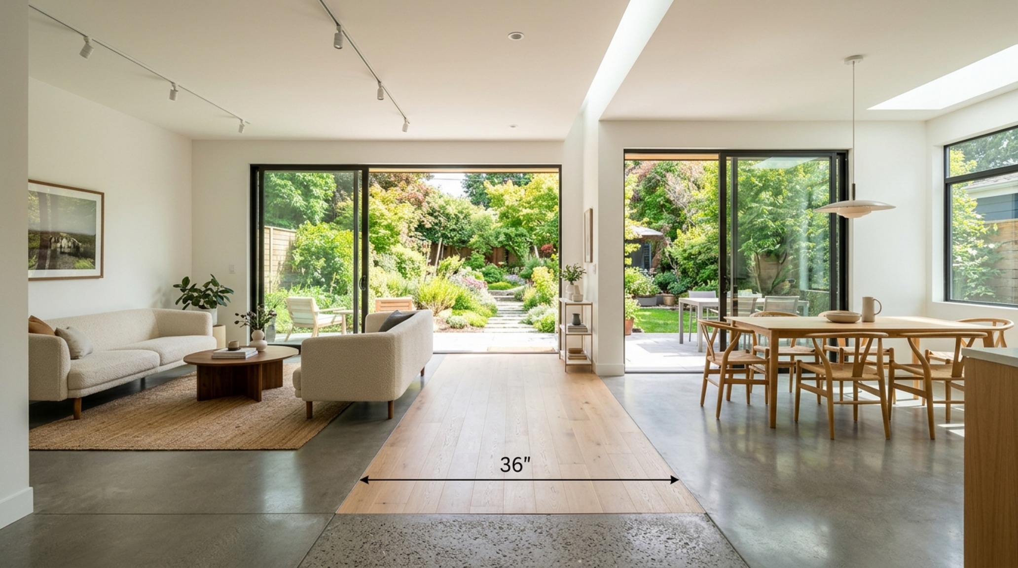
The morning sun hits a room not just as light, but as a sculptor of volume and shadow, defining the silent boundaries of our daily lives. To truly master the principles and elements of interior design, one must move beyond the superficiality of ‘decorating’ and instead adopt the mindset of an architect of atmosphere. It is the subtle tension between a heavy, grounded travertine coffee table and the airy negative space surrounding it that dictates whether a room feels like a sanctuary or a storage unit. When we talk about these foundational concepts, we are talking about the geometry of human comfort—the way a 36-inch walkway allows for effortless circulation, or how a high-CRI lighting scheme can transform a flat wall into a living canvas of texture.
Understanding the architectural blueprint of a home means recognizing that every choice, from the height of a wainscoting line to the tactile grain of a fluted oak panel, contributes to a larger spatial narrative. We don’t just see a room; we feel its proportions. If the scale is off—if a grand sectional is forced into a modest footprint—the resulting friction creates a subconscious sense of unease. Conversely, when the elements of balance, rhythm, and emphasis are handled with precision, the space begins to breathe.
Modern Principles and Elements of Interior Design Ideas: The Power of Axis and Alignment
Design in the modern era has shifted away from the cluttered ornamentation of the past toward a rigorous focus on sightlines and structural honesty. Modern principles and elements of interior design ideas center on the concept of the ‘datum’—a reference point, like a continuous floor plane or a consistent head-height for windows and doors, that organizes the chaos of a room. Imagine a living space where the top of the bookshelf aligns perfectly with the door frame; this alignment creates a visual horizontal line that calms the eye, grounding the entire composition in a sense of intentionality.
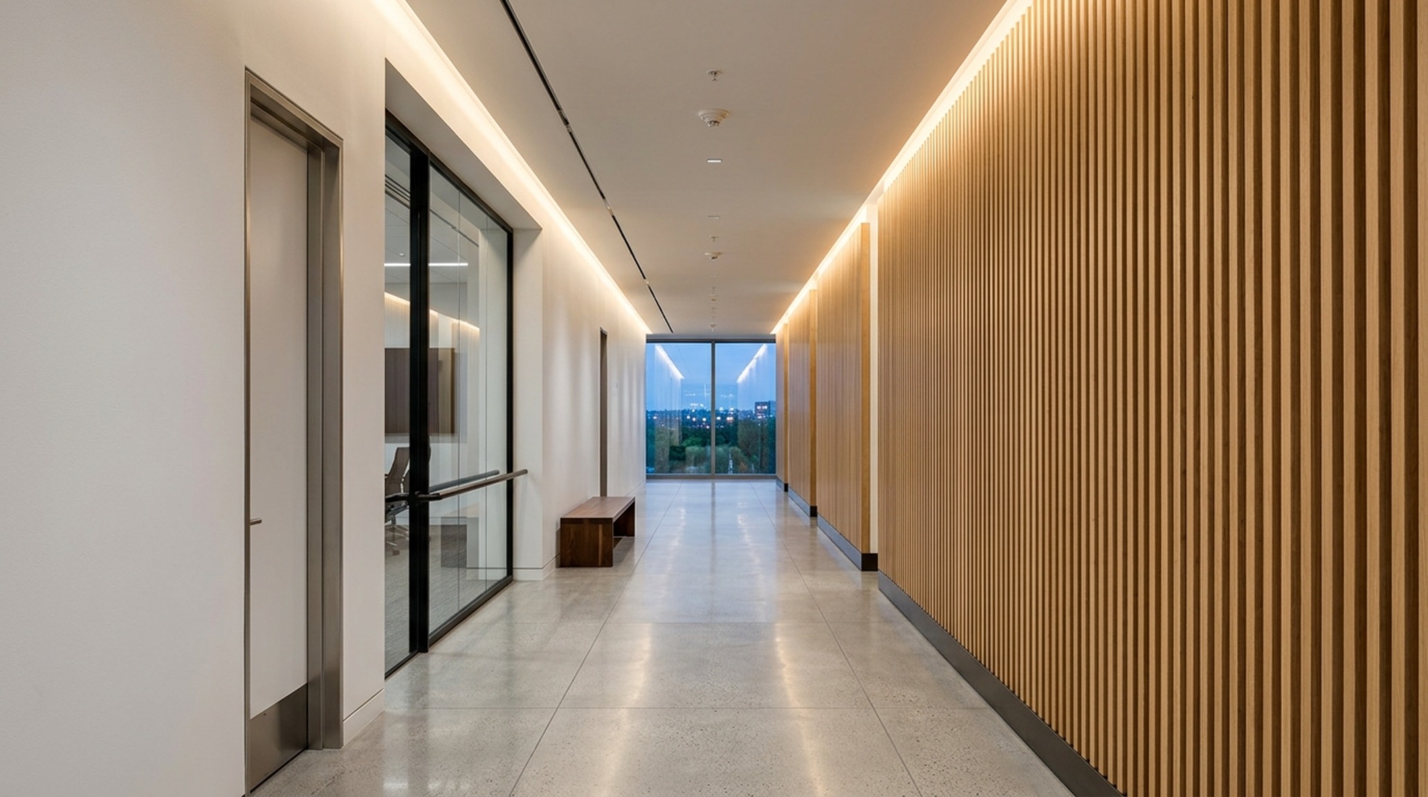
Balance in a modern context doesn’t always mean rigid symmetry. While a pair of identical armchairs flanking a fireplace offers a classic formal balance, the modern designer often leans into asymmetrical balance. This might involve counteracting a large, dark-toned sofa with two smaller, lighter-colored chairs and a tall, slender floor lamp. The visual ‘weight’ remains equal, but the arrangement feels more dynamic and less prescriptive. By utilizing architectural software or even a simple hand-sketched floor plan, we can ensure that the primary circulation paths—never less than 36 inches for a main thoroughfare—remain unencumbered, allowing the eye to travel across the room without interruption.
The Science of Scale: Precision in the Living Volume
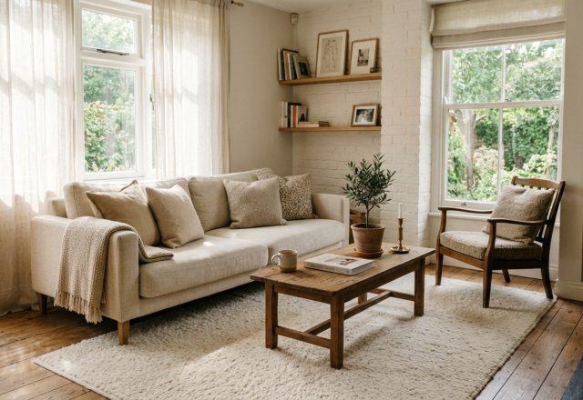
Scale and proportion are the mathematical heart of design. Scale refers to how an object relates to the size of the room, while proportion is the relationship between elements themselves. A common pitfall in residential design is the ‘undersized rug’—a visual island that makes the entire seating arrangement feel adrift. For a standard 12’x15′ living room, an 8’x10’ rug is often the absolute minimum, ensuring that at least the front legs of all furniture pieces sit firmly on the textile. This creates a defined ‘zone’ within the larger architectural volume.
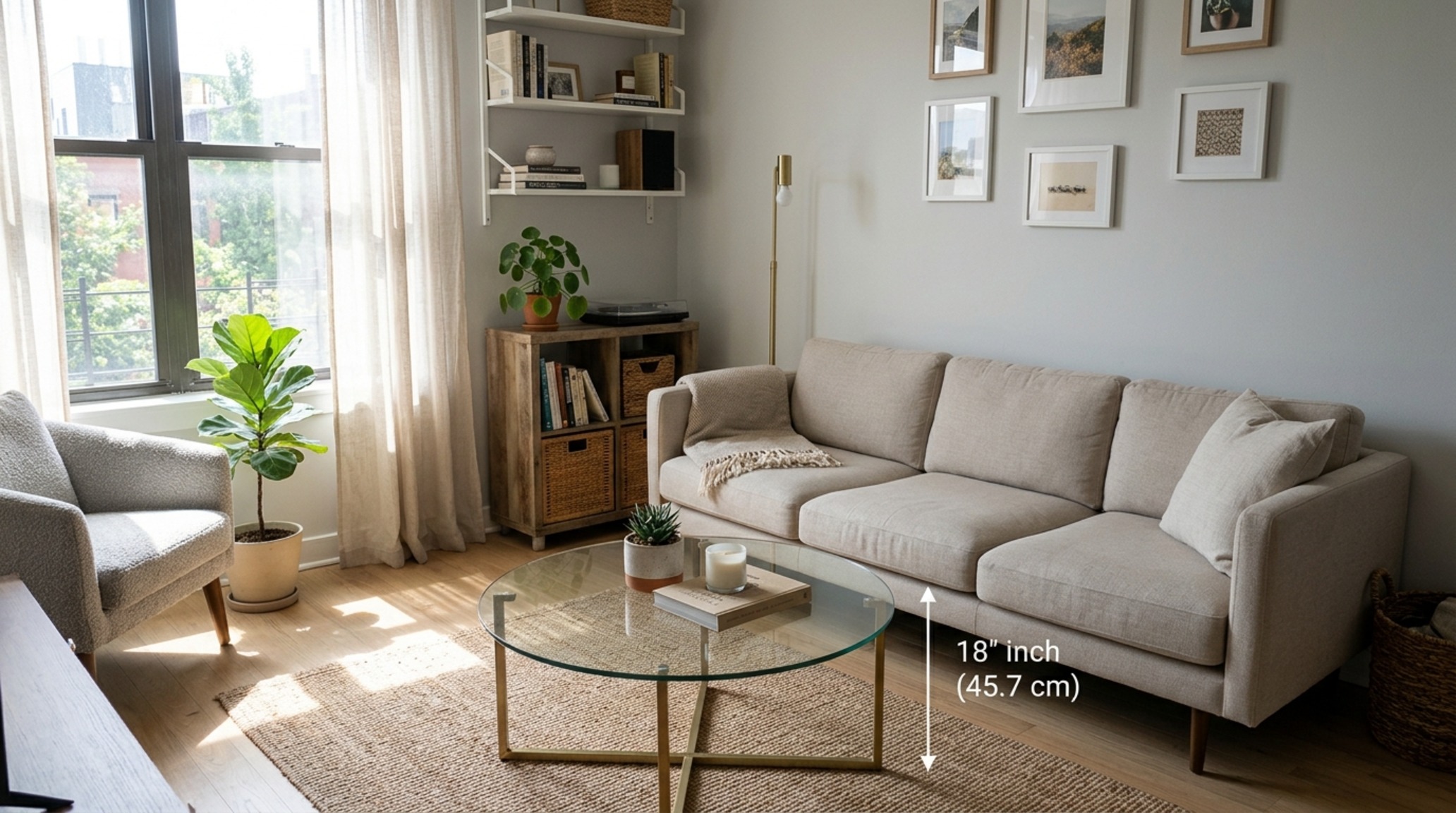
Consider the 18-inch rule: the ideal distance between the edge of a sofa and the coffee table. It is close enough to reach a drink but far enough to allow for legroom. Similarly, a dining chair requires 30 inches of clearance from the table edge to the nearest wall or piece of furniture to allow a guest to push back comfortably. These aren’t just suggestions; they are the ergonomic pillars that support the principles and elements of interior design in a functional home. When these measurements are respected, the furniture feels ‘right’ in its skin, allowing the materiality of the pieces—perhaps a honed Carrara marble top or a rich walnut base—to take center stage.
Spatial Perspectives & Material Curation
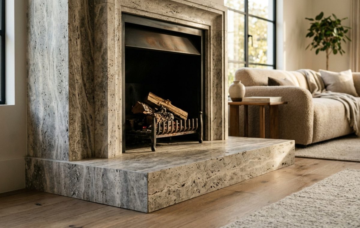
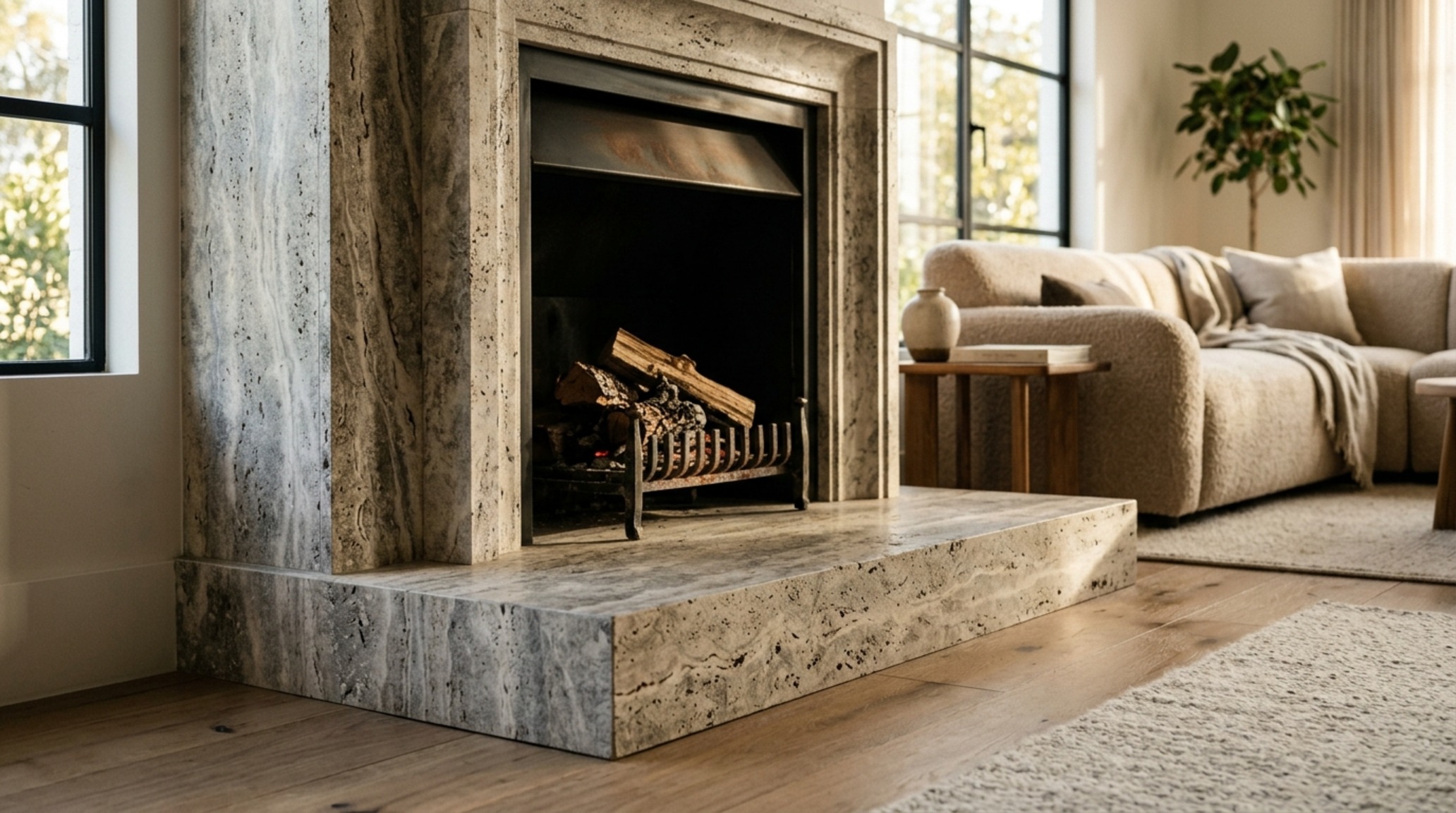
To walk through a well-designed home is to experience a rhythmic sequence of compressions and releases. Rhythm in interior design is achieved through repetition and transition. It might be the repeated verticality of floor-to-ceiling drapery panels in a soft linen, or the way a specific accent color, like the muted terracotta of Farrow & Ball’s Setting Plaster, appears in a throw pillow, then a piece of ceramic art, and finally in the veining of a stone fireplace surround. This visual trail guides the observer through the space, creating a cohesive story rather than a series of disjointed chapters.
Luxury Principles and Elements of Interior Design Textures: The Tactile Dimension
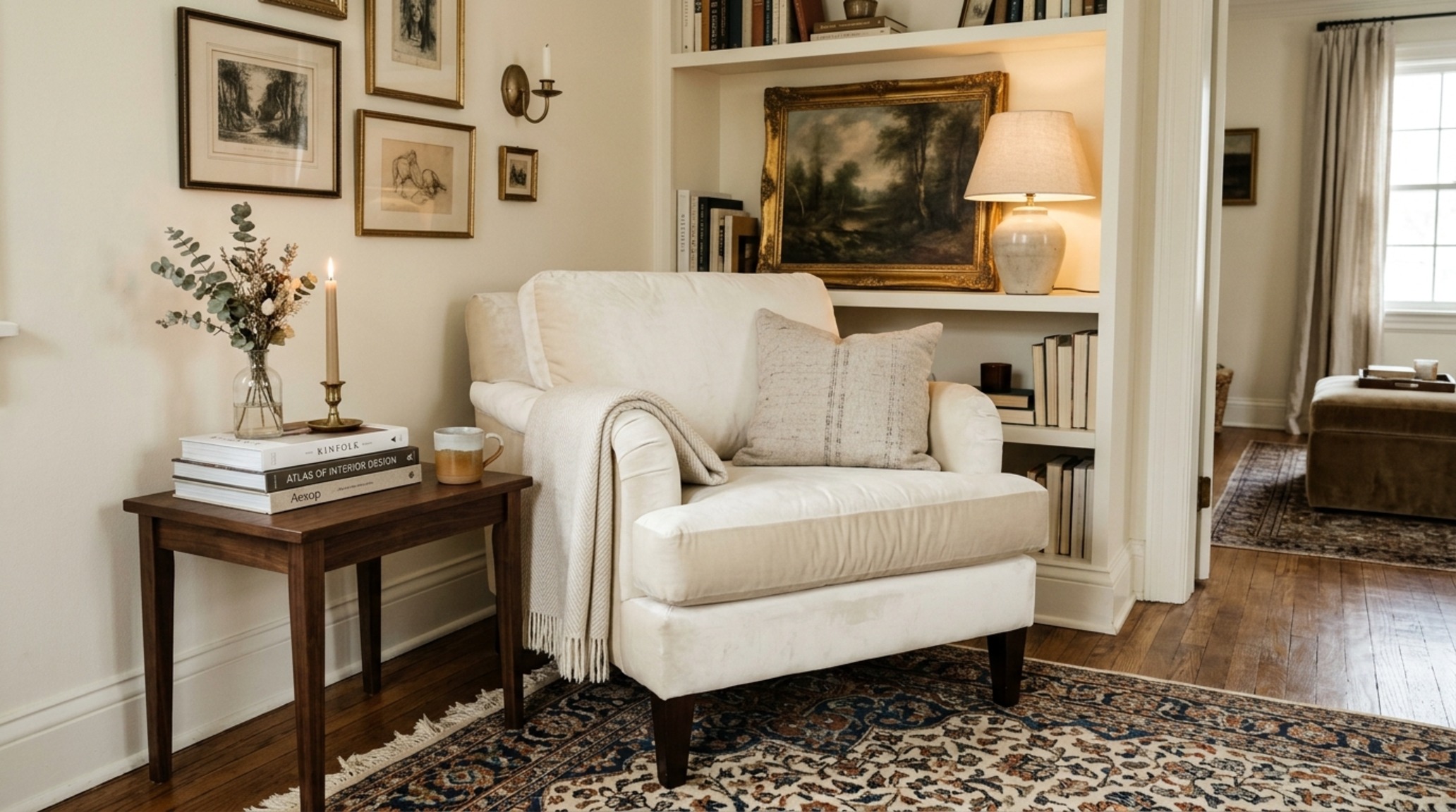
Luxury is rarely about the price tag; it is about the depth of the sensory experience. When exploring luxury principles and elements of interior design textures, we look for ‘material honesty.’ This means choosing materials that look and feel like what they are—solid wood that shows its grain, unlacquered brass that develops a living patina, and heavy-weight linens that drape with a certain gravitas. Texture is the secret weapon of the neutral palette. In a room painted in Benjamin Moore’s Swiss Coffee, the interest comes from the contrast between a nubby bouclé sofa, a smooth silk rug, and a rough-hewn stone side table.
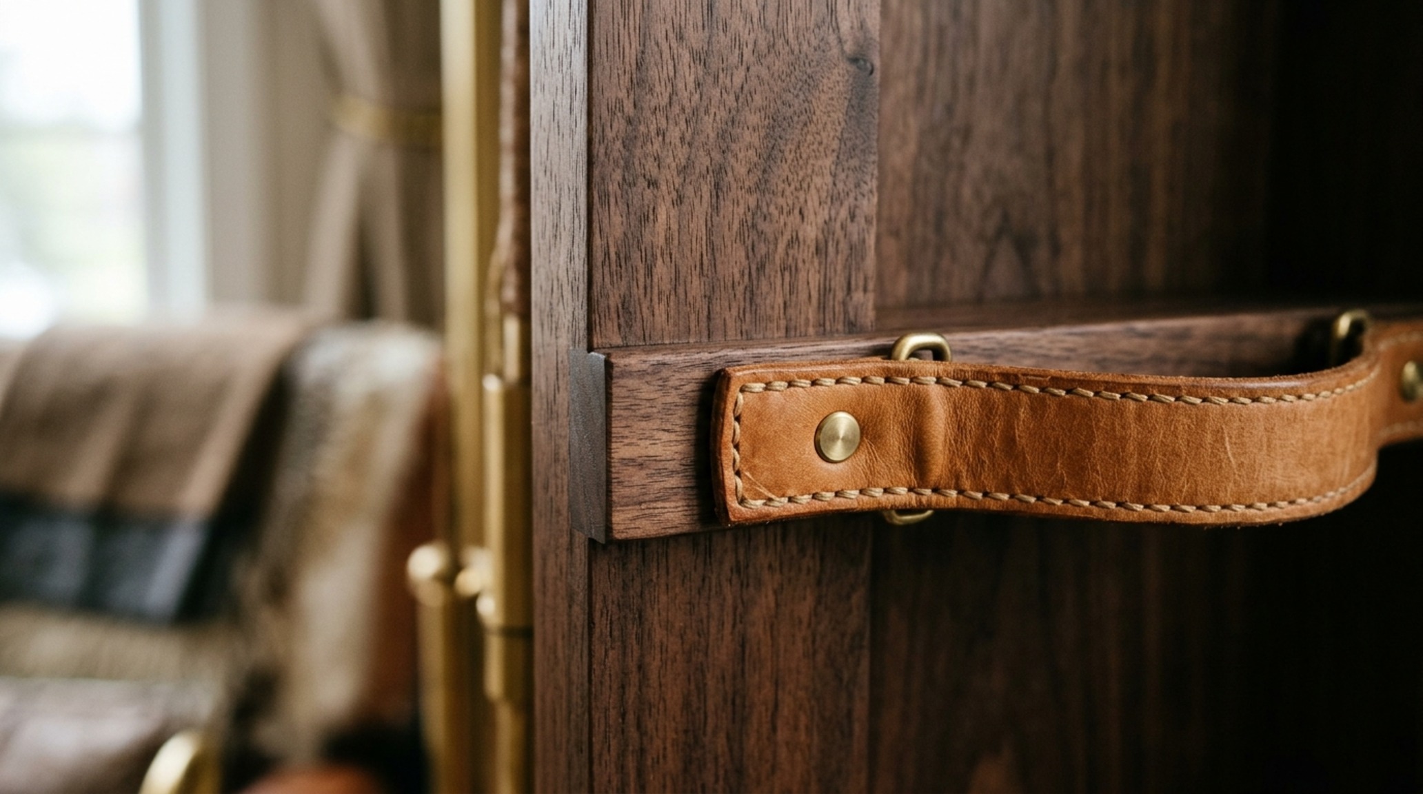
Contrast is one of the most potent elements at our disposal. It is the juxtaposition of light and dark, smooth and rough, old and new. A high-gloss lacquered ceiling reflecting the matte texture of a wide-plank European oak floor creates a sophisticated tension. In luxury environments, we often use ‘tactile grounding’—ensuring that the surfaces we touch most frequently (handrails, door hardware, cabinet pulls) are made of high-quality, substantial materials. The weight of a solid forged-brass handle provides a subconscious cue of quality that no synthetic finish can replicate.
Principles and Elements of Interior Design Lighting Guide: Sculpting with Photons
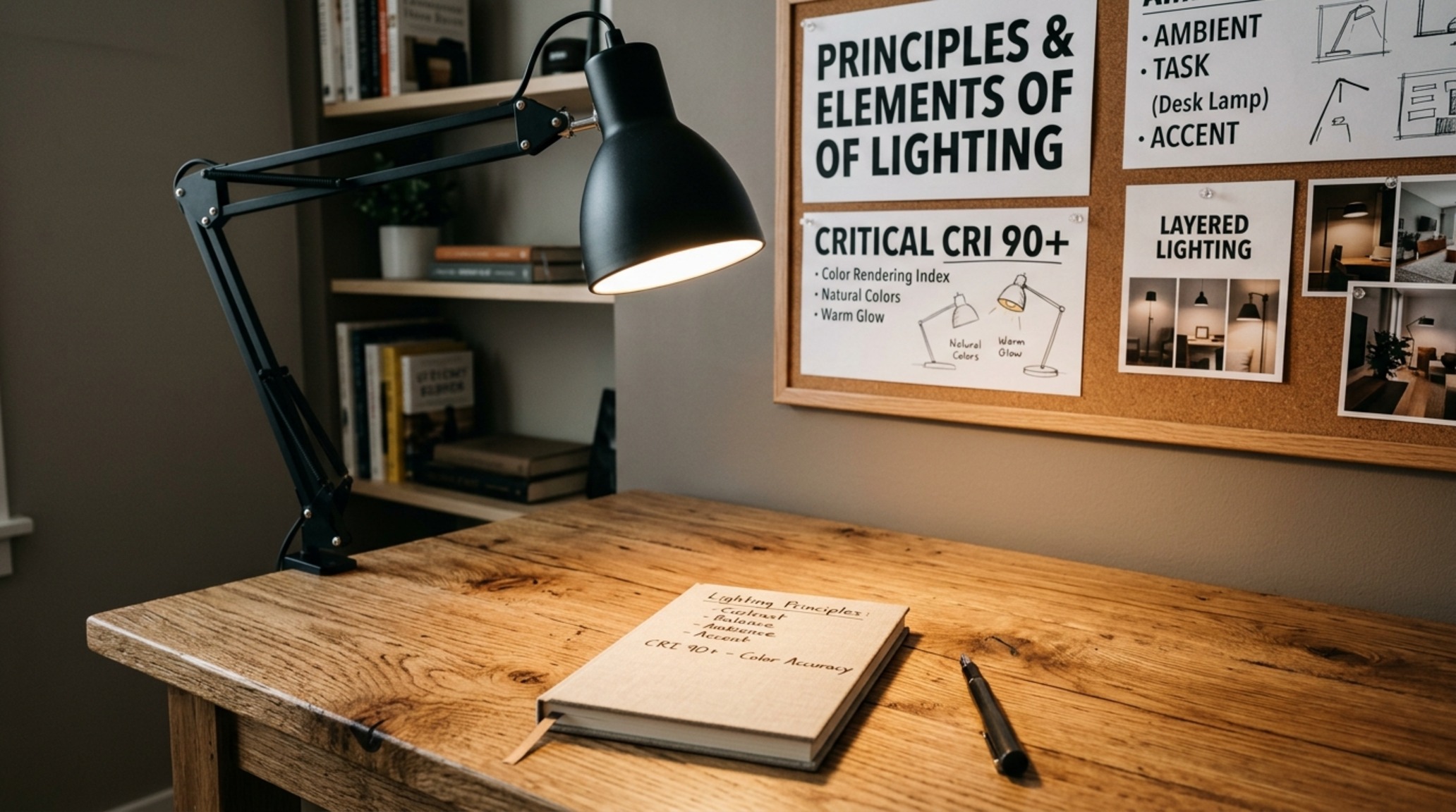
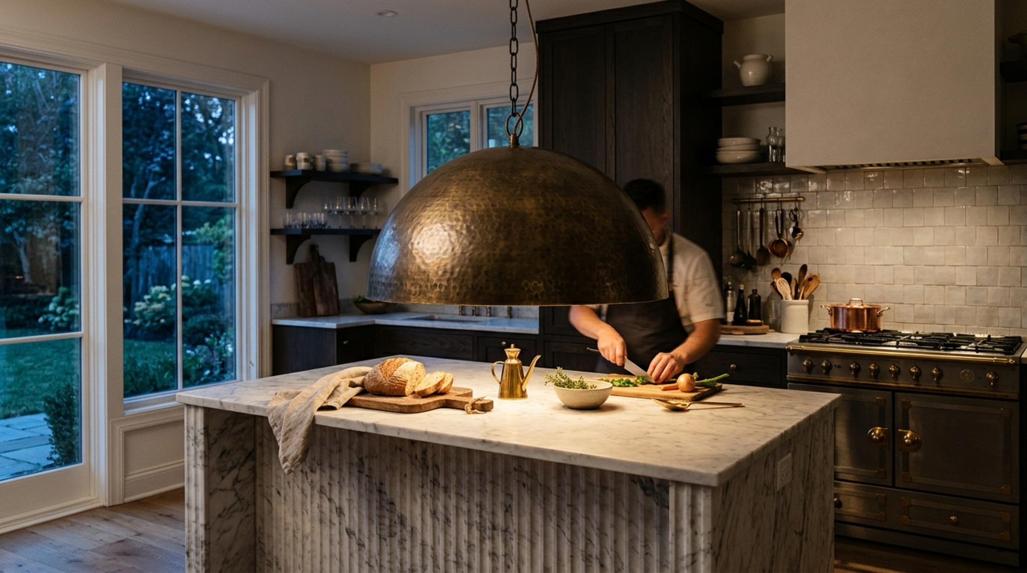
Lighting is the ‘invisible’ element that can either elevate or destroy a design. A comprehensive principles and elements of interior design lighting guide emphasizes the necessity of layering: ambient, task, and accent lighting. Ambient light is your base layer, often achieved through recessed architectural lighting or a central statement pendant. However, the secret to a professional look is the color temperature. For residential spaces, 2700K (warm white) is the standard for creating an inviting atmosphere, while 3000K provides a slightly crisper feel for kitchens and workspaces.
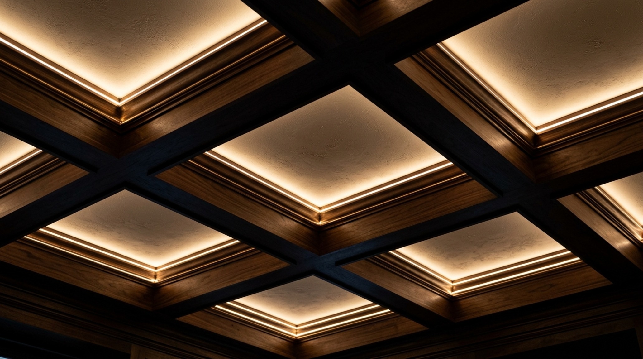
The ‘CRI’ or Color Rendering Index is equally vital; always look for bulbs with a CRI of 90 or higher to ensure that the colors in your room—that expensive navy velvet or the delicate sage paint—appear true to life. Task lighting should be purposeful: a pharmacy-style floor lamp by a reading chair or under-cabinet LED strips in a kitchen. Accent lighting, such as a picture light over a gallery wall or a small uplight behind a large fiddle-leaf fig, adds the final layer of drama. By controlling the ‘shadow play’ in a room, we can direct the eye to the architectural features we want to highlight, such as a vaulted ceiling or a beautifully articulated crown molding.
Small Space Principles and Elements of Interior Design: The Art of Efficiency
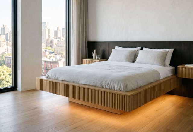
Designing for compact footprints requires a surgical level of precision. Small space principles and elements of interior design rely heavily on the use of ‘leggy’ furniture and transparent materials to keep the floor plane visible. If you can see the floor under a sofa or a vanity, the brain perceives the room as larger. This is why floating vanities and wall-mounted consoles are such effective tools in urban apartments. They provide necessary storage without claiming the visual territory of the floor.
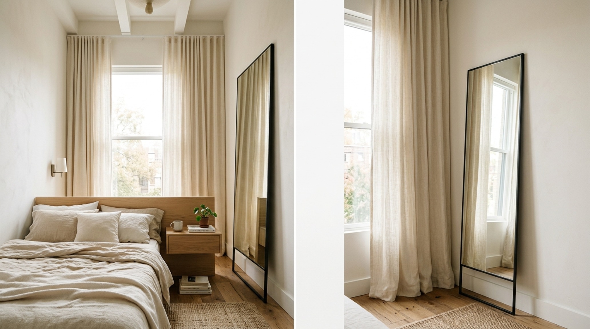
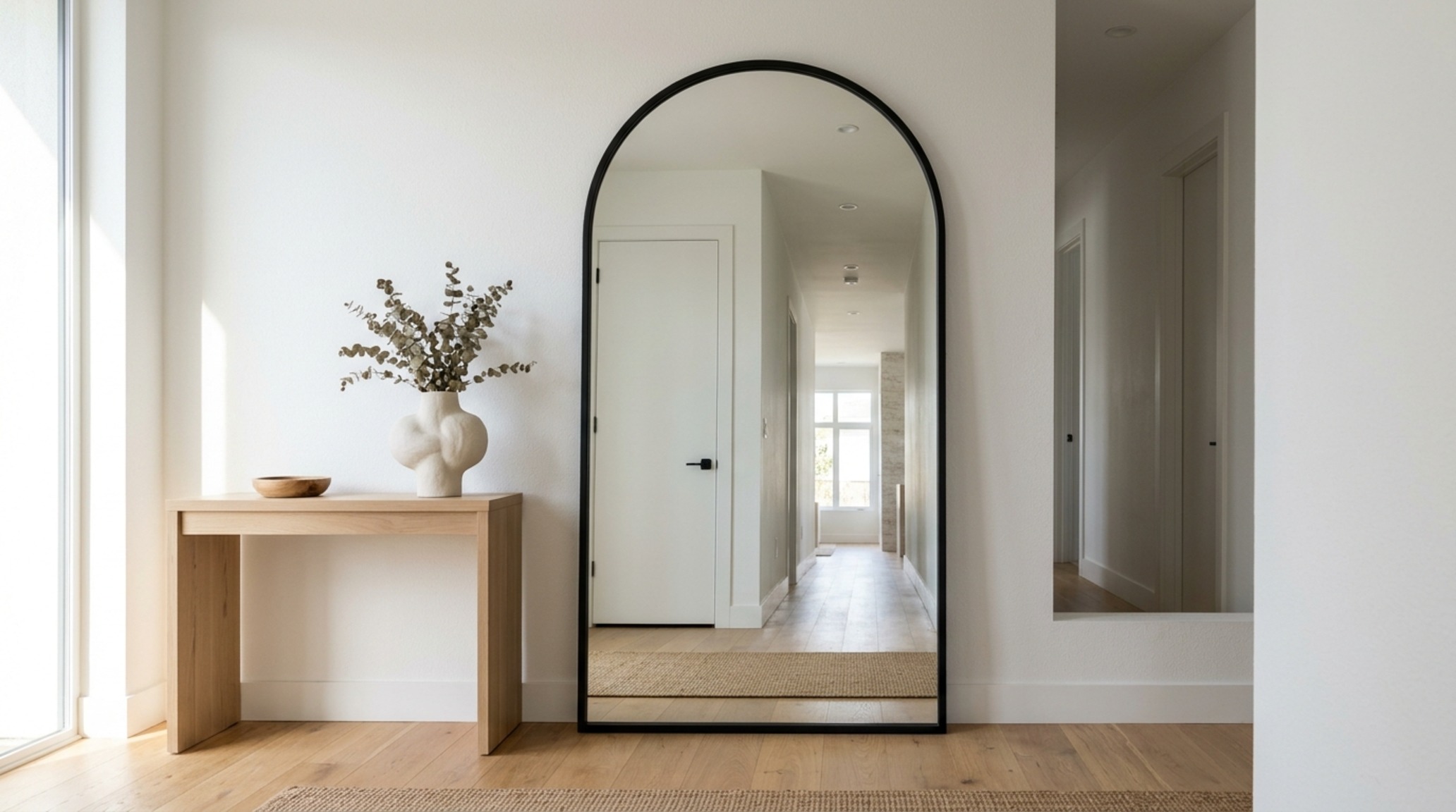
Verticality is another key strategy. By drawing the eye upward with floor-to-ceiling shelving or a tall, slender mirror, we emphasize the height of the room rather than its narrow width. Mirror placement is a classic but misunderstood tool; a mirror should always reflect something beautiful or an open view, never a cluttered corner. When a mirror is placed opposite a window, it effectively doubles the natural light and creates a ‘virtual’ window that breaks through the boundary of the wall. In these smaller volumes, every inch counts—from the 24-inch depth of a standard kitchen counter to the 12-inch depth of a hallway bookshelf—ensuring that the spatial flow remains fluid despite the constraints.
div class=”image-placeholder” data-index=”3″>