The Invisible Choreography: Why Spatial Precision Trumps Square Footage
Does a room truly breathe if its occupants are constantly dodging the sharp corners of oversized furniture? Essential interior design advice suggests that the luxury of space is not found in expansive square footage, but in the mathematical precision of the floor plan’s choreography. When we look at a room that feels effortless, we aren’t just seeing beautiful objects; we are experiencing the successful negotiation between human ergonomics and architectural limits. The tension between the desire for aesthetic grandeur and the reality of a compact urban footprint is where true design innovation is born. It is the art of the ‘invisible inch’—the clearance that allows a chair to pull back without hitting a wall, or the reach that makes a coffee table feel useful rather than an obstacle.
To master this, one must first respect the standard architectural clearances that professional designers treat as law. A primary circulation path requires 36 inches of width to feel generous; anything less feels like a corridor of compromise. In a dining context, the magic number is 30 inches—the space required to pull out a chair and sit comfortably without disrupting the flow of the room. When we ignore these physical realities, the most expensive sofa in the world will still feel like a mistake. By grounding our aesthetic choices in these functional metrics, we transform a decorative exercise into a livable sanctuary.
Small Space Interior Design Advice for Visual Expansion
In smaller environments, the floor plane is the most valuable real estate. The moment you clutter the floor, the room shrinks psychologically. This is why the ‘leggy’ furniture trend isn’t just about Mid-Century nostalgia; it’s a strategic move to keep the eye moving underneath pieces, creating the illusion of more surface area. By opting for a sofa on slender tapered legs or a floating media console, you allow the flooring—perhaps a wide-plank oak or a honed limestone—to run edge-to-edge, uninterrupted. This continuity is a hallmark of professional small space interior design advice because it tricks the brain into perceiving the room as an open volume rather than a series of boxed-in zones.
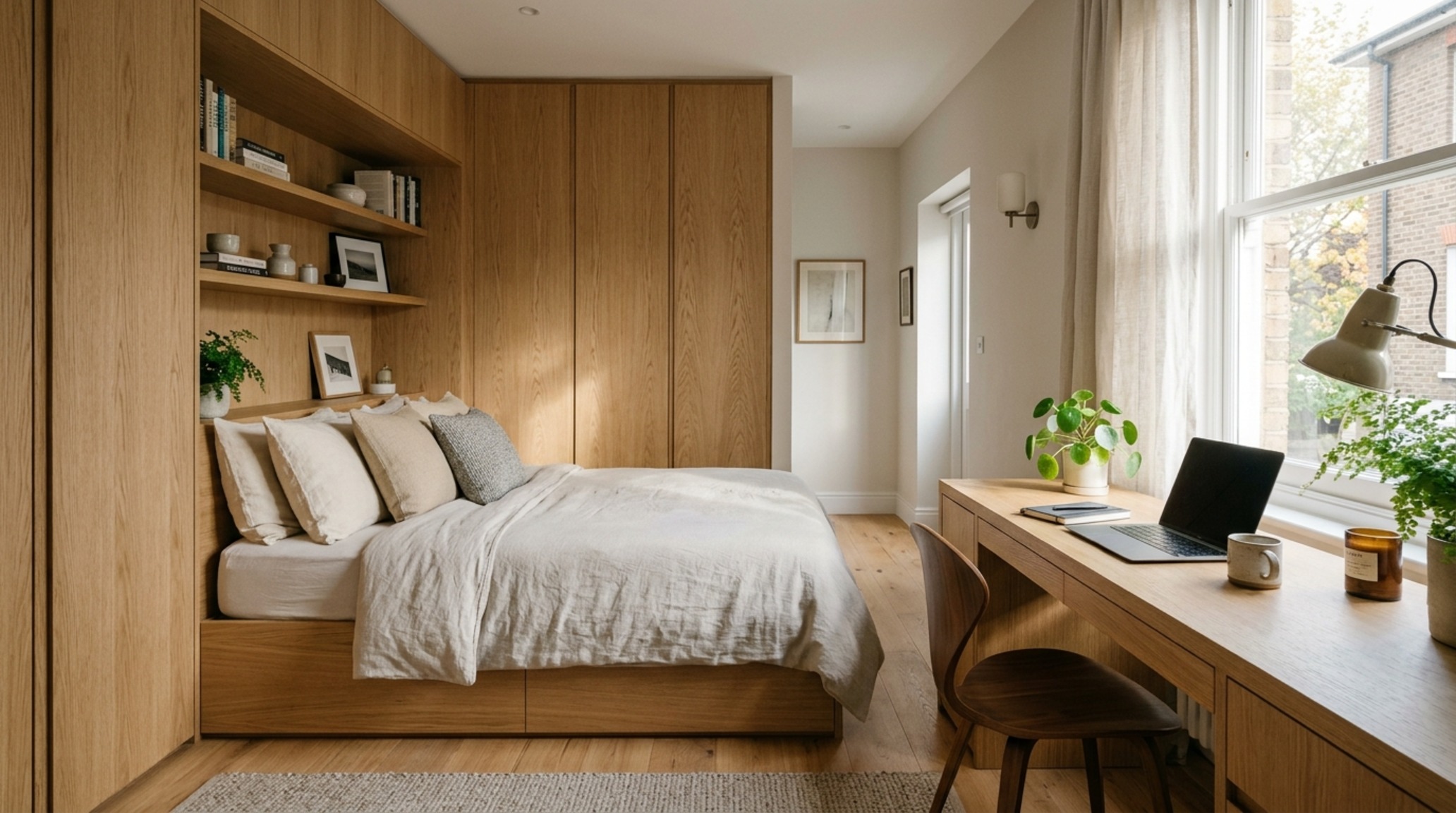
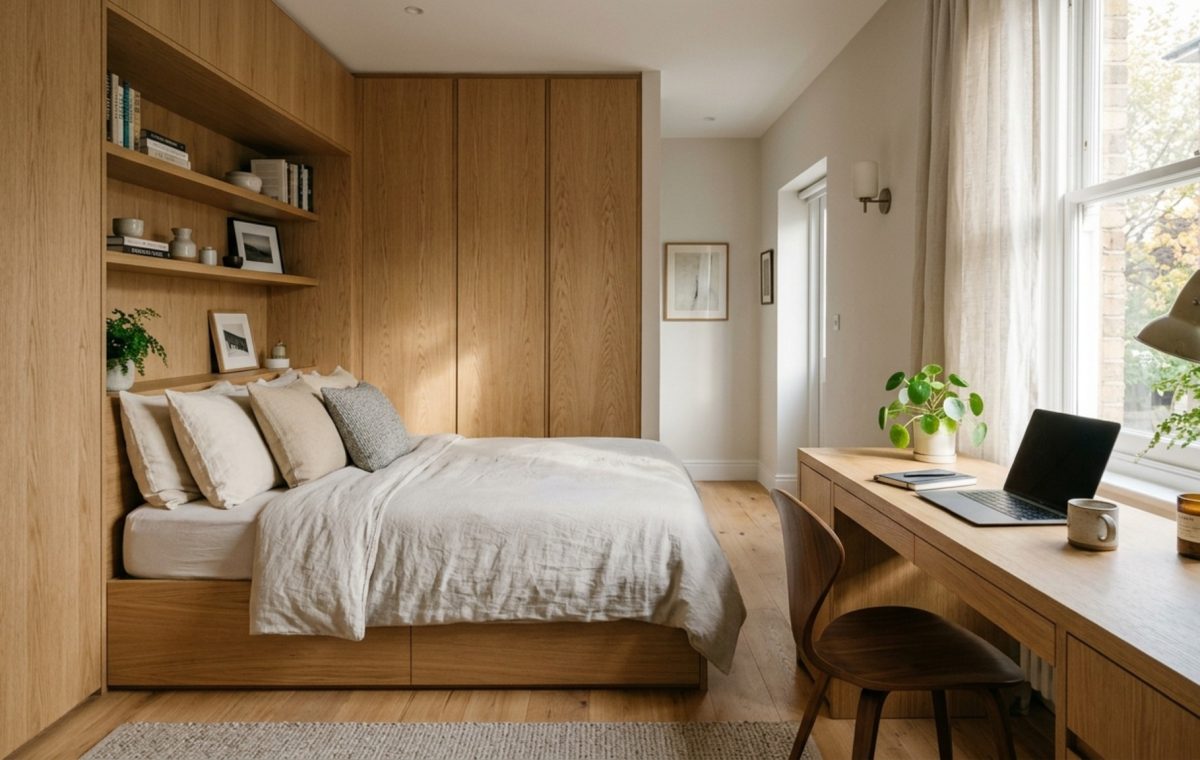
Consider the scene above: a masterclass in millwork where every square inch serves a dual purpose. The integration of a built-in daybed that transitions into a desk shelf eliminates the visual ‘noise’ of separate furniture legs. By using a monochromatic palette—think Benjamin Moore’s ‘Classic Gray’—the millwork recedes into the architecture, making the wall feel like a functional sculpture rather than a storage unit. Notice how the negative space above the furniture allows the eye to rest, preventing the common mistake of over-filling vertical planes just because they are available.
The Kinetic Home: Modern Interior Design Advice Ideas for Fluid Living
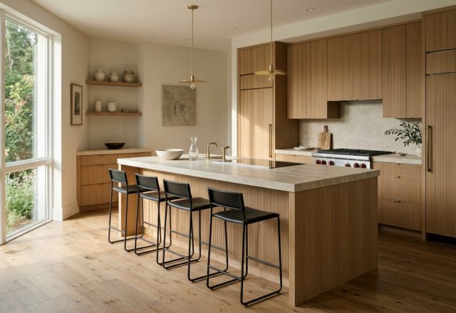
The modern home is no longer a static collection of rooms; it is a high-performance machine that must adapt from a workspace at 10 AM to a social hub at 8 PM. Achieving this fluidity requires modern interior design advice ideas that prioritize kinetic elements. We are seeing a massive shift toward ‘hidden kitchens’ and pocket-door pantries that allow utilitarian zones to disappear when not in use. This isn’t just about minimalism; it’s about the psychological relief of closing a door on the day’s clutter. When a kitchen island can serve as a prep station, a dining table, and a desk, the ergonomics must be flawless. A standard counter height of 36 inches works for prep, but if you intend to use it for extended periods of work or dining, the overhang for stools must be at least 12 inches to accommodate knee clearance.
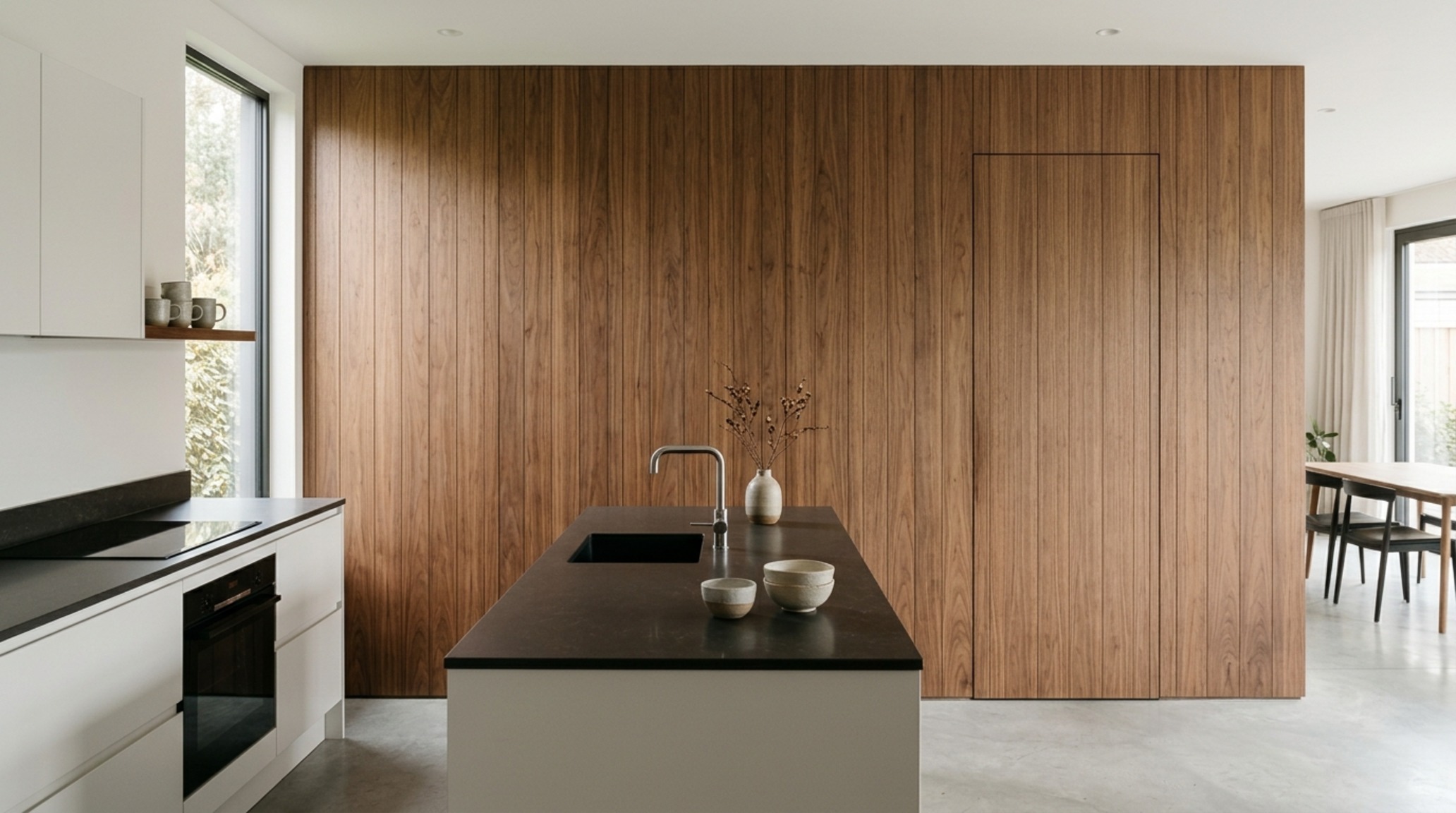
In the architectural vignette shown, the use of a pivot door disguised as a library wall exemplifies this kinetic approach. The seamless integration allows for a private home office to exist within a larger living area without the visual disruption of a standard door frame. This level of craftsmanship relies on flush-mount hardware and shadow-gap detailing, ensuring that when the door is closed, the spatial cadence remains unbroken. The materiality here—oiled walnut and blackened steel—provides a grounding weight that feels permanent, even though the space is inherently flexible.
Tactile Grounds: Luxury Interior Design Advice Textures and Materiality
Luxury is often mistaken for opulence, but in the realm of high-end design, luxury is actually the presence of thoughtful texture. It’s the way light hits a hand-plastered wall compared to a flat-painted one. Integrating luxury interior design advice textures means layering materials that invite touch and evoke a sense of permanence. Think of a ‘honed’ versus a ‘polished’ finish on a marble countertop; the honed surface feels softer, more organic, and hides the inevitable wear of a life well-lived. Designers often use the ‘rule of three’ for textures: one hard (stone or metal), one soft (bouclé or velvet), and one organic (wood or woven jute). This trifecta ensures that a room feels balanced and multi-dimensional rather than flat and clinical.
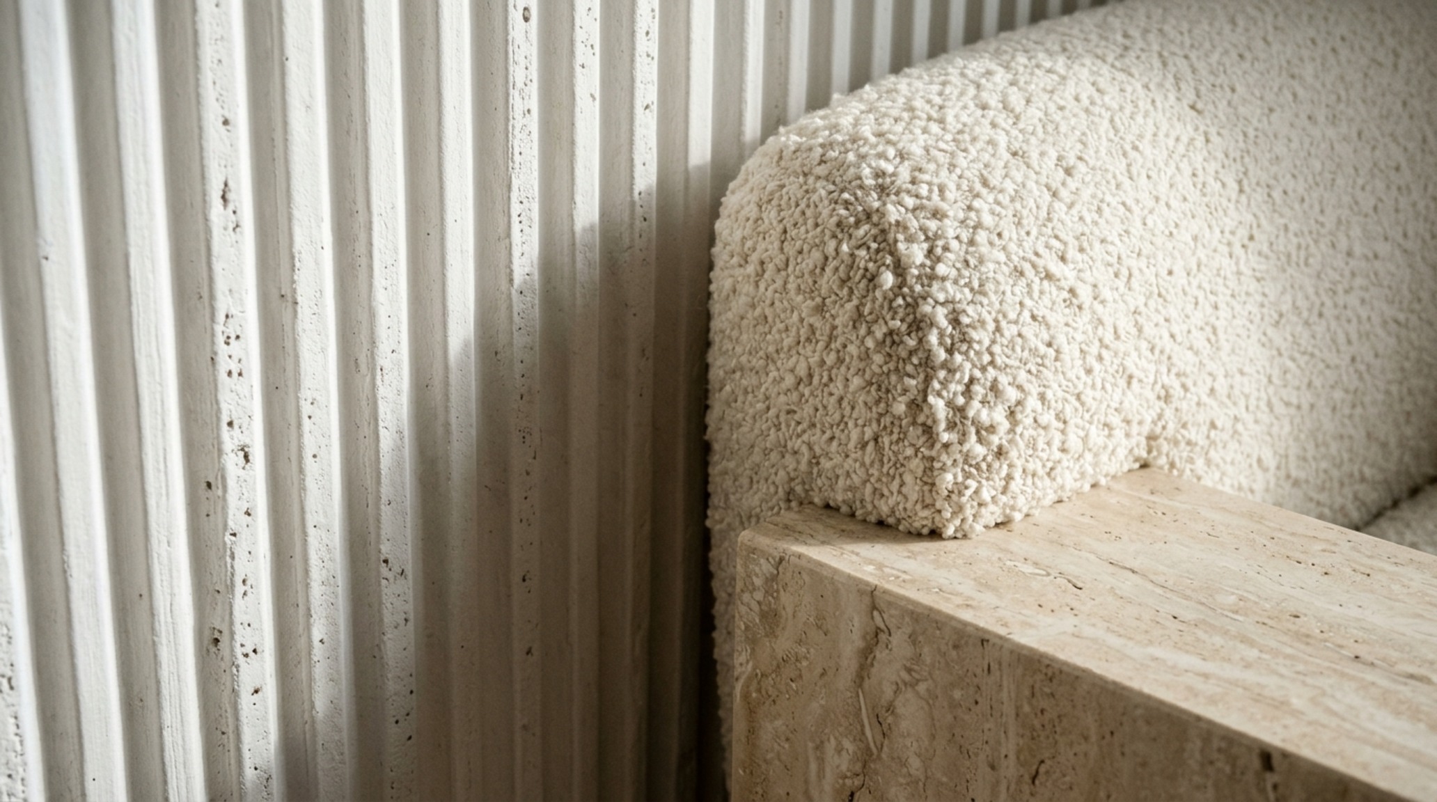
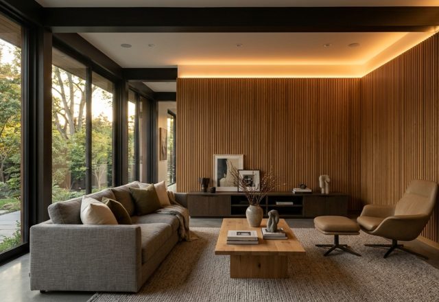
The tactile composition pictured illustrates how a monochromatic room can feel incredibly rich through material variation alone. A fluted white oak wall panel provides a rhythmic shadow play that changes throughout the day as the sun moves. Paired with a low-slung sofa in a heavy-weight linen and a rug with a subtle high-low pile, the space feels curated and intentional. The absence of bold color is replaced by the ‘visual weight’ of these surfaces. To replicate this, look for paints with a high solids content or lime-wash finishes like those from Portola Paints, which add a velvety depth that standard latex simply cannot achieve.
Illuminated Volumes: An Interior Design Advice Lighting Guide for Spatial Depth
Lighting is the most powerful tool in a designer’s kit, yet it is frequently the most misunderstood. A single overhead light source is the fastest way to flatten a room and make it feel institutional. A comprehensive interior design advice lighting guide always starts with ‘layering.’ You need three distinct layers: ambient (the overall glow), task (focused light for reading or cooking), and accent (lighting that highlights art or architecture). For a residential setting, the ‘golden rule’ is a color temperature of 2700K. This mimics the warm, inviting glow of a sunset or candlelight. Anything above 3000K starts to feel blue and sterile, which can disrupt your circadian rhythm and make even the best-designed room feel cold.
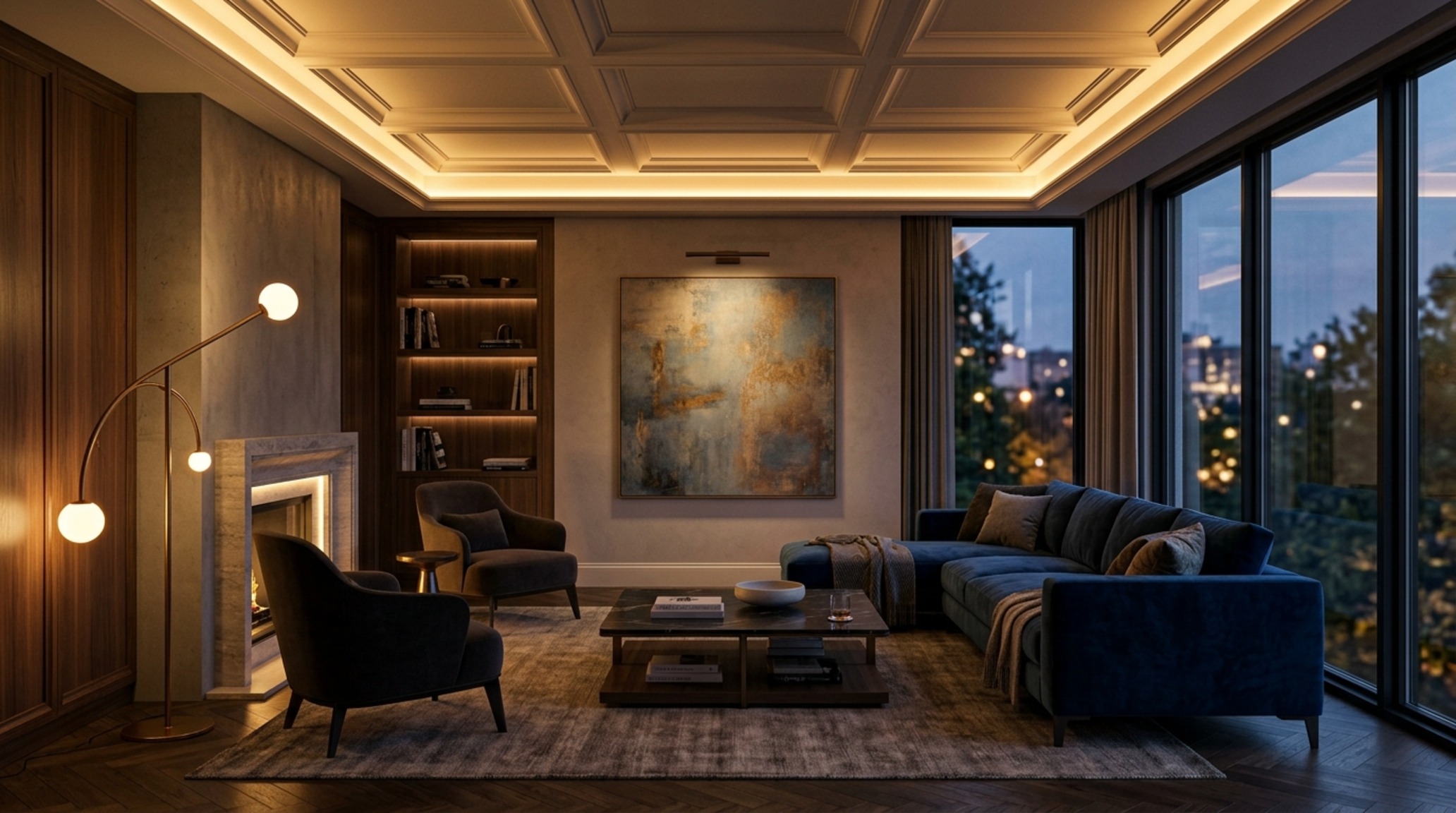
Observe the way the architectural lighting in the preceding image defines the volume of the space. Instead of a grid of recessed ‘cans’ in the ceiling, the designer has used integrated LED tape in a ceiling cove to wash the walls with light. This ‘wall washing’ technique pushes the boundaries of the room outward, making it feel larger. Task lighting is provided by a sculptural floor lamp that also acts as a visual anchor for the seating group. High Color Rendering Index (CRI) ratings of 90+ are non-negotiable here; they ensure that the colors of your fabrics and art look as true under artificial light as they do in the noon-day sun.
The Spatial Ledger: Ergonomics and the Art of the Reach
Beyond the visual, ergonomics is about the ‘reach.’ How far do you have to lean to set down a glass of water? The ideal distance between a sofa and a coffee table is 18 inches. This is close enough to be functional but far enough to allow for easy leg movement. Similarly, the height of a side table should be within two inches of the sofa arm. When these measurements are off, the room feels ‘jittery’—your body subconsciously senses the awkwardness even if your eye doesn’t immediately spot it. Professional interior design advice often focuses on these micro-adjustments because they are the difference between a house that looks like a showroom and a home that feels like a refuge.
Storage is the final frontier of ergonomic mastery. The most effective storage is that which is ‘de-centralized.’ Rather than one massive closet, integrate small pockets of storage where the items are actually used. A shallow 12-inch deep cabinet in an entryway is enough for mail, keys, and tech charging, whereas a deep closet would just become a dark abyss of lost items. By utilizing ‘dead space’—the areas under benches, the tops of wardrobes, or the niches between wall studs—you can maintain a minimalist aesthetic without sacrificing the necessities of modern life.
Tactile Finishes, Color Codes & Spatial Ledger
Architectural breakdown detailing authentic surfaces, paint references, and standard circulation clearances.
Ultimately, the most resonant spaces are those that honor the human form. Whether you are navigating a 500-square-foot studio or a sprawling estate, the principles of ergonomic mastery remain the same. It is a commitment to the quiet details—the 1.5-inch countertop overhang, the perfectly dimmed 2700K bulb, the soft friction of a linen curtain against a limestone floor. True interior design advice isn’t about telling you what to buy; it’s about teaching you how to see. It is an invitation to inhabit your home with intention, ensuring that every object and every measurement supports the life you wish to lead within those walls. As the sun sets and the architectural shadows lengthen, a well-designed room doesn’t just look beautiful; it feels like an exhale.
Editorial Silo • Recommended Architecture Studies
- Garden Decoration Ideas: The Architectural Blueprint & Spatial Flow Guide — Archival Design Case Study
- Ergonomic Mastery: Functional & Space-Saving Hacks for Wall Panels Interior Design — Archival Design Case Study
Modern Spatial Living Lookbook
Architectural studies focusing on material integrity, natural light articulation, and serene proportions.
Curated Visual Lookbook
Design Gallery & Spatial Studies
A visual curation of architectural arrangements, lighting concepts, and material palettes featured in this space.