CURATORIAL CRITIQUE & DESIGN ANTHOLOGY
When we examine the evolution of the modern residential sanctuary, we observe a definitive shift from the purely ornamental to the rigorously structural. For too long, the design industry relied on surface-level aesthetics to mask fundamental spatial failures in compact floor plans. However, today’s most astute architectural interventions prioritize the reclaimed floor plane and the precision of the footprint. Modern small bathroom solutions are no longer merely about choosing the right towel rack; they are about re-engineering the very skeleton of the room to achieve a sense of expansive, unencumbered flow. It is a transition from ‘decorating a box’ to ‘sculpting a void,’ where every millimeter of clearance is a calculated victory for human movement.
The challenge of the constrained footprint is, in reality, a gift of focus. By removing the luxury of excess square footage, we are forced to confront the essential. This editorial exploration moves beyond the superficial to address the core architectural geometry of the home’s most private space. We are looking at the ‘Structural Sweep’—a methodology that treats the bathroom as a high-precision puzzle where linear fixture alignment and visual weightlessness reclaim the floor plane from the clutches of traditional, bulky cabinetry.
The Linear Alignment: Engineering the Path of Travel
In a standard 5×8 guest bath, the greatest thief of space is often the erratic placement of plumbing. When the sink, toilet, and shower are scattered across different walls, the ‘path of travel’ becomes a jagged zig-zag. By re-engineering the space to place all major plumbing on a single ‘wet wall,’ we create a clear, unobstructed sightline from the threshold to the far wall. This architectural precision allows for a 36-inch standard walkway—the gold standard for comfortable residential circulation—even in rooms that technically shouldn’t allow for it.
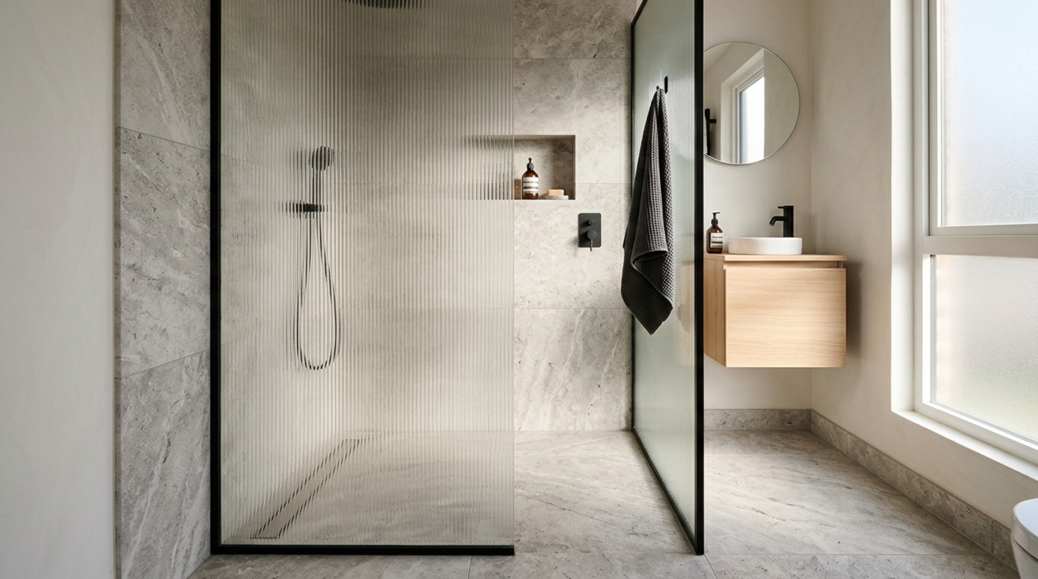
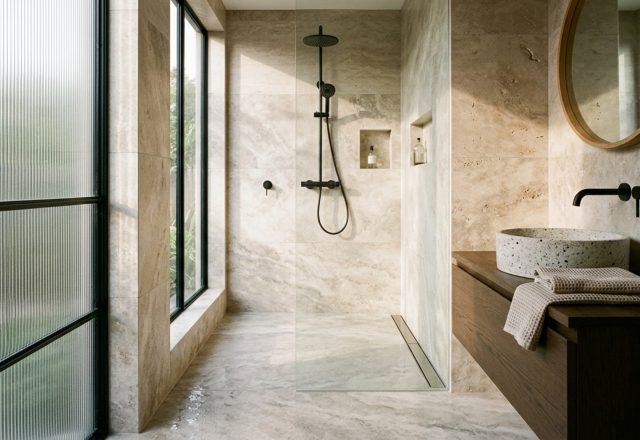
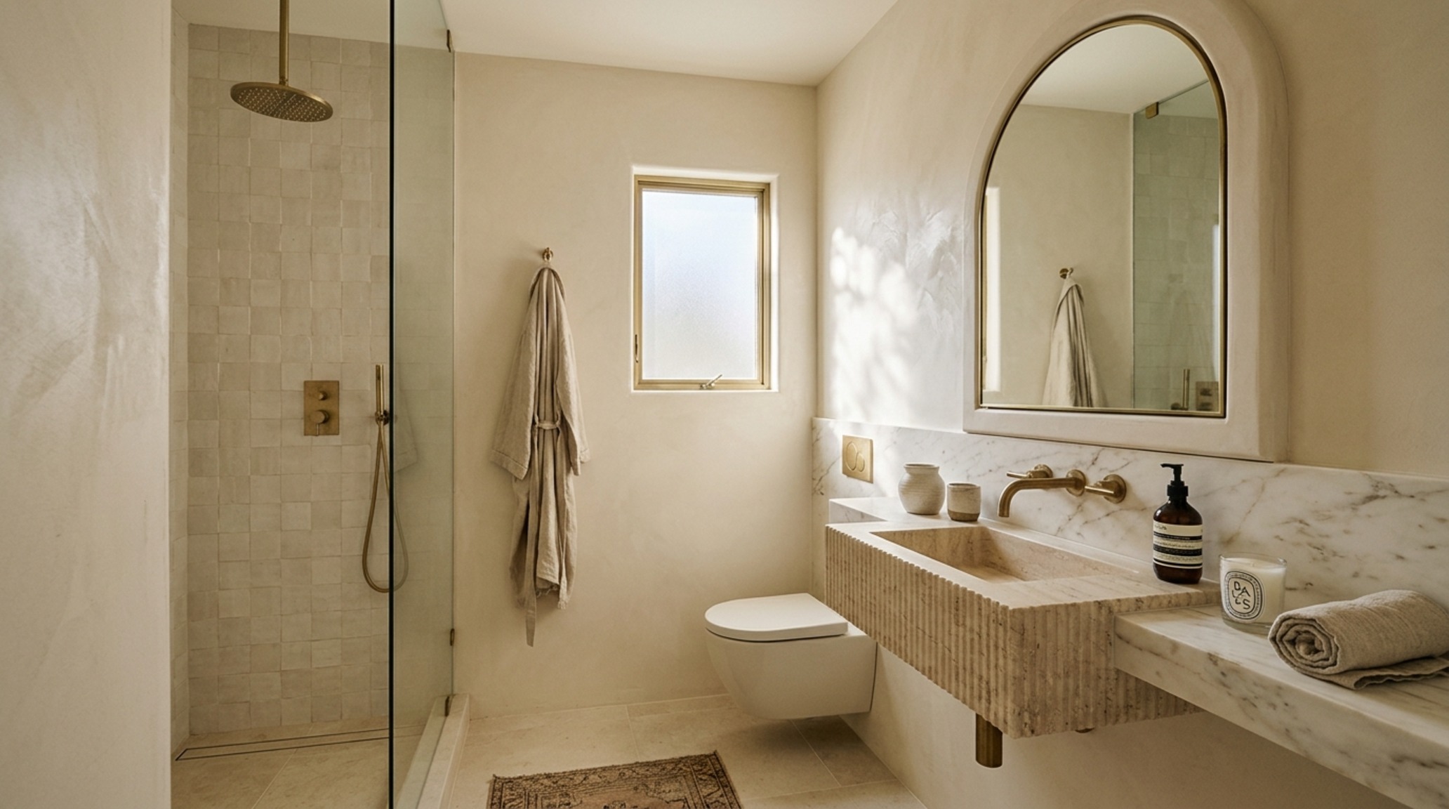
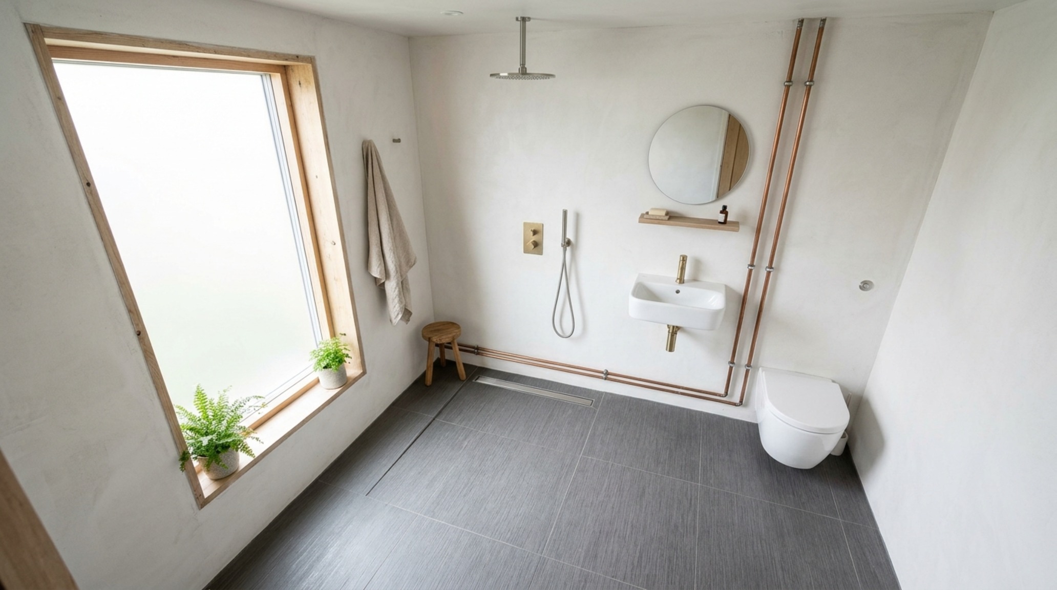
Notice how the linear drain in the image above disappears into the floor plane. This isn’t just an aesthetic choice; it’s a structural one. By aligning the shower entrance with the main floor level, we eliminate the visual and physical ‘trip hazard’ of a traditional curb. This continuity of material—perhaps a honed Silver Shadow Travertine—tricks the eye into perceiving the shower floor as an extension of the main room, effectively adding three to four linear feet to the room’s visual depth. This is the foundation of wet room conversions for tiny spaces, a strategy that prioritizes the unobstructed floor.
Wet Room Conversions for Tiny Spaces: Erasing the Threshold
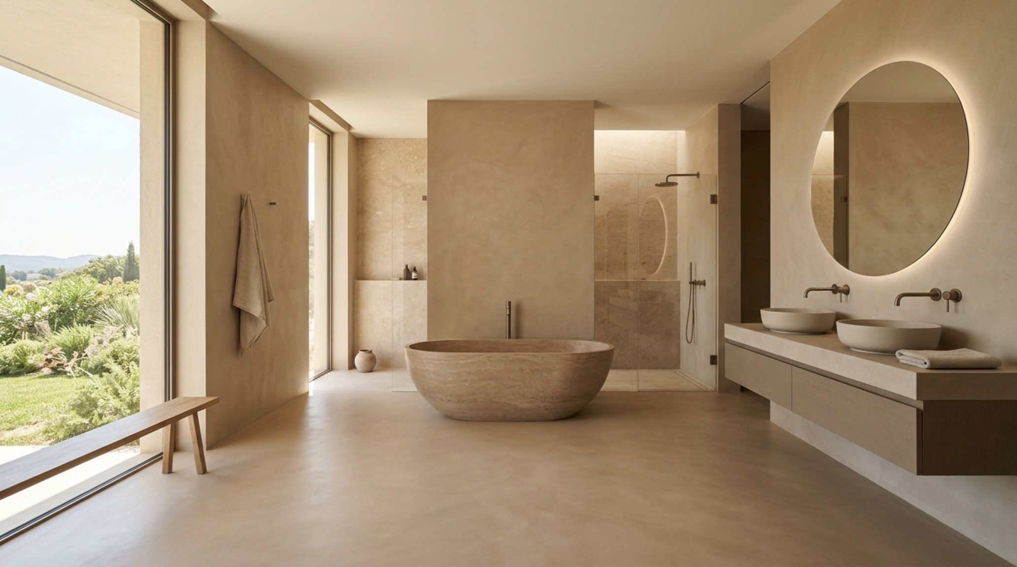
The traditional tub-shower combo is a volumetric behemoth. It consumes roughly 15 square feet of floor space and acts as a massive visual block. To re-engineer this, we look toward the European wet room model. By waterproofing the entire room and utilizing a subtle 1.5% floor slope toward a hidden linear drain, we can remove glass partitions entirely or replace them with a single, fixed fluted glass panel. This removal of the ‘enclosure’ allows the light—ideally a soft 2700K ambient glow—to wash across the entire space without being interrupted by metal frames or thick acrylic walls.
When we discuss small bathroom solutions in this context, we are talking about ‘visual breathability.’ The absence of a curb means the tile grid remains unbroken. Designers often reach for 12×24 or 24×48 large-format tiles in these scenarios to minimize grout lines. Fewer grout lines mean less visual noise, allowing the eye to sweep across the room without ‘stuttering’ on the grid. It is the architectural equivalent of a deep, calming breath.
Floating Vanities for Small Bathrooms: Opening Sightlines & Floor Plane
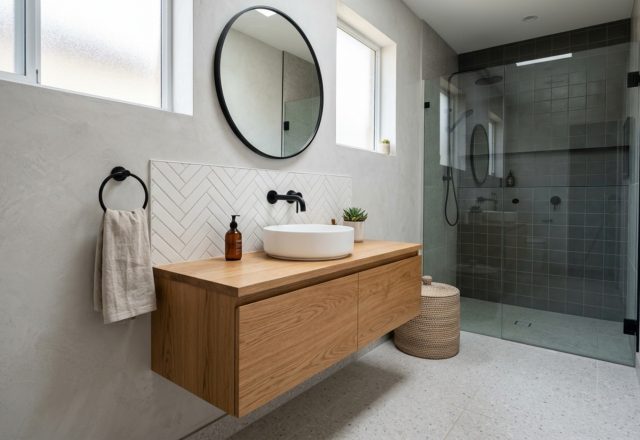
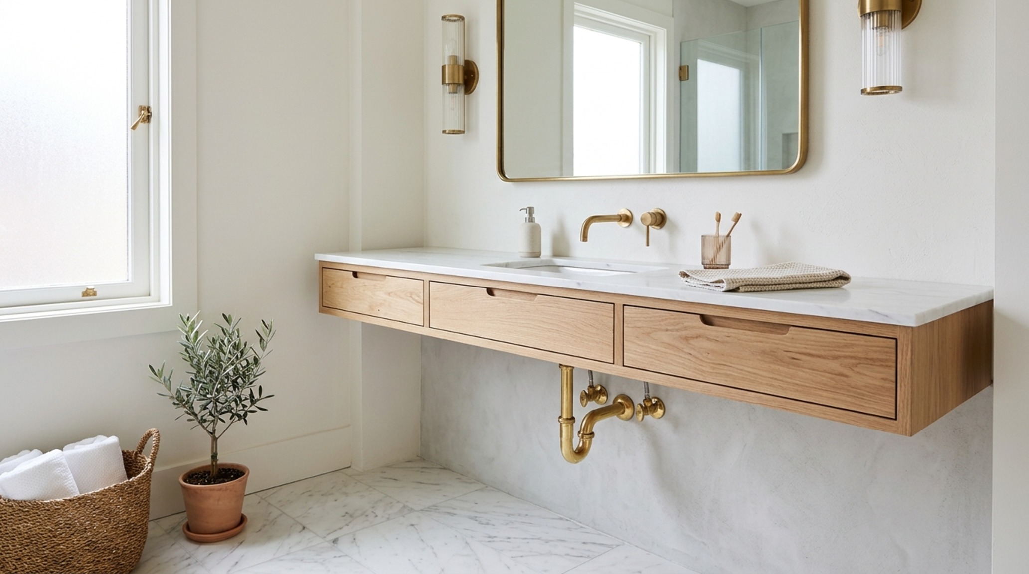
Weight is a psychological construct in interior design. A vanity that sits flush on the floor feels heavy; it anchors the space and defines a hard boundary. Conversely, a wall-hung unit creates a pocket of ‘negative space’ underneath that the eye interprets as additional floor area. This is where floating vanity storage ideas become transformative. By mounting a custom white oak vanity 12 inches off the floor, we expose the tile all the way to the wall, extending the room’s perceived footprint by several inches.
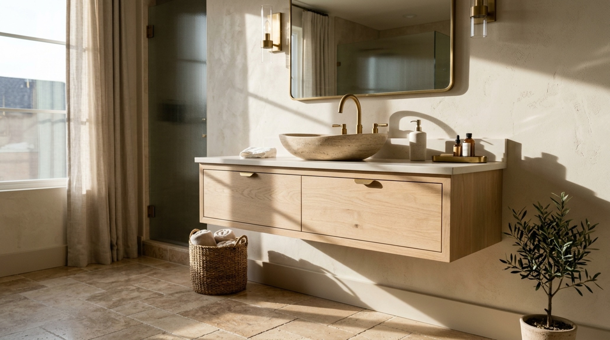
In the architectural study shown above, the vanity is not just a cabinet; it is a cantilevered sculpture. To maintain the ‘visual weightlessness,’ we often specify concealed p-traps and bottle traps in a matching finish—perhaps a soft tumbled brass. This attention to technical detail ensures that even the utility of the sink doesn’t disrupt the spatial cadence. When the floor is visible, the room feels larger. It’s a simple rule of geometry that yields massive dividends in a tight environment.
Wall-Hung Toilet Clearance Guide: The Tech of the Tank
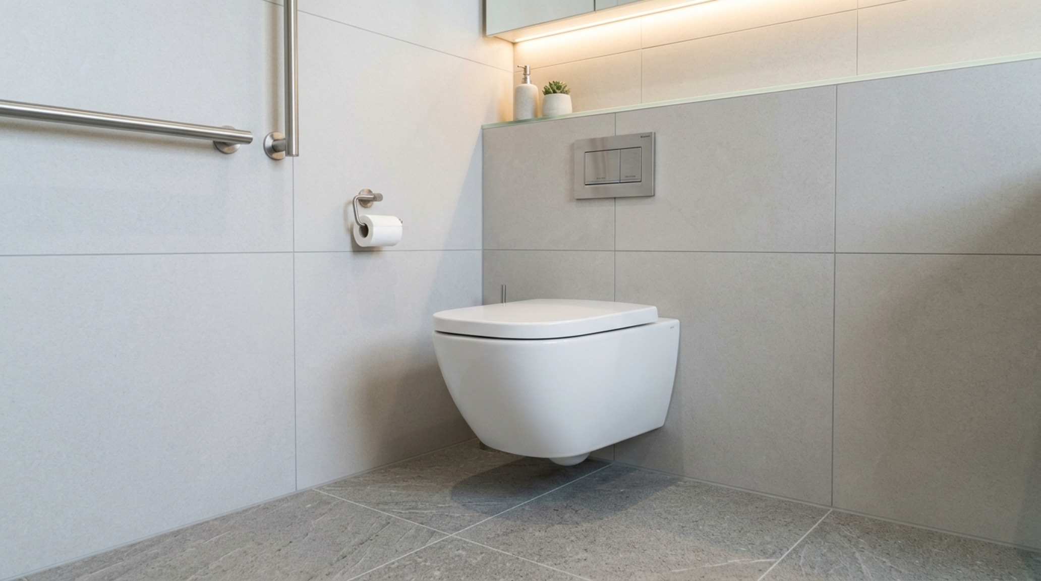
Perhaps the most underutilized tool in the architect’s kit for small spaces is the in-wall tank system. Traditional floor-mounted toilets occupy a significant amount of ‘footprint real estate,’ often extending 28 to 30 inches from the wall. By moving the tank into the 2×4 or 2×6 stud bay, we can save up to 10 inches of floor space. Following a wall-hung toilet clearance guide, we aim for a 15-inch centerline distance from any sidewall or obstruction, ensuring the 30-inch total clearance required for code while maximizing the remaining room for the primary circulation path.
This structural intervention allows the toilet to ‘float’ alongside the vanity. Beyond the ease of cleaning, this maintains the ‘unbroken floor’ philosophy. When the eye can see the transition where the floor meets the wall across the entire length of the room, the brain registers the space as being wider than its physical dimensions. We are essentially hacking the human perception of volume through architectural precision.
Architectural Details & Spatial Cadence
The materiality we choose must support this structural rigor. I often specify a monochromatic bathroom color palette to further blur the boundaries between planes. Consider a soft, parchment-like tone such as Benjamin Moore Swiss Coffee (#F1EFE2) or the earthy depth of Farrow & Ball Setting Plaster (#E9D3C6). When the walls, ceiling, and even the cabinetry share a similar value on the grayscale, the corners of the room seem to recede. We are no longer looking at a box; we are looking at a cohesive, atmospheric envelope.
“Design is not just what it looks like and feels like. Design is how it works—especially when you are fighting for every millimeter in a high-density urban environment.”
To ground these light tones, we look to tactile grounding. A vanity top in honed Carrara marble or a textured zellige tile backsplash provides the ‘hand-feel’ that makes a space feel high-end rather than clinical. We pair these with lighting specs that mimic natural daylight: a high CRI of 90+ ensures that skin tones look natural in the vanity mirror, while 3000K task lighting provides the necessary precision for grooming without the cold, blue flicker of lower-quality LEDs.
Maximizing Vertical Space in Bathrooms: The Recessed Utility
In a small bathroom, every wall is an opportunity for ‘recessed utility.’ Rather than adding protruding shelves that clutter the sightlines, we carve into the architecture. Recessed medicine cabinets, deep shower niches, and even built-in shelving between the studs allow for storage that is ‘flush’ with the wall. This is the hallmark of maximizing vertical space in bathrooms—storage that doesn’t steal from the room’s air volume.
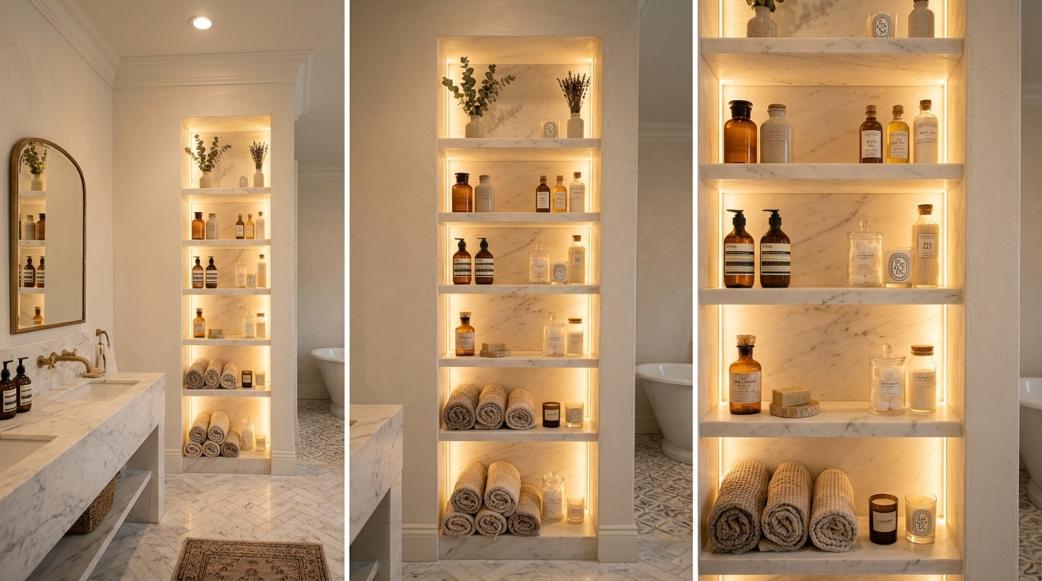
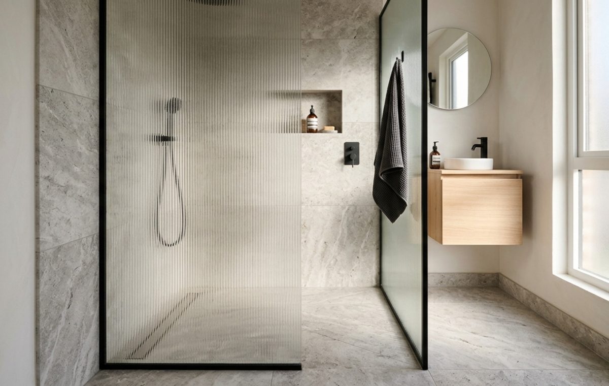
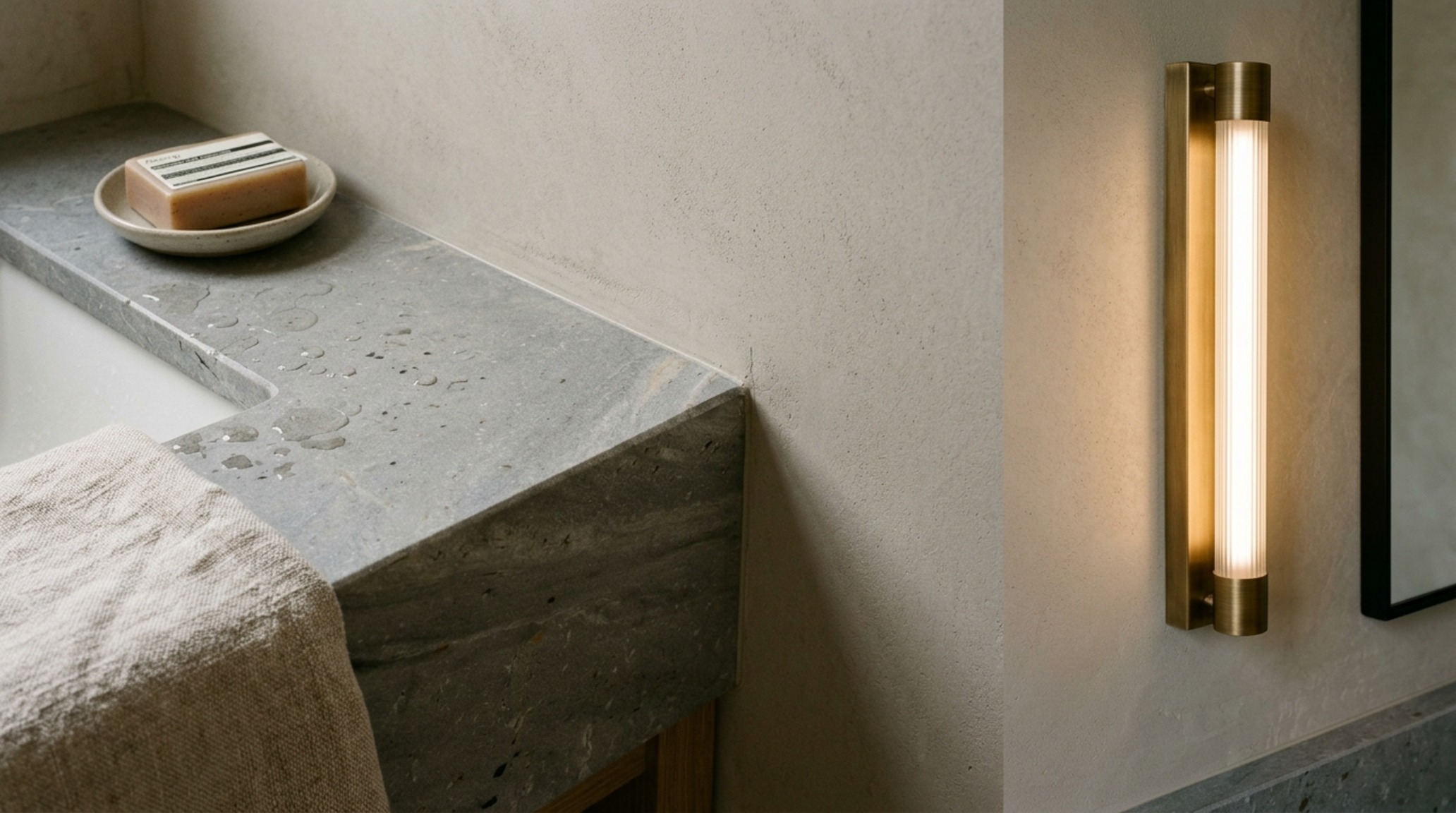
As illustrated in the visual narrative above, the recessed niche in the shower is more than a place for shampoo. It is an architectural feature, often lined with a contrasting material like a fluted stone or a metallic trim. It draws the eye upward, emphasizing the ceiling height—another crucial trick for small spaces. When we encourage the eye to move vertically, we distract it from the horizontal limitations of the room. This ‘upward sweep’ is complemented by tall, slim mirrors or vertical sconces that elongate the walls.
The Luxury of the Exact: Material Selection & Precision
When the square footage is limited, the quality of the material becomes the focal point. We look for ‘honest’ materials—stone that feels like stone, wood with a visible grain, and metals that will patina over time. In luxury small bathroom design, the ‘luxury’ isn’t about size; it’s about the precision of the joinery and the thoughtfulness of the transitions. A mitred edge on a stone countertop or a perfectly centered drain is the architectural equivalent of a bespoke suit. It fits perfectly because it was designed specifically for that one body of space.
We also consider the ‘reach’—the distance between the user and their essentials. In a well-engineered small bath, everything is within an 18-inch reach of the primary station. The towel bar is exactly where the hand falls; the soap niche is at elbow height; the lighting is angled to eliminate shadows on the face. This ergonomics-first approach ensures that the small space never feels ‘cramped,’ only ‘tailored.’
Architectural Materials, Swatches & Kelvin Index
Practical architectural ledger outlining surface materials, color values, and circulation dimensions.
True innovation in the home is rarely about adding more. Instead, it is about the sophisticated removal of barriers. When we approach small bathroom solutions through the lens of architectural precision, we transform a utility room into a masterclass in spatial efficiency. By reclaiming the floor plane, aligning the plumbing, and utilizing the vertical axis, we create a sanctuary that feels as expansive as it is intimate. The small bathroom is not a limitation; it is the ultimate canvas for a designer’s technical rigor and creative restraint—a quiet testament to the power of the perfectly placed line.
Editorial Silo • Recommended Architecture Studies
- Materiality and the Sensory Bath: Interior Design Ideas For Bathrooms & Curating Tactile Palettes for an Elevated Private Sanctuary — Archival Design Case Study
- Small Bathroom Design Ideas On A Budget: The Architectural Blueprint & Spatial Flow Guide — Archival Design Case Study
Contemporary Living Lookbook
High-resolution photography exploring proportions, organic textures, and spatial harmony.
Curated Visual Lookbook
Design Gallery & Spatial Studies
A visual curation of architectural arrangements, lighting concepts, and material palettes featured in this space.