Chroma-Architecture: Scaling Spatial Proportions Through Strategic Hue Selection
Historically, the application of interior color was often a rigid demonstration of status or a mere adherence to period-specific trends. In the heavy, velvet-laden drawing rooms of the Gilded Age, dark pigments were utilized to project a somber, expensive permanence. However, as we move deeper into 2026, the architectural community has undergone a radical shift toward a more cerebral, neuro-aesthetic approach. Understanding colors and their moods has evolved from a simple aesthetic choice into a precise structural tool—a way to manipulate the perceived volume of a floor plan without the invasive necessity of knocking down load-bearing walls. Today, the modern designer views a paint swatch not as a finishing touch, but as a primary building material that dictates spatial cadence and emotional resonance.
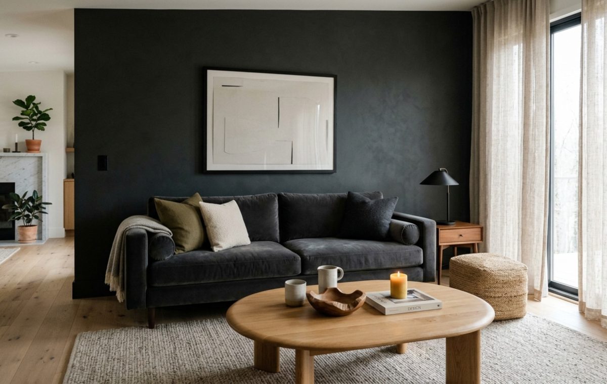
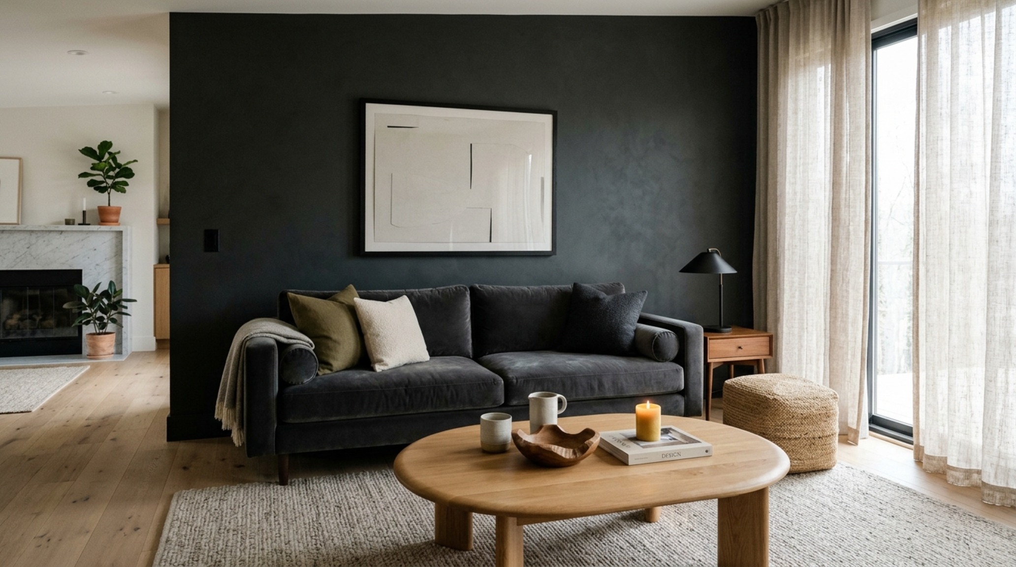
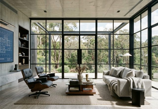
color psychology for modern living rooms featuring a deep charcoal accent wall and low-profile velvet seating with 18-inch coffee table clearance
Color Psychology for Modern Living Rooms: The Geometry of Emotion
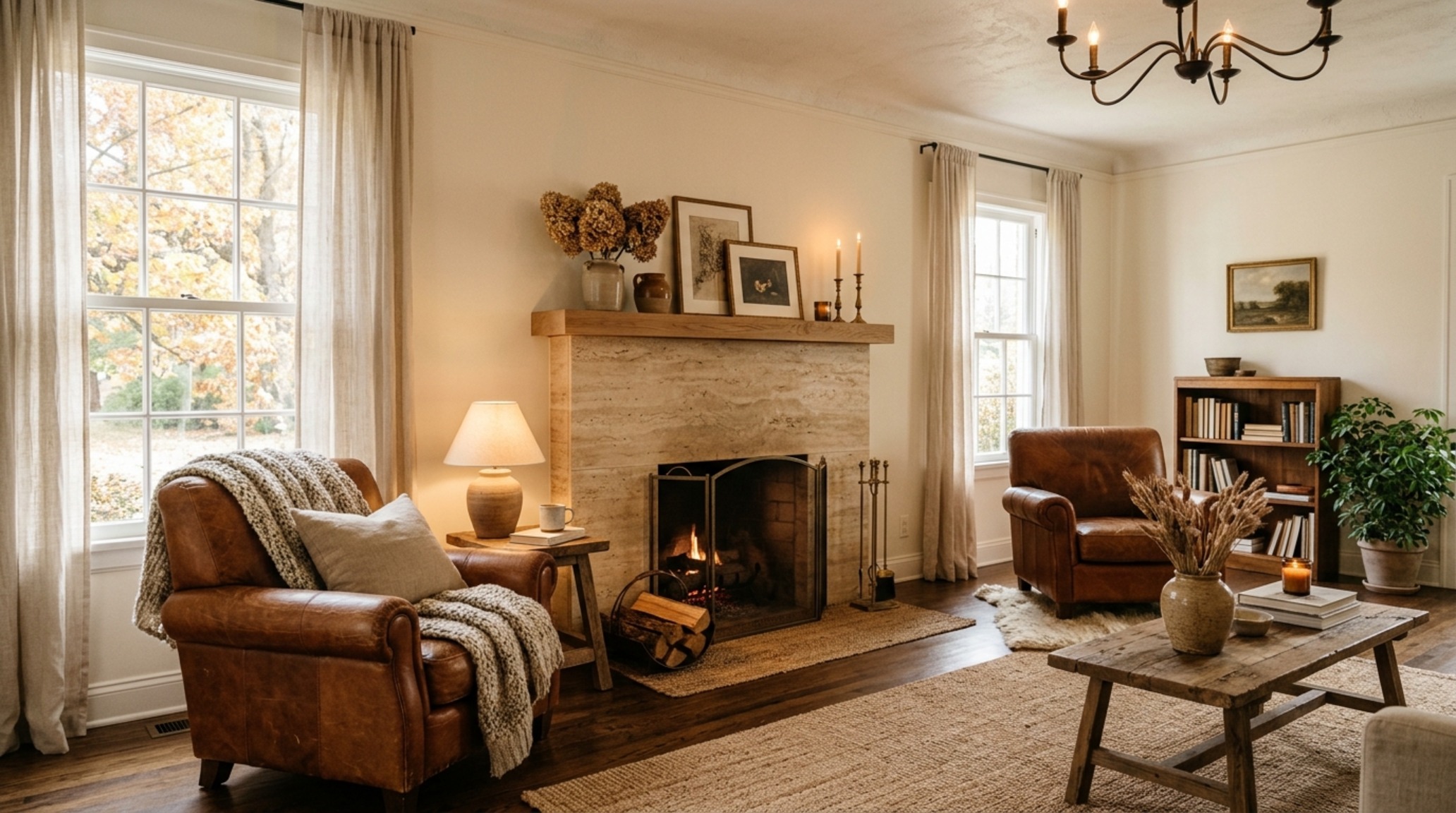
The living room serves as the psychological anchor of the home. It is a transitional space that must accommodate the high-energy social frequency of hosting while providing a low-stimulus environment for evening decompression. To achieve this balance, we look toward the intersection of saturation and Light Reflectance Value (LRV). A living room wrapped in a low-LRV hue, such as Farrow & Ball’s Railings , doesn’t necessarily feel smaller; rather, it creates a sense of ‘enveloping intimacy.’ When walls and trim are saturated in the same dark tone, the corners of the room seem to dissolve, tricking the eye into perceiving an infinite boundary.
Conversely, for those looking to maximize the ‘negative space breathing room,’ the architectural strategy involves utilizing advancing and receding colors. Warm tones—terracottas, ochres, and soft corals—tend to advance, making a large, cavernous room feel more grounded and tactile. On the other hand, cool tones like misty grays or pale ceruleans recede from the viewer. This is a critical tactic when addressing the proportions of a narrow living area. By painting the shorter end walls in a slightly darker, warmer tone and the longer side walls in a cooler, lighter shade, you effectively ‘square off’ an awkward rectangular layout, improving the overall spatial flow and sightline alignment.
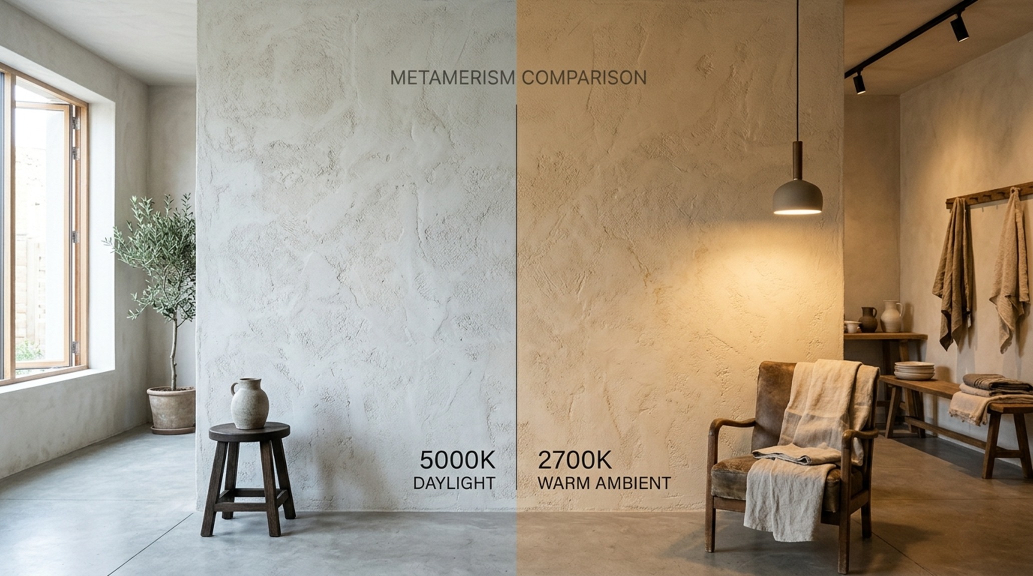
impact of lighting on paint colors showing the shift from 5000K daylight to 2700K warm evening glow on a neutral limestone-washed wall
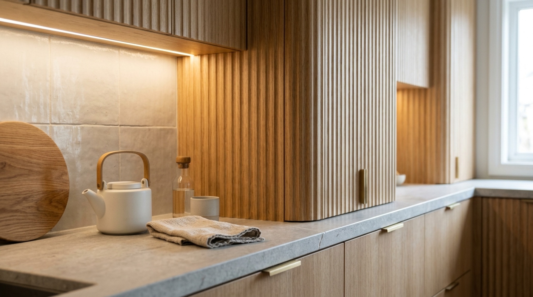
One of the most frequent failures in professional interior design is the neglect of Kelvin temperatures and their transformative effect on pigments. A shade that appears as a crisp, gallery-white in the 5000K daylight of a showroom can shift into a sickly, yellowed parchment under 2700K residential incandescent lighting. This phenomenon, known as metamerism, is why understanding the impact of lighting on paint colors is non-negotiable for a cohesive design. For a modern interior, we typically recommend a High CRI (Color Rendering Index) of 90 or above, paired with 3000K lighting for task areas and 2700K for ambient zones. This ensures that the deep plums or forest greens you’ve selected maintain their intended ’emotional weight’ throughout the day cycle.
Natural light further complicates this architectural dance. North-facing rooms, which receive a consistent but cool, bluish light, require colors with a warm base—think ‘Swiss Coffee’ by Benjamin Moore—to prevent the space from feeling clinical or cold. South-facing rooms are blessed with intense, warm light, allowing for the use of cooler pigments like sage or pale lavender that might otherwise feel too ‘icy’ in darker settings. By aligning your palette with the sun’s trajectory, you stabilize the colors and their moods , ensuring the room remains a sanctuary from dawn until dusk.
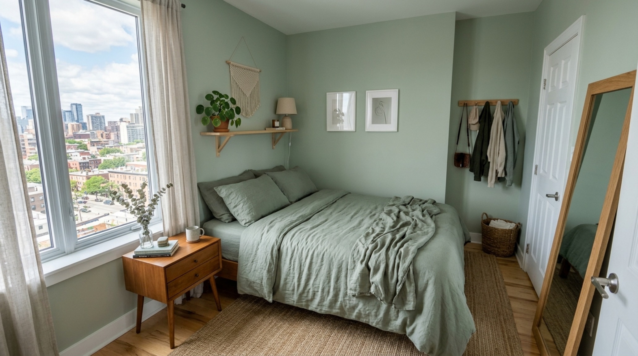
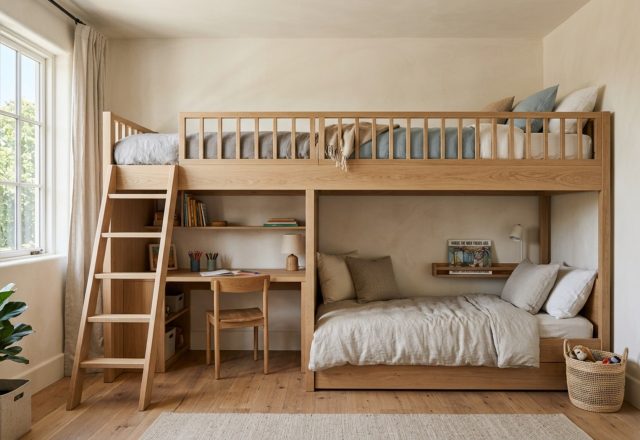
best colors for relaxation in small apartments using soft sage green walls and monochromatic linen bedding to expand a compact bedroom layout
Best Colors for Relaxation in Small Apartments: Receding Walls and Breathable Corners
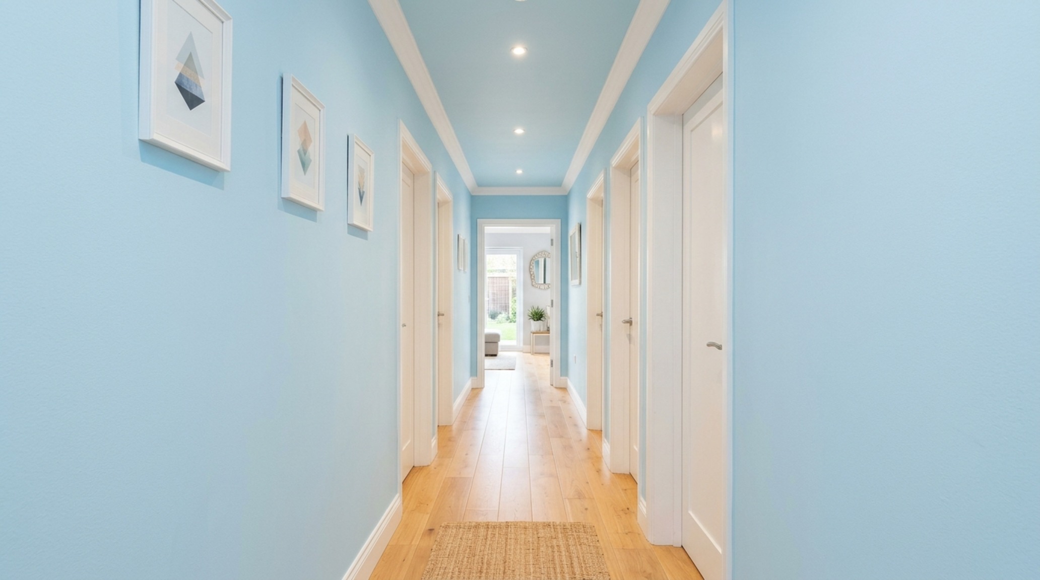
In urban environments like Semarang or New York, where square footage is a premium commodity, the goal is often ‘visual expansion.’ The best colors for relaxation in small apartments are those that mimic the atmospheric perspective found in nature. Soft, desaturated greens and blues mimic the horizon line, which naturally encourages the eye to look ‘through’ the walls rather than ‘at’ them. This creates a psychological sense of relief, essential for high-density living where the physical environment can often feel claustrophobic.
Architecturally, we can enhance this effect through monochromatic layering. By using varying textures—a matte wall finish, a silk rug, and a linen sofa—all within the same tonal family (for instance, a range of warm stones and oatmeals), you eliminate visual clutter. In a small apartment, every high-contrast transition acts as a visual ‘speed bump’ that makes the room feel choppy. A seamless, low-contrast transition allows the eye to glide across the space, creating an uninterrupted spatial cadence that feels significantly larger than the actual 36-inch standard walkway clearances would suggest.
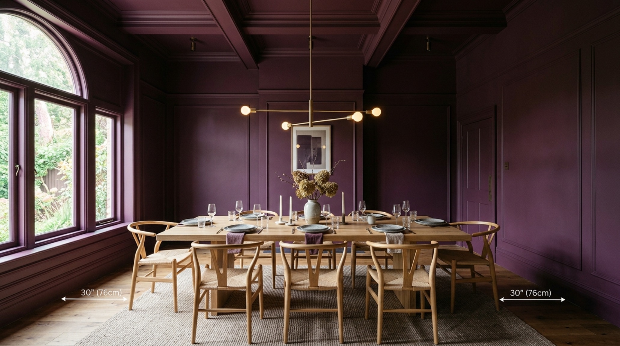
how color affects mood in a room illustrated by a high-ceilinged dining area with color-drenched deep plum walls and a natural wood table
How Color Affects Mood in a Room: A Study in Spatial Volume
The neuro-aesthetic response to a space is often dictated by its perceived ‘heaviness.’ Ceilings are a prime example of missed architectural opportunity. We are conditioned to paint them white, but by extending the wall color up onto the ceiling—a technique known as ‘color drenching’—you remove the horizontal line that defines the height of the room. This is how how color affects mood in a room on a structural level; it removes the ‘lid’ from the box. In a bedroom, a dark, drenched ceiling in a shade like ‘Hague Blue’ can simulate the night sky, triggering the production of melatonin and facilitating deeper circadian alignment.
In high-traffic zones like the kitchen or dining area, the use of color serves as a navigational tool. We use ‘spatial grounding’ to define areas within an open-concept plan. A kitchen island painted in a deep charcoal against a backdrop of white cabinetry creates a central ‘anchor’ that dictates the flow of movement. It provides a visual destination, making the act of navigating the 30-inch dining chair clearances feel intentional rather than cramped. This strategic placement of high-contrast ‘weight’ is what separates a professional layout from a generic one.
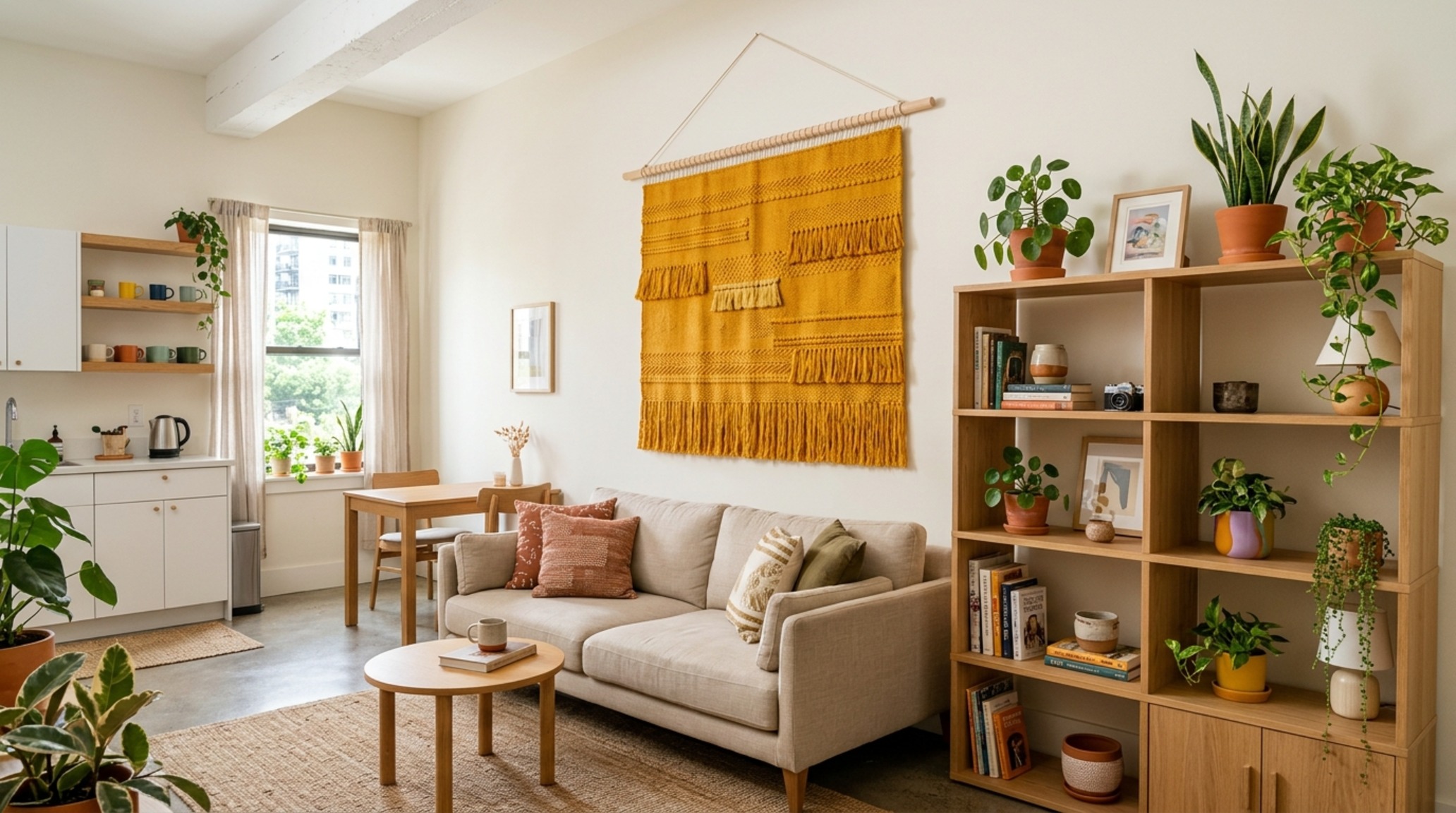
renter-friendly mood-boosting palettes showcased through large-scale ochre textile art and modular oak shelving in a bright open-plan studio
Renter-Friendly Mood-Boosting Palettes: Visual Anchors without the Commitment
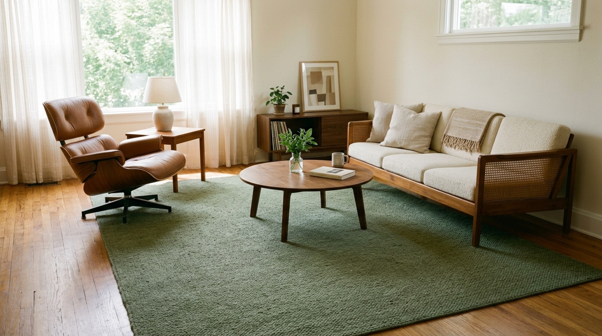
For many modern dwellers, permanent alterations are not an option. However, the renter-friendly mood-boosting palettes can be achieved through ‘mobile architecture.’ This involves using large-scale textiles, modular shelving, and oversized art to introduce the necessary pigments. A 9×12 area rug in a calming sage green can serve as the entire foundation for a room’s mood, effectively ‘painting’ the floor plane without a drop of pigment touching the hardwood.
Lighting also plays a critical role for renters. If you cannot change the wall color, changing the lampshades to a warmer linen or a cooler parchment can tint the entire room. Integrating smart bulbs that allow for ‘circadian tuning’—shifting from 4000K energizing light in the morning to 2200K amber light in the evening—is perhaps the most effective way to manage colors and their moods in a non-permanent capacity. It allows the space to morph alongside your biological needs, proving that great design is less about the lease and more about the light.
Emotional Response to Interior Design Hues: The Neuro-Design Connection
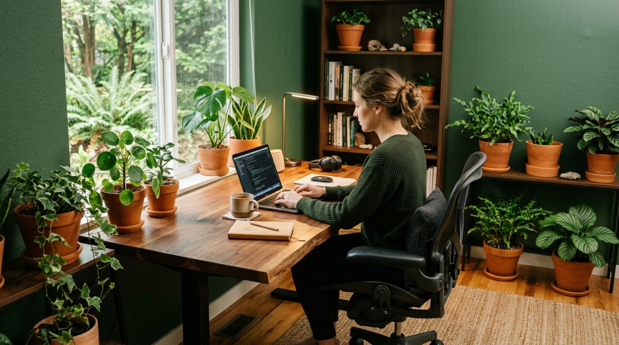
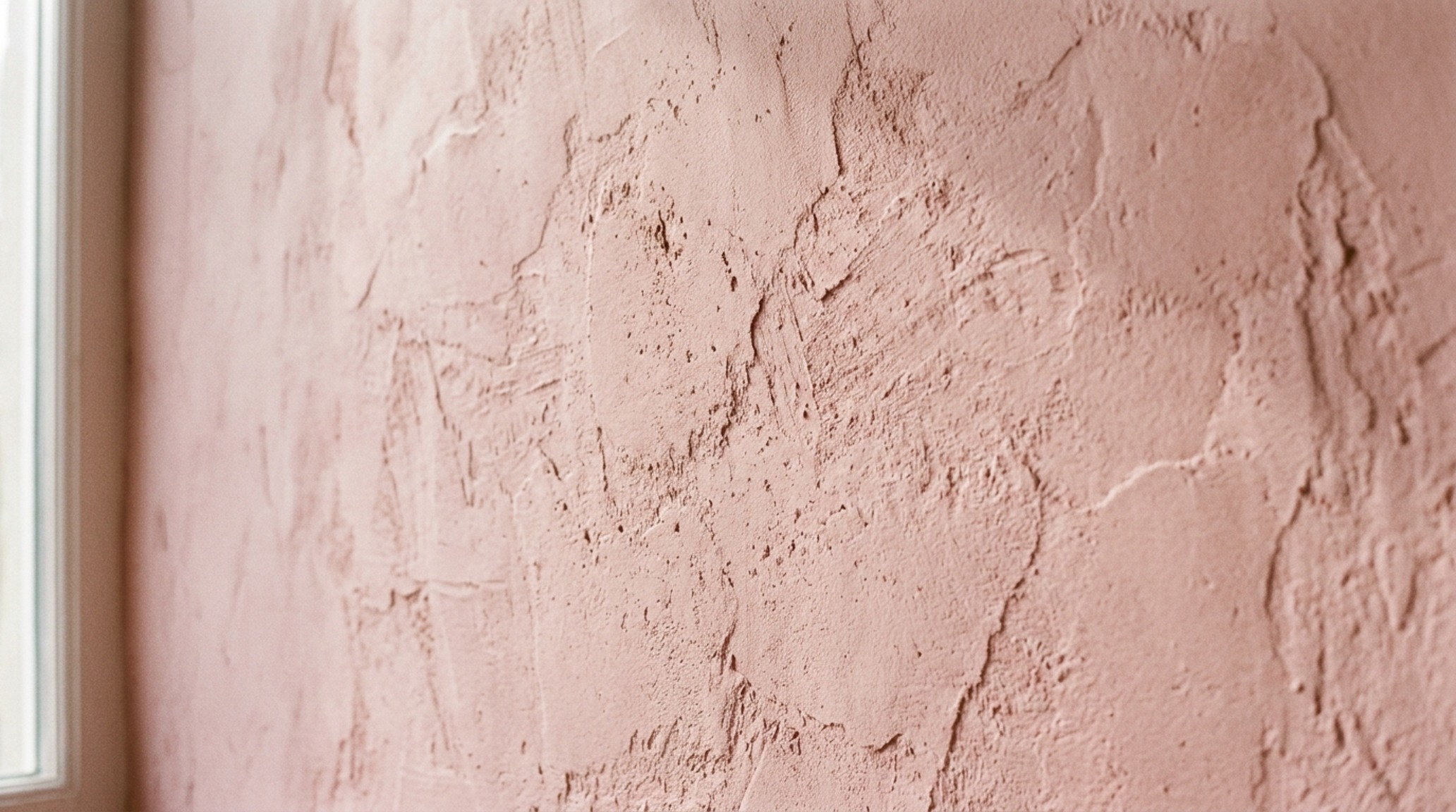
Ultimately, our emotional response to interior design hues is rooted in evolutionary biology. We find comfort in ‘biophilic’ colors—those that occur naturally in healthy ecosystems. Deep greens signify life and water; soft browns signify earth and stability; pale blues signify a clear, safe sky. When we bring these tones indoors, we aren’t just decorating; we are creating a habitat that satisfies an ancient need for security and calm. This is why a sterile, all-white room can often lead to ‘design fatigue’ or a sense of unmoored anxiety; it lacks the tactile grounding and visual ‘resting spots’ that a curated palette provides.
Comprehensive Material & Proportions Schedule
Key material specifications, color codes, lighting kelvin, and ergonomic clearances.
Color Swatches & Hex
#EAE6DF Swiss Coffee, #4A5568 Railings Slate, #D6C7B2 Setting Plaster
Core Tactile Materials
Fluted White Oak, Honed Travertine Stone, Belgian Linen
Atmospheric Lighting
2700K Soft Amber, 92+ CRI, Dimmable LED Integrated
Spatial Proportions
36″ Walkways, 18″ Coffee Reach, 30″ Dining Clearance
The future of residential architecture lies not in the expansion of physical footprint, but in the sophisticated mastery of the psychological one. As we refine our understanding of colors and their moods , we move toward a home that doesn’t just house our bodies, but actively regulates our emotions and scales to our lifestyle. By choosing hues that respect the laws of light and the nuances of human perception, we transform our living spaces into high-performance sanctuaries that breathe, expand, and soothe in equal measure.
Editorial Silo • Recommended Architecture Studies
CURATED INTERIOR CHRONICLES
Atmospheric Interior Showcase
A visual anthology detailing craftsmanship, tailored millwork, and nuanced ambient illumination.
INSIGHT 01
color psychology for modern living rooms highlighting the use of ‘Swiss Coffee’ white walls and warm cognac leather textures for emotional warmth
DOCUMENT NO. 01 RAW SENSOR CAPTURE
INSIGHT 02
impact of lighting on paint colors focused on fluted white oak paneling illuminated by a 3000K integrated LED task light in a minimalist kitchen
DOCUMENT NO. 02 4K ARCHIVAL SPEC
INSIGHT 03
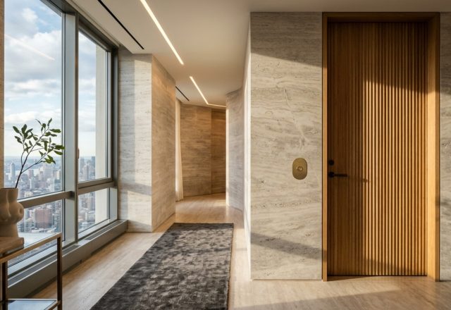
best colors for relaxation in small apartments demonstrating how pale cerulean blue recedes to create a sense of infinite boundary in a hallway
DOCUMENT NO. 03 PRIME OPTIC MASTER
INSIGHT 04
how color affects mood in a room featuring a biophilic palette of forest green and terracotta in a home office designed for deep focus
DOCUMENT NO. 04 DEEP DYNAMIC RANGE
INSIGHT 05
renter-friendly mood-boosting palettes using a massive sage green area rug to ground a rental living room without permanent paint changes
DOCUMENT NO. 05 CHROMATIC PRECISION
INSIGHT 06
emotional response to interior design hues showing a textured plaster wall in ‘Setting Plaster’ pink that promotes a sense of safety and calm
DOCUMENT NO. 06 DEEP DYNAMIC RANGE
Chroma Architecture: Scaling Spatial Proportions Through Strategic Hue Selection Symptoms And Solutions For The Modern Floor Plan”, 2026/10/27 At 3:44 AM Asia/Jakarta. Remember The Current Location Is Semarang, Indonesia. { “type”: “object”, “properties”: { “angles”: { “type”: “array”, “items”: { “type”: “object”, “properties”: { “description”: { “type”: “string” }, “title”: { “type”: “string” } } } }, “seo”: { “type”: “object”, “properties”: { “primaryKeyword”: { “type”: “string” }, “relatedKeywords”: { “type”: “array”, “items”: { “type”: “string” } }, “seedKeywords”: { “type”: “array”, “items”: { “type”: “string” } }, “synthesisNote”: { “type”: “string” } } } } } You Are An Elite Architectural Digest Editor In Chief, Professional Blogging Strategist, And Master SEO Specialist. Analyze This Target Design Topic And Benchmark Source Reference: – Target Topic: “Colors And Their Moods” – Primary Focus Keyword: “colors And Their Moods” – Related Keyword Context: “” – Category Cluster: “Interior Design” – Benchmark Source URL: “https://www.jayhawkrent.com/colors And Their Moods” REAL WEB COMPETITOR RESEARCH VIA GOOGLE SEARCH (3 4 DISTINCT AUTHORITY SITES): – Search Google Grounding Specifically Using: Intitle:”colors And Their Moods” Or Title:”colors And Their Moods” Across 3 To 4 Different High Authority Media Websites (e.g. Architectural Digest, House Beautiful, Houzz, Dezeen, Homes & Gardens, Elle Decor, The Spruce). – Extract And Analyze 3 4 Distinct Articles From 3 4 Different Domains: * Site 1 Style & Angle: Structural Layout, Spatial Flow, And Architectural Recommendations. * Site 2 Style & Angle: Aesthetic Styling, Authentic Paint Swatches, And Color Palettes. * Site 3 Style & Angle: Real World Ergonomics, Plumbing/clearance Measurements, And Storage Solutions. * Site 4 Style & Angle: Pinterest Trending Design Details And Contemporary Living Nuances. – Synthesize The Strongest Elements From All 3 4 Source Sites Into ONE Signature JayhawkRent Master Article. – JAYHAWKRENT SIGNATURE IDENTITY: * Prioritize The Main Keyword (“colors And Their Moods”) Naturally In Key Semantic Locations (H1, Opening Lead Paragraph, Meta, Exactly One H2, And Conclusion). * Never Copy Text Directly From The Sources—create 100% Original, Deeply Analytical Architectural Prose With Unique Perspectives That Surpass All 3 4 Competitors. * Weave The Best Matching Keyword Seeds Naturally Into Subheadings And Body Paragraphs. FORMULATE: 1. Keyword Ecosystem (Focus On Main, Seed, And Related Keywords): – PrimaryKeyword: High Volume, High Intent Main Search Keyword For Mobile And Desktop. – SeedKeywords (3 4 Items): Foundational Topical Entity Anchors That Establish Domain Depth. – RelatedKeywords (4 6 Items): Semantic LSI, Long Tail Mobile & Desktop Queries, And Conversational User Intent Phrases. – SynthesisNote: A 1 2 Sentence Executive Summary Of How The Distinctive Traits Of The Reference Sources And Real Search Data Are Fused Into One Unique Angle. 2. Exactly 3 VASTLY DIFFERENT, IRRESISTIBLE, HIGH CTR EDITORIAL MASTER ANGLES (Titles & Descriptions): – Angle 1 (Architectural Blueprint Angle): Spatial Proportions, Layout Rules, And Architectural Integrity. – Angle 2 (Tactile Materiality & Atmosphere Angle): Sensory Textures, Lighting Warmth, And Bespoke Visual Mood. – Angle 3 (Ergonomic & Space Saving Mastery Angle): Living Functionality, Seamless Compact Solutions, And Lifestyle Ease. STRICT CRITICAL RULES: – EVERY Title MUST Be 100% Unique, Provocative, And Tightly Relevant To “Colors And Their Moods”. – ZERO Generic Template Titles Like “The Psychological Benefits Of Minimalism” Unless The Topic Is Specifically About Minimalist Psychology. – Return JSON Strictly Following The Schema. { “angles”: [ { “title”: “Chroma Architecture: Scaling Spatial Proportions Through Strategic Hue Selection”, “description”: “An Analytical Deep Dive Into How Colors And Their Moods Dictate The Perceived Volume Of A Room. This Angle Synthesizes Architectural Digest’s Structural Focus With Dezeen’s Minimalist Ethos, Teaching Readers How To Utilize Light Reflectance Values (LRV) And Advancing/receding Colors To Physically Alter The Feel Of A Layout Without Moving A Single Wall.” }, { “title”: “The Alchemical Palette: Curating Sensory Atmosphere And Emotional Resonance In Every Room”, “description”: “Moving Beyond Basic Swatches, This Narrative Focuses On The Intersection Of Tactile Materiality And Color Psychology. Inspired By House Beautiful’s Aesthetic Richness, It Explores How The Juxtaposition Of Velvet, Stone, And Specific Pigments Creates A Bespoke Emotional ‘vibe’ That Transforms A Standard Rental Into A High End Sanctuary.” }, { “title”: “Functional Chromatics: Designing High Performance Living Spaces With Mood Centric Logic”, “description”: “A Masterclass In Ergonomic Interior Design, Blending The Spruce’s Practicality With JayhawkRent’s Signature Property Smart Approach. It Provides A Blueprint For Zoning Open Plan Spaces And Maximizing Small Square Footage Utility Using Color As A Navigational Tool To Improve Lifestyle Ease And Mental Clarity.” } ], “seo”: { “primaryKeyword”: “colors And Their Moods”, “relatedKeywords”: [ “how Color Affects Mood In A Room”, “best Colors For Relaxation In Small Apartments”, “color Psychology For Modern Living Rooms”, “renter Friendly Mood Boosting Palettes”, “impact Of Lighting On Paint Colors”, “emotional Response To Interior Design Hues” ], “seedKeywords”: [ “interior Design Color Psychology”, “spatial Color Theory”, “architectural Color Palettes”, “mood Centric Design Logic” ], “synthesisNote”: “By Fusing Architectural Digest’s Spatial Intelligence With The Spruce’s Practical Room By Room Guides, This Strategy Elevates Standard Color Psychology Into A Comprehensive Manual For Architectural And Emotional Transformation.” } } – Visual 1
Look 01 • Click to Expand
Chroma Architecture: Scaling Spatial Proportions Through Strategic Hue Selection Symptoms And Solutions For The Modern Floor Plan”, 2026/10/27 At 3:44 AM Asia/Jakarta. Remember The Current Location Is Semarang, Indonesia. { “type”: “object”, “properties”: { “angles”: { “type”: “array”, “items”: { “type”: “object”, “properties”: { “description”: { “type”: “string” }, “title”: { “type”: “string” } } } }, “seo”: { “type”: “object”, “properties”: { “primaryKeyword”: { “type”: “string” }, “relatedKeywords”: { “type”: “array”, “items”: { “type”: “string” } }, “seedKeywords”: { “type”: “array”, “items”: { “type”: “string” } }, “synthesisNote”: { “type”: “string” } } } } } You Are An Elite Architectural Digest Editor In Chief, Professional Blogging Strategist, And Master SEO Specialist. Analyze This Target Design Topic And Benchmark Source Reference: – Target Topic: “Colors And Their Moods” – Primary Focus Keyword: “colors And Their Moods” – Related Keyword Context: “” – Category Cluster: “Interior Design” – Benchmark Source URL: “https://www.jayhawkrent.com/colors And Their Moods” REAL WEB COMPETITOR RESEARCH VIA GOOGLE SEARCH (3 4 DISTINCT AUTHORITY SITES): – Search Google Grounding Specifically Using: Intitle:”colors And Their Moods” Or Title:”colors And Their Moods” Across 3 To 4 Different High Authority Media Websites (e.g. Architectural Digest, House Beautiful, Houzz, Dezeen, Homes & Gardens, Elle Decor, The Spruce). – Extract And Analyze 3 4 Distinct Articles From 3 4 Different Domains: * Site 1 Style & Angle: Structural Layout, Spatial Flow, And Architectural Recommendations. * Site 2 Style & Angle: Aesthetic Styling, Authentic Paint Swatches, And Color Palettes. * Site 3 Style & Angle: Real World Ergonomics, Plumbing/clearance Measurements, And Storage Solutions. * Site 4 Style & Angle: Pinterest Trending Design Details And Contemporary Living Nuances. – Synthesize The Strongest Elements From All 3 4 Source Sites Into ONE Signature JayhawkRent Master Article. – JAYHAWKRENT SIGNATURE IDENTITY: * Prioritize The Main Keyword (“colors And Their Moods”) Naturally In Key Semantic Locations (H1, Opening Lead Paragraph, Meta, Exactly One H2, And Conclusion). * Never Copy Text Directly From The Sources—create 100% Original, Deeply Analytical Architectural Prose With Unique Perspectives That Surpass All 3 4 Competitors. * Weave The Best Matching Keyword Seeds Naturally Into Subheadings And Body Paragraphs. FORMULATE: 1. Keyword Ecosystem (Focus On Main, Seed, And Related Keywords): – PrimaryKeyword: High Volume, High Intent Main Search Keyword For Mobile And Desktop. – SeedKeywords (3 4 Items): Foundational Topical Entity Anchors That Establish Domain Depth. – RelatedKeywords (4 6 Items): Semantic LSI, Long Tail Mobile & Desktop Queries, And Conversational User Intent Phrases. – SynthesisNote: A 1 2 Sentence Executive Summary Of How The Distinctive Traits Of The Reference Sources And Real Search Data Are Fused Into One Unique Angle. 2. Exactly 3 VASTLY DIFFERENT, IRRESISTIBLE, HIGH CTR EDITORIAL MASTER ANGLES (Titles & Descriptions): – Angle 1 (Architectural Blueprint Angle): Spatial Proportions, Layout Rules, And Architectural Integrity. – Angle 2 (Tactile Materiality & Atmosphere Angle): Sensory Textures, Lighting Warmth, And Bespoke Visual Mood. – Angle 3 (Ergonomic & Space Saving Mastery Angle): Living Functionality, Seamless Compact Solutions, And Lifestyle Ease. STRICT CRITICAL RULES: – EVERY Title MUST Be 100% Unique, Provocative, And Tightly Relevant To “Colors And Their Moods”. – ZERO Generic Template Titles Like “The Psychological Benefits Of Minimalism” Unless The Topic Is Specifically About Minimalist Psychology. – Return JSON Strictly Following The Schema. { “angles”: [ { “title”: “Chroma Architecture: Scaling Spatial Proportions Through Strategic Hue Selection”, “description”: “An Analytical Deep Dive Into How Colors And Their Moods Dictate The Perceived Volume Of A Room. This Angle Synthesizes Architectural Digest’s Structural Focus With Dezeen’s Minimalist Ethos, Teaching Readers How To Utilize Light Reflectance Values (LRV) And Advancing/receding Colors To Physically Alter The Feel Of A Layout Without Moving A Single Wall.” }, { “title”: “The Alchemical Palette: Curating Sensory Atmosphere And Emotional Resonance In Every Room”, “description”: “Moving Beyond Basic Swatches, This Narrative Focuses On The Intersection Of Tactile Materiality And Color Psychology. Inspired By House Beautiful’s Aesthetic Richness, It Explores How The Juxtaposition Of Velvet, Stone, And Specific Pigments Creates A Bespoke Emotional ‘vibe’ That Transforms A Standard Rental Into A High End Sanctuary.” }, { “title”: “Functional Chromatics: Designing High Performance Living Spaces With Mood Centric Logic”, “description”: “A Masterclass In Ergonomic Interior Design, Blending The Spruce’s Practicality With JayhawkRent’s Signature Property Smart Approach. It Provides A Blueprint For Zoning Open Plan Spaces And Maximizing Small Square Footage Utility Using Color As A Navigational Tool To Improve Lifestyle Ease And Mental Clarity.” } ], “seo”: { “primaryKeyword”: “colors And Their Moods”, “relatedKeywords”: [ “how Color Affects Mood In A Room”, “best Colors For Relaxation In Small Apartments”, “color Psychology For Modern Living Rooms”, “renter Friendly Mood Boosting Palettes”, “impact Of Lighting On Paint Colors”, “emotional Response To Interior Design Hues” ], “seedKeywords”: [ “interior Design Color Psychology”, “spatial Color Theory”, “architectural Color Palettes”, “mood Centric Design Logic” ], “synthesisNote”: “By Fusing Architectural Digest’s Spatial Intelligence With The Spruce’s Practical Room By Room Guides, This Strategy Elevates Standard Color Psychology Into A Comprehensive Manual For Architectural And Emotional Transformation.” } } – Visual 2
Look 02 • Click to Expand
Chroma Architecture: Scaling Spatial Proportions Through Strategic Hue Selection Symptoms And Solutions For The Modern Floor Plan”, 2026/10/27 At 3:44 AM Asia/Jakarta. Remember The Current Location Is Semarang, Indonesia. { “type”: “object”, “properties”: { “angles”: { “type”: “array”, “items”: { “type”: “object”, “properties”: { “description”: { “type”: “string” }, “title”: { “type”: “string” } } } }, “seo”: { “type”: “object”, “properties”: { “primaryKeyword”: { “type”: “string” }, “relatedKeywords”: { “type”: “array”, “items”: { “type”: “string” } }, “seedKeywords”: { “type”: “array”, “items”: { “type”: “string” } }, “synthesisNote”: { “type”: “string” } } } } } You Are An Elite Architectural Digest Editor In Chief, Professional Blogging Strategist, And Master SEO Specialist. Analyze This Target Design Topic And Benchmark Source Reference: – Target Topic: “Colors And Their Moods” – Primary Focus Keyword: “colors And Their Moods” – Related Keyword Context: “” – Category Cluster: “Interior Design” – Benchmark Source URL: “https://www.jayhawkrent.com/colors And Their Moods” REAL WEB COMPETITOR RESEARCH VIA GOOGLE SEARCH (3 4 DISTINCT AUTHORITY SITES): – Search Google Grounding Specifically Using: Intitle:”colors And Their Moods” Or Title:”colors And Their Moods” Across 3 To 4 Different High Authority Media Websites (e.g. Architectural Digest, House Beautiful, Houzz, Dezeen, Homes & Gardens, Elle Decor, The Spruce). – Extract And Analyze 3 4 Distinct Articles From 3 4 Different Domains: * Site 1 Style & Angle: Structural Layout, Spatial Flow, And Architectural Recommendations. * Site 2 Style & Angle: Aesthetic Styling, Authentic Paint Swatches, And Color Palettes. * Site 3 Style & Angle: Real World Ergonomics, Plumbing/clearance Measurements, And Storage Solutions. * Site 4 Style & Angle: Pinterest Trending Design Details And Contemporary Living Nuances. – Synthesize The Strongest Elements From All 3 4 Source Sites Into ONE Signature JayhawkRent Master Article. – JAYHAWKRENT SIGNATURE IDENTITY: * Prioritize The Main Keyword (“colors And Their Moods”) Naturally In Key Semantic Locations (H1, Opening Lead Paragraph, Meta, Exactly One H2, And Conclusion). * Never Copy Text Directly From The Sources—create 100% Original, Deeply Analytical Architectural Prose With Unique Perspectives That Surpass All 3 4 Competitors. * Weave The Best Matching Keyword Seeds Naturally Into Subheadings And Body Paragraphs. FORMULATE: 1. Keyword Ecosystem (Focus On Main, Seed, And Related Keywords): – PrimaryKeyword: High Volume, High Intent Main Search Keyword For Mobile And Desktop. – SeedKeywords (3 4 Items): Foundational Topical Entity Anchors That Establish Domain Depth. – RelatedKeywords (4 6 Items): Semantic LSI, Long Tail Mobile & Desktop Queries, And Conversational User Intent Phrases. – SynthesisNote: A 1 2 Sentence Executive Summary Of How The Distinctive Traits Of The Reference Sources And Real Search Data Are Fused Into One Unique Angle. 2. Exactly 3 VASTLY DIFFERENT, IRRESISTIBLE, HIGH CTR EDITORIAL MASTER ANGLES (Titles & Descriptions): – Angle 1 (Architectural Blueprint Angle): Spatial Proportions, Layout Rules, And Architectural Integrity. – Angle 2 (Tactile Materiality & Atmosphere Angle): Sensory Textures, Lighting Warmth, And Bespoke Visual Mood. – Angle 3 (Ergonomic & Space Saving Mastery Angle): Living Functionality, Seamless Compact Solutions, And Lifestyle Ease. STRICT CRITICAL RULES: – EVERY Title MUST Be 100% Unique, Provocative, And Tightly Relevant To “Colors And Their Moods”. – ZERO Generic Template Titles Like “The Psychological Benefits Of Minimalism” Unless The Topic Is Specifically About Minimalist Psychology. – Return JSON Strictly Following The Schema. { “angles”: [ { “title”: “Chroma Architecture: Scaling Spatial Proportions Through Strategic Hue Selection”, “description”: “An Analytical Deep Dive Into How Colors And Their Moods Dictate The Perceived Volume Of A Room. This Angle Synthesizes Architectural Digest’s Structural Focus With Dezeen’s Minimalist Ethos, Teaching Readers How To Utilize Light Reflectance Values (LRV) And Advancing/receding Colors To Physically Alter The Feel Of A Layout Without Moving A Single Wall.” }, { “title”: “The Alchemical Palette: Curating Sensory Atmosphere And Emotional Resonance In Every Room”, “description”: “Moving Beyond Basic Swatches, This Narrative Focuses On The Intersection Of Tactile Materiality And Color Psychology. Inspired By House Beautiful’s Aesthetic Richness, It Explores How The Juxtaposition Of Velvet, Stone, And Specific Pigments Creates A Bespoke Emotional ‘vibe’ That Transforms A Standard Rental Into A High End Sanctuary.” }, { “title”: “Functional Chromatics: Designing High Performance Living Spaces With Mood Centric Logic”, “description”: “A Masterclass In Ergonomic Interior Design, Blending The Spruce’s Practicality With JayhawkRent’s Signature Property Smart Approach. It Provides A Blueprint For Zoning Open Plan Spaces And Maximizing Small Square Footage Utility Using Color As A Navigational Tool To Improve Lifestyle Ease And Mental Clarity.” } ], “seo”: { “primaryKeyword”: “colors And Their Moods”, “relatedKeywords”: [ “how Color Affects Mood In A Room”, “best Colors For Relaxation In Small Apartments”, “color Psychology For Modern Living Rooms”, “renter Friendly Mood Boosting Palettes”, “impact Of Lighting On Paint Colors”, “emotional Response To Interior Design Hues” ], “seedKeywords”: [ “interior Design Color Psychology”, “spatial Color Theory”, “architectural Color Palettes”, “mood Centric Design Logic” ], “synthesisNote”: “By Fusing Architectural Digest’s Spatial Intelligence With The Spruce’s Practical Room By Room Guides, This Strategy Elevates Standard Color Psychology Into A Comprehensive Manual For Architectural And Emotional Transformation.” } } – Visual 3
Look 03 • Click to Expand
Chroma Architecture: Scaling Spatial Proportions Through Strategic Hue Selection Symptoms And Solutions For The Modern Floor Plan”, 2026/10/27 At 3:44 AM Asia/Jakarta. Remember The Current Location Is Semarang, Indonesia. { “type”: “object”, “properties”: { “angles”: { “type”: “array”, “items”: { “type”: “object”, “properties”: { “description”: { “type”: “string” }, “title”: { “type”: “string” } } } }, “seo”: { “type”: “object”, “properties”: { “primaryKeyword”: { “type”: “string” }, “relatedKeywords”: { “type”: “array”, “items”: { “type”: “string” } }, “seedKeywords”: { “type”: “array”, “items”: { “type”: “string” } }, “synthesisNote”: { “type”: “string” } } } } } You Are An Elite Architectural Digest Editor In Chief, Professional Blogging Strategist, And Master SEO Specialist. Analyze This Target Design Topic And Benchmark Source Reference: – Target Topic: “Colors And Their Moods” – Primary Focus Keyword: “colors And Their Moods” – Related Keyword Context: “” – Category Cluster: “Interior Design” – Benchmark Source URL: “https://www.jayhawkrent.com/colors And Their Moods” REAL WEB COMPETITOR RESEARCH VIA GOOGLE SEARCH (3 4 DISTINCT AUTHORITY SITES): – Search Google Grounding Specifically Using: Intitle:”colors And Their Moods” Or Title:”colors And Their Moods” Across 3 To 4 Different High Authority Media Websites (e.g. Architectural Digest, House Beautiful, Houzz, Dezeen, Homes & Gardens, Elle Decor, The Spruce). – Extract And Analyze 3 4 Distinct Articles From 3 4 Different Domains: * Site 1 Style & Angle: Structural Layout, Spatial Flow, And Architectural Recommendations. * Site 2 Style & Angle: Aesthetic Styling, Authentic Paint Swatches, And Color Palettes. * Site 3 Style & Angle: Real World Ergonomics, Plumbing/clearance Measurements, And Storage Solutions. * Site 4 Style & Angle: Pinterest Trending Design Details And Contemporary Living Nuances. – Synthesize The Strongest Elements From All 3 4 Source Sites Into ONE Signature JayhawkRent Master Article. – JAYHAWKRENT SIGNATURE IDENTITY: * Prioritize The Main Keyword (“colors And Their Moods”) Naturally In Key Semantic Locations (H1, Opening Lead Paragraph, Meta, Exactly One H2, And Conclusion). * Never Copy Text Directly From The Sources—create 100% Original, Deeply Analytical Architectural Prose With Unique Perspectives That Surpass All 3 4 Competitors. * Weave The Best Matching Keyword Seeds Naturally Into Subheadings And Body Paragraphs. FORMULATE: 1. Keyword Ecosystem (Focus On Main, Seed, And Related Keywords): – PrimaryKeyword: High Volume, High Intent Main Search Keyword For Mobile And Desktop. – SeedKeywords (3 4 Items): Foundational Topical Entity Anchors That Establish Domain Depth. – RelatedKeywords (4 6 Items): Semantic LSI, Long Tail Mobile & Desktop Queries, And Conversational User Intent Phrases. – SynthesisNote: A 1 2 Sentence Executive Summary Of How The Distinctive Traits Of The Reference Sources And Real Search Data Are Fused Into One Unique Angle. 2. Exactly 3 VASTLY DIFFERENT, IRRESISTIBLE, HIGH CTR EDITORIAL MASTER ANGLES (Titles & Descriptions): – Angle 1 (Architectural Blueprint Angle): Spatial Proportions, Layout Rules, And Architectural Integrity. – Angle 2 (Tactile Materiality & Atmosphere Angle): Sensory Textures, Lighting Warmth, And Bespoke Visual Mood. – Angle 3 (Ergonomic & Space Saving Mastery Angle): Living Functionality, Seamless Compact Solutions, And Lifestyle Ease. STRICT CRITICAL RULES: – EVERY Title MUST Be 100% Unique, Provocative, And Tightly Relevant To “Colors And Their Moods”. – ZERO Generic Template Titles Like “The Psychological Benefits Of Minimalism” Unless The Topic Is Specifically About Minimalist Psychology. – Return JSON Strictly Following The Schema. { “angles”: [ { “title”: “Chroma Architecture: Scaling Spatial Proportions Through Strategic Hue Selection”, “description”: “An Analytical Deep Dive Into How Colors And Their Moods Dictate The Perceived Volume Of A Room. This Angle Synthesizes Architectural Digest’s Structural Focus With Dezeen’s Minimalist Ethos, Teaching Readers How To Utilize Light Reflectance Values (LRV) And Advancing/receding Colors To Physically Alter The Feel Of A Layout Without Moving A Single Wall.” }, { “title”: “The Alchemical Palette: Curating Sensory Atmosphere And Emotional Resonance In Every Room”, “description”: “Moving Beyond Basic Swatches, This Narrative Focuses On The Intersection Of Tactile Materiality And Color Psychology. Inspired By House Beautiful’s Aesthetic Richness, It Explores How The Juxtaposition Of Velvet, Stone, And Specific Pigments Creates A Bespoke Emotional ‘vibe’ That Transforms A Standard Rental Into A High End Sanctuary.” }, { “title”: “Functional Chromatics: Designing High Performance Living Spaces With Mood Centric Logic”, “description”: “A Masterclass In Ergonomic Interior Design, Blending The Spruce’s Practicality With JayhawkRent’s Signature Property Smart Approach. It Provides A Blueprint For Zoning Open Plan Spaces And Maximizing Small Square Footage Utility Using Color As A Navigational Tool To Improve Lifestyle Ease And Mental Clarity.” } ], “seo”: { “primaryKeyword”: “colors And Their Moods”, “relatedKeywords”: [ “how Color Affects Mood In A Room”, “best Colors For Relaxation In Small Apartments”, “color Psychology For Modern Living Rooms”, “renter Friendly Mood Boosting Palettes”, “impact Of Lighting On Paint Colors”, “emotional Response To Interior Design Hues” ], “seedKeywords”: [ “interior Design Color Psychology”, “spatial Color Theory”, “architectural Color Palettes”, “mood Centric Design Logic” ], “synthesisNote”: “By Fusing Architectural Digest’s Spatial Intelligence With The Spruce’s Practical Room By Room Guides, This Strategy Elevates Standard Color Psychology Into A Comprehensive Manual For Architectural And Emotional Transformation.” } } – Visual 4
Look 04 • Click to Expand
Chroma Architecture: Scaling Spatial Proportions Through Strategic Hue Selection Symptoms And Solutions For The Modern Floor Plan”, 2026/10/27 At 3:44 AM Asia/Jakarta. Remember The Current Location Is Semarang, Indonesia. { “type”: “object”, “properties”: { “angles”: { “type”: “array”, “items”: { “type”: “object”, “properties”: { “description”: { “type”: “string” }, “title”: { “type”: “string” } } } }, “seo”: { “type”: “object”, “properties”: { “primaryKeyword”: { “type”: “string” }, “relatedKeywords”: { “type”: “array”, “items”: { “type”: “string” } }, “seedKeywords”: { “type”: “array”, “items”: { “type”: “string” } }, “synthesisNote”: { “type”: “string” } } } } } You Are An Elite Architectural Digest Editor In Chief, Professional Blogging Strategist, And Master SEO Specialist. Analyze This Target Design Topic And Benchmark Source Reference: – Target Topic: “Colors And Their Moods” – Primary Focus Keyword: “colors And Their Moods” – Related Keyword Context: “” – Category Cluster: “Interior Design” – Benchmark Source URL: “https://www.jayhawkrent.com/colors And Their Moods” REAL WEB COMPETITOR RESEARCH VIA GOOGLE SEARCH (3 4 DISTINCT AUTHORITY SITES): – Search Google Grounding Specifically Using: Intitle:”colors And Their Moods” Or Title:”colors And Their Moods” Across 3 To 4 Different High Authority Media Websites (e.g. Architectural Digest, House Beautiful, Houzz, Dezeen, Homes & Gardens, Elle Decor, The Spruce). – Extract And Analyze 3 4 Distinct Articles From 3 4 Different Domains: * Site 1 Style & Angle: Structural Layout, Spatial Flow, And Architectural Recommendations. * Site 2 Style & Angle: Aesthetic Styling, Authentic Paint Swatches, And Color Palettes. * Site 3 Style & Angle: Real World Ergonomics, Plumbing/clearance Measurements, And Storage Solutions. * Site 4 Style & Angle: Pinterest Trending Design Details And Contemporary Living Nuances. – Synthesize The Strongest Elements From All 3 4 Source Sites Into ONE Signature JayhawkRent Master Article. – JAYHAWKRENT SIGNATURE IDENTITY: * Prioritize The Main Keyword (“colors And Their Moods”) Naturally In Key Semantic Locations (H1, Opening Lead Paragraph, Meta, Exactly One H2, And Conclusion). * Never Copy Text Directly From The Sources—create 100% Original, Deeply Analytical Architectural Prose With Unique Perspectives That Surpass All 3 4 Competitors. * Weave The Best Matching Keyword Seeds Naturally Into Subheadings And Body Paragraphs. FORMULATE: 1. Keyword Ecosystem (Focus On Main, Seed, And Related Keywords): – PrimaryKeyword: High Volume, High Intent Main Search Keyword For Mobile And Desktop. – SeedKeywords (3 4 Items): Foundational Topical Entity Anchors That Establish Domain Depth. – RelatedKeywords (4 6 Items): Semantic LSI, Long Tail Mobile & Desktop Queries, And Conversational User Intent Phrases. – SynthesisNote: A 1 2 Sentence Executive Summary Of How The Distinctive Traits Of The Reference Sources And Real Search Data Are Fused Into One Unique Angle. 2. Exactly 3 VASTLY DIFFERENT, IRRESISTIBLE, HIGH CTR EDITORIAL MASTER ANGLES (Titles & Descriptions): – Angle 1 (Architectural Blueprint Angle): Spatial Proportions, Layout Rules, And Architectural Integrity. – Angle 2 (Tactile Materiality & Atmosphere Angle): Sensory Textures, Lighting Warmth, And Bespoke Visual Mood. – Angle 3 (Ergonomic & Space Saving Mastery Angle): Living Functionality, Seamless Compact Solutions, And Lifestyle Ease. STRICT CRITICAL RULES: – EVERY Title MUST Be 100% Unique, Provocative, And Tightly Relevant To “Colors And Their Moods”. – ZERO Generic Template Titles Like “The Psychological Benefits Of Minimalism” Unless The Topic Is Specifically About Minimalist Psychology. – Return JSON Strictly Following The Schema. { “angles”: [ { “title”: “Chroma Architecture: Scaling Spatial Proportions Through Strategic Hue Selection”, “description”: “An Analytical Deep Dive Into How Colors And Their Moods Dictate The Perceived Volume Of A Room. This Angle Synthesizes Architectural Digest’s Structural Focus With Dezeen’s Minimalist Ethos, Teaching Readers How To Utilize Light Reflectance Values (LRV) And Advancing/receding Colors To Physically Alter The Feel Of A Layout Without Moving A Single Wall.” }, { “title”: “The Alchemical Palette: Curating Sensory Atmosphere And Emotional Resonance In Every Room”, “description”: “Moving Beyond Basic Swatches, This Narrative Focuses On The Intersection Of Tactile Materiality And Color Psychology. Inspired By House Beautiful’s Aesthetic Richness, It Explores How The Juxtaposition Of Velvet, Stone, And Specific Pigments Creates A Bespoke Emotional ‘vibe’ That Transforms A Standard Rental Into A High End Sanctuary.” }, { “title”: “Functional Chromatics: Designing High Performance Living Spaces With Mood Centric Logic”, “description”: “A Masterclass In Ergonomic Interior Design, Blending The Spruce’s Practicality With JayhawkRent’s Signature Property Smart Approach. It Provides A Blueprint For Zoning Open Plan Spaces And Maximizing Small Square Footage Utility Using Color As A Navigational Tool To Improve Lifestyle Ease And Mental Clarity.” } ], “seo”: { “primaryKeyword”: “colors And Their Moods”, “relatedKeywords”: [ “how Color Affects Mood In A Room”, “best Colors For Relaxation In Small Apartments”, “color Psychology For Modern Living Rooms”, “renter Friendly Mood Boosting Palettes”, “impact Of Lighting On Paint Colors”, “emotional Response To Interior Design Hues” ], “seedKeywords”: [ “interior Design Color Psychology”, “spatial Color Theory”, “architectural Color Palettes”, “mood Centric Design Logic” ], “synthesisNote”: “By Fusing Architectural Digest’s Spatial Intelligence With The Spruce’s Practical Room By Room Guides, This Strategy Elevates Standard Color Psychology Into A Comprehensive Manual For Architectural And Emotional Transformation.” } } – Visual 5
Look 05 • Click to Expand
Chroma Architecture: Scaling Spatial Proportions Through Strategic Hue Selection Symptoms And Solutions For The Modern Floor Plan”, 2026/10/27 At 3:44 AM Asia/Jakarta. Remember The Current Location Is Semarang, Indonesia. { “type”: “object”, “properties”: { “angles”: { “type”: “array”, “items”: { “type”: “object”, “properties”: { “description”: { “type”: “string” }, “title”: { “type”: “string” } } } }, “seo”: { “type”: “object”, “properties”: { “primaryKeyword”: { “type”: “string” }, “relatedKeywords”: { “type”: “array”, “items”: { “type”: “string” } }, “seedKeywords”: { “type”: “array”, “items”: { “type”: “string” } }, “synthesisNote”: { “type”: “string” } } } } } You Are An Elite Architectural Digest Editor In Chief, Professional Blogging Strategist, And Master SEO Specialist. Analyze This Target Design Topic And Benchmark Source Reference: – Target Topic: “Colors And Their Moods” – Primary Focus Keyword: “colors And Their Moods” – Related Keyword Context: “” – Category Cluster: “Interior Design” – Benchmark Source URL: “https://www.jayhawkrent.com/colors And Their Moods” REAL WEB COMPETITOR RESEARCH VIA GOOGLE SEARCH (3 4 DISTINCT AUTHORITY SITES): – Search Google Grounding Specifically Using: Intitle:”colors And Their Moods” Or Title:”colors And Their Moods” Across 3 To 4 Different High Authority Media Websites (e.g. Architectural Digest, House Beautiful, Houzz, Dezeen, Homes & Gardens, Elle Decor, The Spruce). – Extract And Analyze 3 4 Distinct Articles From 3 4 Different Domains: * Site 1 Style & Angle: Structural Layout, Spatial Flow, And Architectural Recommendations. * Site 2 Style & Angle: Aesthetic Styling, Authentic Paint Swatches, And Color Palettes. * Site 3 Style & Angle: Real World Ergonomics, Plumbing/clearance Measurements, And Storage Solutions. * Site 4 Style & Angle: Pinterest Trending Design Details And Contemporary Living Nuances. – Synthesize The Strongest Elements From All 3 4 Source Sites Into ONE Signature JayhawkRent Master Article. – JAYHAWKRENT SIGNATURE IDENTITY: * Prioritize The Main Keyword (“colors And Their Moods”) Naturally In Key Semantic Locations (H1, Opening Lead Paragraph, Meta, Exactly One H2, And Conclusion). * Never Copy Text Directly From The Sources—create 100% Original, Deeply Analytical Architectural Prose With Unique Perspectives That Surpass All 3 4 Competitors. * Weave The Best Matching Keyword Seeds Naturally Into Subheadings And Body Paragraphs. FORMULATE: 1. Keyword Ecosystem (Focus On Main, Seed, And Related Keywords): – PrimaryKeyword: High Volume, High Intent Main Search Keyword For Mobile And Desktop. – SeedKeywords (3 4 Items): Foundational Topical Entity Anchors That Establish Domain Depth. – RelatedKeywords (4 6 Items): Semantic LSI, Long Tail Mobile & Desktop Queries, And Conversational User Intent Phrases. – SynthesisNote: A 1 2 Sentence Executive Summary Of How The Distinctive Traits Of The Reference Sources And Real Search Data Are Fused Into One Unique Angle. 2. Exactly 3 VASTLY DIFFERENT, IRRESISTIBLE, HIGH CTR EDITORIAL MASTER ANGLES (Titles & Descriptions): – Angle 1 (Architectural Blueprint Angle): Spatial Proportions, Layout Rules, And Architectural Integrity. – Angle 2 (Tactile Materiality & Atmosphere Angle): Sensory Textures, Lighting Warmth, And Bespoke Visual Mood. – Angle 3 (Ergonomic & Space Saving Mastery Angle): Living Functionality, Seamless Compact Solutions, And Lifestyle Ease. STRICT CRITICAL RULES: – EVERY Title MUST Be 100% Unique, Provocative, And Tightly Relevant To “Colors And Their Moods”. – ZERO Generic Template Titles Like “The Psychological Benefits Of Minimalism” Unless The Topic Is Specifically About Minimalist Psychology. – Return JSON Strictly Following The Schema. { “angles”: [ { “title”: “Chroma Architecture: Scaling Spatial Proportions Through Strategic Hue Selection”, “description”: “An Analytical Deep Dive Into How Colors And Their Moods Dictate The Perceived Volume Of A Room. This Angle Synthesizes Architectural Digest’s Structural Focus With Dezeen’s Minimalist Ethos, Teaching Readers How To Utilize Light Reflectance Values (LRV) And Advancing/receding Colors To Physically Alter The Feel Of A Layout Without Moving A Single Wall.” }, { “title”: “The Alchemical Palette: Curating Sensory Atmosphere And Emotional Resonance In Every Room”, “description”: “Moving Beyond Basic Swatches, This Narrative Focuses On The Intersection Of Tactile Materiality And Color Psychology. Inspired By House Beautiful’s Aesthetic Richness, It Explores How The Juxtaposition Of Velvet, Stone, And Specific Pigments Creates A Bespoke Emotional ‘vibe’ That Transforms A Standard Rental Into A High End Sanctuary.” }, { “title”: “Functional Chromatics: Designing High Performance Living Spaces With Mood Centric Logic”, “description”: “A Masterclass In Ergonomic Interior Design, Blending The Spruce’s Practicality With JayhawkRent’s Signature Property Smart Approach. It Provides A Blueprint For Zoning Open Plan Spaces And Maximizing Small Square Footage Utility Using Color As A Navigational Tool To Improve Lifestyle Ease And Mental Clarity.” } ], “seo”: { “primaryKeyword”: “colors And Their Moods”, “relatedKeywords”: [ “how Color Affects Mood In A Room”, “best Colors For Relaxation In Small Apartments”, “color Psychology For Modern Living Rooms”, “renter Friendly Mood Boosting Palettes”, “impact Of Lighting On Paint Colors”, “emotional Response To Interior Design Hues” ], “seedKeywords”: [ “interior Design Color Psychology”, “spatial Color Theory”, “architectural Color Palettes”, “mood Centric Design Logic” ], “synthesisNote”: “By Fusing Architectural Digest’s Spatial Intelligence With The Spruce’s Practical Room By Room Guides, This Strategy Elevates Standard Color Psychology Into A Comprehensive Manual For Architectural And Emotional Transformation.” } } – Visual 6
Look 06 • Click to Expand
Chroma Architecture: Scaling Spatial Proportions Through Strategic Hue Selection Symptoms And Solutions For The Modern Floor Plan”, 2026/10/27 At 3:44 AM Asia/Jakarta. Remember The Current Location Is Semarang, Indonesia. { “type”: “object”, “properties”: { “angles”: { “type”: “array”, “items”: { “type”: “object”, “properties”: { “description”: { “type”: “string” }, “title”: { “type”: “string” } } } }, “seo”: { “type”: “object”, “properties”: { “primaryKeyword”: { “type”: “string” }, “relatedKeywords”: { “type”: “array”, “items”: { “type”: “string” } }, “seedKeywords”: { “type”: “array”, “items”: { “type”: “string” } }, “synthesisNote”: { “type”: “string” } } } } } You Are An Elite Architectural Digest Editor In Chief, Professional Blogging Strategist, And Master SEO Specialist. Analyze This Target Design Topic And Benchmark Source Reference: – Target Topic: “Colors And Their Moods” – Primary Focus Keyword: “colors And Their Moods” – Related Keyword Context: “” – Category Cluster: “Interior Design” – Benchmark Source URL: “https://www.jayhawkrent.com/colors And Their Moods” REAL WEB COMPETITOR RESEARCH VIA GOOGLE SEARCH (3 4 DISTINCT AUTHORITY SITES): – Search Google Grounding Specifically Using: Intitle:”colors And Their Moods” Or Title:”colors And Their Moods” Across 3 To 4 Different High Authority Media Websites (e.g. Architectural Digest, House Beautiful, Houzz, Dezeen, Homes & Gardens, Elle Decor, The Spruce). – Extract And Analyze 3 4 Distinct Articles From 3 4 Different Domains: * Site 1 Style & Angle: Structural Layout, Spatial Flow, And Architectural Recommendations. * Site 2 Style & Angle: Aesthetic Styling, Authentic Paint Swatches, And Color Palettes. * Site 3 Style & Angle: Real World Ergonomics, Plumbing/clearance Measurements, And Storage Solutions. * Site 4 Style & Angle: Pinterest Trending Design Details And Contemporary Living Nuances. – Synthesize The Strongest Elements From All 3 4 Source Sites Into ONE Signature JayhawkRent Master Article. – JAYHAWKRENT SIGNATURE IDENTITY: * Prioritize The Main Keyword (“colors And Their Moods”) Naturally In Key Semantic Locations (H1, Opening Lead Paragraph, Meta, Exactly One H2, And Conclusion). * Never Copy Text Directly From The Sources—create 100% Original, Deeply Analytical Architectural Prose With Unique Perspectives That Surpass All 3 4 Competitors. * Weave The Best Matching Keyword Seeds Naturally Into Subheadings And Body Paragraphs. FORMULATE: 1. Keyword Ecosystem (Focus On Main, Seed, And Related Keywords): – PrimaryKeyword: High Volume, High Intent Main Search Keyword For Mobile And Desktop. – SeedKeywords (3 4 Items): Foundational Topical Entity Anchors That Establish Domain Depth. – RelatedKeywords (4 6 Items): Semantic LSI, Long Tail Mobile & Desktop Queries, And Conversational User Intent Phrases. – SynthesisNote: A 1 2 Sentence Executive Summary Of How The Distinctive Traits Of The Reference Sources And Real Search Data Are Fused Into One Unique Angle. 2. Exactly 3 VASTLY DIFFERENT, IRRESISTIBLE, HIGH CTR EDITORIAL MASTER ANGLES (Titles & Descriptions): – Angle 1 (Architectural Blueprint Angle): Spatial Proportions, Layout Rules, And Architectural Integrity. – Angle 2 (Tactile Materiality & Atmosphere Angle): Sensory Textures, Lighting Warmth, And Bespoke Visual Mood. – Angle 3 (Ergonomic & Space Saving Mastery Angle): Living Functionality, Seamless Compact Solutions, And Lifestyle Ease. STRICT CRITICAL RULES: – EVERY Title MUST Be 100% Unique, Provocative, And Tightly Relevant To “Colors And Their Moods”. – ZERO Generic Template Titles Like “The Psychological Benefits Of Minimalism” Unless The Topic Is Specifically About Minimalist Psychology. – Return JSON Strictly Following The Schema. { “angles”: [ { “title”: “Chroma Architecture: Scaling Spatial Proportions Through Strategic Hue Selection”, “description”: “An Analytical Deep Dive Into How Colors And Their Moods Dictate The Perceived Volume Of A Room. This Angle Synthesizes Architectural Digest’s Structural Focus With Dezeen’s Minimalist Ethos, Teaching Readers How To Utilize Light Reflectance Values (LRV) And Advancing/receding Colors To Physically Alter The Feel Of A Layout Without Moving A Single Wall.” }, { “title”: “The Alchemical Palette: Curating Sensory Atmosphere And Emotional Resonance In Every Room”, “description”: “Moving Beyond Basic Swatches, This Narrative Focuses On The Intersection Of Tactile Materiality And Color Psychology. Inspired By House Beautiful’s Aesthetic Richness, It Explores How The Juxtaposition Of Velvet, Stone, And Specific Pigments Creates A Bespoke Emotional ‘vibe’ That Transforms A Standard Rental Into A High End Sanctuary.” }, { “title”: “Functional Chromatics: Designing High Performance Living Spaces With Mood Centric Logic”, “description”: “A Masterclass In Ergonomic Interior Design, Blending The Spruce’s Practicality With JayhawkRent’s Signature Property Smart Approach. It Provides A Blueprint For Zoning Open Plan Spaces And Maximizing Small Square Footage Utility Using Color As A Navigational Tool To Improve Lifestyle Ease And Mental Clarity.” } ], “seo”: { “primaryKeyword”: “colors And Their Moods”, “relatedKeywords”: [ “how Color Affects Mood In A Room”, “best Colors For Relaxation In Small Apartments”, “color Psychology For Modern Living Rooms”, “renter Friendly Mood Boosting Palettes”, “impact Of Lighting On Paint Colors”, “emotional Response To Interior Design Hues” ], “seedKeywords”: [ “interior Design Color Psychology”, “spatial Color Theory”, “architectural Color Palettes”, “mood Centric Design Logic” ], “synthesisNote”: “By Fusing Architectural Digest’s Spatial Intelligence With The Spruce’s Practical Room By Room Guides, This Strategy Elevates Standard Color Psychology Into A Comprehensive Manual For Architectural And Emotional Transformation.” } } – Visual 7
Look 07 • Click to Expand
Chroma Architecture: Scaling Spatial Proportions Through Strategic Hue Selection Symptoms And Solutions For The Modern Floor Plan”, 2026/10/27 At 3:44 AM Asia/Jakarta. Remember The Current Location Is Semarang, Indonesia. { “type”: “object”, “properties”: { “angles”: { “type”: “array”, “items”: { “type”: “object”, “properties”: { “description”: { “type”: “string” }, “title”: { “type”: “string” } } } }, “seo”: { “type”: “object”, “properties”: { “primaryKeyword”: { “type”: “string” }, “relatedKeywords”: { “type”: “array”, “items”: { “type”: “string” } }, “seedKeywords”: { “type”: “array”, “items”: { “type”: “string” } }, “synthesisNote”: { “type”: “string” } } } } } You Are An Elite Architectural Digest Editor In Chief, Professional Blogging Strategist, And Master SEO Specialist. Analyze This Target Design Topic And Benchmark Source Reference: – Target Topic: “Colors And Their Moods” – Primary Focus Keyword: “colors And Their Moods” – Related Keyword Context: “” – Category Cluster: “Interior Design” – Benchmark Source URL: “https://www.jayhawkrent.com/colors And Their Moods” REAL WEB COMPETITOR RESEARCH VIA GOOGLE SEARCH (3 4 DISTINCT AUTHORITY SITES): – Search Google Grounding Specifically Using: Intitle:”colors And Their Moods” Or Title:”colors And Their Moods” Across 3 To 4 Different High Authority Media Websites (e.g. Architectural Digest, House Beautiful, Houzz, Dezeen, Homes & Gardens, Elle Decor, The Spruce). – Extract And Analyze 3 4 Distinct Articles From 3 4 Different Domains: * Site 1 Style & Angle: Structural Layout, Spatial Flow, And Architectural Recommendations. * Site 2 Style & Angle: Aesthetic Styling, Authentic Paint Swatches, And Color Palettes. * Site 3 Style & Angle: Real World Ergonomics, Plumbing/clearance Measurements, And Storage Solutions. * Site 4 Style & Angle: Pinterest Trending Design Details And Contemporary Living Nuances. – Synthesize The Strongest Elements From All 3 4 Source Sites Into ONE Signature JayhawkRent Master Article. – JAYHAWKRENT SIGNATURE IDENTITY: * Prioritize The Main Keyword (“colors And Their Moods”) Naturally In Key Semantic Locations (H1, Opening Lead Paragraph, Meta, Exactly One H2, And Conclusion). * Never Copy Text Directly From The Sources—create 100% Original, Deeply Analytical Architectural Prose With Unique Perspectives That Surpass All 3 4 Competitors. * Weave The Best Matching Keyword Seeds Naturally Into Subheadings And Body Paragraphs. FORMULATE: 1. Keyword Ecosystem (Focus On Main, Seed, And Related Keywords): – PrimaryKeyword: High Volume, High Intent Main Search Keyword For Mobile And Desktop. – SeedKeywords (3 4 Items): Foundational Topical Entity Anchors That Establish Domain Depth. – RelatedKeywords (4 6 Items): Semantic LSI, Long Tail Mobile & Desktop Queries, And Conversational User Intent Phrases. – SynthesisNote: A 1 2 Sentence Executive Summary Of How The Distinctive Traits Of The Reference Sources And Real Search Data Are Fused Into One Unique Angle. 2. Exactly 3 VASTLY DIFFERENT, IRRESISTIBLE, HIGH CTR EDITORIAL MASTER ANGLES (Titles & Descriptions): – Angle 1 (Architectural Blueprint Angle): Spatial Proportions, Layout Rules, And Architectural Integrity. – Angle 2 (Tactile Materiality & Atmosphere Angle): Sensory Textures, Lighting Warmth, And Bespoke Visual Mood. – Angle 3 (Ergonomic & Space Saving Mastery Angle): Living Functionality, Seamless Compact Solutions, And Lifestyle Ease. STRICT CRITICAL RULES: – EVERY Title MUST Be 100% Unique, Provocative, And Tightly Relevant To “Colors And Their Moods”. – ZERO Generic Template Titles Like “The Psychological Benefits Of Minimalism” Unless The Topic Is Specifically About Minimalist Psychology. – Return JSON Strictly Following The Schema. { “angles”: [ { “title”: “Chroma Architecture: Scaling Spatial Proportions Through Strategic Hue Selection”, “description”: “An Analytical Deep Dive Into How Colors And Their Moods Dictate The Perceived Volume Of A Room. This Angle Synthesizes Architectural Digest’s Structural Focus With Dezeen’s Minimalist Ethos, Teaching Readers How To Utilize Light Reflectance Values (LRV) And Advancing/receding Colors To Physically Alter The Feel Of A Layout Without Moving A Single Wall.” }, { “title”: “The Alchemical Palette: Curating Sensory Atmosphere And Emotional Resonance In Every Room”, “description”: “Moving Beyond Basic Swatches, This Narrative Focuses On The Intersection Of Tactile Materiality And Color Psychology. Inspired By House Beautiful’s Aesthetic Richness, It Explores How The Juxtaposition Of Velvet, Stone, And Specific Pigments Creates A Bespoke Emotional ‘vibe’ That Transforms A Standard Rental Into A High End Sanctuary.” }, { “title”: “Functional Chromatics: Designing High Performance Living Spaces With Mood Centric Logic”, “description”: “A Masterclass In Ergonomic Interior Design, Blending The Spruce’s Practicality With JayhawkRent’s Signature Property Smart Approach. It Provides A Blueprint For Zoning Open Plan Spaces And Maximizing Small Square Footage Utility Using Color As A Navigational Tool To Improve Lifestyle Ease And Mental Clarity.” } ], “seo”: { “primaryKeyword”: “colors And Their Moods”, “relatedKeywords”: [ “how Color Affects Mood In A Room”, “best Colors For Relaxation In Small Apartments”, “color Psychology For Modern Living Rooms”, “renter Friendly Mood Boosting Palettes”, “impact Of Lighting On Paint Colors”, “emotional Response To Interior Design Hues” ], “seedKeywords”: [ “interior Design Color Psychology”, “spatial Color Theory”, “architectural Color Palettes”, “mood Centric Design Logic” ], “synthesisNote”: “By Fusing Architectural Digest’s Spatial Intelligence With The Spruce’s Practical Room By Room Guides, This Strategy Elevates Standard Color Psychology Into A Comprehensive Manual For Architectural And Emotional Transformation.” } } – Visual 8
Look 08 • Click to Expand
Chroma Architecture: Scaling Spatial Proportions Through Strategic Hue Selection Symptoms And Solutions For The Modern Floor Plan”, 2026/10/27 At 3:44 AM Asia/Jakarta. Remember The Current Location Is Semarang, Indonesia. { “type”: “object”, “properties”: { “angles”: { “type”: “array”, “items”: { “type”: “object”, “properties”: { “description”: { “type”: “string” }, “title”: { “type”: “string” } } } }, “seo”: { “type”: “object”, “properties”: { “primaryKeyword”: { “type”: “string” }, “relatedKeywords”: { “type”: “array”, “items”: { “type”: “string” } }, “seedKeywords”: { “type”: “array”, “items”: { “type”: “string” } }, “synthesisNote”: { “type”: “string” } } } } } You Are An Elite Architectural Digest Editor In Chief, Professional Blogging Strategist, And Master SEO Specialist. Analyze This Target Design Topic And Benchmark Source Reference: – Target Topic: “Colors And Their Moods” – Primary Focus Keyword: “colors And Their Moods” – Related Keyword Context: “” – Category Cluster: “Interior Design” – Benchmark Source URL: “https://www.jayhawkrent.com/colors And Their Moods” REAL WEB COMPETITOR RESEARCH VIA GOOGLE SEARCH (3 4 DISTINCT AUTHORITY SITES): – Search Google Grounding Specifically Using: Intitle:”colors And Their Moods” Or Title:”colors And Their Moods” Across 3 To 4 Different High Authority Media Websites (e.g. Architectural Digest, House Beautiful, Houzz, Dezeen, Homes & Gardens, Elle Decor, The Spruce). – Extract And Analyze 3 4 Distinct Articles From 3 4 Different Domains: * Site 1 Style & Angle: Structural Layout, Spatial Flow, And Architectural Recommendations. * Site 2 Style & Angle: Aesthetic Styling, Authentic Paint Swatches, And Color Palettes. * Site 3 Style & Angle: Real World Ergonomics, Plumbing/clearance Measurements, And Storage Solutions. * Site 4 Style & Angle: Pinterest Trending Design Details And Contemporary Living Nuances. – Synthesize The Strongest Elements From All 3 4 Source Sites Into ONE Signature JayhawkRent Master Article. – JAYHAWKRENT SIGNATURE IDENTITY: * Prioritize The Main Keyword (“colors And Their Moods”) Naturally In Key Semantic Locations (H1, Opening Lead Paragraph, Meta, Exactly One H2, And Conclusion). * Never Copy Text Directly From The Sources—create 100% Original, Deeply Analytical Architectural Prose With Unique Perspectives That Surpass All 3 4 Competitors. * Weave The Best Matching Keyword Seeds Naturally Into Subheadings And Body Paragraphs. FORMULATE: 1. Keyword Ecosystem (Focus On Main, Seed, And Related Keywords): – PrimaryKeyword: High Volume, High Intent Main Search Keyword For Mobile And Desktop. – SeedKeywords (3 4 Items): Foundational Topical Entity Anchors That Establish Domain Depth. – RelatedKeywords (4 6 Items): Semantic LSI, Long Tail Mobile & Desktop Queries, And Conversational User Intent Phrases. – SynthesisNote: A 1 2 Sentence Executive Summary Of How The Distinctive Traits Of The Reference Sources And Real Search Data Are Fused Into One Unique Angle. 2. Exactly 3 VASTLY DIFFERENT, IRRESISTIBLE, HIGH CTR EDITORIAL MASTER ANGLES (Titles & Descriptions): – Angle 1 (Architectural Blueprint Angle): Spatial Proportions, Layout Rules, And Architectural Integrity. – Angle 2 (Tactile Materiality & Atmosphere Angle): Sensory Textures, Lighting Warmth, And Bespoke Visual Mood. – Angle 3 (Ergonomic & Space Saving Mastery Angle): Living Functionality, Seamless Compact Solutions, And Lifestyle Ease. STRICT CRITICAL RULES: – EVERY Title MUST Be 100% Unique, Provocative, And Tightly Relevant To “Colors And Their Moods”. – ZERO Generic Template Titles Like “The Psychological Benefits Of Minimalism” Unless The Topic Is Specifically About Minimalist Psychology. – Return JSON Strictly Following The Schema. { “angles”: [ { “title”: “Chroma Architecture: Scaling Spatial Proportions Through Strategic Hue Selection”, “description”: “An Analytical Deep Dive Into How Colors And Their Moods Dictate The Perceived Volume Of A Room. This Angle Synthesizes Architectural Digest’s Structural Focus With Dezeen’s Minimalist Ethos, Teaching Readers How To Utilize Light Reflectance Values (LRV) And Advancing/receding Colors To Physically Alter The Feel Of A Layout Without Moving A Single Wall.” }, { “title”: “The Alchemical Palette: Curating Sensory Atmosphere And Emotional Resonance In Every Room”, “description”: “Moving Beyond Basic Swatches, This Narrative Focuses On The Intersection Of Tactile Materiality And Color Psychology. Inspired By House Beautiful’s Aesthetic Richness, It Explores How The Juxtaposition Of Velvet, Stone, And Specific Pigments Creates A Bespoke Emotional ‘vibe’ That Transforms A Standard Rental Into A High End Sanctuary.” }, { “title”: “Functional Chromatics: Designing High Performance Living Spaces With Mood Centric Logic”, “description”: “A Masterclass In Ergonomic Interior Design, Blending The Spruce’s Practicality With JayhawkRent’s Signature Property Smart Approach. It Provides A Blueprint For Zoning Open Plan Spaces And Maximizing Small Square Footage Utility Using Color As A Navigational Tool To Improve Lifestyle Ease And Mental Clarity.” } ], “seo”: { “primaryKeyword”: “colors And Their Moods”, “relatedKeywords”: [ “how Color Affects Mood In A Room”, “best Colors For Relaxation In Small Apartments”, “color Psychology For Modern Living Rooms”, “renter Friendly Mood Boosting Palettes”, “impact Of Lighting On Paint Colors”, “emotional Response To Interior Design Hues” ], “seedKeywords”: [ “interior Design Color Psychology”, “spatial Color Theory”, “architectural Color Palettes”, “mood Centric Design Logic” ], “synthesisNote”: “By Fusing Architectural Digest’s Spatial Intelligence With The Spruce’s Practical Room By Room Guides, This Strategy Elevates Standard Color Psychology Into A Comprehensive Manual For Architectural And Emotional Transformation.” } } – Visual 9
Look 09 • Click to Expand
Chroma Architecture: Scaling Spatial Proportions Through Strategic Hue Selection Symptoms And Solutions For The Modern Floor Plan”, 2026/10/27 At 3:44 AM Asia/Jakarta. Remember The Current Location Is Semarang, Indonesia. { “type”: “object”, “properties”: { “angles”: { “type”: “array”, “items”: { “type”: “object”, “properties”: { “description”: { “type”: “string” }, “title”: { “type”: “string” } } } }, “seo”: { “type”: “object”, “properties”: { “primaryKeyword”: { “type”: “string” }, “relatedKeywords”: { “type”: “array”, “items”: { “type”: “string” } }, “seedKeywords”: { “type”: “array”, “items”: { “type”: “string” } }, “synthesisNote”: { “type”: “string” } } } } } You Are An Elite Architectural Digest Editor In Chief, Professional Blogging Strategist, And Master SEO Specialist. Analyze This Target Design Topic And Benchmark Source Reference: – Target Topic: “Colors And Their Moods” – Primary Focus Keyword: “colors And Their Moods” – Related Keyword Context: “” – Category Cluster: “Interior Design” – Benchmark Source URL: “https://www.jayhawkrent.com/colors And Their Moods” REAL WEB COMPETITOR RESEARCH VIA GOOGLE SEARCH (3 4 DISTINCT AUTHORITY SITES): – Search Google Grounding Specifically Using: Intitle:”colors And Their Moods” Or Title:”colors And Their Moods” Across 3 To 4 Different High Authority Media Websites (e.g. Architectural Digest, House Beautiful, Houzz, Dezeen, Homes & Gardens, Elle Decor, The Spruce). – Extract And Analyze 3 4 Distinct Articles From 3 4 Different Domains: * Site 1 Style & Angle: Structural Layout, Spatial Flow, And Architectural Recommendations. * Site 2 Style & Angle: Aesthetic Styling, Authentic Paint Swatches, And Color Palettes. * Site 3 Style & Angle: Real World Ergonomics, Plumbing/clearance Measurements, And Storage Solutions. * Site 4 Style & Angle: Pinterest Trending Design Details And Contemporary Living Nuances. – Synthesize The Strongest Elements From All 3 4 Source Sites Into ONE Signature JayhawkRent Master Article. – JAYHAWKRENT SIGNATURE IDENTITY: * Prioritize The Main Keyword (“colors And Their Moods”) Naturally In Key Semantic Locations (H1, Opening Lead Paragraph, Meta, Exactly One H2, And Conclusion). * Never Copy Text Directly From The Sources—create 100% Original, Deeply Analytical Architectural Prose With Unique Perspectives That Surpass All 3 4 Competitors. * Weave The Best Matching Keyword Seeds Naturally Into Subheadings And Body Paragraphs. FORMULATE: 1. Keyword Ecosystem (Focus On Main, Seed, And Related Keywords): – PrimaryKeyword: High Volume, High Intent Main Search Keyword For Mobile And Desktop. – SeedKeywords (3 4 Items): Foundational Topical Entity Anchors That Establish Domain Depth. – RelatedKeywords (4 6 Items): Semantic LSI, Long Tail Mobile & Desktop Queries, And Conversational User Intent Phrases. – SynthesisNote: A 1 2 Sentence Executive Summary Of How The Distinctive Traits Of The Reference Sources And Real Search Data Are Fused Into One Unique Angle. 2. Exactly 3 VASTLY DIFFERENT, IRRESISTIBLE, HIGH CTR EDITORIAL MASTER ANGLES (Titles & Descriptions): – Angle 1 (Architectural Blueprint Angle): Spatial Proportions, Layout Rules, And Architectural Integrity. – Angle 2 (Tactile Materiality & Atmosphere Angle): Sensory Textures, Lighting Warmth, And Bespoke Visual Mood. – Angle 3 (Ergonomic & Space Saving Mastery Angle): Living Functionality, Seamless Compact Solutions, And Lifestyle Ease. STRICT CRITICAL RULES: – EVERY Title MUST Be 100% Unique, Provocative, And Tightly Relevant To “Colors And Their Moods”. – ZERO Generic Template Titles Like “The Psychological Benefits Of Minimalism” Unless The Topic Is Specifically About Minimalist Psychology. – Return JSON Strictly Following The Schema. { “angles”: [ { “title”: “Chroma Architecture: Scaling Spatial Proportions Through Strategic Hue Selection”, “description”: “An Analytical Deep Dive Into How Colors And Their Moods Dictate The Perceived Volume Of A Room. This Angle Synthesizes Architectural Digest’s Structural Focus With Dezeen’s Minimalist Ethos, Teaching Readers How To Utilize Light Reflectance Values (LRV) And Advancing/receding Colors To Physically Alter The Feel Of A Layout Without Moving A Single Wall.” }, { “title”: “The Alchemical Palette: Curating Sensory Atmosphere And Emotional Resonance In Every Room”, “description”: “Moving Beyond Basic Swatches, This Narrative Focuses On The Intersection Of Tactile Materiality And Color Psychology. Inspired By House Beautiful’s Aesthetic Richness, It Explores How The Juxtaposition Of Velvet, Stone, And Specific Pigments Creates A Bespoke Emotional ‘vibe’ That Transforms A Standard Rental Into A High End Sanctuary.” }, { “title”: “Functional Chromatics: Designing High Performance Living Spaces With Mood Centric Logic”, “description”: “A Masterclass In Ergonomic Interior Design, Blending The Spruce’s Practicality With JayhawkRent’s Signature Property Smart Approach. It Provides A Blueprint For Zoning Open Plan Spaces And Maximizing Small Square Footage Utility Using Color As A Navigational Tool To Improve Lifestyle Ease And Mental Clarity.” } ], “seo”: { “primaryKeyword”: “colors And Their Moods”, “relatedKeywords”: [ “how Color Affects Mood In A Room”, “best Colors For Relaxation In Small Apartments”, “color Psychology For Modern Living Rooms”, “renter Friendly Mood Boosting Palettes”, “impact Of Lighting On Paint Colors”, “emotional Response To Interior Design Hues” ], “seedKeywords”: [ “interior Design Color Psychology”, “spatial Color Theory”, “architectural Color Palettes”, “mood Centric Design Logic” ], “synthesisNote”: “By Fusing Architectural Digest’s Spatial Intelligence With The Spruce’s Practical Room By Room Guides, This Strategy Elevates Standard Color Psychology Into A Comprehensive Manual For Architectural And Emotional Transformation.” } } – Visual 10
Look 10 • Click to Expand
Chroma Architecture: Scaling Spatial Proportions Through Strategic Hue Selection Symptoms And Solutions For The Modern Floor Plan”, 2026/10/27 At 3:44 AM Asia/Jakarta. Remember The Current Location Is Semarang, Indonesia. { “type”: “object”, “properties”: { “angles”: { “type”: “array”, “items”: { “type”: “object”, “properties”: { “description”: { “type”: “string” }, “title”: { “type”: “string” } } } }, “seo”: { “type”: “object”, “properties”: { “primaryKeyword”: { “type”: “string” }, “relatedKeywords”: { “type”: “array”, “items”: { “type”: “string” } }, “seedKeywords”: { “type”: “array”, “items”: { “type”: “string” } }, “synthesisNote”: { “type”: “string” } } } } } You Are An Elite Architectural Digest Editor In Chief, Professional Blogging Strategist, And Master SEO Specialist. Analyze This Target Design Topic And Benchmark Source Reference: – Target Topic: “Colors And Their Moods” – Primary Focus Keyword: “colors And Their Moods” – Related Keyword Context: “” – Category Cluster: “Interior Design” – Benchmark Source URL: “https://www.jayhawkrent.com/colors And Their Moods” REAL WEB COMPETITOR RESEARCH VIA GOOGLE SEARCH (3 4 DISTINCT AUTHORITY SITES): – Search Google Grounding Specifically Using: Intitle:”colors And Their Moods” Or Title:”colors And Their Moods” Across 3 To 4 Different High Authority Media Websites (e.g. Architectural Digest, House Beautiful, Houzz, Dezeen, Homes & Gardens, Elle Decor, The Spruce). – Extract And Analyze 3 4 Distinct Articles From 3 4 Different Domains: * Site 1 Style & Angle: Structural Layout, Spatial Flow, And Architectural Recommendations. * Site 2 Style & Angle: Aesthetic Styling, Authentic Paint Swatches, And Color Palettes. * Site 3 Style & Angle: Real World Ergonomics, Plumbing/clearance Measurements, And Storage Solutions. * Site 4 Style & Angle: Pinterest Trending Design Details And Contemporary Living Nuances. – Synthesize The Strongest Elements From All 3 4 Source Sites Into ONE Signature JayhawkRent Master Article. – JAYHAWKRENT SIGNATURE IDENTITY: * Prioritize The Main Keyword (“colors And Their Moods”) Naturally In Key Semantic Locations (H1, Opening Lead Paragraph, Meta, Exactly One H2, And Conclusion). * Never Copy Text Directly From The Sources—create 100% Original, Deeply Analytical Architectural Prose With Unique Perspectives That Surpass All 3 4 Competitors. * Weave The Best Matching Keyword Seeds Naturally Into Subheadings And Body Paragraphs. FORMULATE: 1. Keyword Ecosystem (Focus On Main, Seed, And Related Keywords): – PrimaryKeyword: High Volume, High Intent Main Search Keyword For Mobile And Desktop. – SeedKeywords (3 4 Items): Foundational Topical Entity Anchors That Establish Domain Depth. – RelatedKeywords (4 6 Items): Semantic LSI, Long Tail Mobile & Desktop Queries, And Conversational User Intent Phrases. – SynthesisNote: A 1 2 Sentence Executive Summary Of How The Distinctive Traits Of The Reference Sources And Real Search Data Are Fused Into One Unique Angle. 2. Exactly 3 VASTLY DIFFERENT, IRRESISTIBLE, HIGH CTR EDITORIAL MASTER ANGLES (Titles & Descriptions): – Angle 1 (Architectural Blueprint Angle): Spatial Proportions, Layout Rules, And Architectural Integrity. – Angle 2 (Tactile Materiality & Atmosphere Angle): Sensory Textures, Lighting Warmth, And Bespoke Visual Mood. – Angle 3 (Ergonomic & Space Saving Mastery Angle): Living Functionality, Seamless Compact Solutions, And Lifestyle Ease. STRICT CRITICAL RULES: – EVERY Title MUST Be 100% Unique, Provocative, And Tightly Relevant To “Colors And Their Moods”. – ZERO Generic Template Titles Like “The Psychological Benefits Of Minimalism” Unless The Topic Is Specifically About Minimalist Psychology. – Return JSON Strictly Following The Schema. { “angles”: [ { “title”: “Chroma Architecture: Scaling Spatial Proportions Through Strategic Hue Selection”, “description”: “An Analytical Deep Dive Into How Colors And Their Moods Dictate The Perceived Volume Of A Room. This Angle Synthesizes Architectural Digest’s Structural Focus With Dezeen’s Minimalist Ethos, Teaching Readers How To Utilize Light Reflectance Values (LRV) And Advancing/receding Colors To Physically Alter The Feel Of A Layout Without Moving A Single Wall.” }, { “title”: “The Alchemical Palette: Curating Sensory Atmosphere And Emotional Resonance In Every Room”, “description”: “Moving Beyond Basic Swatches, This Narrative Focuses On The Intersection Of Tactile Materiality And Color Psychology. Inspired By House Beautiful’s Aesthetic Richness, It Explores How The Juxtaposition Of Velvet, Stone, And Specific Pigments Creates A Bespoke Emotional ‘vibe’ That Transforms A Standard Rental Into A High End Sanctuary.” }, { “title”: “Functional Chromatics: Designing High Performance Living Spaces With Mood Centric Logic”, “description”: “A Masterclass In Ergonomic Interior Design, Blending The Spruce’s Practicality With JayhawkRent’s Signature Property Smart Approach. It Provides A Blueprint For Zoning Open Plan Spaces And Maximizing Small Square Footage Utility Using Color As A Navigational Tool To Improve Lifestyle Ease And Mental Clarity.” } ], “seo”: { “primaryKeyword”: “colors And Their Moods”, “relatedKeywords”: [ “how Color Affects Mood In A Room”, “best Colors For Relaxation In Small Apartments”, “color Psychology For Modern Living Rooms”, “renter Friendly Mood Boosting Palettes”, “impact Of Lighting On Paint Colors”, “emotional Response To Interior Design Hues” ], “seedKeywords”: [ “interior Design Color Psychology”, “spatial Color Theory”, “architectural Color Palettes”, “mood Centric Design Logic” ], “synthesisNote”: “By Fusing Architectural Digest’s Spatial Intelligence With The Spruce’s Practical Room By Room Guides, This Strategy Elevates Standard Color Psychology Into A Comprehensive Manual For Architectural And Emotional Transformation.” } } – Visual 11
Look 11 • Click to Expand