The Geometry of Breath: Space, Flow, and the High-Performance Hue
In a compact urban apartment, every square inch represents a negotiation between physical necessity and psychological liberty. We measure a 36-inch primary circulation path not just by the clearance of the hip, but by the visual breathability of the walls flanking it. When a doorway swing consumes a 30-inch radius, the surrounding atmosphere must compensate for that kinetic intrusion. This is where interior color matching transitions from a mere aesthetic preference into a functional center of gravity. By treating color as a structural component—much like a load-bearing wall or a structural beam—we can manipulate the perceived volume of a room, ensuring that the 18-inch reach from sofa to coffee table feels like a deliberate design choice rather than a spatial constraint.
Ergonomic clarity in design is often discussed through the lens of furniture height or lumbar support, yet our visual processing of a room is the first point of ergonomic contact. Visual noise is a form of friction. When our eyes encounter disjointed color transitions or jarring contrasts in a small footprint, the brain works harder to map the boundaries of the space. Strategic color alignment eliminates this cognitive drag. By utilizing receding cool tones and precision-matched neutrals, we can effectively push the walls outward, allowing the architecture to step back and the lived experience to step forward.
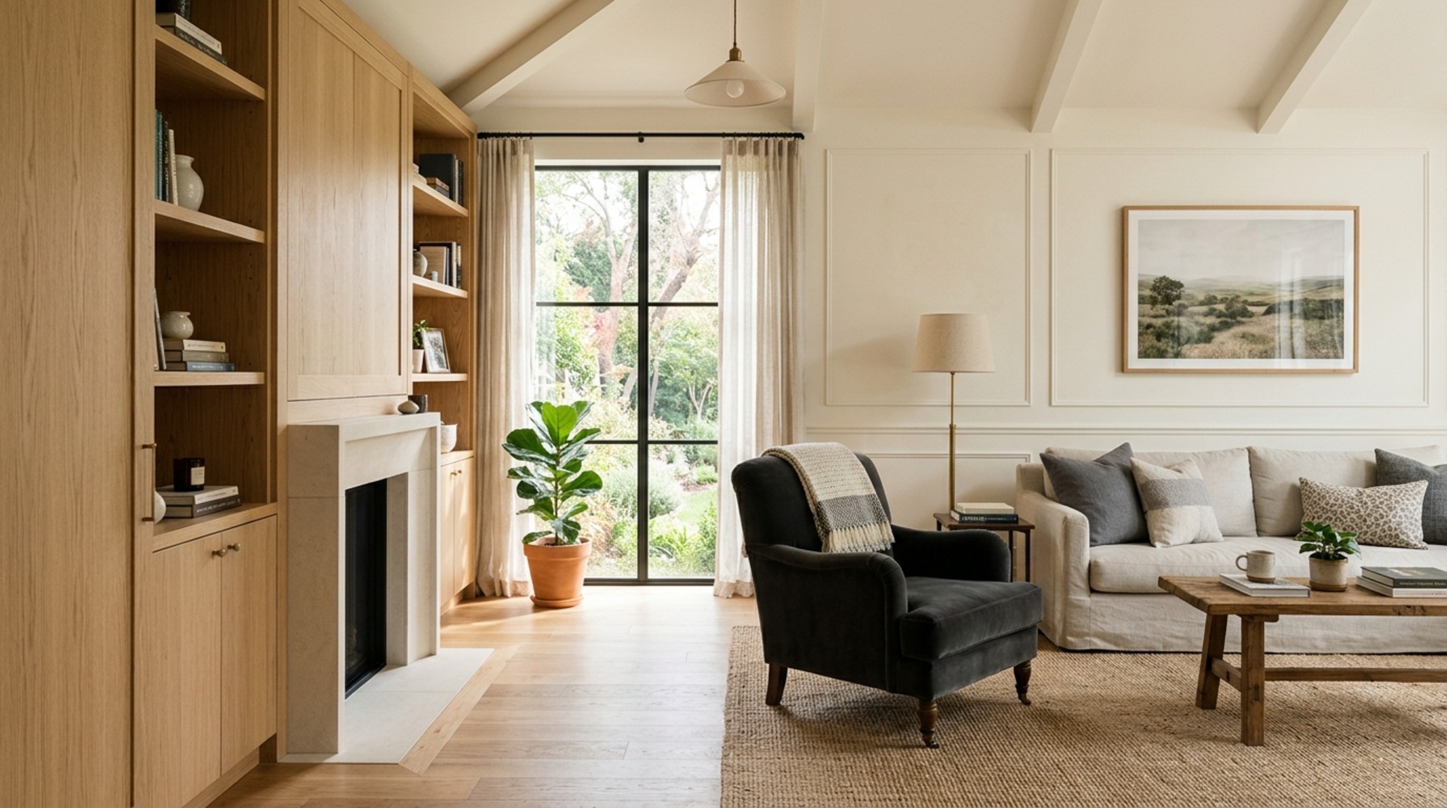
Mastering the 60-30-10 Rule for Room Design in Multi-Purpose Hubs
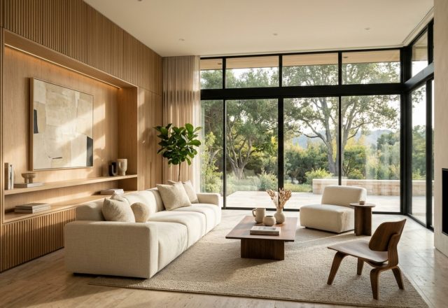
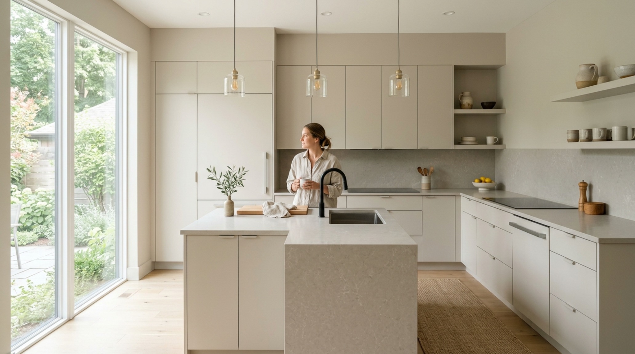
The traditional 60-30-10 rule for room design—where 60% of the room is a dominant color, 30% is a secondary color, and 10% is an accent—takes on a new level of importance in high-traffic, multi-purpose environments. In a 12×14 living room that serves as an office by day and a sanctuary by night, the 60% dominant hue should ideally possess a high Light Reflectance Value (LRV). Consider the soft, nuanced warmth of Benjamin Moore Swiss Coffee. With an LRV of 83, it doesn’t just sit on the wall; it acts as a light-dispersing tool, bouncing photons into shadow-prone corners. The 30% secondary tone—perhaps a textured linen or a fluted white oak cabinetry—provides the tactile grounding necessary to keep the space from feeling clinical. The final 10% isn’t just a pop of color; it’s a strategic marker that guides the eye toward functional zones, such as a Reading nook or a transition to the kitchen.
Light Reflectance Value in Design: The Physics of Expansion
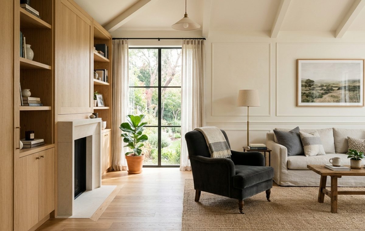
To understand how to expand a small-space footprint, one must look at the Light Reflectance Value (LRV) of their palette. Darker pigments absorb light, pulling walls inward and creating an intimate, if sometimes restrictive, cocoon. Conversely, high LRV tones reflect light, creating a sense of boundary-less expansion. However, the secret to interior color matching for ergonomic clarity lies in the ‘middle distance.’ Using a tone like Farrow & Ball Setting Plaster on both walls and millwork creates a monochromatic envelope. This lack of visual interruption between the vertical wall plane and the horizontal trim line prevents the eye from ‘stopping’ at the architectural seams, effectively blurring the edges of the room and making a 10-foot ceiling feel significantly loftier.
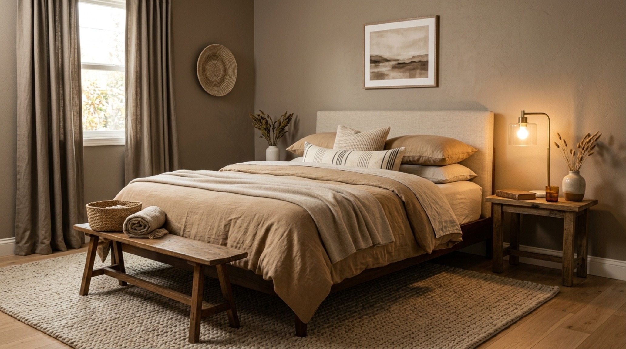
Tonal Layering Techniques: The Art of the Micro-Shift
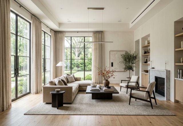
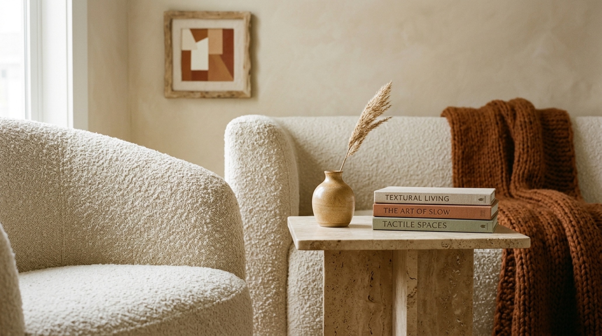
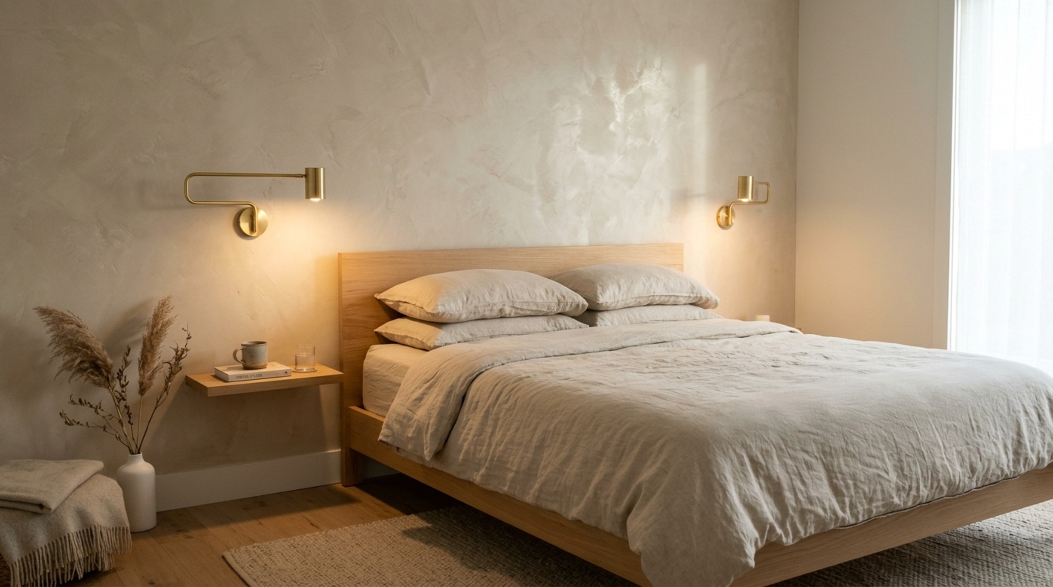
True sophistication in modern design is found not in contrast, but in the subtle micro-shifts of value and saturation. Tonal layering techniques involve selecting a primary hue and cascading it through its various tints and shades across different materials. Imagine a living space where the walls are a matte greige, the sofa is a plush velvet in a slightly deeper mushroom, and the rugs are a chunky wool weave in a pale sand. This layering creates depth without introducing the visual ‘clutter’ of disparate colors. When we match the undertones of our hard surfaces—say, a honed travertine coffee table—with the fabric of our window treatments, we create a spatial cadence that feels rhythmic and intentional.
This technique is particularly effective when working with artificial lighting. In a space designed with 2700K warm ambient lighting and high CRI (90+) task lamps, tonal layering allows for a beautiful shadow play. As the light hits different textures within the same color family, it reveals the ‘soul’ of the material—the grain of the wood, the weave of the fabric—without breaking the color-matched unity that keeps the small space feeling expansive. It is an exercise in restraint that pays dividends in mental clarity and spatial ease.
Accent Wall Coordination: Beyond the Focal Point
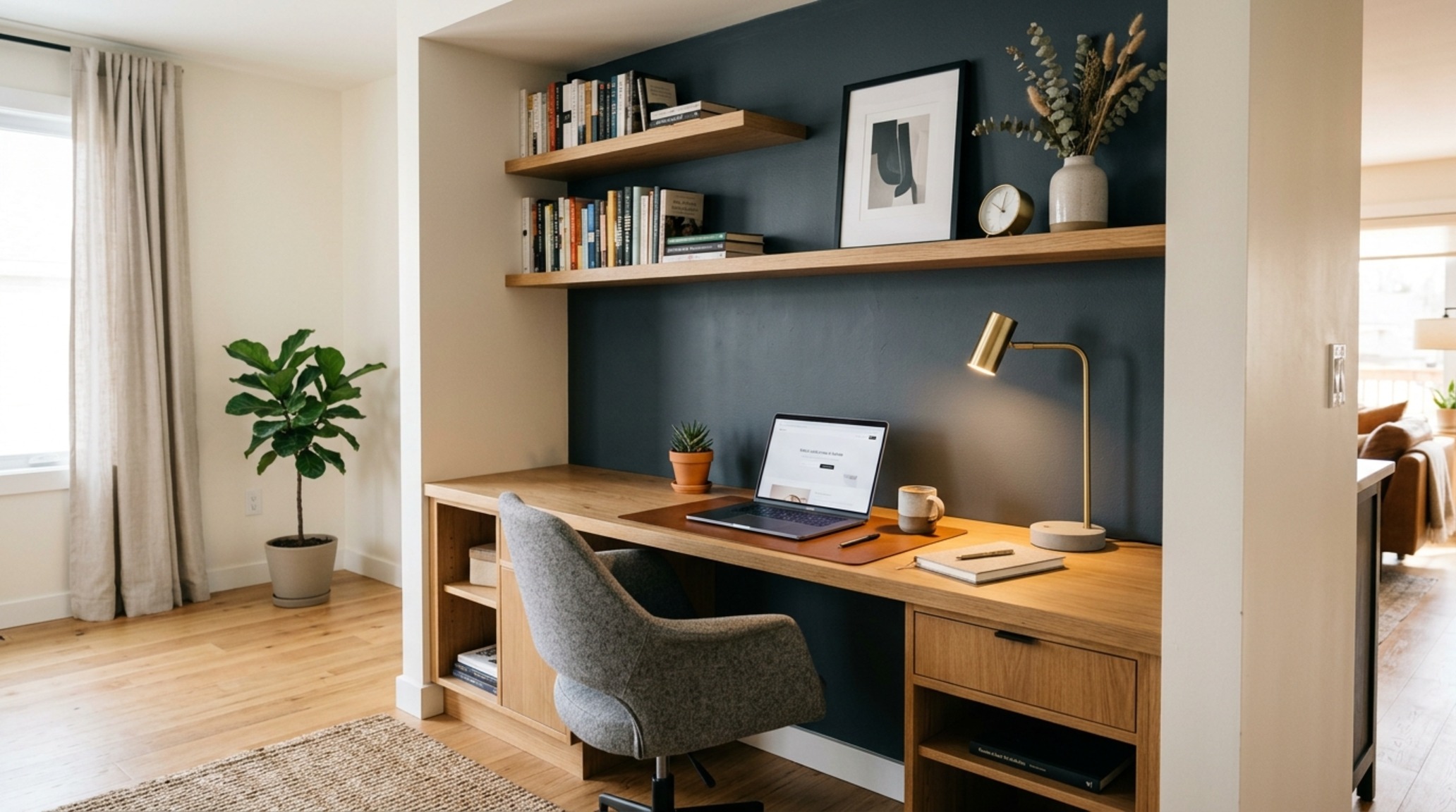
The concept of the accent wall has evolved. No longer is it simply about painting one wall a loud, contrasting color. Modern accent wall coordination is about architectural emphasis and sightline alignment. In an open-plan studio, an accent wall should serve to define a functional zone—like a home office alcove—without disrupting the flow of the entire unit. Using a deeply saturated but muted tone, such as a slate charcoal with navy undertones, can create a ‘recessive’ effect. When placed behind a monitor or a desk, it absorbs the glare and creates a visual ‘sink’ that helps the occupant focus, while the remaining walls in a lighter, matched neutral maintain the overall sense of openness.
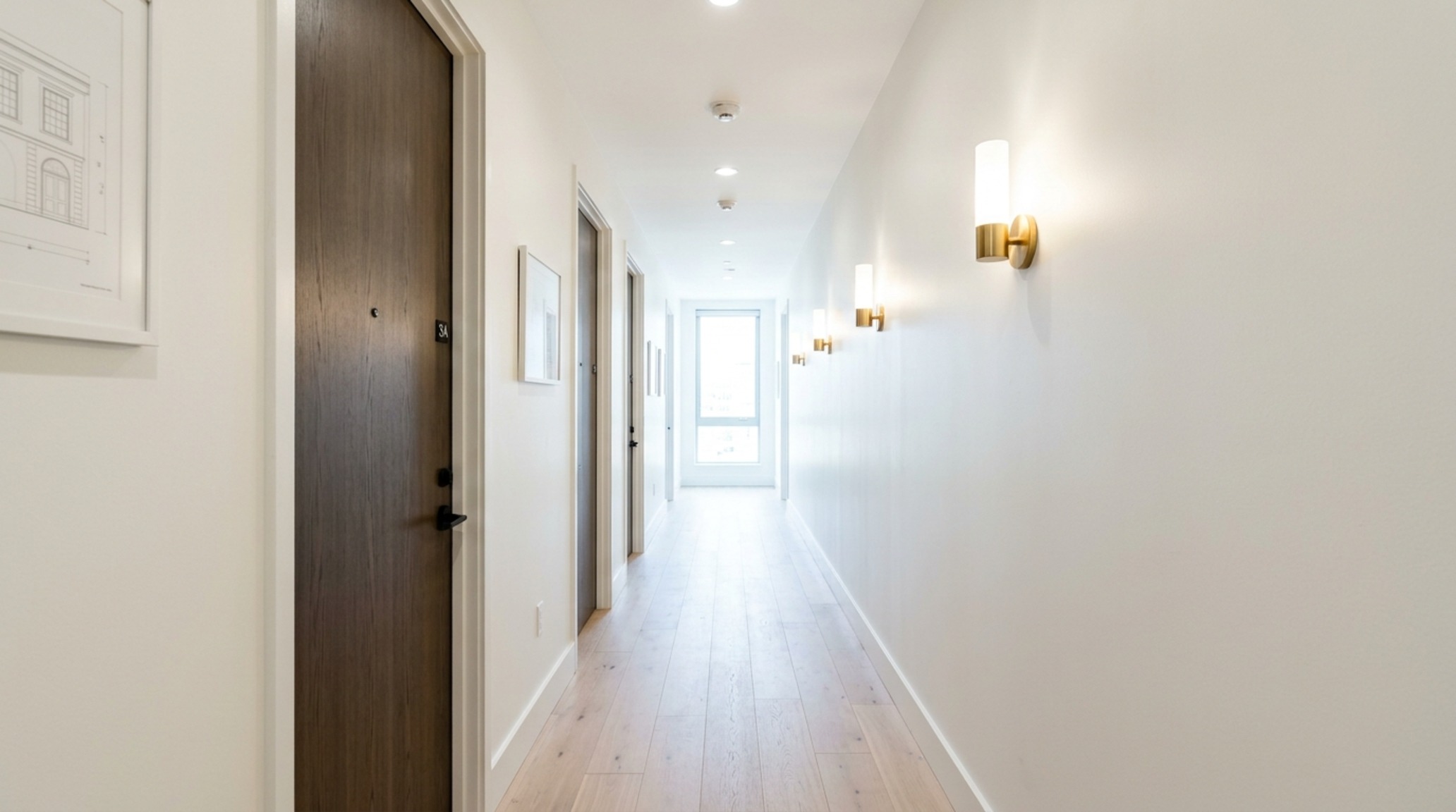
Architectural Vignettes & Spatial Flow
In the orchestration of a high-performance home, the transition points are as critical as the rooms themselves. A hallway that feels like a pressurized tube can be transformed through interior color matching that connects it to the larger volumes at either end. By carrying the floor color up onto the baseboards and even the lower third of the wall—a technique known as ‘color drenching’—the floor plane appears wider. This isn’t just a trick of the eye; it affects how we move through the space. We walk more confidently through a hallway that feels open, maintaining a 36-inch primary circulation path with ease because the visual boundaries have been pushed back.
The integration of materiality is the final layer of this ergonomic puzzle. A fluted white oak panel that matches the tone of the adjacent painted wall adds texture without adding visual weight. This is the essence of tactile color matching strategies: ensuring that the ‘feel’ of the space is as cohesive as the ‘look.’ When your hand grazes a wall as you turn a corner, and the texture of the plaster matches the warmth of the light, the home feels like a singular, breathable organism rather than a collection of boxes.
Complementary Color Schemes for Living Rooms: Balance and Ease
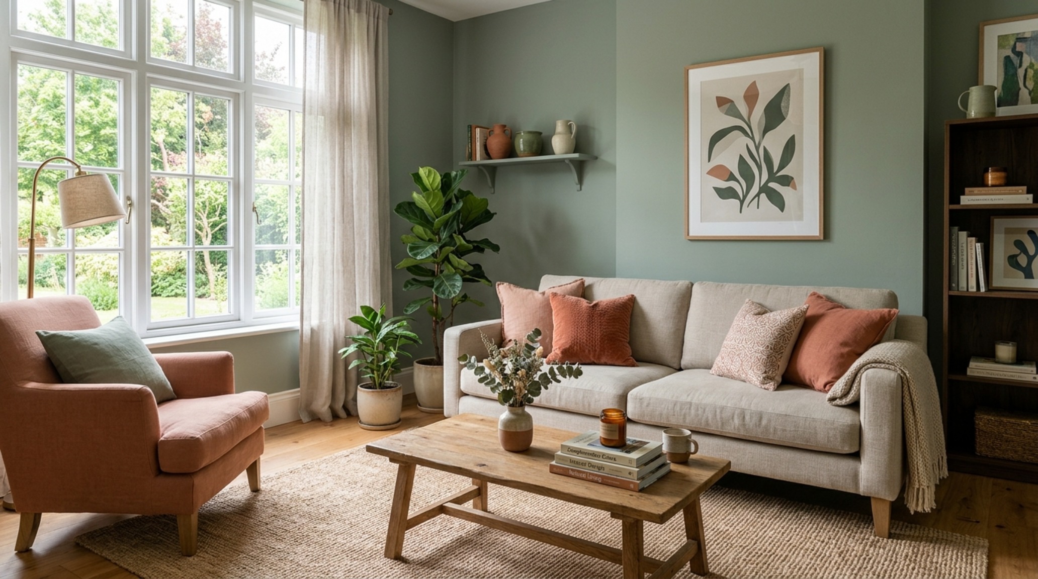
While monochromatic schemes are powerful for expansion, complementary color schemes for living rooms can be used to create energetic balance in high-traffic zones. The key is to use muted versions of complementary colors to avoid high-chroma vibration. A soft sage green paired with a muted terracotta or a dusty rose creates a natural, grounded environment. This approach works best when the colors share a similar ‘weight’ or LRV. By keeping the saturation levels consistent, you maintain the ergonomic clarity of the space while introducing a sophisticated, biophilic energy that connects the interior to the natural world outside the window.
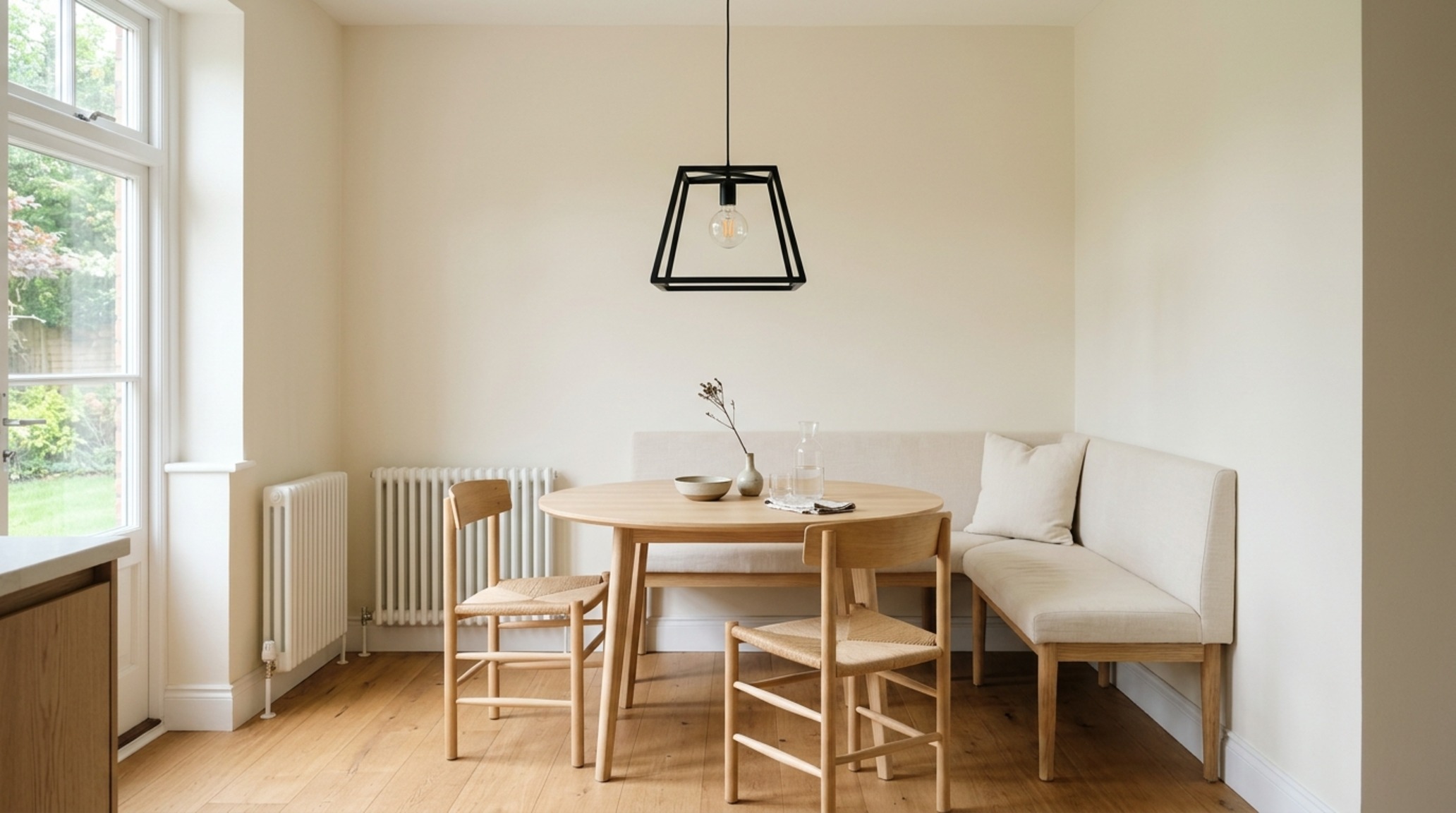
Consider the placement of furniture within these schemes. A dining chair requires at least 30 inches of clearance from the table to the nearest wall for comfortable entry and exit. When the color of that chair matches the tonal family of the rug beneath it, the furniture becomes ‘grounded,’ reducing the appearance of ‘floating’ objects that can make a room feel cluttered. Every decision, from the 18-inch height of a side table to the exact HEX code of the trim, should serve the ultimate goal of spatial fluidity.
Tactile Finishes, Color Codes & Spatial Ledger
Architectural summary of tactile material selections, lighting specifications, and spatial ergonomics.
The evolution of our living environments hinges on the recognition that color is not a veneer, but a vital architectural tool. By embracing interior color matching as a discipline of ergonomics, we move toward a future where our homes do not merely house us, but actively support our cognitive well-being. As we refine the relationship between the light hitting a plastered wall and the clearance of a hallway, we find a new kind of luxury—the luxury of unencumbered thought and effortless movement. The modern home is no longer defined by its square footage, but by the intelligence of its spatial cadence and the clarity of its chromatic soul.
Editorial Silo • Recommended Architecture Studies
- Sensory Modernism: Modern Houses Pictures & A Visual Guide to Textural Depth and Earth-Toned Palettes — Archival Design Case Study
- Curtain Designs For Windows: The Architectural Blueprint & Spatial Flow Guide — Archival Design Case Study
Interior Perspective Lookbook
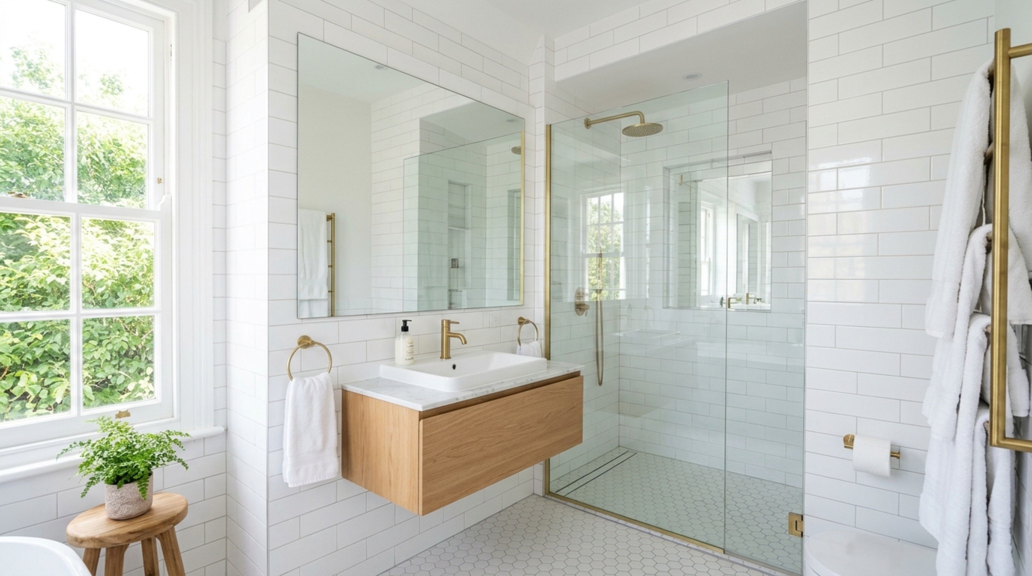
Detailed photographic vignettes showcasing texture balances, lighting nuances, and functional luxury.
Curated Visual Lookbook
Design Gallery & Spatial Studies
A visual curation of architectural arrangements, lighting concepts, and material palettes featured in this space.