The Evolution of Adolescent Architecture: Beyond the Thematic Trap
For decades, the design of adolescent spaces was governed by the bulky, thematic conventions of the ‘bedroom set’—a rigid, often juvenile approach that prioritized temporary aesthetic whims over architectural logic. We remember the car-shaped beds and the neon-streaked wallpapers that felt obsolete before the ink was dry. Today, we are witnessing a profound shift toward sophistication, where teenage bedroom colors are no longer chosen for their ‘cool’ factor alone, but are employed as strategic architectural instruments. This modern methodology treats the room as a multi-functional studio apartment, utilizing pigment to delineate boundaries, correct structural awkwardness, and facilitate the high-stakes psychological transition from childhood into the rigors of young adulthood.
By viewing paint through the lens of ‘Chromatic Zoning,’ we move away from the flat application of color and toward a 3D sculpting of the environment. We are no longer just ‘painting a room’; we are defining the spatial cadence of a life that must balance deep-focus study sessions with the restorative silence of sleep. The success of this approach lies in its ability to manipulate how a teenager perceives their footprint, turning a standard 12×12 box into a curated series of ‘moments’ that support their evolving identity and daily habits.
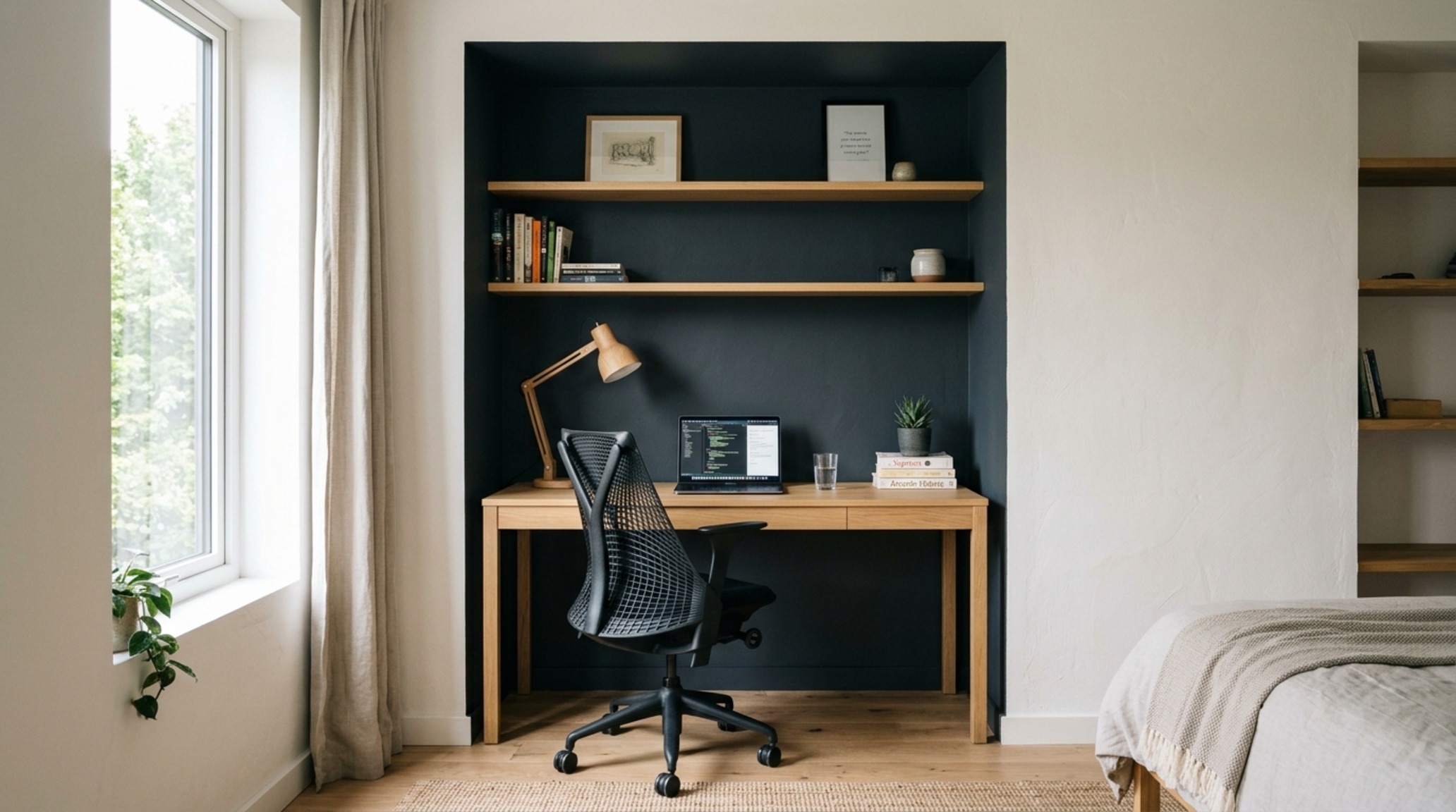
Zoning with Paint Colors: Creating Invisible Walls
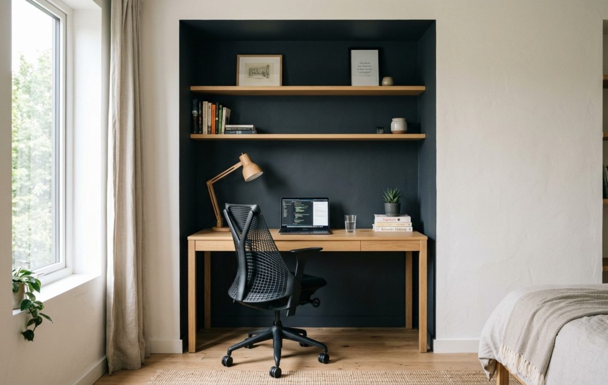
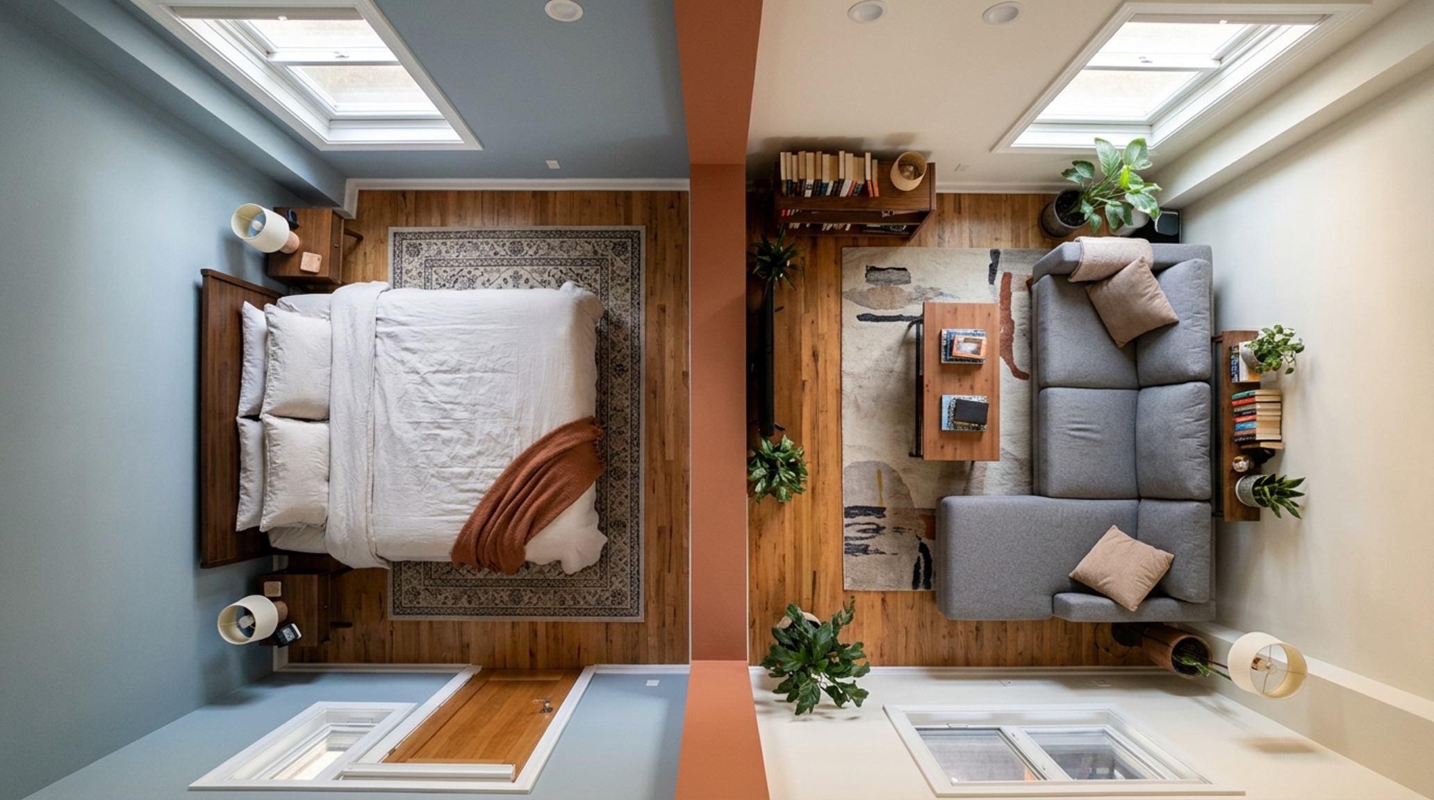
One of the most effective ways to introduce order into a chaotic teenage schedule is through the intentional use of contrast. Zoning with paint colors allows us to create ‘invisible walls’ that compartmentalize a room without sacrificing square footage. Consider a deep, saturated charcoal like Benjamin Moore’s ‘Iron Mountain’ applied exclusively to the study corner. By wrapping the desk area in a darker value—including the ceiling immediately above it—the eye perceives a separate architectural volume. This ‘cocooning’ effect minimizes peripheral visual distractions and signals the brain to enter a state of focus. When this dark volume meets a wall of light-reflective ‘Swiss Coffee’ near the sleeping area, the spatial transition is immediate and visceral.
This technique relies on the understanding of sightline alignment. When standing at the doorway, the strategic placement of these color blocks can direct the gaze toward a curated window view or hide a cluttered storage area in the shadows. We often specify a 2-inch ‘negative space’ gap between the color block and the adjacent wall, allowing the architectural structure to breathe and preventing the room from feeling closed-in or claustrophobic. It is about creating a sense of arrival in different parts of the same room, a luxury usually reserved for larger homes, now made accessible through pigment alone.
Small Room Color Expansion Techniques and the Loft Illusion
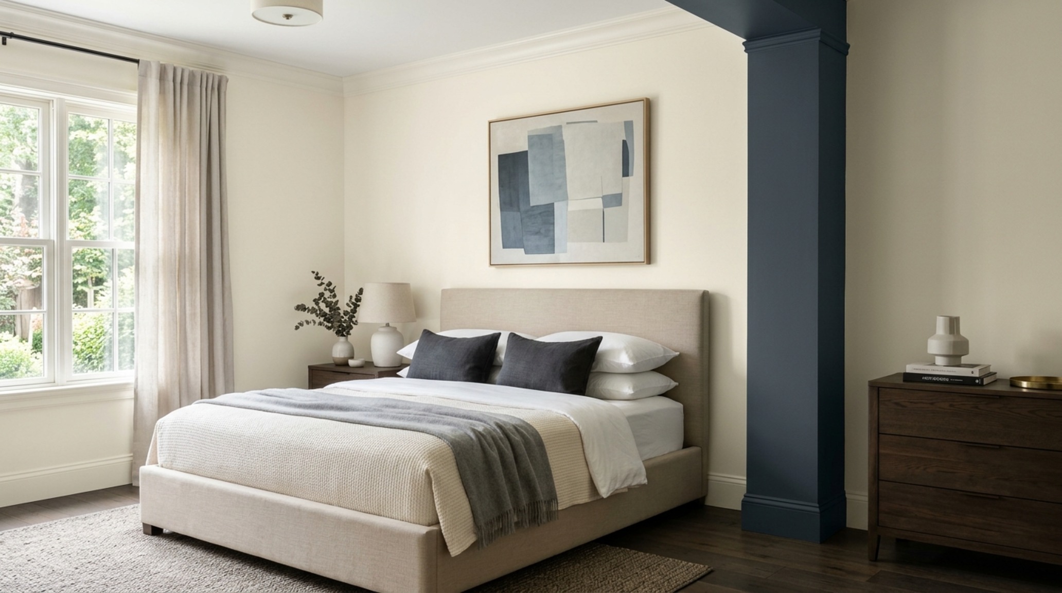
In compact rental layouts or standard suburban footprints, the ceiling is the most underutilized surface in the room. Conventional wisdom suggests white ceilings to keep things ‘airy,’ but architectural reality often proves the opposite. Small room color expansion techniques frequently involve painting the ceiling in a receding dark tone, such as a matte navy or a soft black like Farrow & Ball’s ‘Railings.’ When a ceiling is darker than the walls, it appears to move further away, creating a ‘loft’ feel that mimics the infinite depth of a night sky. This is particularly effective when the wall color is a soft, mid-tone greige that blurs the perimeter lines.
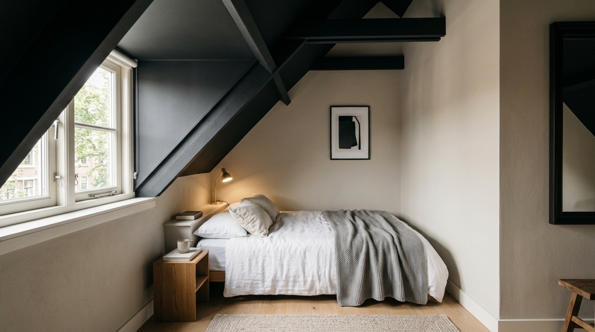
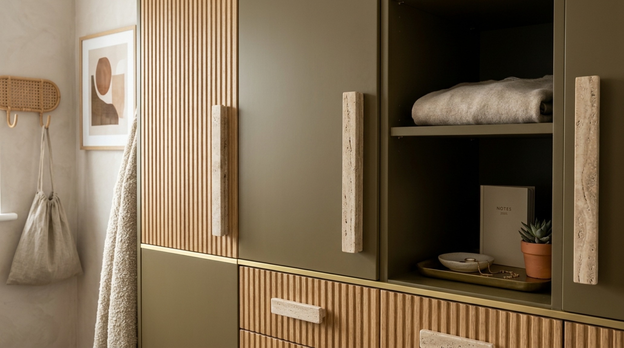
Vertical color-blocking is another masterstroke for adding structural height. By painting a vertical stripe or a ‘trough’ of color that extends from the floor up onto the ceiling, we can break the monotony of a long, narrow room. This creates a vertical axis that draws the eye upward, making a standard 8-foot ceiling feel significantly taller. When executing this, precision is paramount; we recommend using a laser level and high-quality frog tape to ensure the lines are surgically sharp. These teenage bedroom colors aren’t just background noise; they are the scaffolding upon which the room’s furniture—like a custom-built fluted white oak desk or a low-profile platform bed—finds its grounding.
Sophisticated Teen Bedroom Trends 2025: The Rise of Materiality
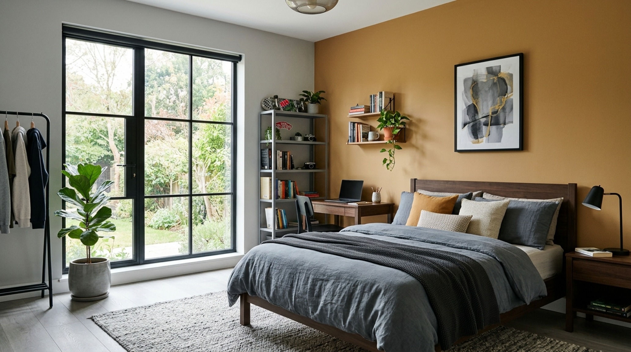
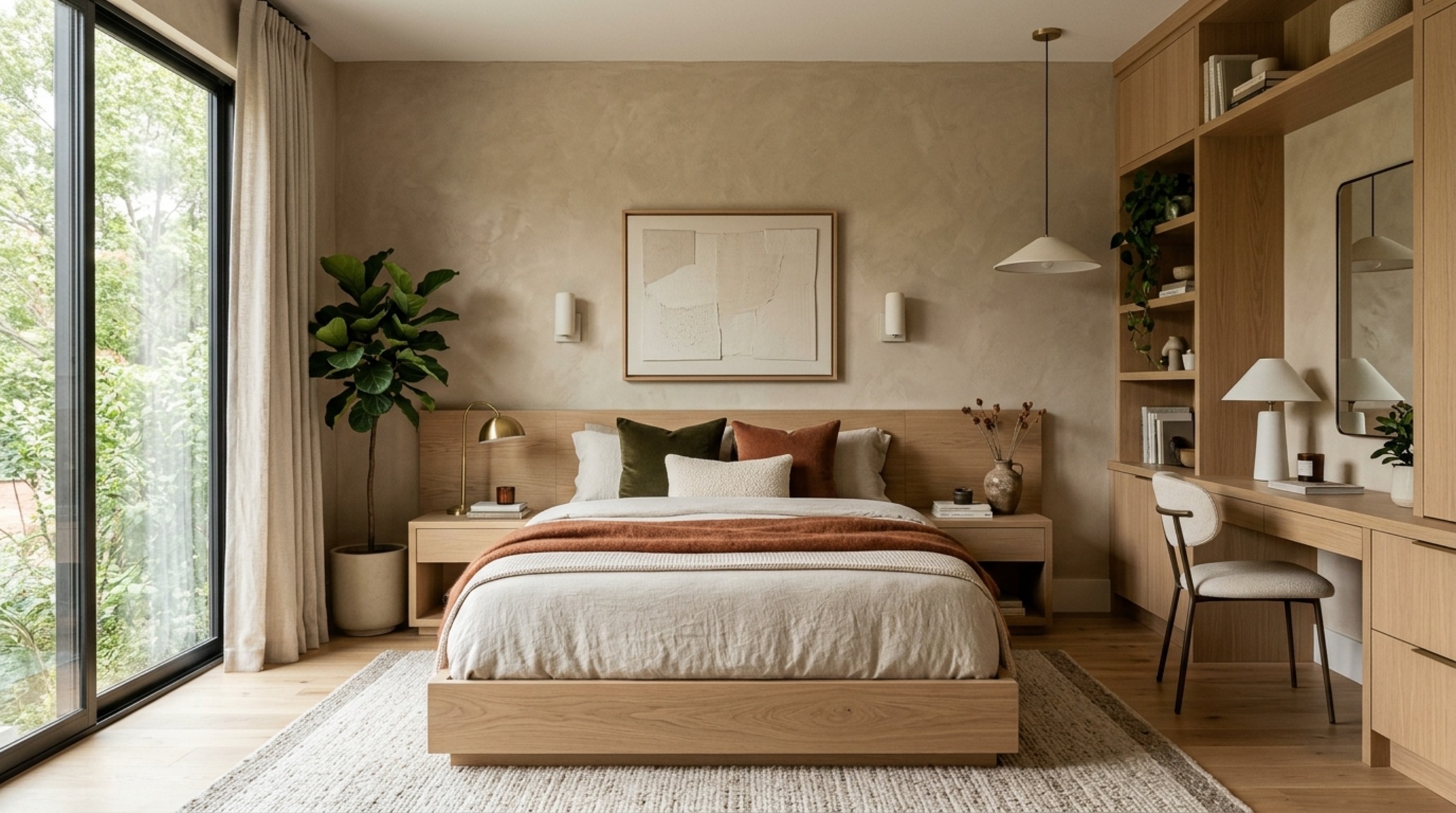
As we look toward the mid-decade mark, the palette is shifting away from the stark, high-contrast ‘Instagram white’ of previous years and toward a deeper, more textured materiality. Sophisticated teen bedroom trends 2025 are anchored in earthy, grounded tones that feel permanent rather than performative. We are seeing a surge in ‘dirty’ neutrals—olives with brown undertones, muted ochres, and desaturated clays. These colors offer a tactile quality that pairs beautifully with natural materials like honed travertine and raw linen.
“Design is not just what it looks like and feels like. Design is how it works. In a teenager’s room, color is the primary engine of that functionality.”
The trend is moving toward the ‘Quiet Luxury’ of bedrooms. This means using paint finishes to add depth; for example, a Roman clay or limewash finish in a deep sage green creates a mottled, stone-like texture that responds dynamically to changing light throughout the day. This move toward complexity reflects the teen’s own journey into more nuanced emotional and intellectual territory. They no longer want a room that screams; they want a room that whispers quality and provides a sanctuary from the digital noise that dominates their lives outside these four walls.
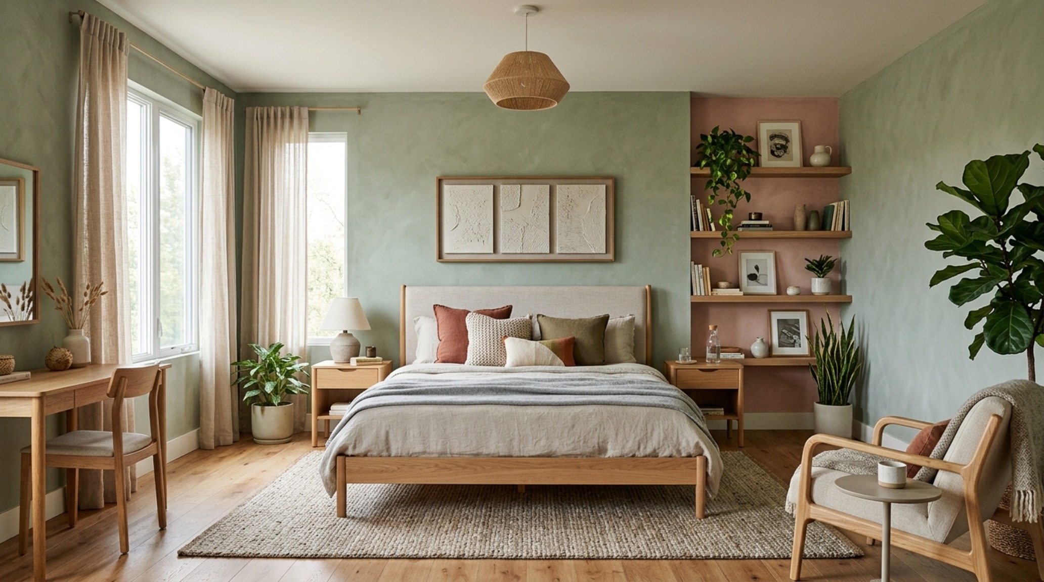
Gender-Neutral Bedroom Palettes and the New Organicism
The outdated binary of ‘blue for boys and pink for girls’ has been replaced by a more sophisticated, nature-inspired spectrum. Gender-neutral bedroom palettes are now the standard, focusing on tones that evoke the outdoors and promote a sense of calm. A base of ‘Setting Plaster’ (a dusty, architectural pink that reads as a warm neutral) paired with forest greens and navy accents creates a space that is both sophisticated and timeless. This palette doesn’t age out; it matures with the occupant.
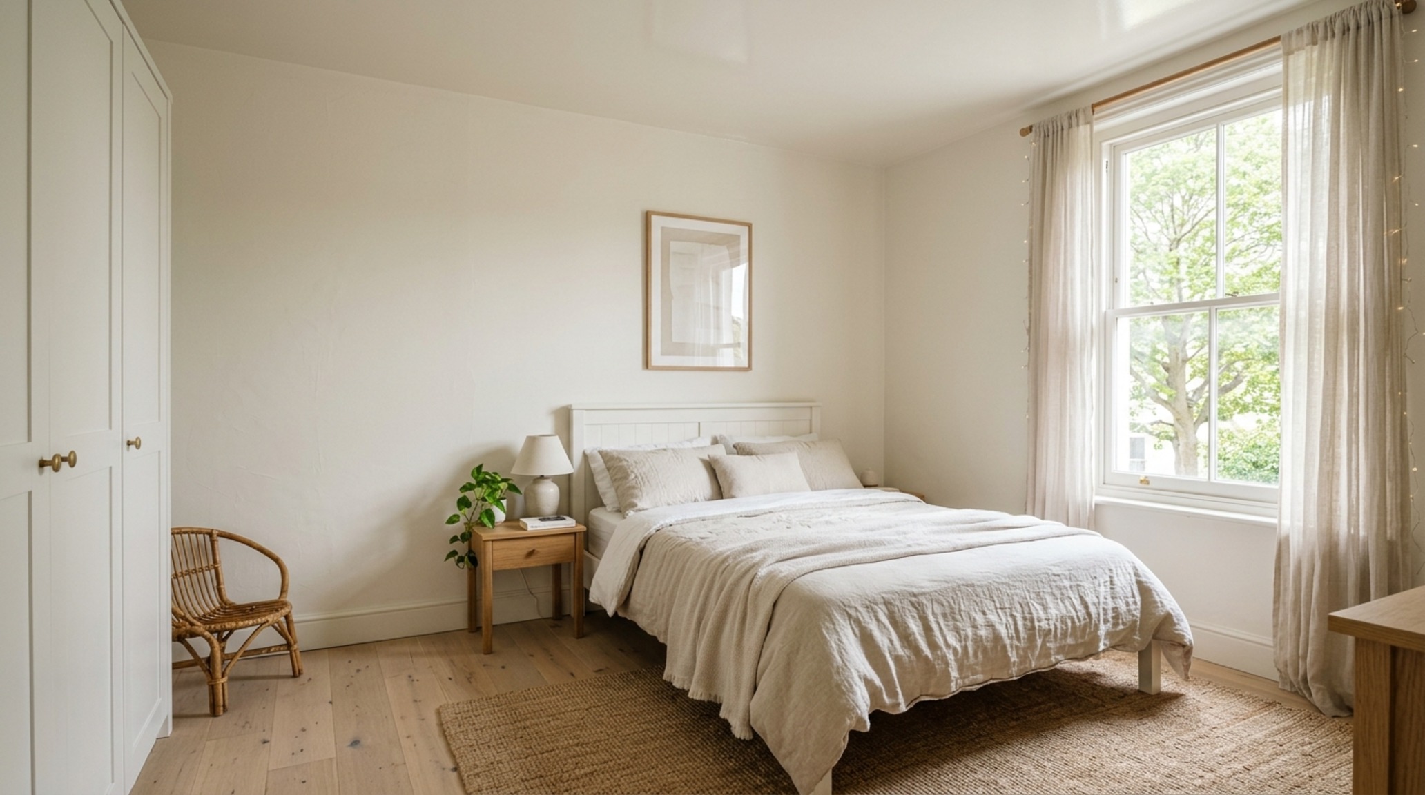
We often recommend a 60-30-10 rule for these organic schemes: 60% of the room in a primary neutral (like a warm alabaster), 30% in a secondary structural color (a deep lichen green for the cabinetry or a focal wall), and 10% in a high-chroma accent (like a burnt orange or a deep mustard). This balance ensures that the teenage bedroom colors feel cohesive and intentional, providing a stable backdrop for the inevitable influx of posters, books, and personal mementos that define a teenager’s personal narrative.
Moody Teen Room Aesthetics: Lighting the Dark Palette
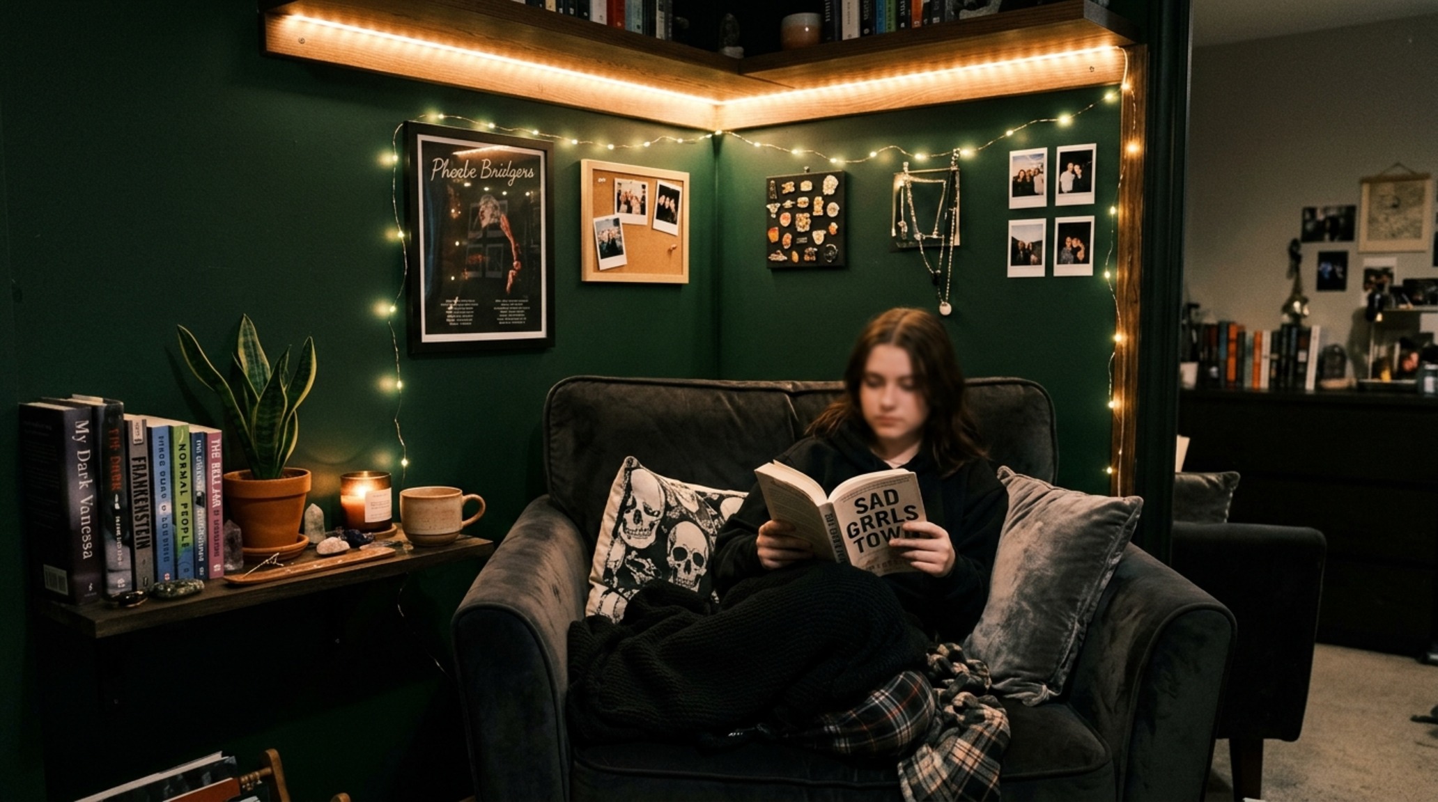
When working with darker, more evocative colors, lighting becomes the critical co-author of the design. Moody teen room aesthetics require a sophisticated layering of light to avoid looking gloomy. We specify a base of 2700K warm ambient lighting for general evening relaxation, but it is the 3000K task lighting at the desk that ensures the space remains functional. Using high CRI (Color Rendering Index) of 90+ is non-negotiable; it ensures that the subtle undertones of a charcoal or deep teal paint are rendered accurately and don’t turn ‘muddy’ under artificial light.
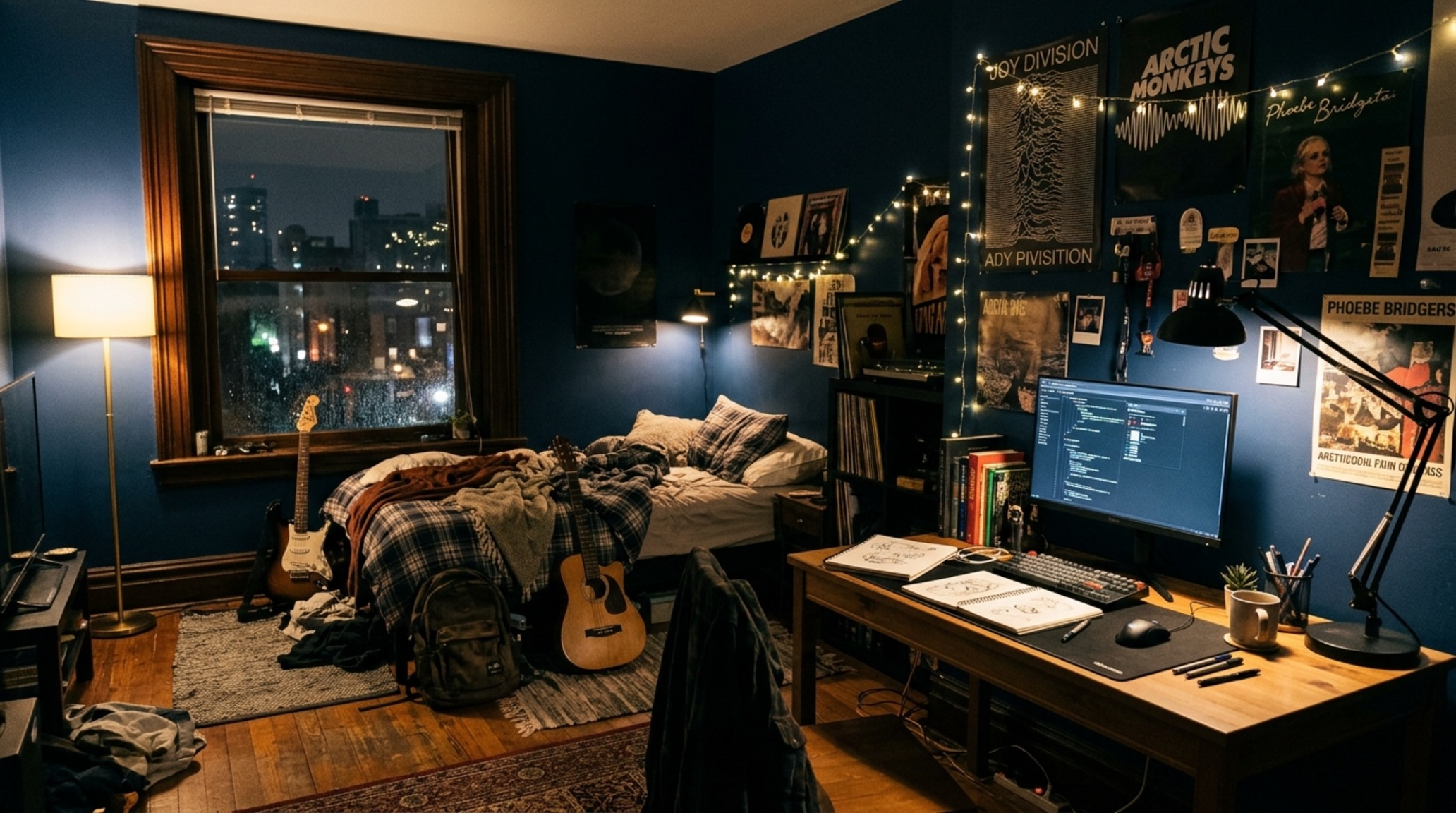
Shadow play is a design tool in its own right. By using directional sconces or LED extrusion strips hidden behind a headboard or under a floating desk, we can highlight the architectural ‘breaks’ created by the paint. This creates a sense of depth and drama, transforming the room into a cinematic environment that feels private and secure. When a teenager retreats to a room where the light hits a deep navy wall just right, casting soft shadows over a plush velvet chair, they aren’t just in a bedroom—they are in a sanctuary designed specifically for their peace of mind.
Transitional Bedroom Paint Schemes for Longevity
The most frequent concern we hear from parents is the ‘fickle’ nature of teenage tastes. However, by selecting transitional bedroom paint schemes, you can create a foundation that remains relevant from age thirteen through twenty-three. The key is to keep the ‘fixed’ elements—the walls and major built-ins—in sophisticated, versatile tones, while allowing the ‘fluid’ elements—bedding, art, and accessories—to carry the more temporary trends.
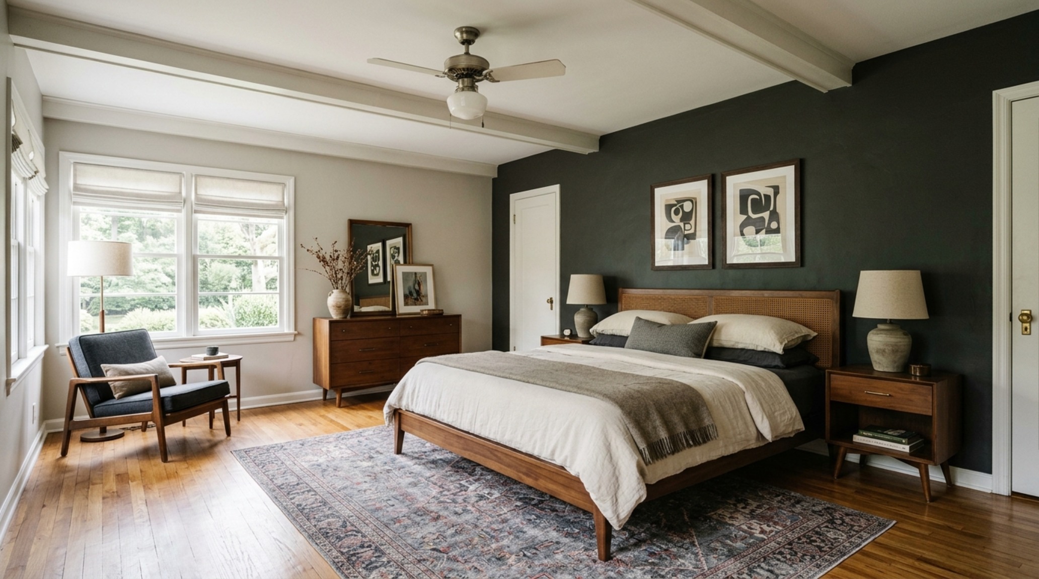
A transition-friendly palette might consist of a warm, stony grey like Sherwin-Williams ‘Agreeable Gray’ on three walls, with the fourth wall featuring a textured wallpaper or a bold, architectural color like ‘Dark Night.’ As the teen grows, the ‘Dark Night’ wall can serve as a backdrop for a collection of framed photography or a minimalist shelving system. The architectural bones of the room remain constant, but the story told within those bones is allowed to evolve. This is sustainable design at its most practical: creating spaces that don’t need to be gutted every three years, but instead, grow alongside their occupants.
Technical Specification & Material Matrix
Practical architectural ledger outlining surface materials, color values, and circulation dimensions.
Ultimately, the art of selecting teenage bedroom colors lies in the intersection of psychology and geometry. When we stop viewing the room as a container for furniture and start seeing it as a dynamic spatial composition, we unlock the true potential of the home. The most successful teenage bedrooms are those that don’t try to freeze a moment in time, but rather provide a sophisticated, architectural framework that honors the complexity of the young person living within it. By using color to sculpt flow, define zones, and expand the perceived boundaries of the space, we create more than just a room; we create a foundation for the future.
Editorial Silo • Recommended Architecture Studies
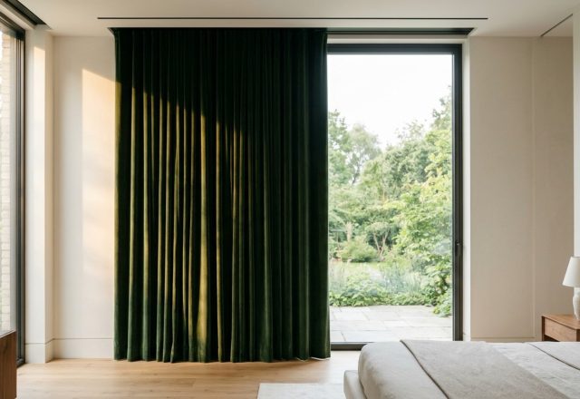
- The High-Performance Window: Ergonomic Innovation and Motorized Drapes for Bedroom Functionality — Archival Design Case Study
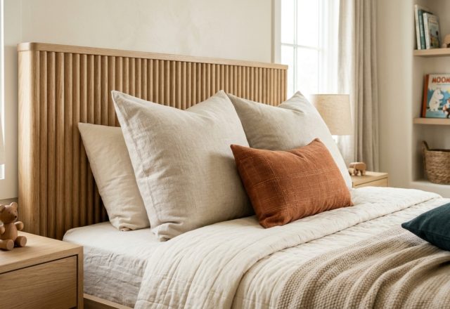
- The Tactile Aesthetic of Modern Bedroom Furniture For Kids: Materials, Moods & Lighting Kelvin — Archival Design Case Study
Architectural Form Portfolio
Carefully observed photographic studies detailing finish textures, sightline choreography, and enduring poise.
Curated Visual Lookbook
Design Gallery & Spatial Studies
A visual curation of architectural arrangements, lighting concepts, and material palettes featured in this space.