The Vertical Spine: Reimagining the Architecture of the Wall
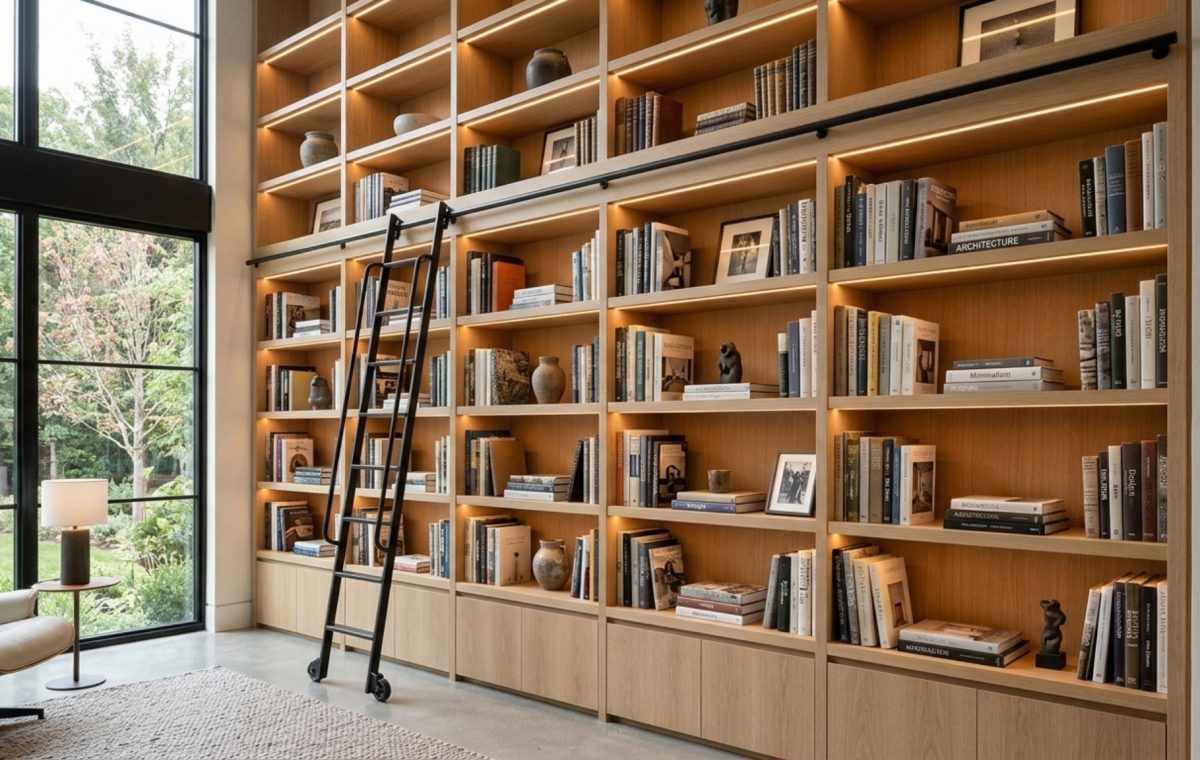
The most common architectural friction in contemporary living is the battle between our growing collections and the rigid constraints of square footage. Introducing intelligent book shelving into the floor plan serves as the definitive structural bridge between organization and aesthetic intent. It is not merely about storage; it is about the manipulation of the room’s volume. When we treat a wall as a canvas for cabinetry, we are essentially redrawing the boundaries of the space, creating a rhythm that guides the eye from floor to ceiling without the jarring interruption of freestanding furniture.
The secret to a successful installation lies in the subtle art of spatial cadence. A wall of books can either feel like a heavy, claustrophobic weight or a sophisticated, recessed sanctuary. This distinction is found in the architectural clearances. For a home library or integrated study, maintaining a 36-inch primary circulation path is non-negotiable. This ensures that the physical presence of the shelving doesn’t impede the natural flow of the human body through the room. When we respect these clearances, the shelving feels like an organic extension of the house’s bones rather than an invasive addition.
Spatial Perspectives & Material Curation: The Geometry of Balance
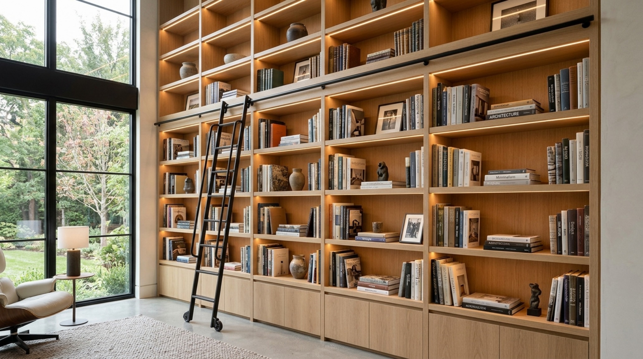
Designers often talk about ‘negative space’ as the breathing room between objects, but in the context of structural shelving, negative space is a physical tool. By varying the heights of shelves—moving beyond the standard 12-inch increment—you create internal architecture within the unit itself. A larger opening near the base can house a sculptural ceramic vessel or a stack of oversized folios, grounding the unit with visual weight. Meanwhile, higher, tighter shelves provide a sense of refined order for standard octavos. This internal hierarchy prevents the wall from becoming a monolithic block of wood, allowing for a play of light and shadow that keeps the eye moving.
Consider the materiality of the ‘back plane.’ Painting the back of the shelving in a contrasting tone, such as Benjamin Moore Swiss Coffee for a soft, creamy warmth, or Farrow & Ball Setting Plaster for a muted, dusty rose glow, provides a tactile grounding for the objects displayed. It turns the shelving into a shadow box, where every spine and object is framed against a deliberate backdrop of color and texture.
Small Space Book Shelving: The Art of Vertical Expansion
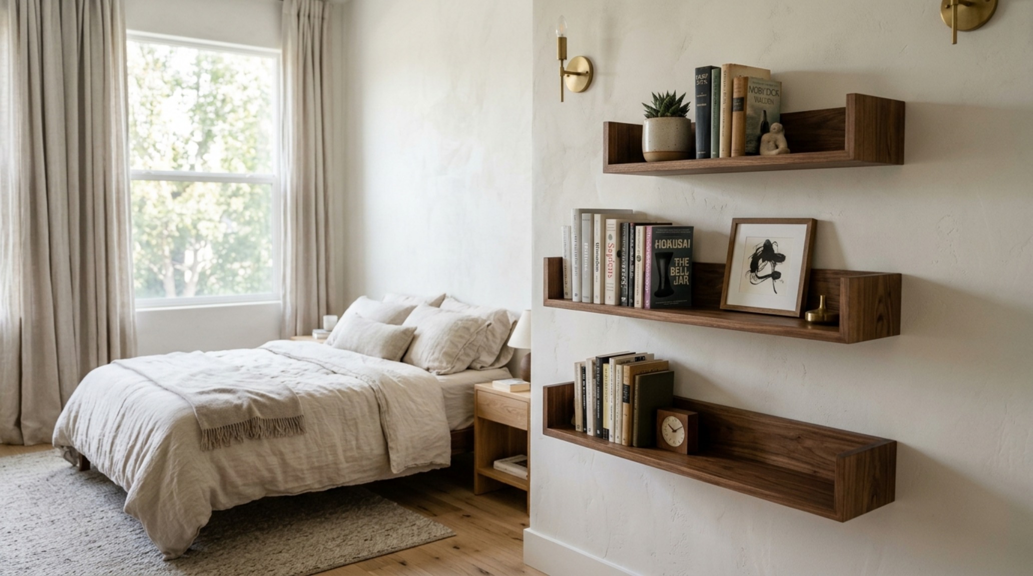
In urban environments where every square inch is a premium, small space book shelving requires a more surgical approach to design. The goal here is to maximize verticality while minimizing the ‘footprint impact’ on the floor plane. Floating shelves are the hero of the small apartment, as they keep the floor visible, tricking the brain into perceiving more square footage than actually exists. When the floor extends all the way to the baseboard, the room feels expansive; when a heavy cabinet blocks that sightline, the room shrinks.
One architectural trick for tight quarters is the wrap-around corner shelf. By utilizing the often-ignored corner, you create a continuous horizontal line that draws the eye around the perimeter of the room, effectively stretching the visual boundaries. To maintain the 18-inch coffee table reach or 30-inch chair clearance, these units should be shallow—never deeper than 10 inches for standard fiction. This prevents the shelving from encroaching on the essential ‘living’ zones of the room while still providing significant linear storage.
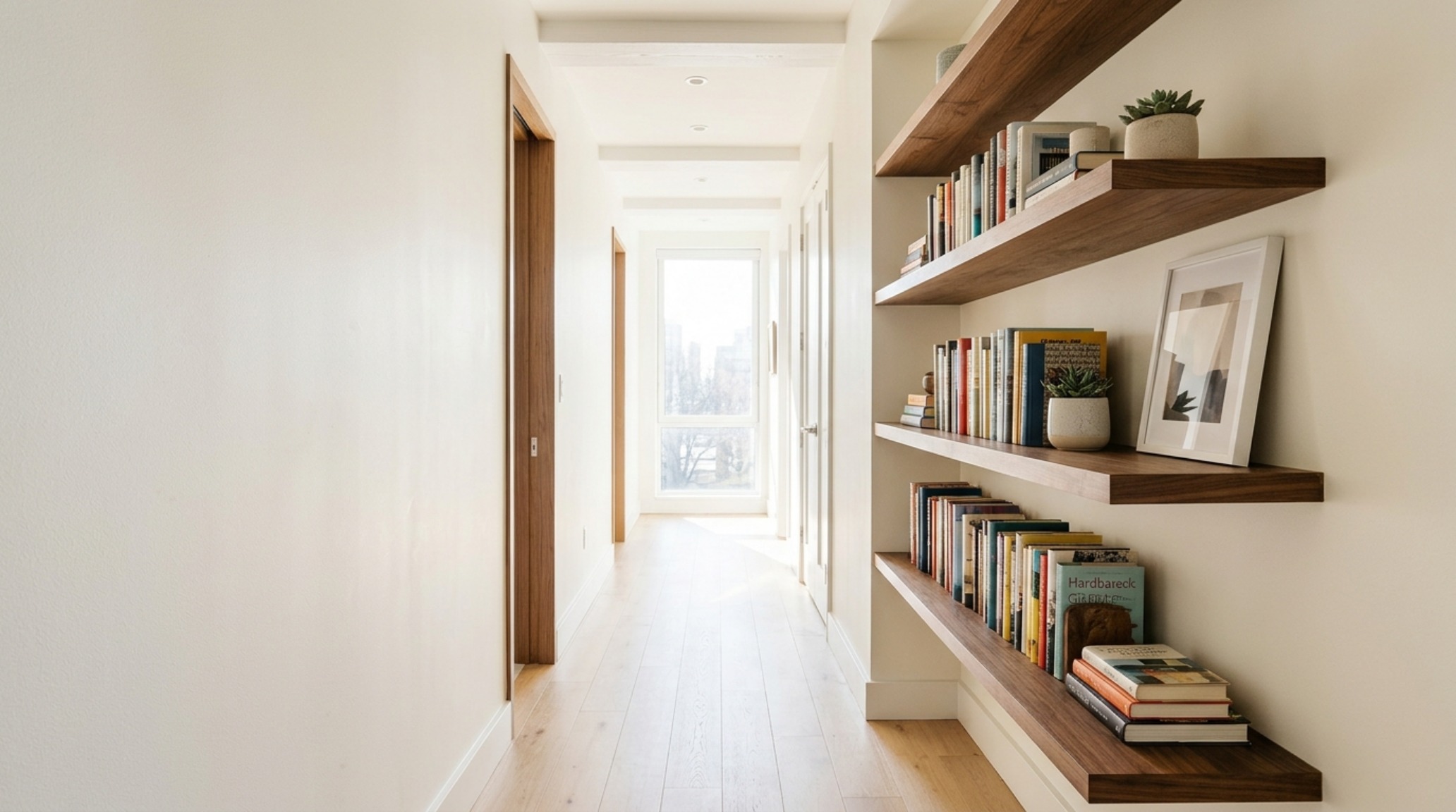
“A well-designed shelf is a conversation between the objects we love and the architecture that holds them; it is where memory meets masonry.”
Luxury Book Shelving Textures: A Tactile Study in Sophistication
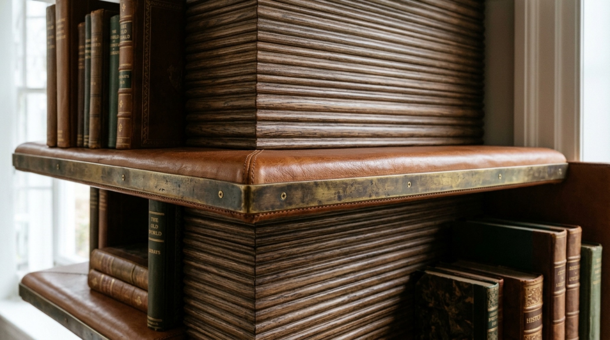
The transition from utility to luxury occurs at the intersection of materiality and joinery. Exploring luxury book shelving textures means looking beyond standard MDF and toward materials that possess a sensory soul. Fluted white oak, for instance, introduces a vertical ribbing that plays with directional light, creating a shimmering effect as you walk past. Combined with honed travertine stone inserts or aged brass hardware, the shelving becomes a piece of high-end millwork that rivals the finest furniture.
Tactility is also found in the shelf edges. A ‘bullnose’ or rounded edge softens the architectural line, making it feel more residential and inviting, whereas a sharp, mitered edge suggests a clean, modernist rigor. For a truly bespoke feel, consider leather-wrapped shelving. The soft, matte finish of the leather provides a non-slip, acoustically dampening surface that feels incredibly indulgent to the touch, especially when paired with a warm 2700K ambient light source that highlights the natural grain of the hide.
Architectural Vignettes & Spatial Flow: The Modular Shift
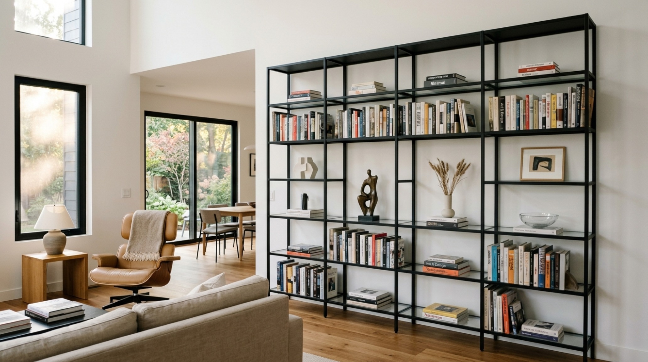
The modern home is fluid, and our storage must follow suit. Modern book shelving ideas have pivoted toward modularity—systems that can be reconfigured as a collection grows or as the room’s function changes. The key to making modular systems look ‘built-in’ is alignment with the room’s existing sightlines. If a shelving rail aligns perfectly with the top of a door frame or the sill of a window, it creates a sense of intentionality. It looks as though the house was designed around the shelves, rather than the shelves being an afterthought.
Modular designs also allow for the integration of ‘openings’—intentional gaps in the shelving that act as windows through the cabinetry. These openings can frame a piece of art, a wall-mounted television, or even a literal window, allowing natural light to penetrate the library wall. This ‘void and solid’ approach is a classic architectural principle used to reduce the mass of a large structure, ensuring that even a wall-to-wall library feels airy and integrated.
Book Shelving Lighting Guide: Designing with Luminescence
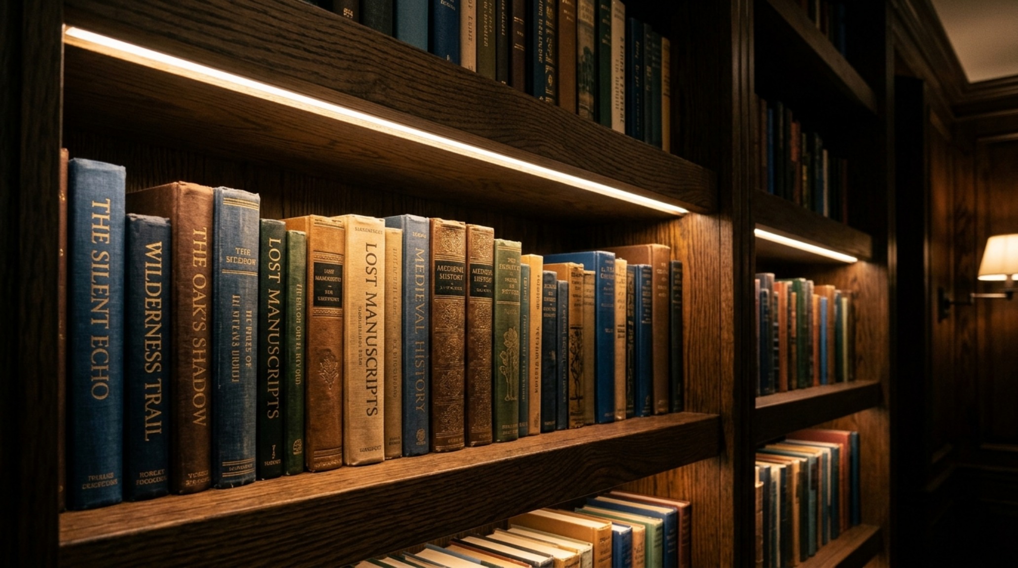
Light is the invisible material of interior design, and nowhere is it more critical than in a library setting. A comprehensive book shelving lighting guide must prioritize both task and atmosphere. For the shelf interiors, integrated LED ribbon lighting (look for a high CRI of 90+ to ensure book spine colors are rendered accurately) should be recessed into the front lip of the shelf. This ‘eyebrow’ lighting casts a soft glow backward, illuminating the titles without causing glare for the reader.
The color temperature is equally vital. A 2700K warm light mimics the cozy, nostalgic feel of candlelight and incandescent bulbs, making the library feel like a sanctuary. For more contemporary spaces, a 3000K source provides a crisper, more energetic light that works well with white oak or metal finishes. Avoid anything above 3500K, as it can make a residential space feel clinical. To add a layer of architectural drama, consider ‘picture lights’ mounted to the header of the unit. These provide a wash of light down the face of the books, highlighting the textures of the leather and cloth bindings and creating a focal point that anchors the entire room.
Materiality, Form & Light Vignettes: The Details That Matter
The final layer of architectural shelving is the ‘stylized edit.’ This is where we move from the structural to the decorative, though the two are inextricably linked. When styling, follow the 60-30-10 rule: 60% books (the structural core), 30% sculptural objects (the personality), and 10% ‘air’ or empty space. This empty space is crucial; it allows the eye to rest and prevents the wall from feeling like a storage unit. Place objects of varying textures—rough stone against smooth glass, matte ceramics against polished brass—to create a visual landscape that feels curated over time.
Curated Materiality & Technical Dimensions Guide
Comprehensive architectural blueprint detailing finishes, paint hex codes, and structural balance.
Ultimately, the success of book shelving is measured by how it makes the inhabitant feel within the room. It should provide a sense of enclosure and comfort, like a warm architectural embrace. By prioritizing clear sightlines, honest materials, and the soft glow of intentional lighting, we transform a simple storage solution into a permanent pillar of the home’s identity. The books on these shelves tell our history, but the shelves themselves define our future spatial experience, standing as quiet sentinels of design excellence in an ever-shifting world.
Editorial Silo • Recommended Architecture Studies
- The Master Blueprint: Engineering Structural Flow When You Create Your Own House Design — Archival Design Case Study
- Kinetic Living: Engineering Ergonomic Fluidity into Modern Home Interiors Designs — Archival Design Case Study
Curated Spatial Visuals
A visual anthology detailing craftsmanship, tailored millwork, and nuanced ambient illumination.
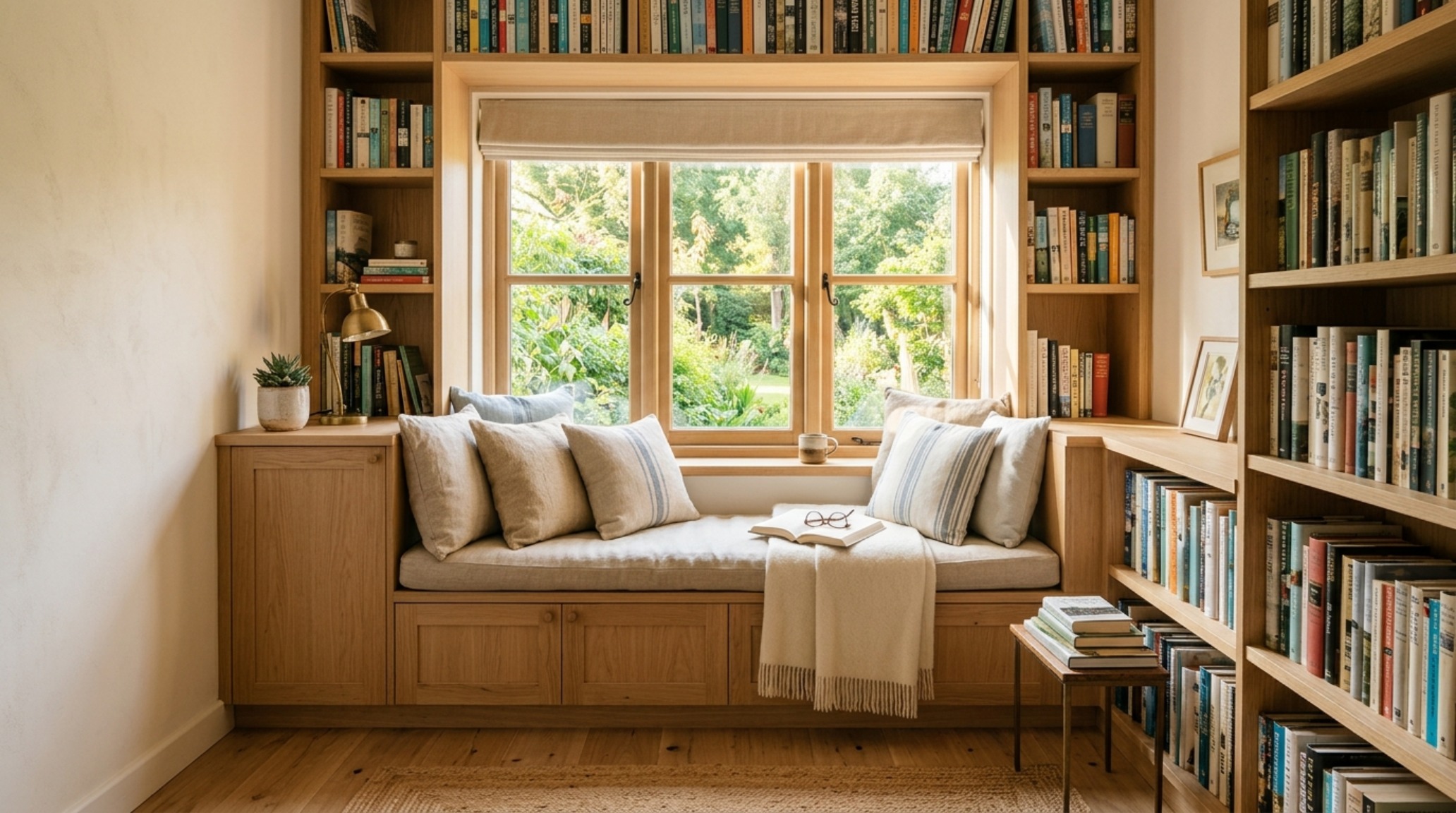
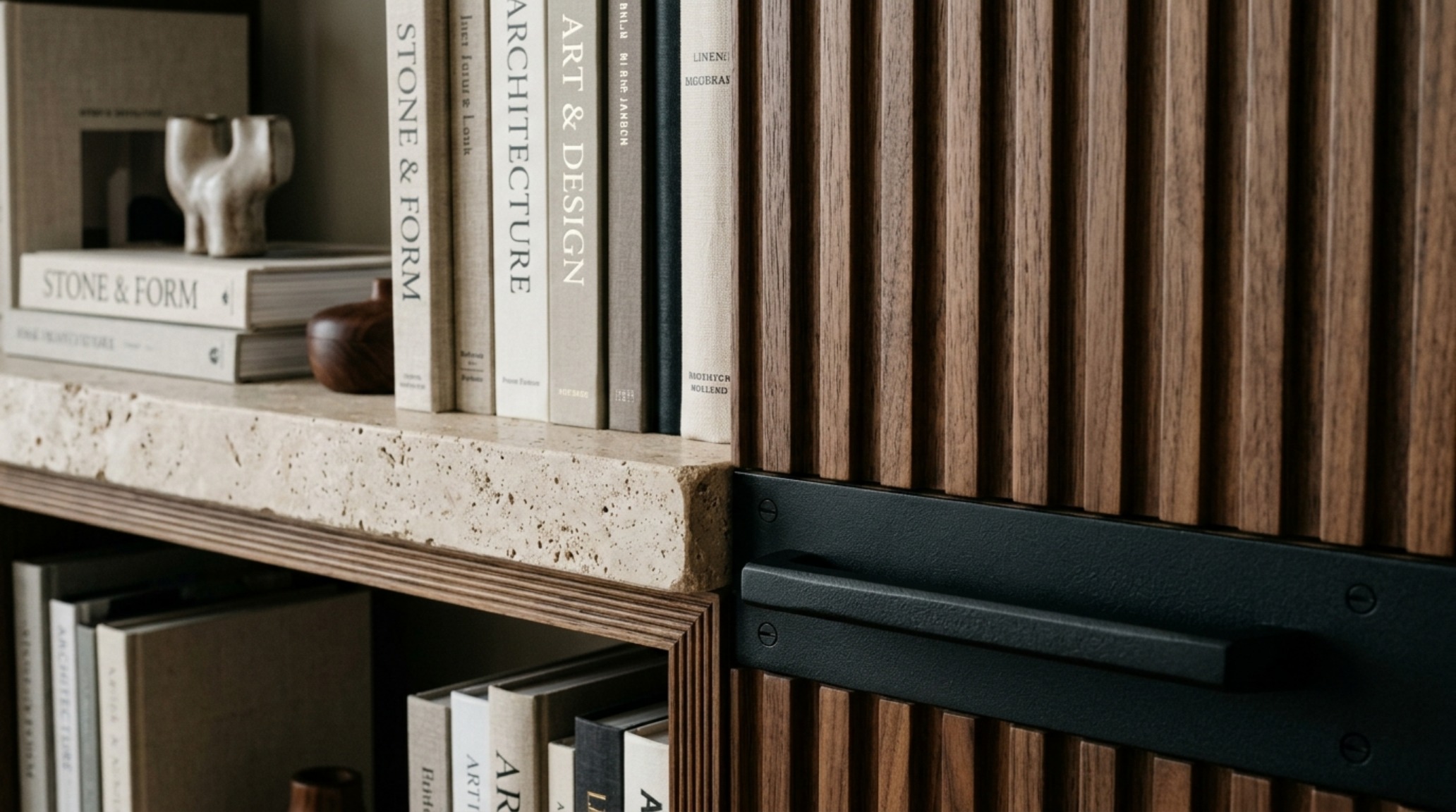
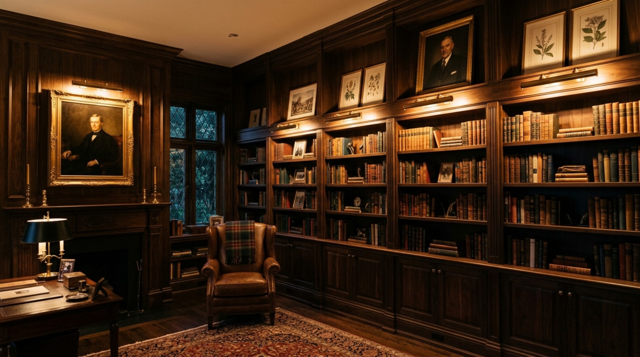
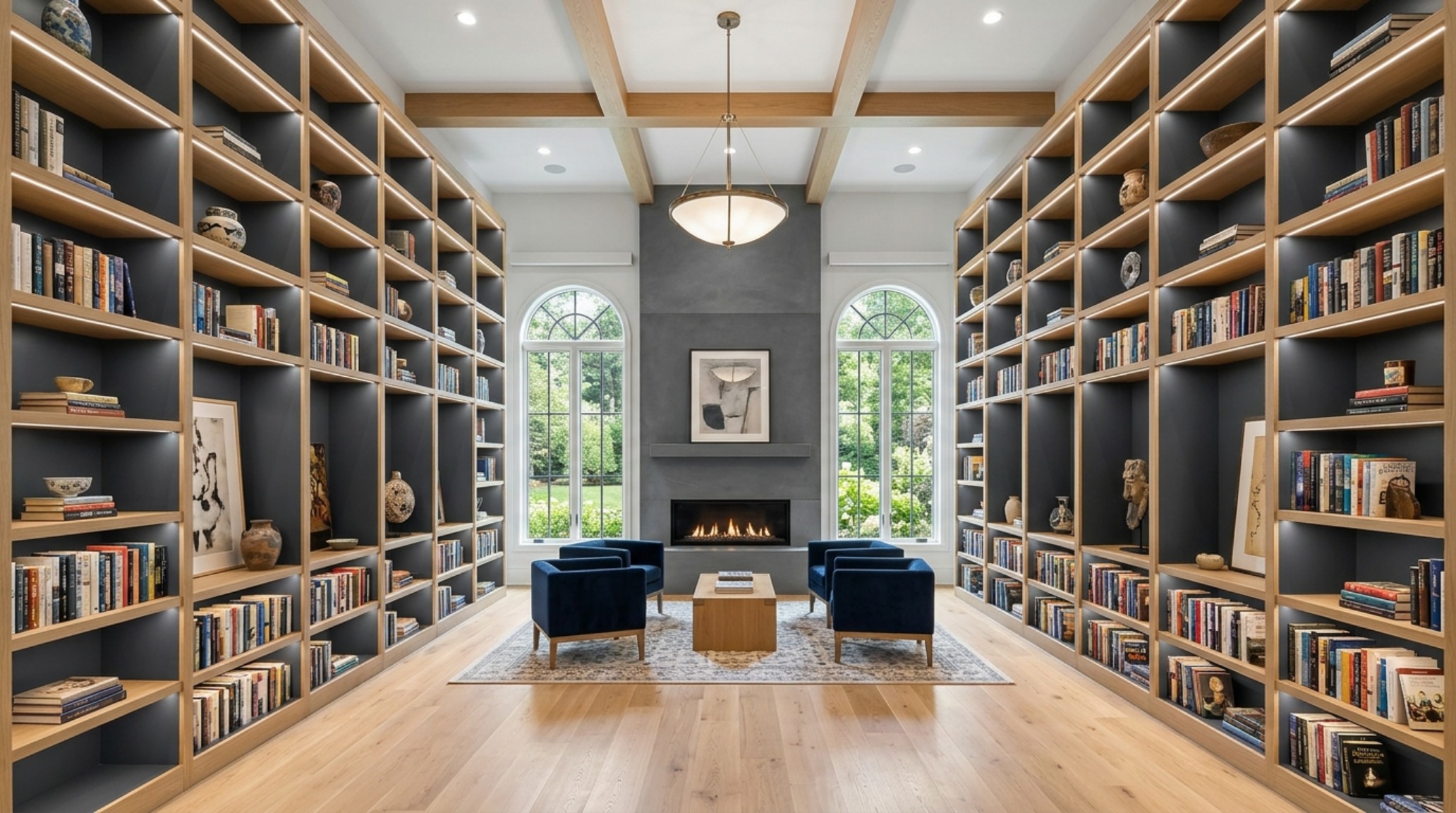
Curated Visual Lookbook
Design Gallery & Spatial Studies
A visual curation of architectural arrangements, lighting concepts, and material palettes featured in this space.