Architectural Illumination: Bright Bedroom Color Ideas & Scaling Bedroom Volume with High-Reflectance Color Systems

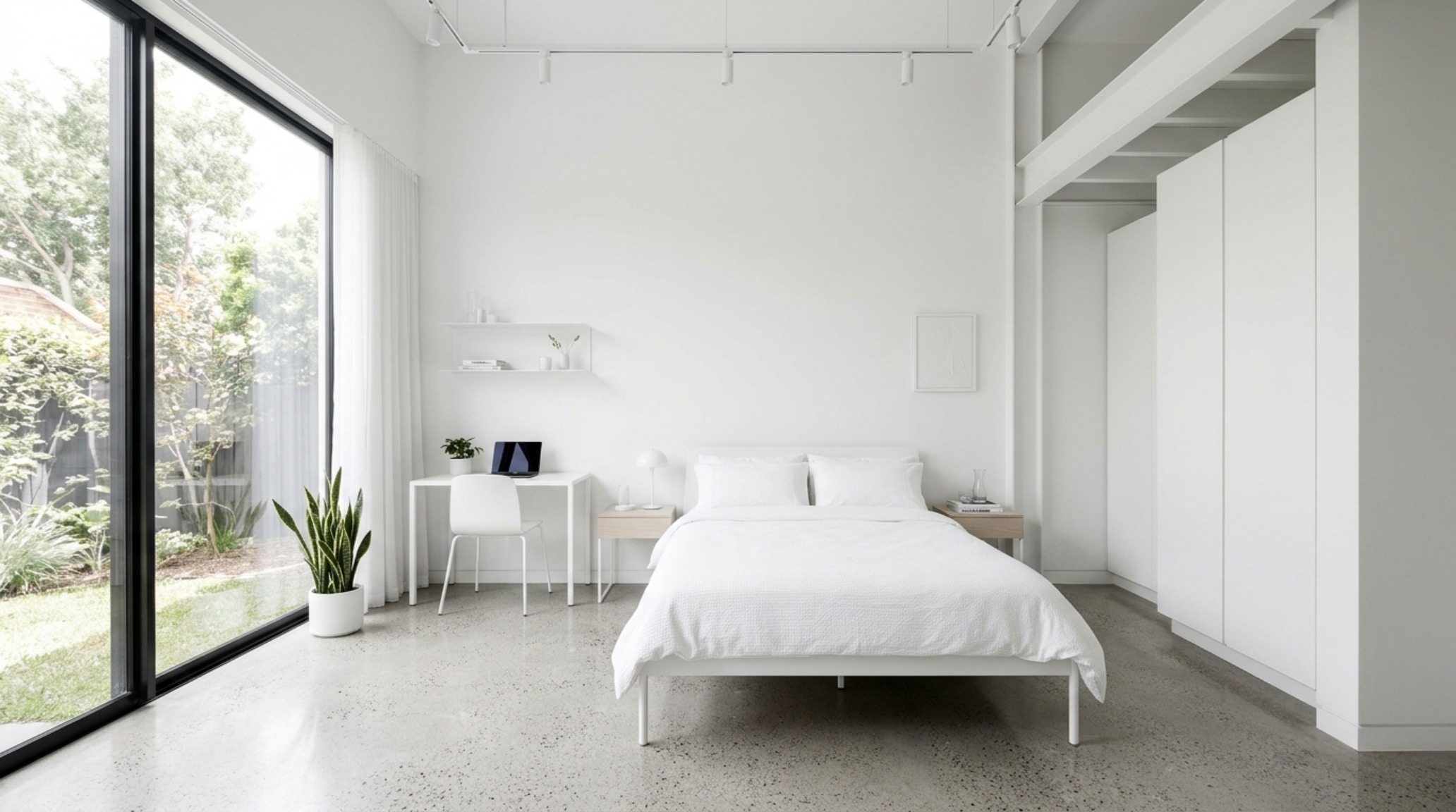
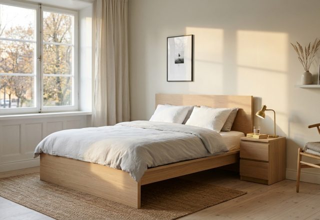
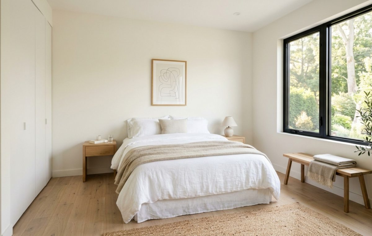
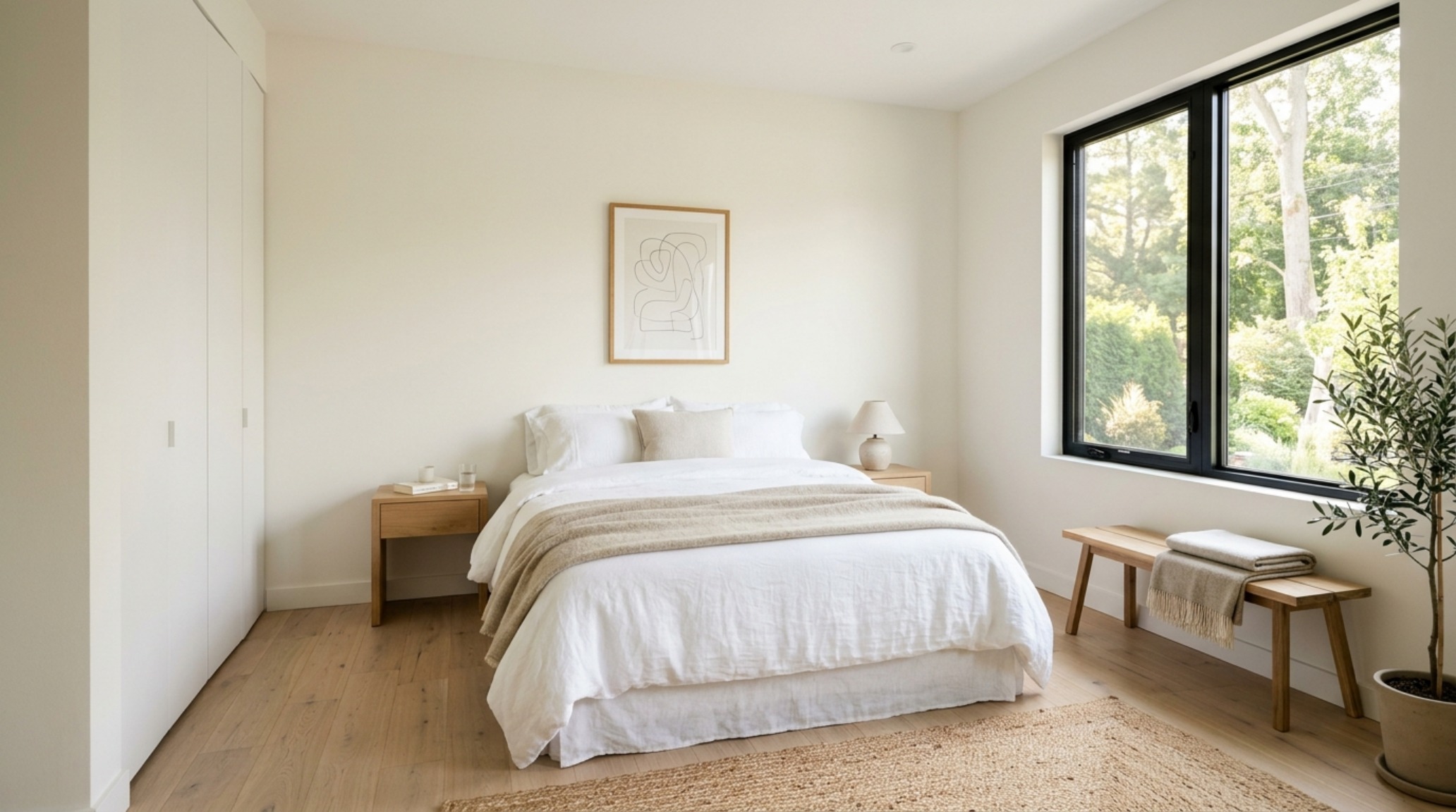
small bedroom color expansion achieved with Benjamin Moore Swiss Coffee walls and minimalist white oak furniture in a sun-drenched modern apartment

Key Points

  • The Physics of Perception: Small Bedroom Color Expansion Why do we so often equate intimacy with darkness, assuming that a sanctuary must be a…

The Physics of Perception: Small Bedroom Color Expansion

Why do we so often equate intimacy with darkness, assuming that a sanctuary must be a cavern? Implementing bright bedroom color ideas is the architectural pivot that transforms a claustrophobic footprint into a boundless, breathing sanctuary. It is a common designer’s dilemma: a client possesses a room with historical charm but restrictive square footage. The instinct is often to lean into the ‘jewel box’ effect with moody charcoals, but for those seeking a restorative, morning-centric atmosphere, we must look to the science of luminosity. By understanding the Luminous Envelope—a strategy where we treat every surface as a reflector—we can effectively scale the perceived volume of a room without moving a single structural stud.
small bedroom color expansion achieved with Benjamin Moore Swiss Coffee walls and minimalist white oak furniture in a sun-drenched modern apartment

At the heart of this transformation is Light Reflectance Value (LRV). Measured on a scale from 0 to 100, LRV tells us how much light a paint color reflects versus how much it absorbs. While a deep navy might sit at an LRV of 10, a professional favorite like Benjamin Moore’s Swiss Coffee hovers around 82. In the context of small bedroom color expansion, these 70 points of difference represent the difference between a wall that feels like a boundary and one that feels like a horizon. When photons hit a high-LRV surface, they bounce back into the center of the room, illuminating shadows and softening the transition between planes.

Architectural Perspectives & Lighting Vignettes

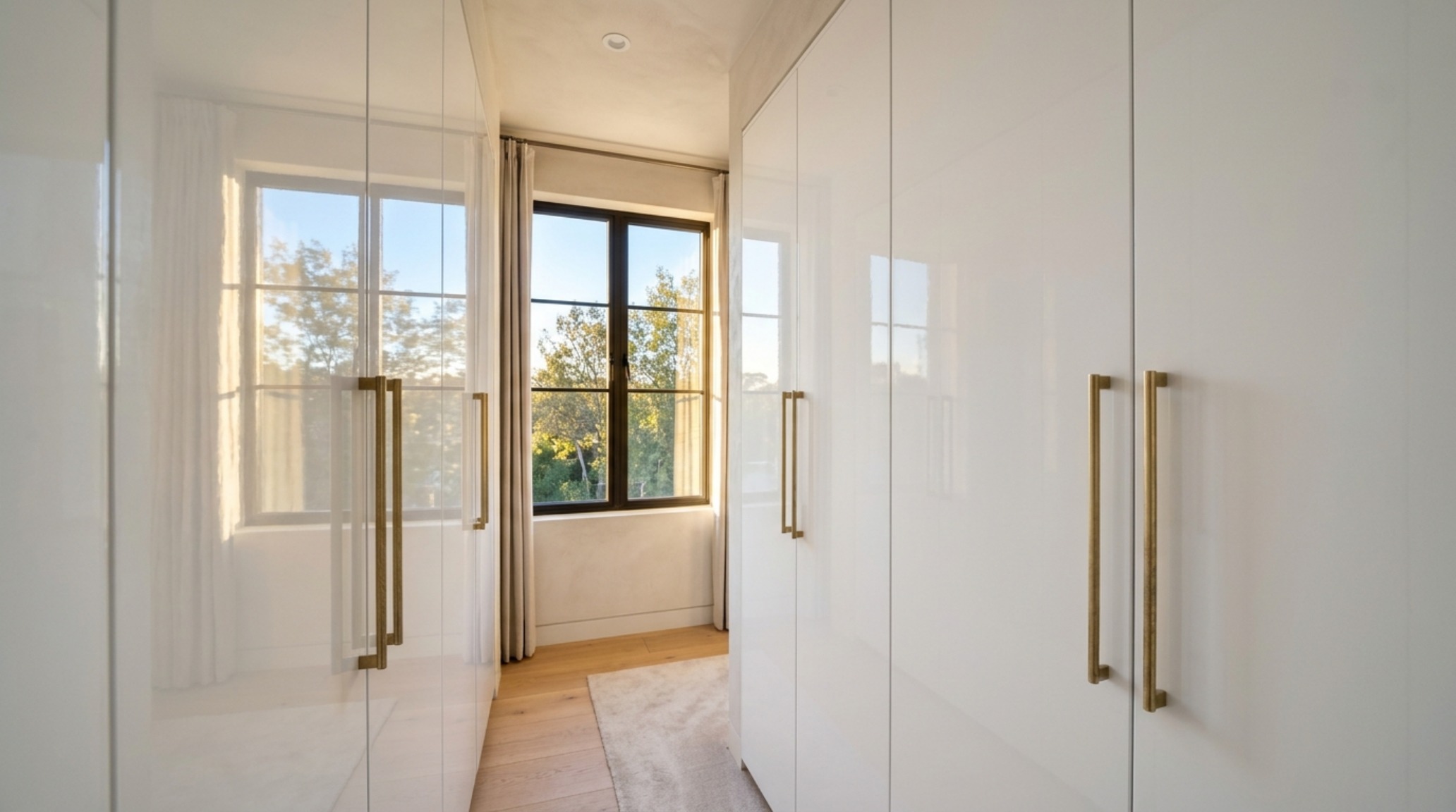
To truly dissolve the physical limitations of a room, we must address the most overlooked surface: the ceiling. In traditional residential construction, the ceiling is often a flat-white afterthought. However, by applying light-reflective wall finishes—specifically a high-gloss or lacquer finish—to the overhead plane, we create a ‘liquid’ effect. This mirror-like quality doesn’t just reflect the floor; it doubles the visual height of the room. Imagine a bedroom where the walls are finished in a soft, matte alabaster and the ceiling is coated in a bespoke high-gloss sheen of the same hue. The corner line where the wall meets the ceiling disappears, replaced by a soft, ethereal glow that makes the architecture feel infinite.
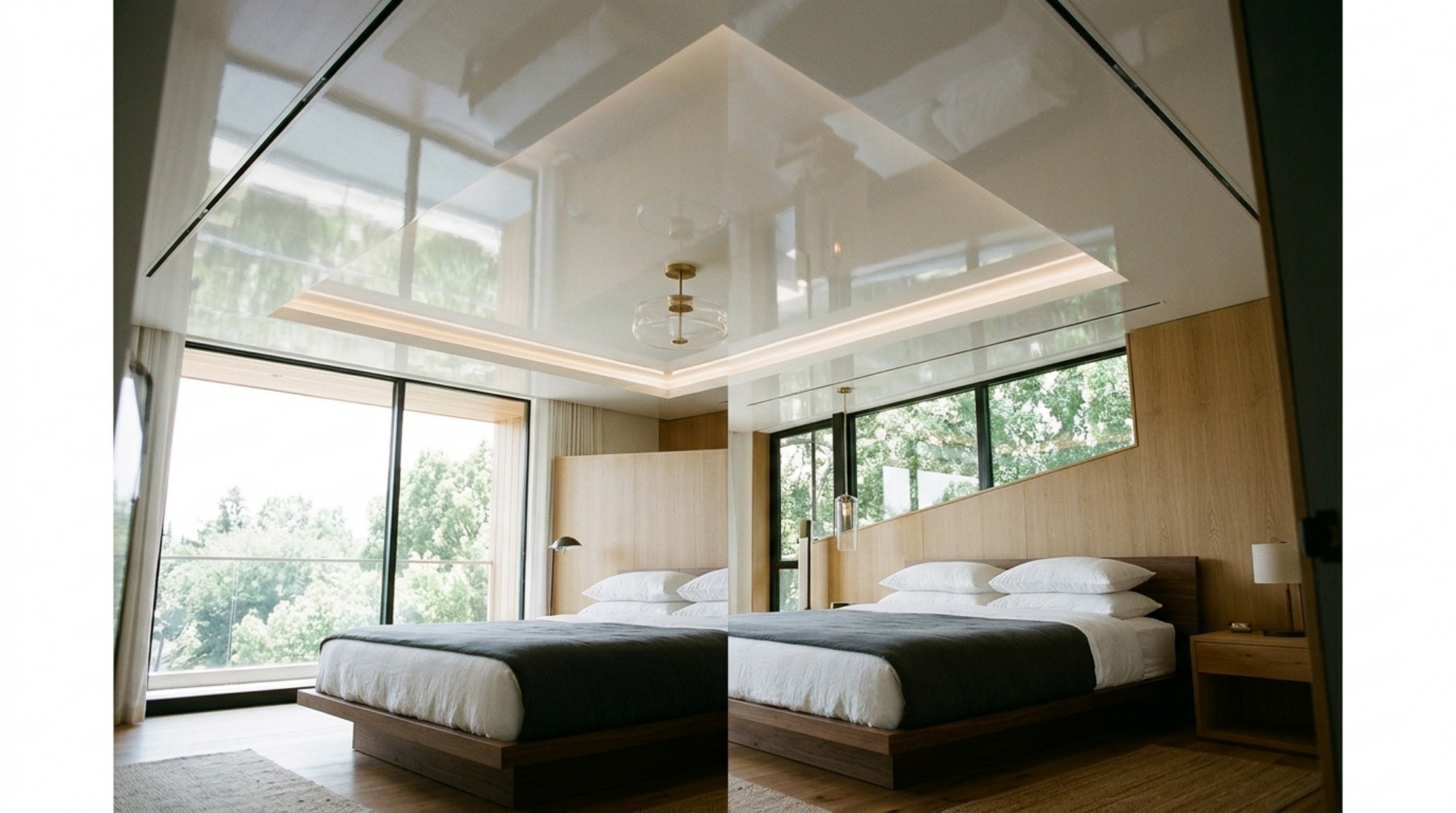
light-reflective wall finishes featuring a high-gloss white ceiling that mirrors the soft natural light from floor-to-ceiling windows

Dopamine Dressing Interior Design: Emotional Resonance through Pigment

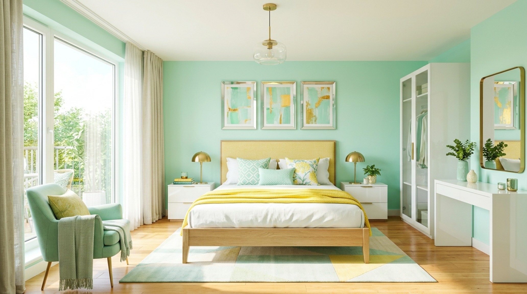
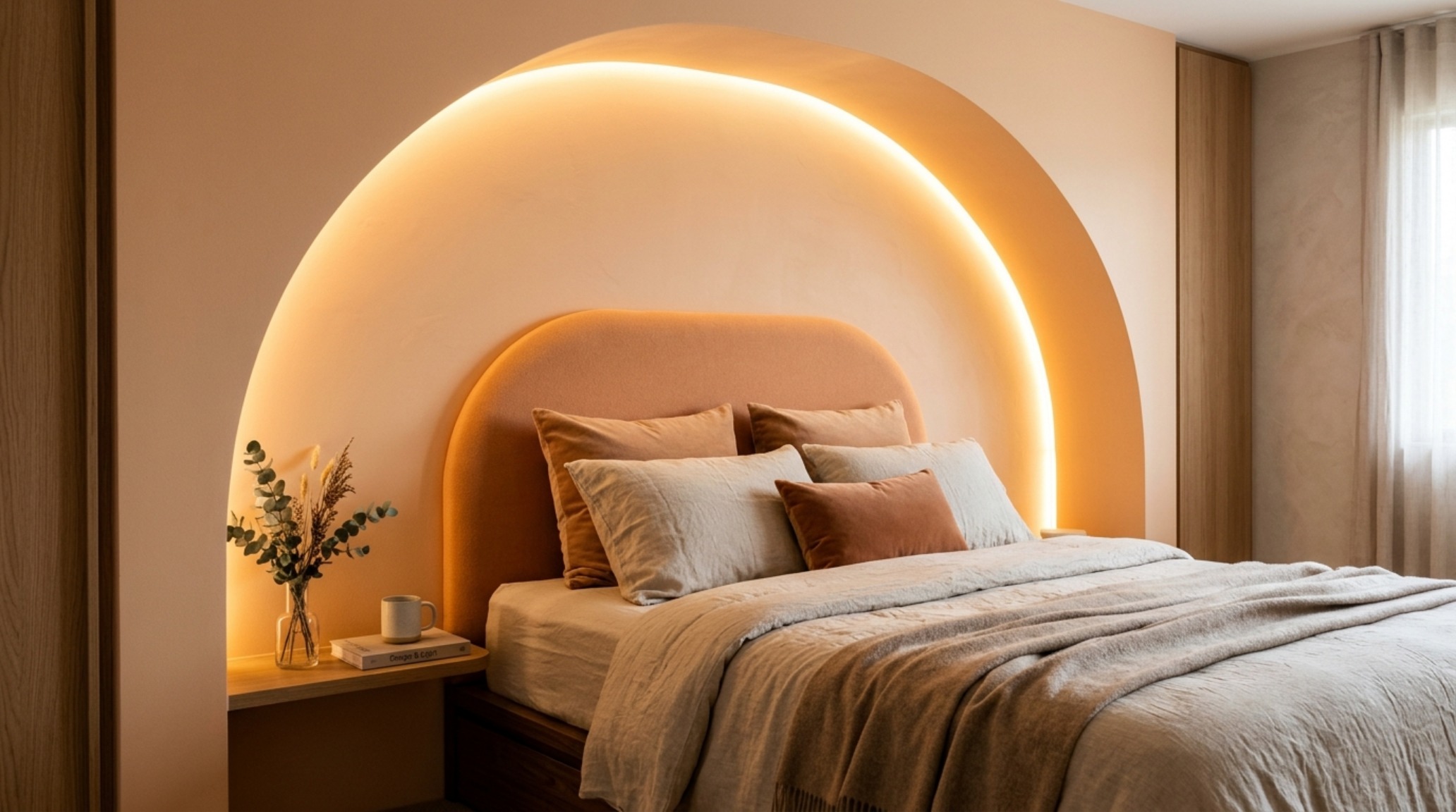
While minimalism often favors a monastic palette of whites and creams, the current movement toward dopamine dressing interior design suggests that ‘bright’ does not have to mean ‘colorless.’ The key is clarity of tone. A muddy, desaturated sage will absorb light, while a clear, luminous mint or a pale primrose will radiate it. We are seeing a shift toward vibrant master suite palettes that prioritize psychological uplift. Think of colors that mimic the ‘golden hour’—soft apricots like Farrow & Ball’s Setting Plaster or the pale, buttery warmth of Benjamin Moore’s Windham Cream. These colors provide the emotional warmth of a saturated space while maintaining an LRV high enough to keep the room feeling expansive.

“The goal of architectural illumination isn’t to flood a room with artificial light, but to curate the way natural light travels through the volume. We aren’t just painting walls; we are positioning reflectors.”
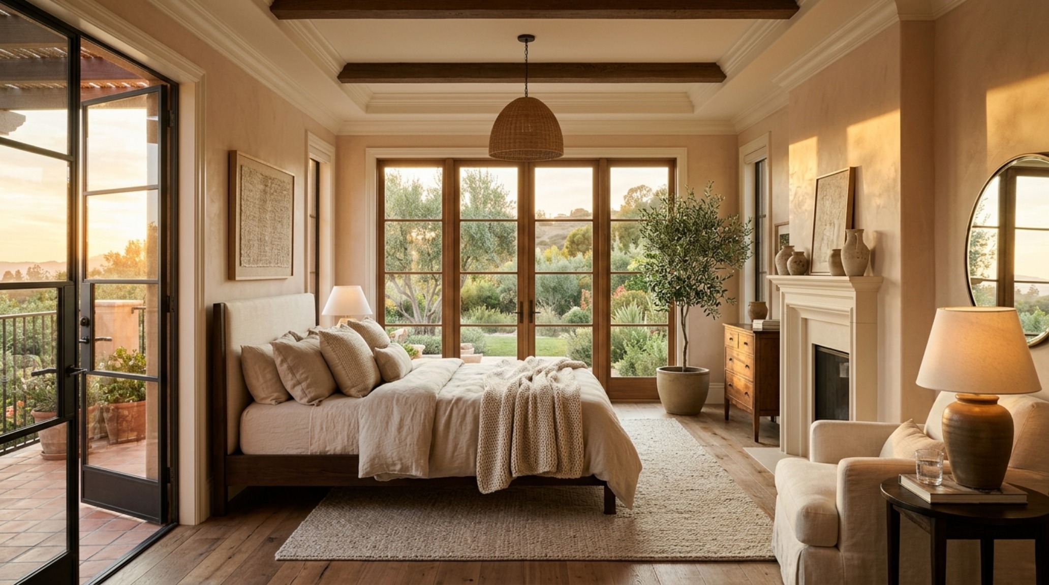
vibrant master suite palettes showcasing a sophisticated blend of Farrow & Ball Setting Plaster and ivory textiles for a warm, luminous glow

High-LRV Paint Swatches: The Professional’s Toolkit

Selecting the right pigment requires a nuanced eye for undertones. A ‘bright’ white with too much blue can feel clinical and cold in northern light, while a white with too much yellow can feel dated in the afternoon sun. Professionals rely on a specific stable of high-rv paint swatches that have proven their mettle across various exposures. White Dove (OC-17) remains a gold standard for its balanced neutrality, while Paper White (OC-55) offers a crisp, gallery-like finish that works beautifully in contemporary settings. For those desiring a hint of pigment, Pale Oak (OC-20) provides a sophisticated greige that transitions seamlessly from day to night without ever feeling heavy.

div class=”image-placeholder” data-index=”3″>
Spatial Perspectives & Material Curation

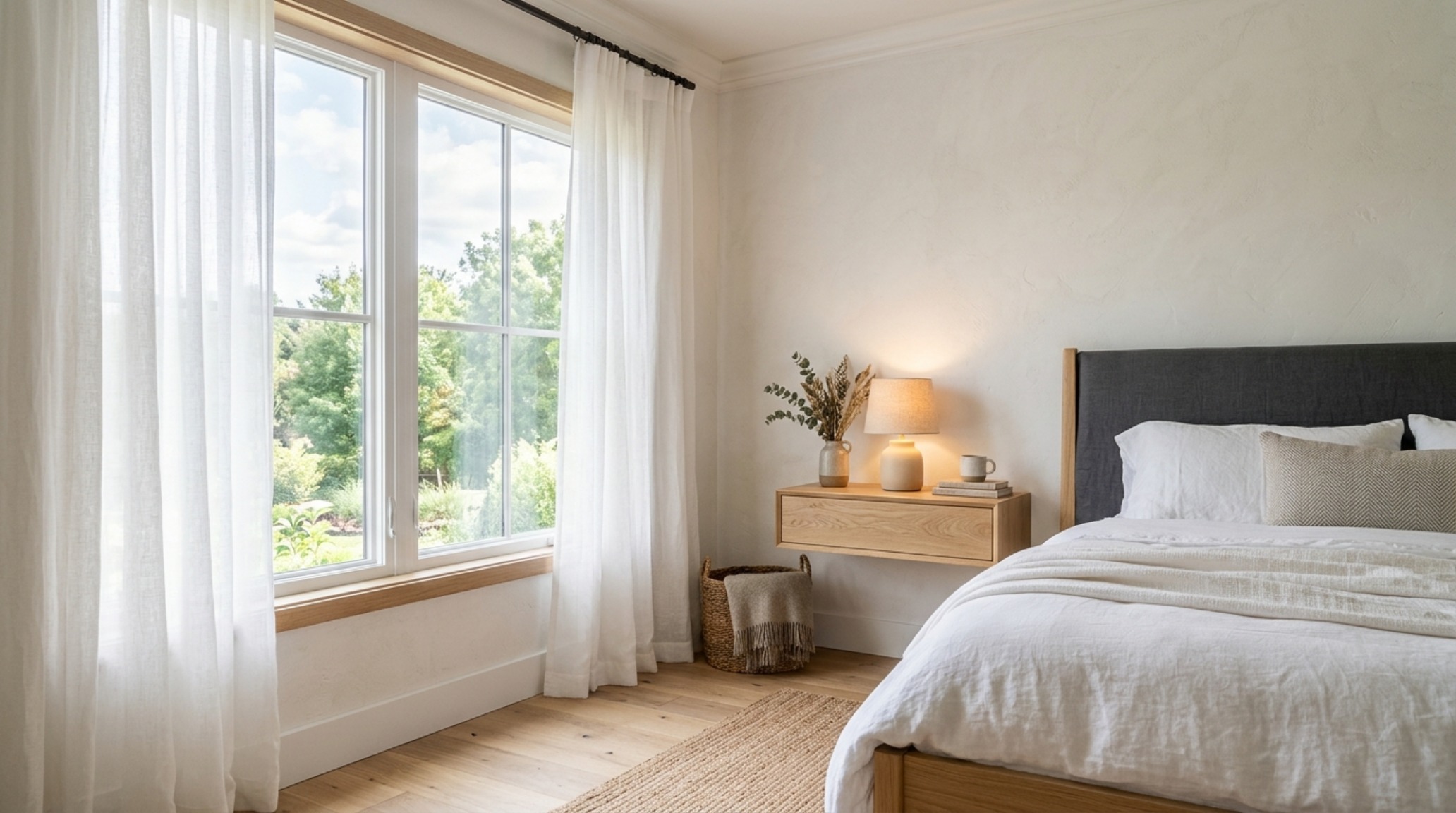
Expanding the footprint of a bedroom is as much about the furniture as it is about the walls. We must respect the ‘spatial cadence’ of the room. This means ensuring a minimum of 36 inches for primary circulation paths and maintaining a 30-inch clearance around the bed to allow for fluid movement. When the eye can see more of the floor plane, the room feels larger. This is why floating nightstands and bed frames with slender, tapered legs are essential in luminous bedroom decor trends. By exposing the floorboards beneath the furniture, we maintain a continuous visual line that tricks the brain into perceiving more floor area than actually exists.

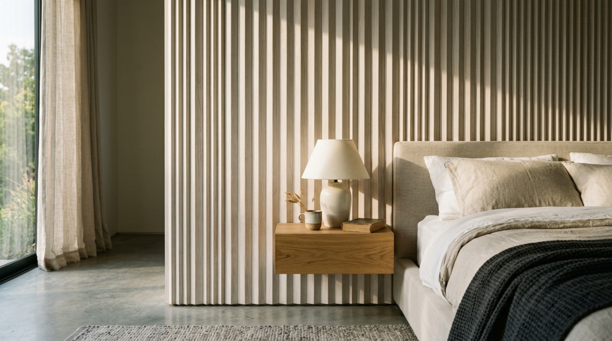
luminous bedroom decor trends incorporating floating nightstands and sheer linen curtains that maximize the flow of natural daylight across the floor plane

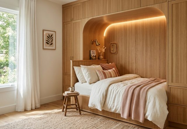
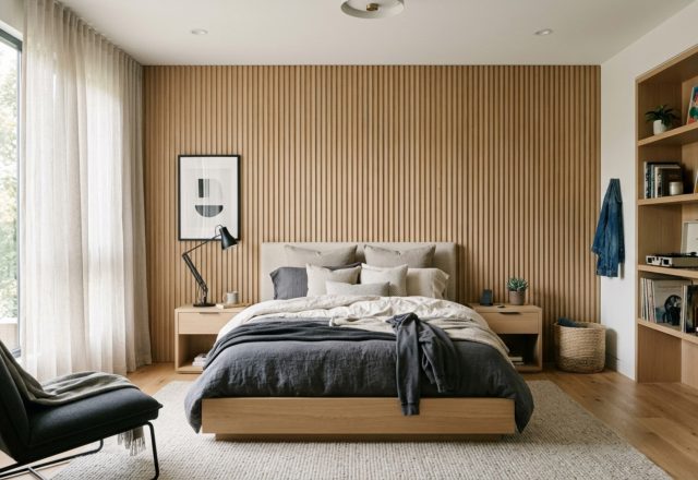
Texture plays a vital role in how light is perceived. A flat, monochromatic room can feel one-dimensional. To ground the luminosity, we introduce tactile materials. Honed travertine, fluted white oak, and heavy-gauge linen provide ‘micro-shadows’ that give the eye a place to rest. These elements act as the structural ‘anchors’ in a sea of light. When natural sunlight from a large window hits a fluted oak paneling, the play of light and shadow adds a rhythmic quality to the room, enhancing the sense of depth and architectural intentionality.

Vibrant Master Suite Palettes and the Art of Color-Blocking

If you fear that a bright palette will feel too airy, consider the ‘structural color-block.’ This involves using a slightly darker, but still luminous, tone for the lower third of the wall—often in the form of wainscoting or a painted ‘dado’ line. For example, a base of soft terracotta topped with a high-LRV cream. This technique provides a sense of ‘tactile grounding’ while the upper portion of the room continues to lift. This approach is particularly effective in vibrant master suite palettes where you want to feel cocooned while sleeping but energized when you wake up. It’s about managing the ‘visual weight’ of the room so that the heaviest colors sit closest to the floor, leaving the upper atmosphere light and unencumbered.

dopamine dressing interior design in a bright bedroom using clear mint accents and high-reflectance surfaces to create an uplifting atmospheric experience

Lighting is the final, non-negotiable layer. In a room designed for high-reflectance, your choice of bulbs is critical. We recommend a 2700K warm ambient light for primary fixtures to maintain a cozy residential feel, paired with 3000K task lighting for reading areas. Ensure all bulbs have a High CRI (Color Rendering Index) of 90+. A low CRI bulb will make even the most expensive paint look muddy and grey. By layering light—using sconces that wash the walls and floor lamps that bounce light off the ceiling—you reinforce the ‘Luminous Envelope’ and ensure the room feels expansive long after the sun has set.

Design Anatomy & Specification Guide

Key material specifications, color codes, lighting kelvin, and ergonomic clearances.

Color Swatches & Hex
#F2F0E6 Swiss Coffee, #E7D7C1 Setting Plaster, #E3E4E0 Paper White
Core Tactile Materials
Bleached White Oak, Honed Silver Travertine, Raw Belgian Linen
Atmospheric Lighting
2700K Warm Ambient, CRI 92+, Diffused LED Cove Lighting
Spatial Proportions
36-inch Main Walkways, 30-inch Bed Clearance, 12-inch Rug Border

Ultimately, the mastery of light is a mastery of spatial psychology. When we curate a palette based on high-reflectance values and structural integrity, we are doing more than just choosing a wall color; we are redefining the limits of our personal world. The bedroom ceases to be a box defined by its walls and becomes an atmospheric experience where the edges are blurred, the ceiling is lifted, and the morning light is invited to linger. As you look toward your next project, remember that the most powerful architectural tool you possess isn’t a sledgehammer—it’s the way you capture the sun.

Ella Wilson

Written by

Ella Wilson

Ella Wilson is a Biophilic Design Consultant with over 16 years of hands-on experience in integrating living botanical elements, natural circadian illumination, and organic raw materials. Ella focuses on homes that nurture mental calm through harmonious spatial proportion. An avid contributor to architectural and design dialogues, Ella writes extensively on creating elevated residential sanctuaries.