The Tactile Dialogue of Light and Form
The rasp of raw, heavy-thread Belgian linen against a hand-applied lime-wash plaster wall creates a tension that defines a space before a single piece of furniture is even placed. In these quiet intersections of texture, the search for bright bedroom color ideas transcends simple aesthetics; it becomes a deliberate exercise in architectural reclamation. When we operate within a compact footprint, color is no longer a decorative layer—it is a tool for spatial expansion. By synthesizing the rigorous ergonomics of high-end hospitality with a nuanced understanding of ‘Expanding Palettes,’ we can dissolve the physical boundaries of a room, replacing the sensation of enclosure with a radiant, breathable sanctuary.
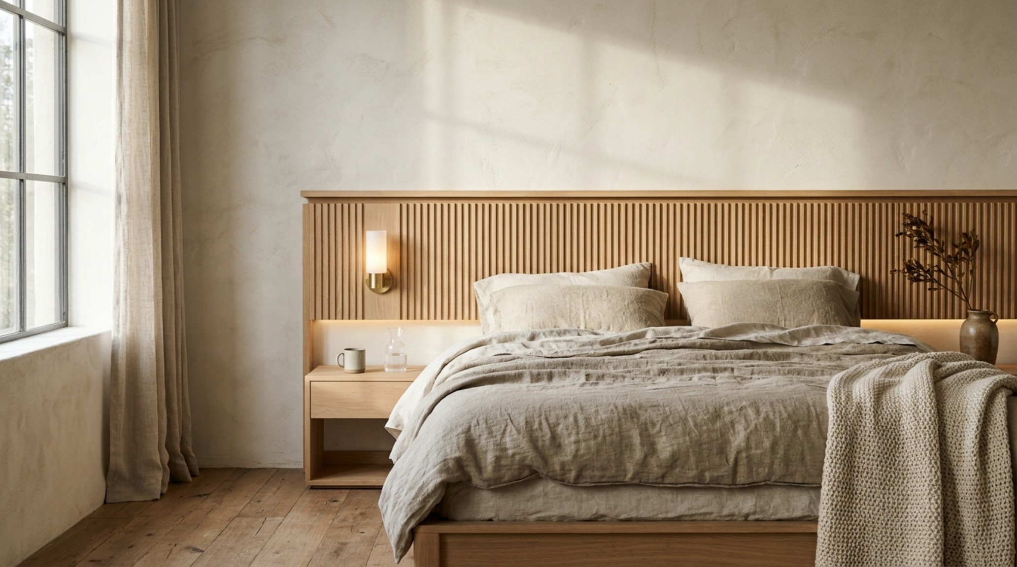
Natural Light Optimization: Harnessing the Architecture of the Sun
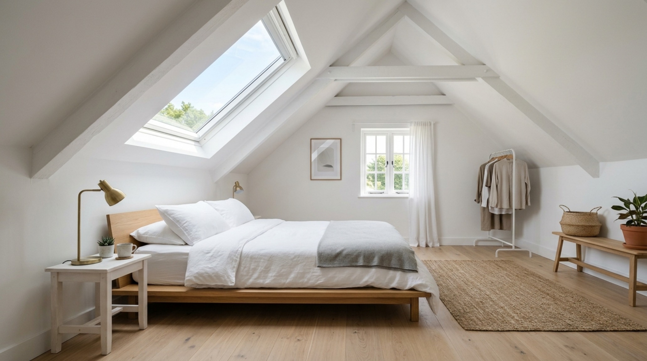
Before selecting a swatch, we must audit the light. A room’s orientation dictates the chromatic behavior of any pigment. North-facing rooms, often cursed with a cool, bluish cast, will greedily soak up light, making cool grays feel cavernous. Here, natural light optimization involves working with the sun’s absence rather than fighting it. We look toward pigments with a subtle yellow or pink undertone to counteract the gloom. Architectural light-harvesting isn’t just about windows; it’s about the specularity of surfaces. A matte finish on a wall might provide a soft, velvety depth, but a satin or eggshell finish on the ceiling—ideally in a shade half-strength of the walls—acts as a massive reflector, bouncing lumen levels deeper into the floor plan.
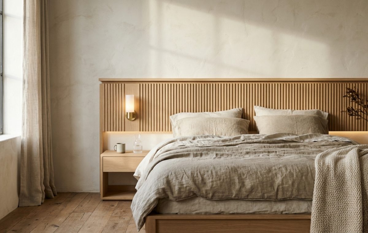
We talk frequently about ‘visual weight.’ In a small bedroom, a dark, bulky mahogany dresser acts as an anchor that drags the eye downward, shrinking the perceived volume. Conversely, furniture with ‘low visual weight’—think acrylic legs, slatted headboards, or wall-hung nightstands—allows the floor plane to extend uninterrupted to the baseboards. This continuity is the secret to making a twelve-by-twelve room feel like a suite.
LRV Paint Tips: Decoding the Science of Reflectance
For the uninitiated, the Light Reflectance Value (LRV) is the most critical metric in a designer’s toolkit. Scale-rated from 0 (absolute black) to 100 (pure white), the LRV tells us exactly how much light a color reflects. When exploring bright bedroom color ideas, I rarely recommend anything with an LRV below 65 for the primary walls of a small space. However, the magic happens in the 75 to 85 range. This is the sweet spot where colors like Benjamin Moore’s ‘Swiss Coffee’ or Farrow & Ball’s ‘White Tie’ reside. They offer enough pigment to feel intentional and warm, yet they possess enough ‘bounce’ to keep the atmosphere airy.
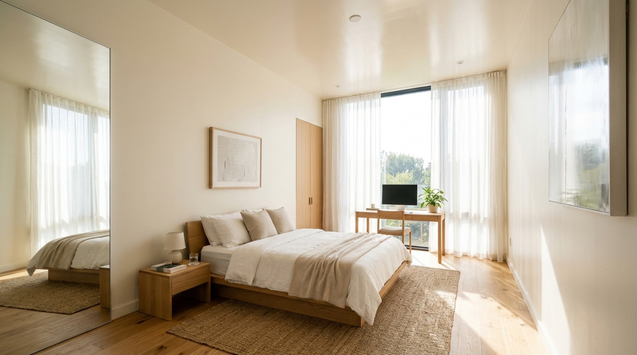
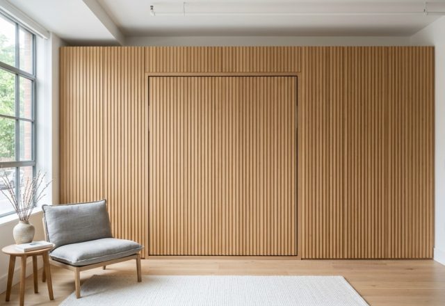
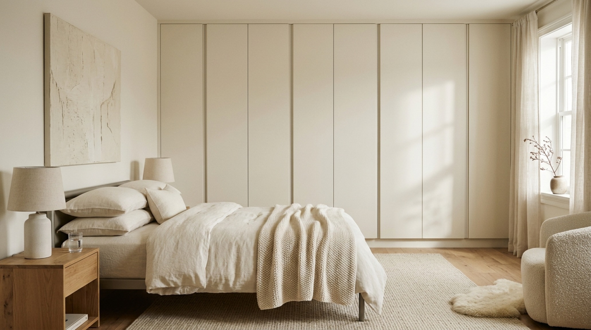
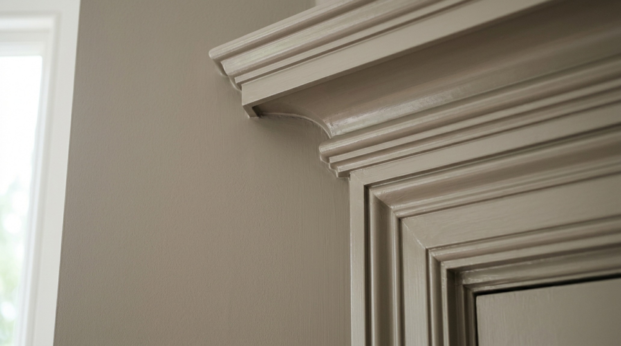
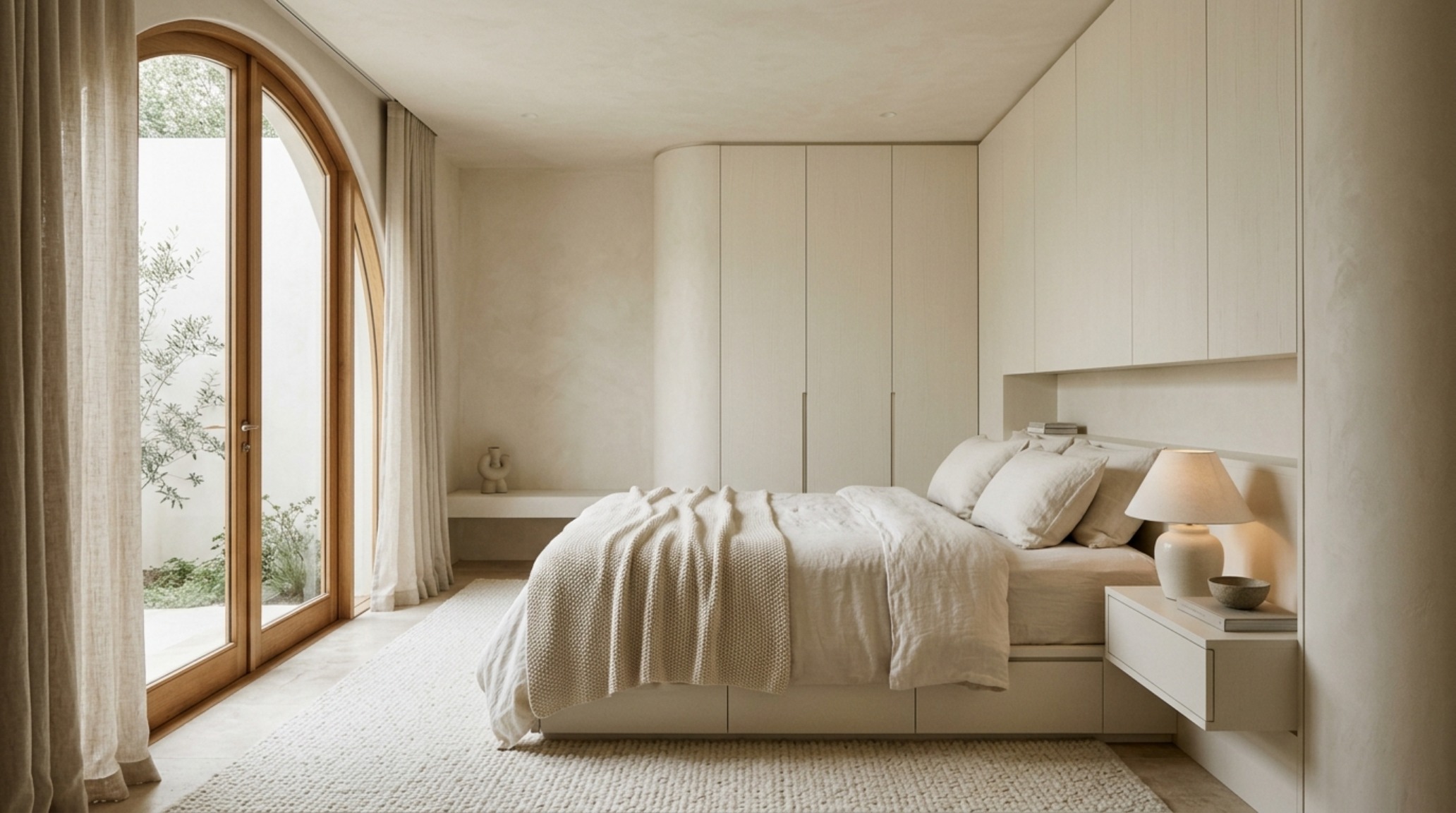
Application matters as much as the value. One of my favorite techniques is the ‘Infinity Wrap.’ By painting the walls, baseboards, and even the window casings in the same monochromatic shade—but varying the sheen—you eliminate the visual ‘staccato’ of contrasting trim. This unified color block hides integrated storage solutions, making wardrobes appear as architectural extensions of the wall rather than protruding boxes. When the eye doesn’t have to stop at a dark door frame or a white baseboard, the spatial flow remains unbroken.
Best White Paint for Dark Rooms: A Curated Palette
Not all whites are created equal. In a room that lacks consistent southern exposure, a ‘pure’ white can often look dingy or grey in the shadows. The best white paint for dark rooms is one that carries a hidden warmth. Designers often turn to ‘Cloud White’ by Benjamin Moore for its creamy, soft-focus quality, or ‘School House White’ by Farrow & Ball for an aged, architectural feel that mimics the look of historic plaster. These shades don’t just sit on the wall; they glow. To elevate this further, consider the texture of the wall itself. A subtle Roman clay finish adds microscopic peaks and valleys that catch the light at different angles, creating a sense of movement that flat paint simply cannot achieve.
“Spatial luxury isn’t found in square footage; it’s found in the elimination of visual noise and the curation of negative space.”
Energizing Bedroom Aesthetics through Saturation Control
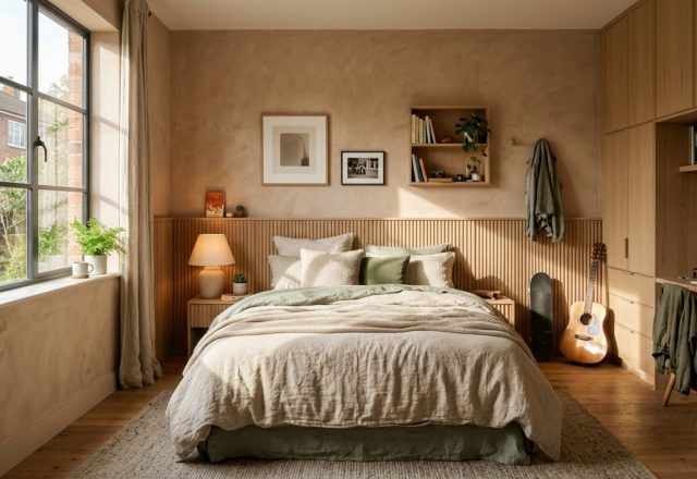
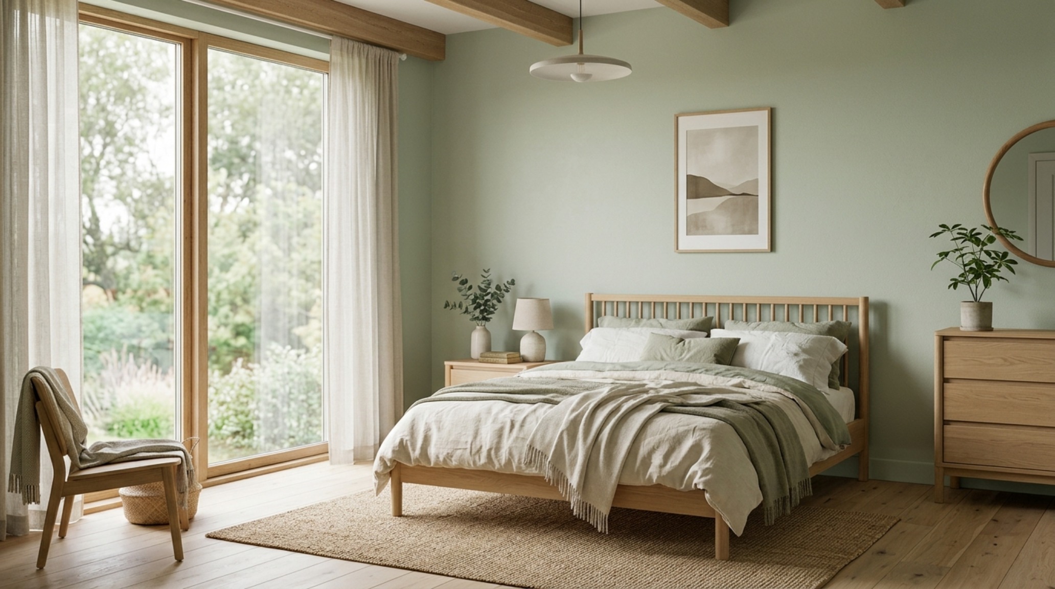
While the ‘all-white’ bedroom is a classic, energizing bedroom aesthetics can also be achieved through controlled saturation. We are seeing a movement away from clinical minimalism toward a ‘Warm Minimal’ approach. This involves using ‘Expanding Palettes’ of earthy, desaturated tones—think terracotta so pale it’s almost nude, or a sage green that feels like a whisper of smoke. These colors provide a psychological grounding that pure white lacks. The trick to keeping these colors ‘bright’ is to pair them with high-contrast tactile elements. A matte, pale-clay wall paired with a crisp, high-CRI (Color Rendering Index) lighting scheme ensures the color feels vibrant rather than muddy.
Pastel Bedroom Decor Trends: Beyond the Nursery
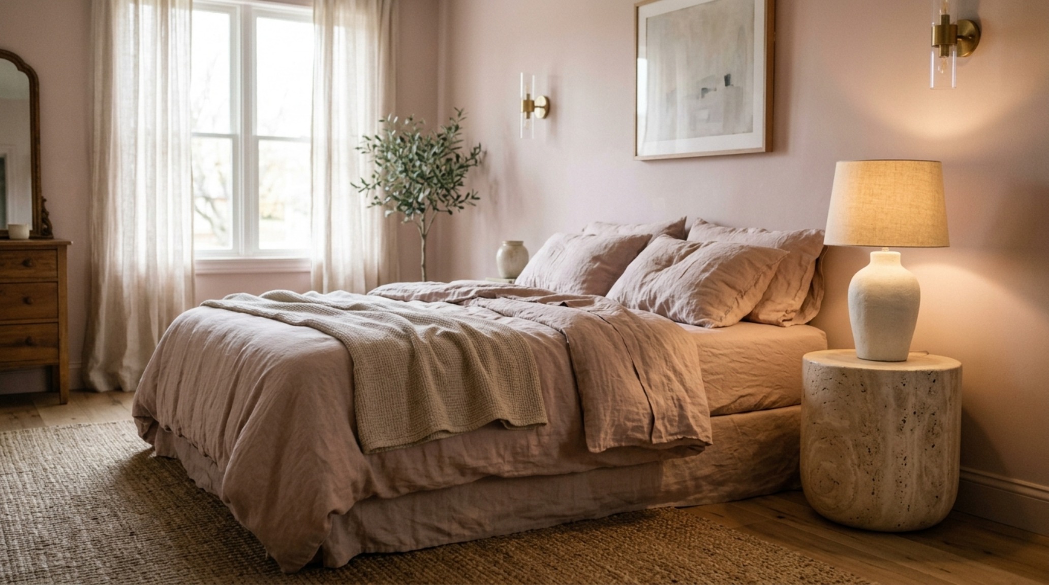
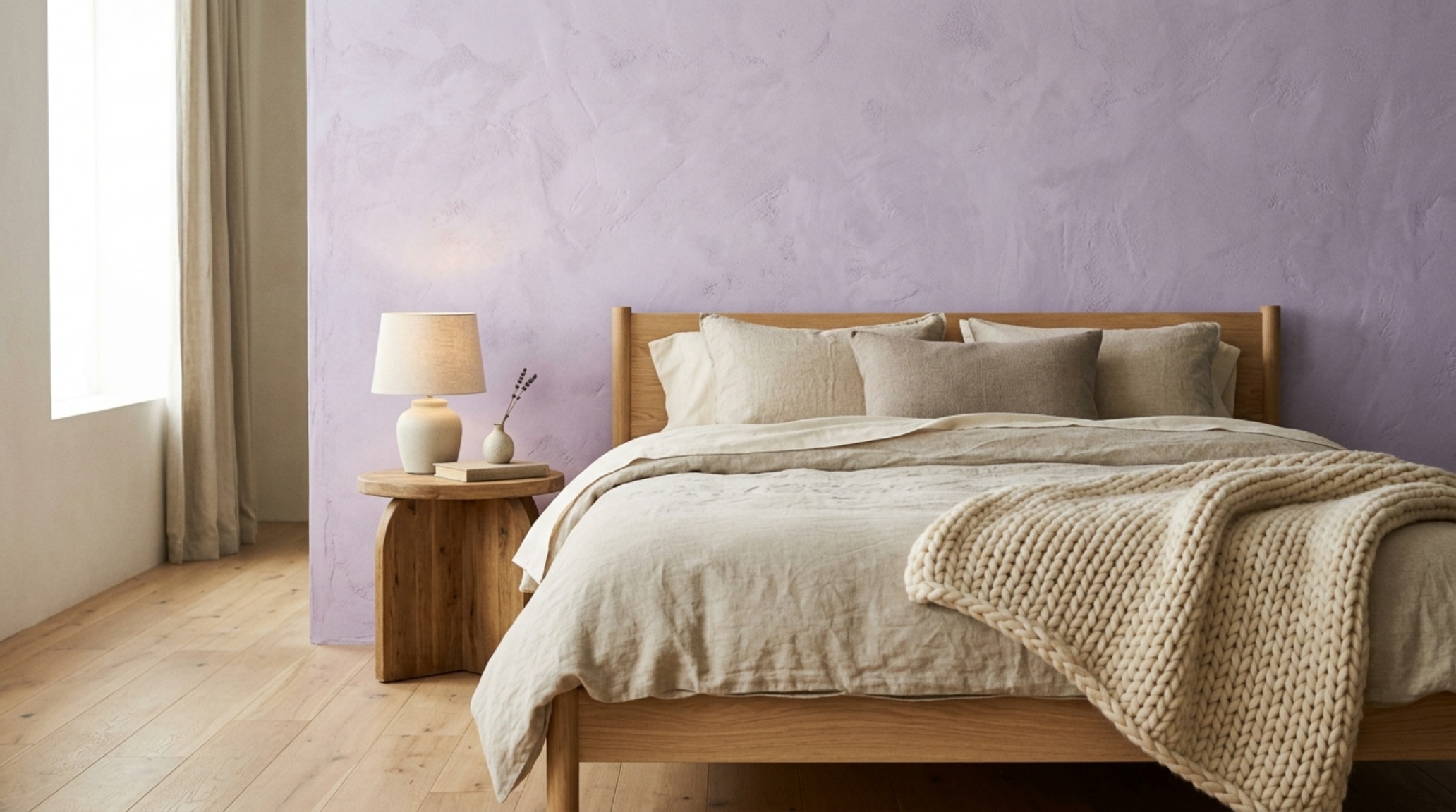
Forget the sugary pinks of the past. Modern pastel bedroom decor trends are sophisticated, leaning into ‘dirty’ pastels. We’re talking about ‘Setting Plaster’ by Farrow & Ball—a dusty, architectural pink that mimics the look of raw Mediterranean walls. These colors work exceptionally well in small spaces because they have a high LRV but offer a sense of enclosure and intimacy. When integrated with hospitality-grade ergonomics—such as 30-inch clearances around the bed and 18-inch reaches for bedside lighting—these colors create a boutique-hotel atmosphere that feels curated and expansive.
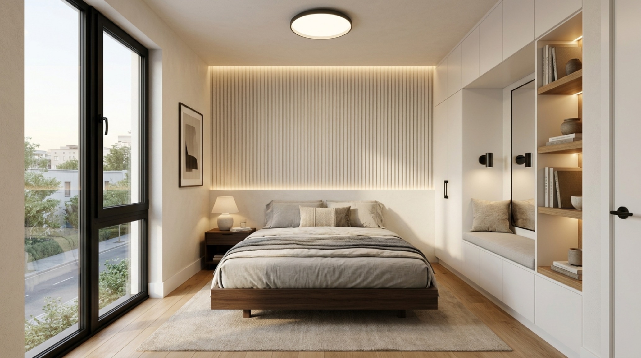
Spatial cadence is the rhythm of the room. In a compact bedroom, every inch is a negotiation. We follow the 36-inch standard for primary walkways to ensure the room never feels ‘tight.’ If 36 inches isn’t possible, we drop to a 30-inch clearance but compensate by using furniture with ‘leggy’ profiles. This allows the eye to see the floor extending under the bed or chair, a psychological trick that fools the brain into perceiving more area than exists. It’s about sightline alignment; if you can see the corner where the floor meets the wall, the room feels larger.
The Spatial Photography Portfolio
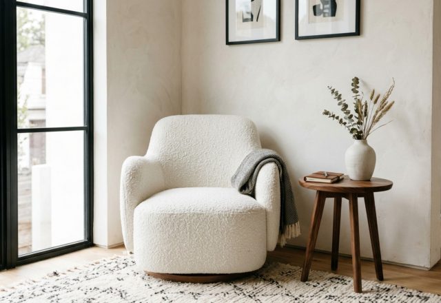
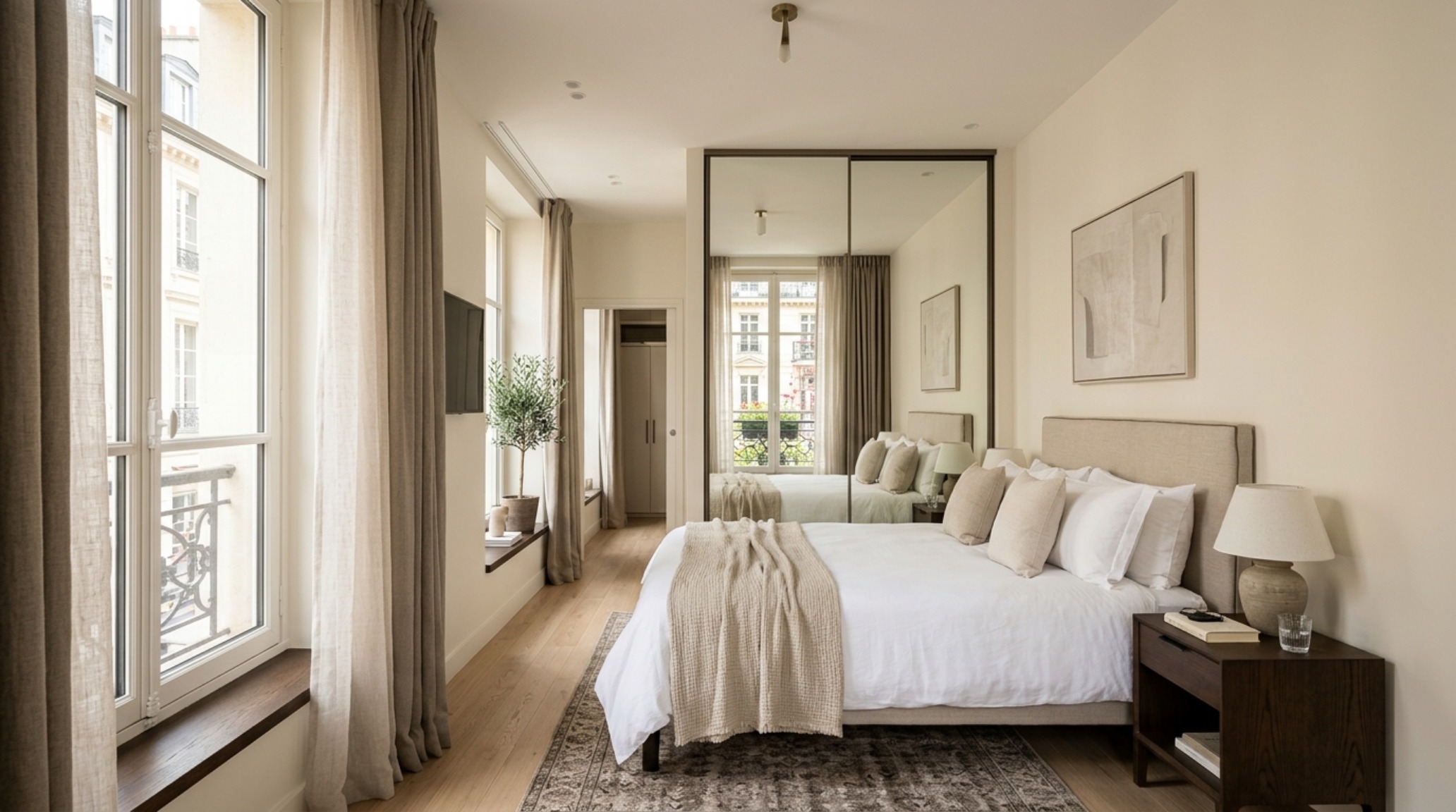
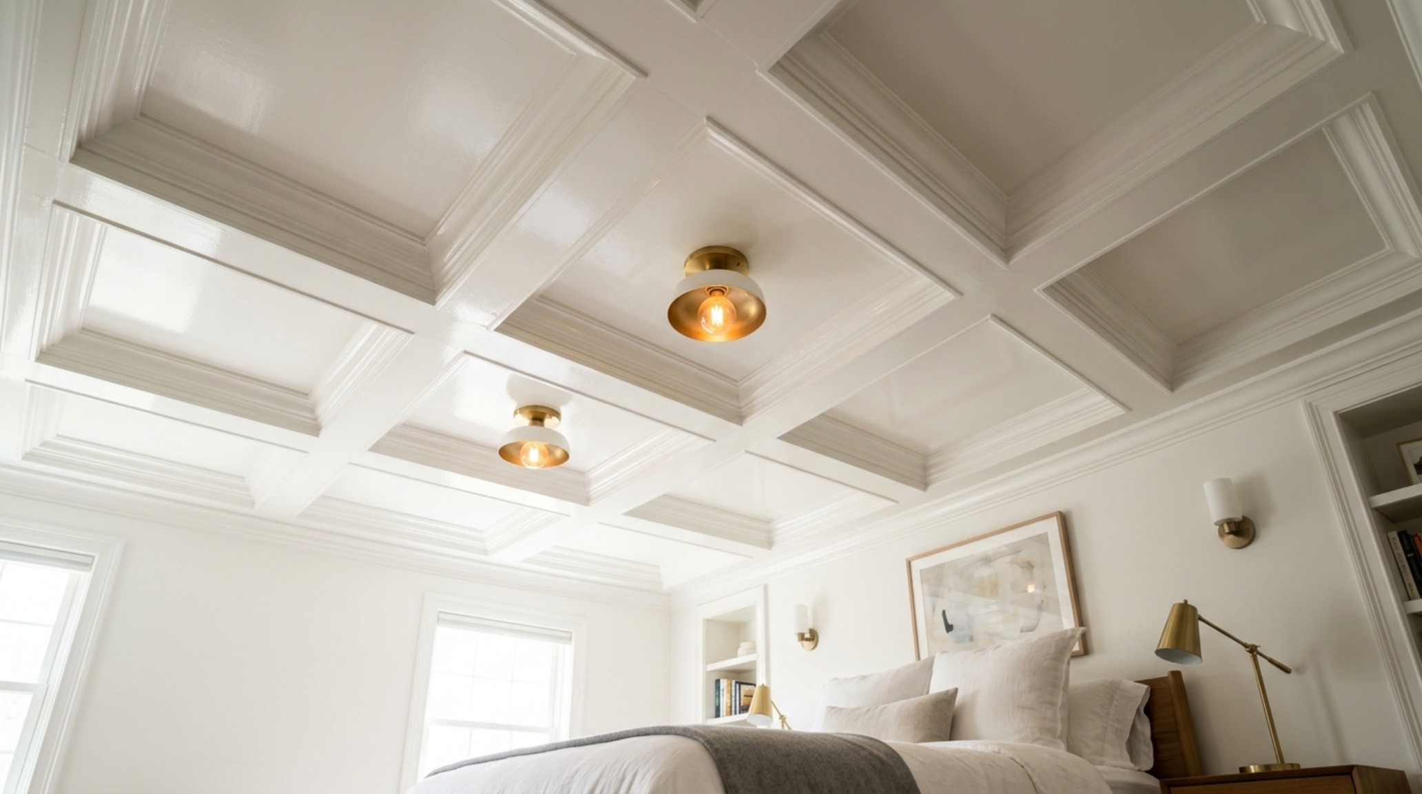
In this curated visual chronicle, we examine how the intersection of material and light creates a sense of effortless volume. Notice how the transition from a matte wall to a high-gloss lacquered ceiling can visually ‘lift’ a low plate height, or how a single, strategically placed mirror can double the perceived ‘bounce’ of 2700K ambient light. These vignettes serve as a blueprint for the modern, radiant sanctuary.
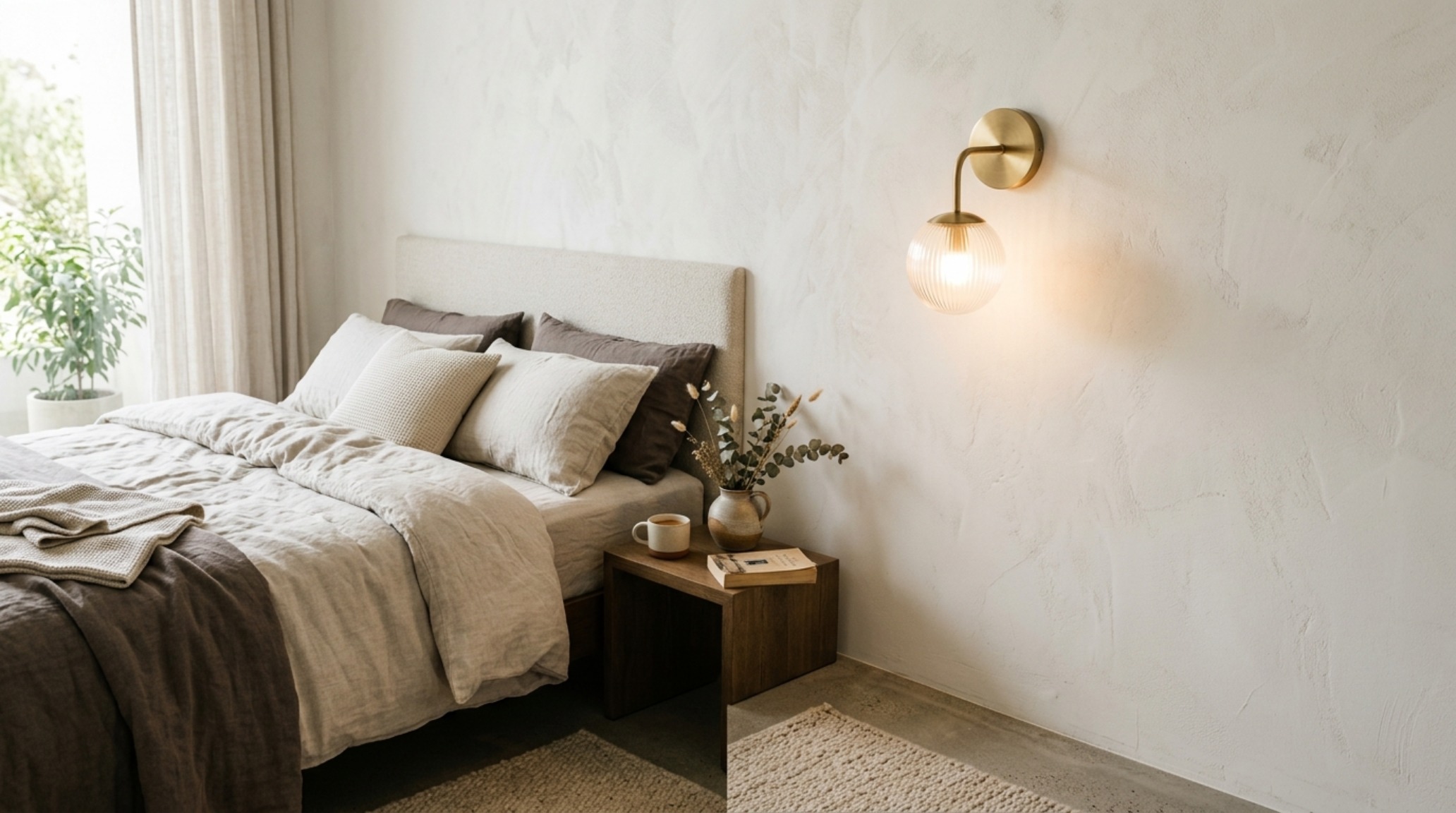
We must also address the ‘Integrated Ergonomics’ of storage. In a small space, the closet shouldn’t be a separate entity; it should be an ‘integrated volume.’ Using the same color-blocking system for the cabinetry as the walls allows the storage to recede. Push-to-open mechanisms eliminate the need for hardware, further reducing visual clutter. This is where the ‘Clear Sanctuary’ concept truly comes to life—where the function of the room is hidden within its form, leaving only the experience of light and comfort.
Spatial Anatomy & Material Specifications
Curated tactile palette, spatial dimensions, and atmospheric lighting index for this design scheme.
The bedroom of the future is not defined by its boundaries, but by the lack of them. Through the meticulous application of bright bedroom color ideas and a reverence for spatial ergonomics, we move beyond the ‘cramped’ and into the ‘curated.’ We are crafting environments that don’t just house our belongings, but breathe alongside us. In the end, the most successful small spaces are those that prioritize the human experience of light, making every square inch feel intentional, expansive, and profoundly radiant.
Editorial Silo • Recommended Architecture Studies
- The Kinetic Bedroom: Beds That Save Space & Engineering Effortless Transitions with Transformative Sleeping Solutions — Archival Design Case Study
- The Tactile Aesthetic of Cool Bedrooms For Teenagers: Materials, Moods & Lighting Kelvin — Archival Design Case Study
Curated Spatial Visuals
A photographic deep dive into spatial ergonomics, material balance, and authentic living atmosphere.
Curated Visual Lookbook
Design Gallery & Spatial Studies
A visual curation of architectural arrangements, lighting concepts, and material palettes featured in this space.