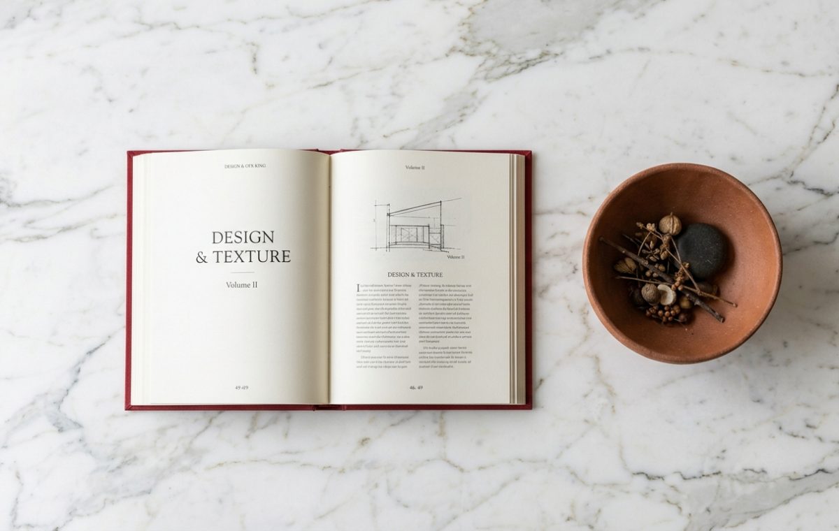
Surface clutter creeps in effortlessly. A stray mail piece here, a rogue remote there, and suddenly your living room feels heavy. Yet a single well-chosen publication changes the narrative completely. Look at how an open volume rests against cool marble. It introduces weight, narrative, and quiet luxury without screaming for attention.
The Power of Tactile Materials
Digital screens dominate our daily routines. We swipe through glossy photographs on glass displays, missing out on physical feedback. Paper weight matters. Binding texture matters. When you place a beautifully bound reference on a table, you invite touch. Pair that reading material with raw earthen elements like an unglazed terracotta bowl filled with dried pods or river stones. This combination grounds a space instantly.
Balancing Scale and Proportion
- Choose oversized publications to anchor smaller coffee tables.
- Layer objects of varying heights to avoid a flat look.
- Keep surfaces functional so the space remains usable for daily life.
Styling should never look untouchable. If guests are afraid to set a teacup down, the arrangement has missed the mark. Real homes breathe. They show wear, curiosity, and intent. By mixing architectural sketches with organic decor, you build a layered environment that feels collected over years rather than bought in one afternoon.
How do you usually balance books and decorative objects on your main surfaces?
Editorial Lookbook & Photo Collection