There is a distinct, almost tectonic shift that occurs when we cross the threshold from a space we merely inhabit to one we truly own. In the realm of urban dwelling, this transition is often defined by the structural liberties and material permanence of a condominium versus the strategic, ephemeral elegance of an apartment. When exploring condo vs apartment decor ideas, the conversation is no longer just about floor plans or amenity packages; it is about the visceral agency of the ‘Right to Renovate.’ It is the difference between a surface that mimics stone and the heavy, cool-to-the-touch reality of honed travertine. This exploration isn’t just about furniture—it’s about the material alchemy that transforms a white-box unit into a sensory sanctuary.
As an interior journalist, I often see the struggle of the modern urbanist: how to achieve a high-end, bespoke feel when the walls are either temporary or restricted by HOA bylaws. The answer lies in tactile grounding and lighting precision. While an apartment dweller must master the art of the ‘removable’—think oversized bouclé textures and Farrow & Ball-inspired palettes—the condo owner has the luxury of architectural intervention, such as installing integrated slatted timber walls or hardwired, warm-dim lighting systems that mimic the natural dip of the sun.
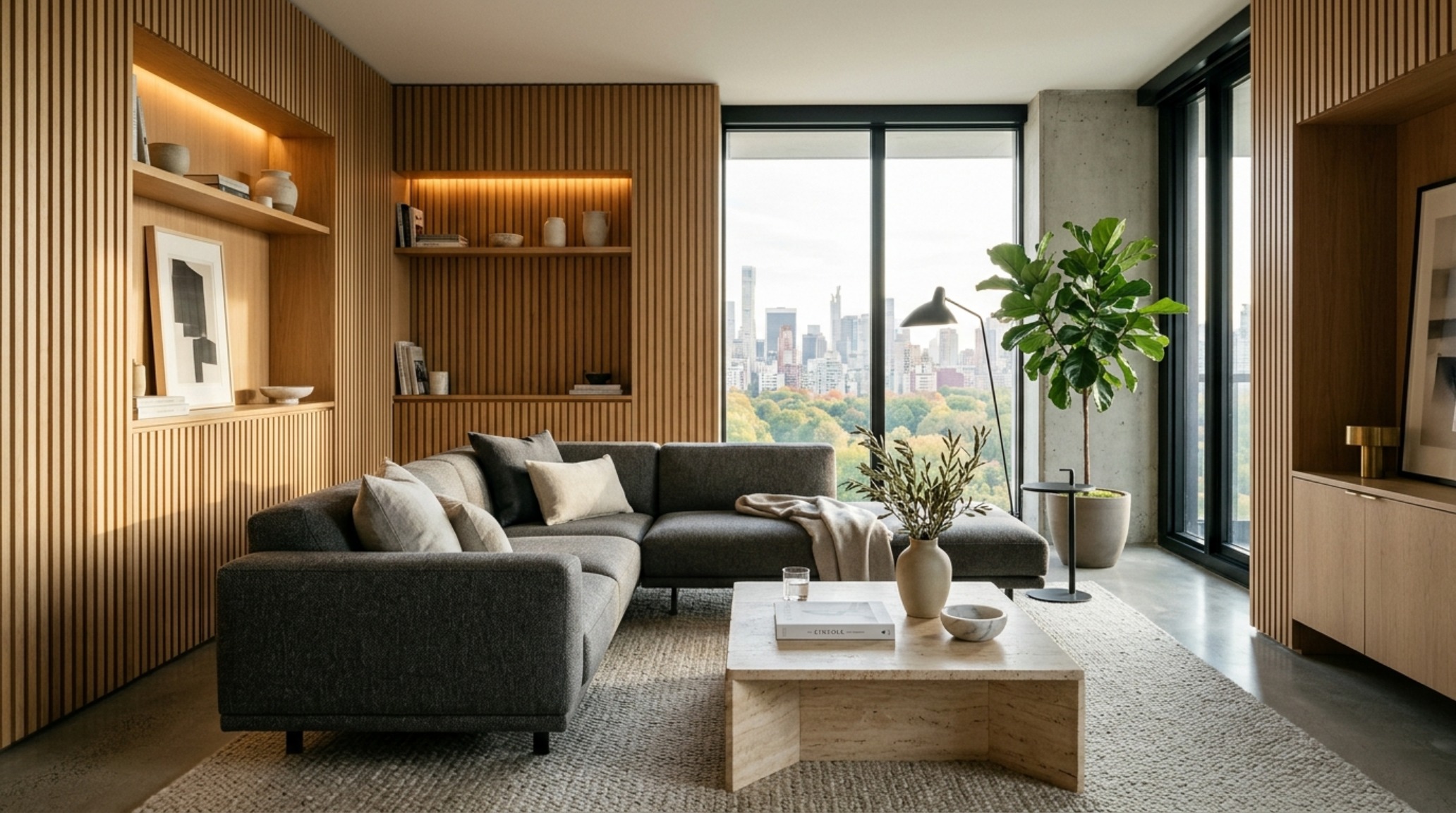
The Permanent Palette: Architectural Integrity in Condo Ownership
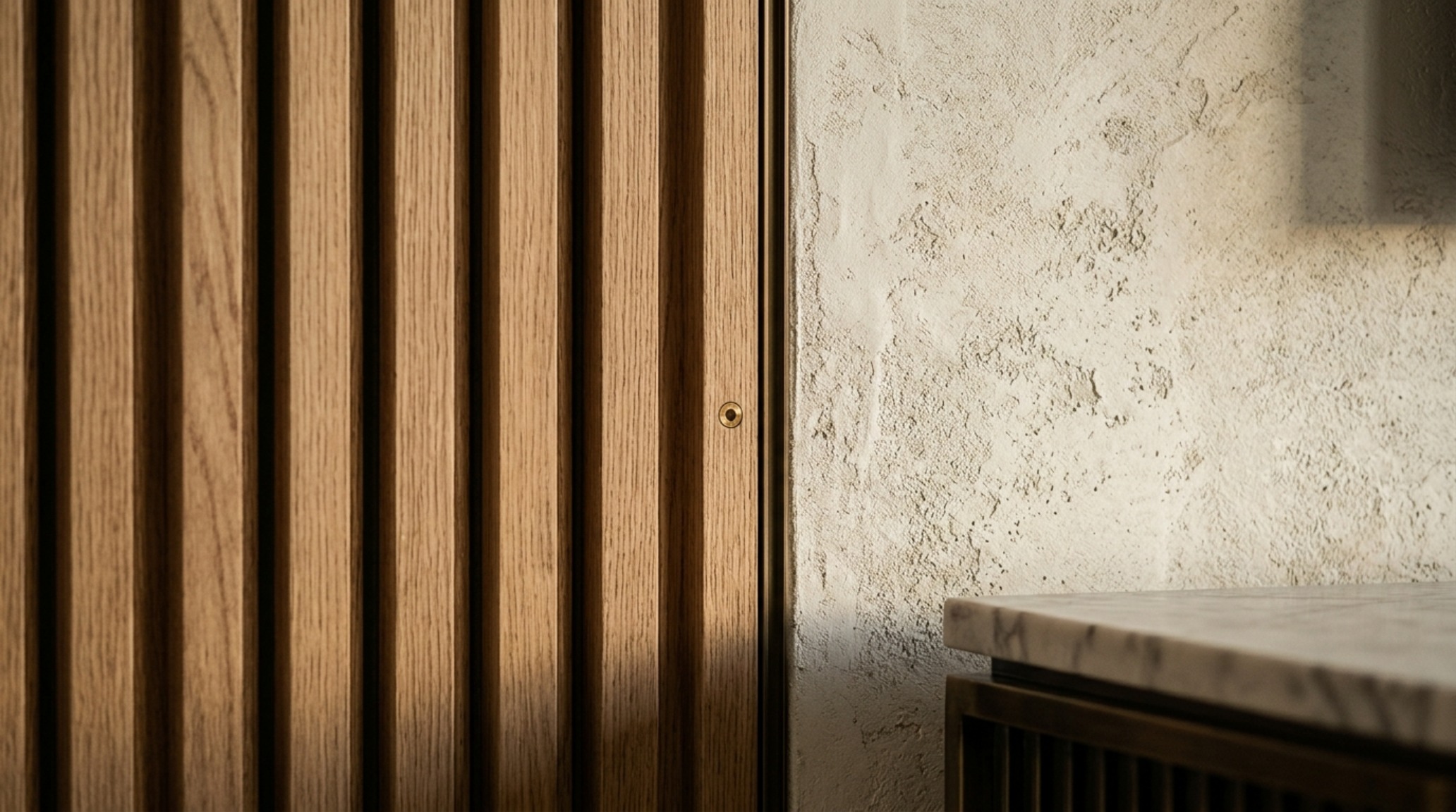
In a condominium, design is an investment in the building’s envelope. The most impactful shift away from the standard apartment feel is the introduction of authentic wood millwork. Consider the trend of vertical slatted timber—specifically white oak or walnut. Unlike a stick-on alternative, integrated millwork provides a rhythmic spatial cadence that alters the acoustics of a room, absorbing the sharp echoes of urban life. When we discuss condo vs apartment decor ideas for owners, we are looking at the ‘bones.’ This includes swapping out builder-grade hollow doors for solid-core versions that close with a satisfying, muffled thud, immediately elevating the home’s perceived value and quiet luxury.
Lighting is the second pillar of condo permanence. While renters are often stuck with fixed ‘boob lights’ or track lighting, owners can implement a layered lighting plan with high CRI (Color Rendering Index) ratings. Aim for 2700K warm-dim technology. These fixtures, when dimmed, don’t just lose brightness—they shift toward a warmer, amber glow, much like a traditional filament bulb. This creates a deeply immersive atmosphere that supports the circadian rhythm, a luxury rarely found in the standard 3000K cool-white overheads of a rental unit.
Navigating Condo vs Apartment Decor Ideas for the Modern Urbanist
For those navigating the rental market, the design philosophy shifts from ‘structural change’ to ‘sensory layering.’ The goal is to obscure the temporary nature of the space through volume and texture. Apartment storage hacks often involve more than just shelving; they involve the use of floor-to-ceiling drapery—specifically heavy linens or velvets—to hide generic closet doors or create soft architectural divisions. By using a ceiling-mounted IKEA Vidga track, a renter can simulate the look of custom drapery pockets, a staple of high-end architectural design.
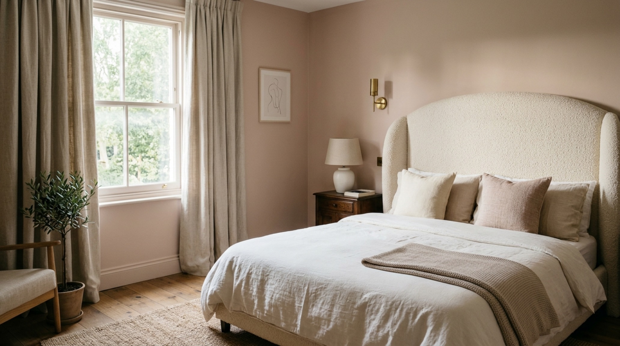
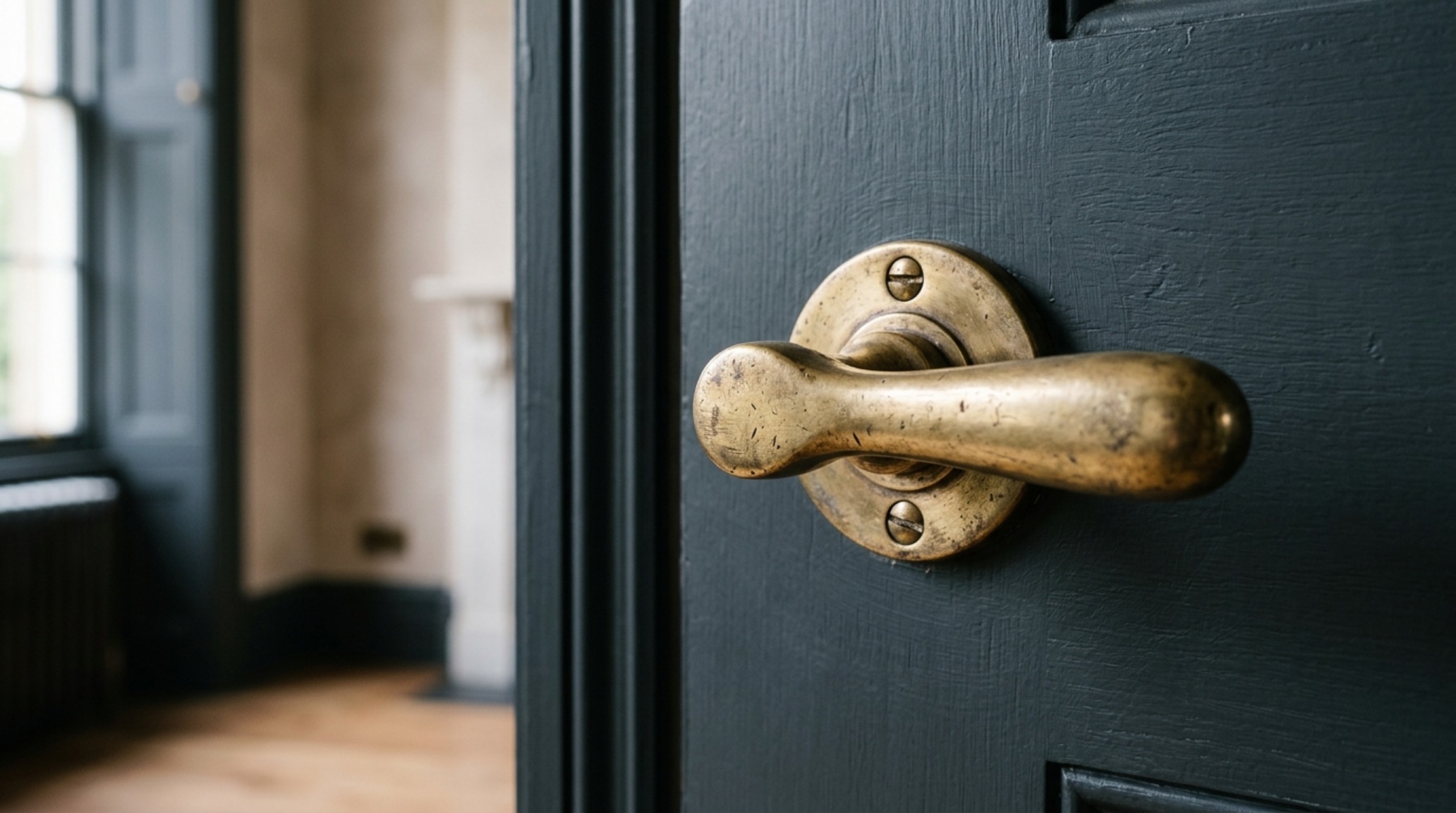
Texture becomes the primary tool for the renter. When you cannot change the floor, an oversized 9×12 wool-and-silk rug provides the necessary tactile grounding. We look for ‘Quiet Luxury’ hacks, such as swapping out plastic hardware for heavy, unlacquered brass knobs from Rejuvenation or Schoolhouse. These are small, tactile ‘touchpoints’ that our hands interact with daily, providing a sense of quality that transcends the lease agreement. Even the wall finish can be addressed through the clever application of ‘limewash’ style removable wallpapers or a calculated use of Farrow & Ball’s ‘Setting Plaster’—a hue that feels like an intentional architectural choice rather than a default beige.
The Science of Spatial Cadence: Clearances and Flow
Regardless of whether you own or rent, the physics of a room remain unchanged. Professional design is rooted in the mathematics of comfort. One of the most common mistakes in urban layouts is ignoring the spatial breathing room required for a home to feel expensive. To maintain an air of luxury, prioritize a 36-inch standard walkway clearance. This ensures that the transition between the living area and the kitchen doesn’t feel like an obstacle course.
In the living room, the 18-inch rule is paramount: your coffee table should be exactly 18 inches from the edge of the sofa. This is the optimal reach for a drink or a book, creating a functional harmony that the brain registers as ‘designed.’ Similarly, in the dining area, ensure a 30-inch clearance behind chairs to allow for effortless movement. These measurements are the invisible threads that hold the aesthetic together. When these clearances are respected, even a small apartment layout begins to mirror the sophisticated sightline alignment of a custom-built condo.
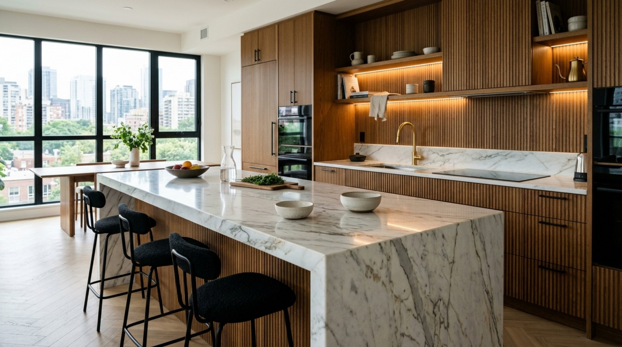
Atmospheric Lighting and the 2700K Standard
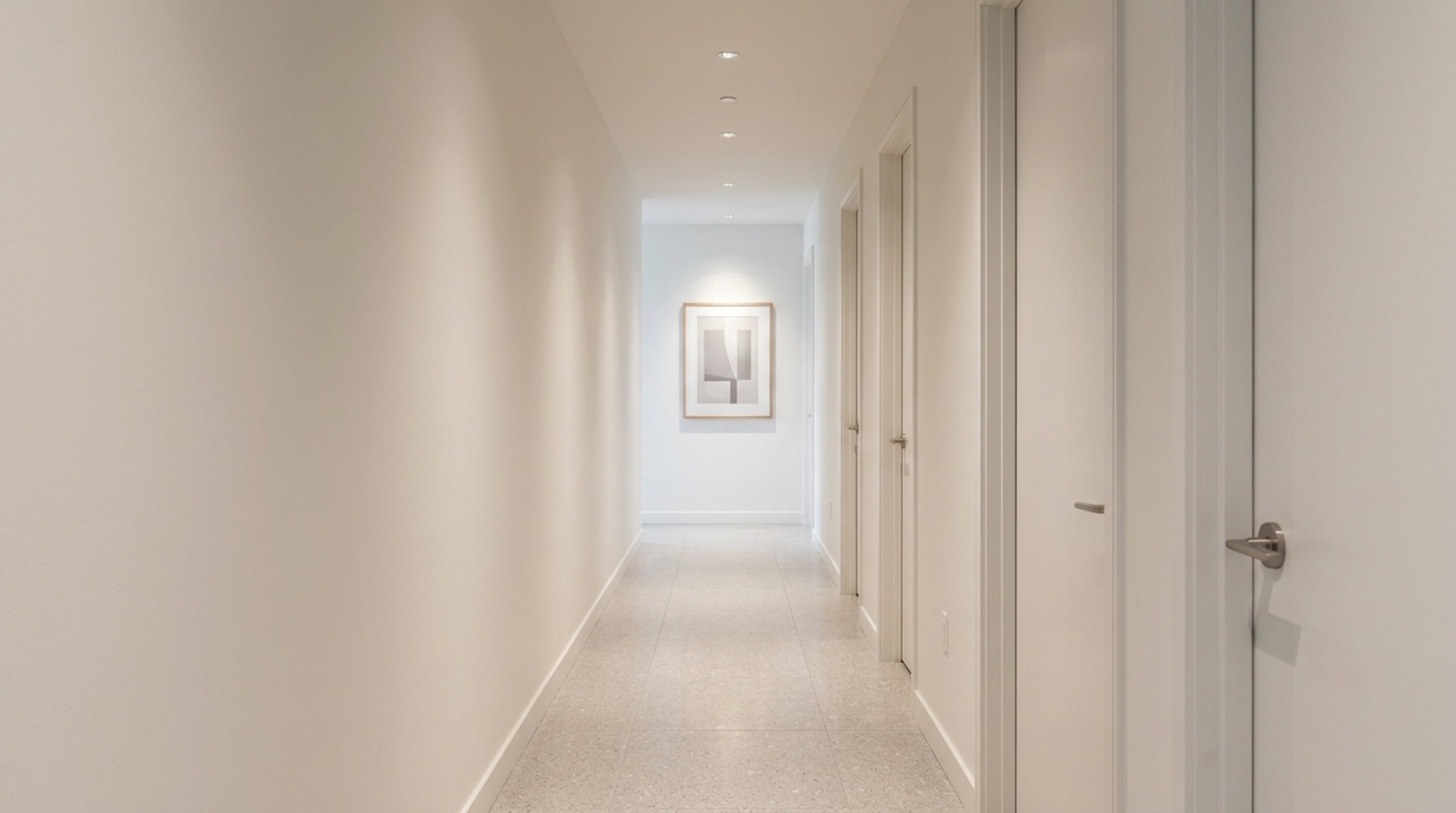
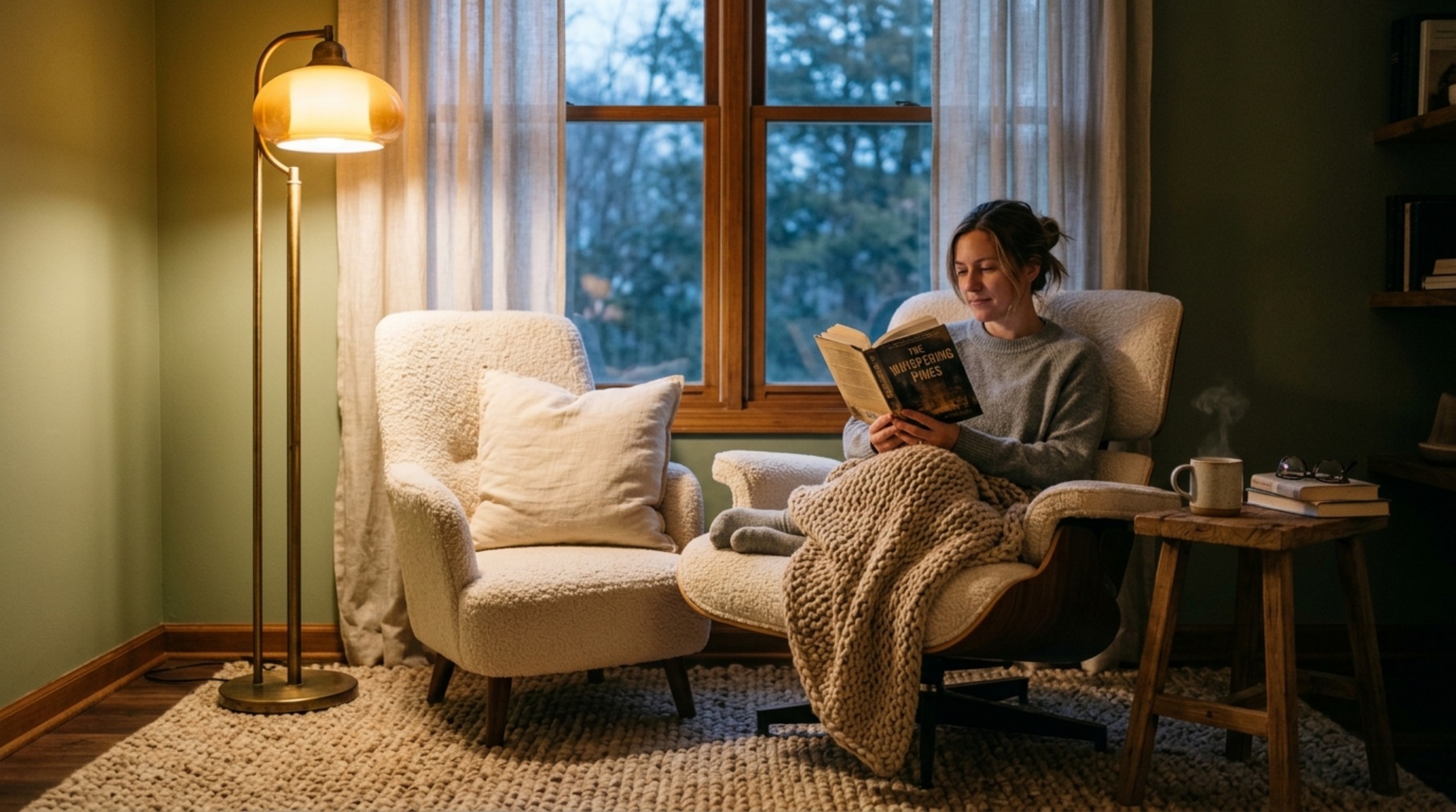
Lighting is arguably the most powerful tool in the material alchemy kit. In a condo renovation, this means recessed 2-inch ‘pinhole’ downlights with a 90+ CRI, which renders the colors of your furniture and art with absolute fidelity. The R9 value (the light’s ability to render red tones) is particularly important for making wood grains and skin tones look healthy and vibrant. For the apartment dweller, the strategy is to bypass the ‘big light’ entirely. Use a combination of floor lamps and table lamps with 2700K LED bulbs to create pockets of warmth.
The Rental Alchemist: High-Impact Temporary Finishes
The rise of high-quality peel-and-stick materials has changed the game for apartment interior hacks. We aren’t talking about the shiny, contact-paper aesthetics of a decade ago. Today’s options include textured vinyl that mimics honed Nero Marquina marble or thick, matte ‘felt’ wallpapers that add both insulation and visual depth. When applied to a generic kitchen backsplash or a focal wall in the bedroom, these materials provide a temporary material weight that belies their removable nature.
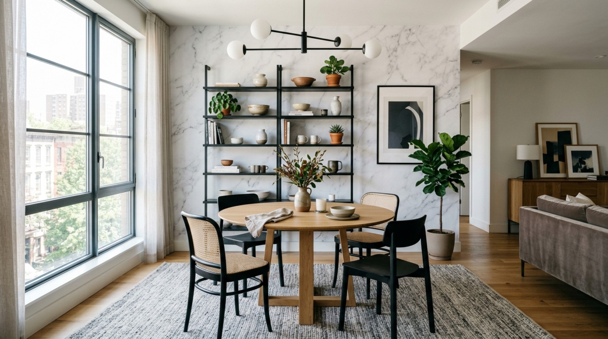
Consider the ‘soft’ renovation of the bathroom. Replacing a standard showerhead with a high-pressure, brushed-nickel rain head or adding a custom-cut teak floor mat can transform a sterile rental bathroom into a spa-like retreat. These are sensory-focused upgrades that don’t require a permit but fundamentally change the daily experience of the home. Pairing these with Benjamin Moore’s ‘Swiss Coffee’ on any permissible surfaces creates a warm, creamy backdrop that feels significantly more curated than standard ‘apartment white.’
Architectural Specification & Material Matrix
Curated tactile palette, spatial dimensions, and atmospheric lighting index for this design scheme.
Ultimately, whether you are stripping back the plaster of a new purchase or layering textures in a high-rise lease, the philosophy remains the same: design for the senses. The most successful condo vs apartment decor ideas are those that prioritize the way a space feels beneath our fingertips and how the light catches the corner of a room at dusk. As we move further into an era where our homes are our offices, our retreats, and our galleries, the focus shifts from the superficial to the soulful. It is not about how long we intend to stay, but how deeply we intend to live while we are there. In the dance between the permanent and the temporary, the true winner is always the inhabitant who chooses to see their walls not as a boundary, but as a canvas for material alchemy.
Editorial Silo • Recommended Architecture Studies
- High-End Play, Zero Clutter: Ergonomic Secrets to Integrating a Stormi-Style Playhouse on a Compact Footprint — Archival Design Case Study
- The Blue Hour Palette: Recreating the Tactile Materiality and 2700K Glow of the Whole Home 2019 Mudroom Decor Ideas — Archival Design Case Study
Architectural Inspiration Lookbook
A high-resolution study in spatial proportions, tactile materiality, and light choreography curated for enduring modern living.
Curated Visual Lookbook
Design Gallery & Spatial Studies
A visual curation of architectural arrangements, lighting concepts, and material palettes featured in this space.
