We often treat the kitchen pantry as a secondary architectural thought—a hollowed-out cavity behind a drywall face, meant to hold the chaos of our culinary lives. But when we shift our perspective from mere storage to intentional spatial design, even a four-square-foot closet can become a masterclass in efficiency. In the realm of small pantry organization ideas, we are no longer just buying bins; we are engineering vertical proportions. This is the transition from the cluttered cupboard to the ‘Super Cabinet,’ a structural intervention where sightline alignment and material honesty dictate the rhythm of the room.
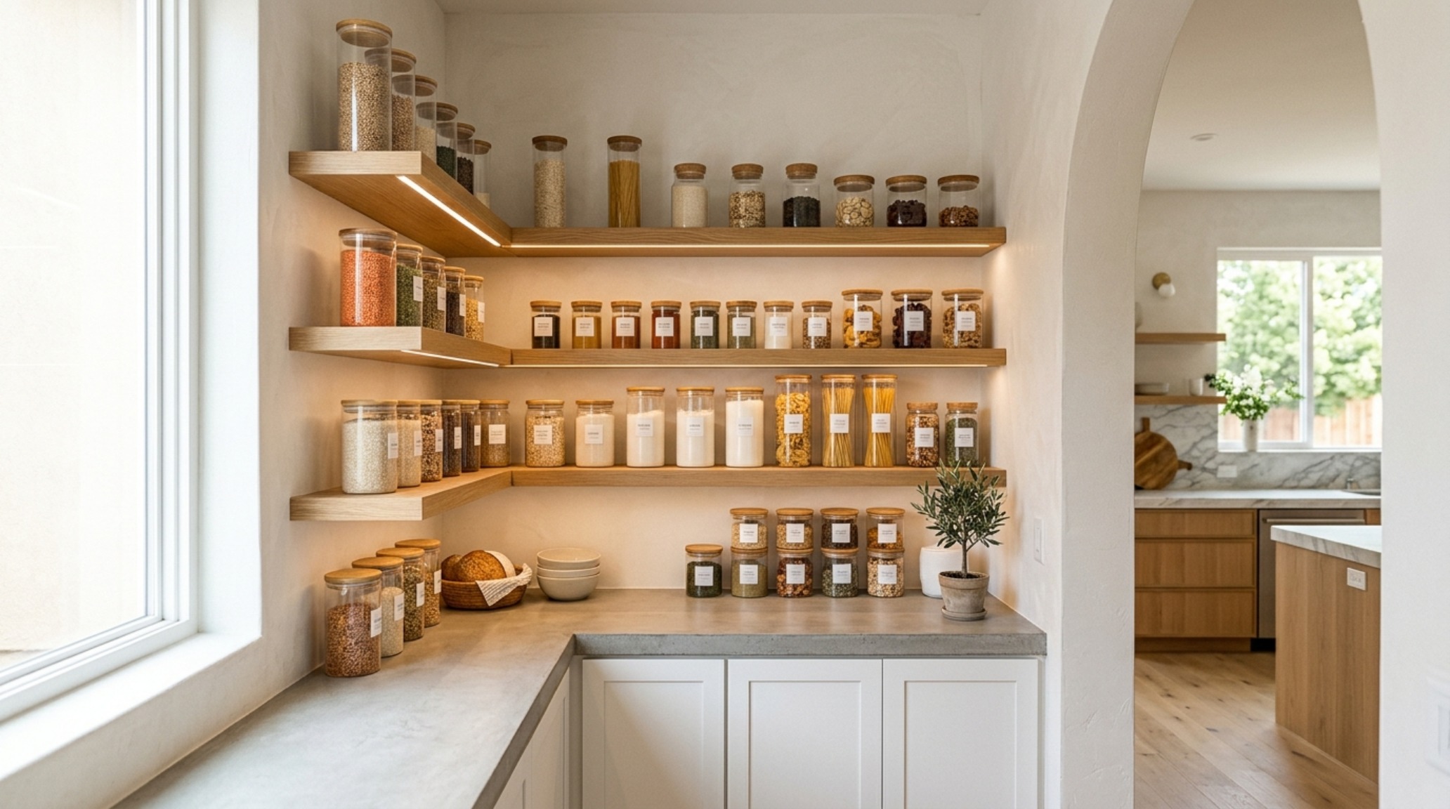
The 80/20 Rule of Shelf Depth and the Geometry of Access
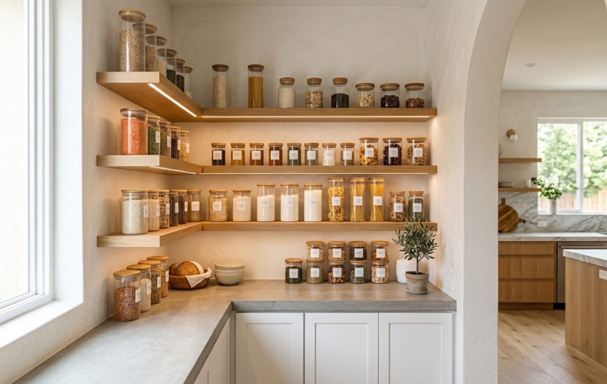
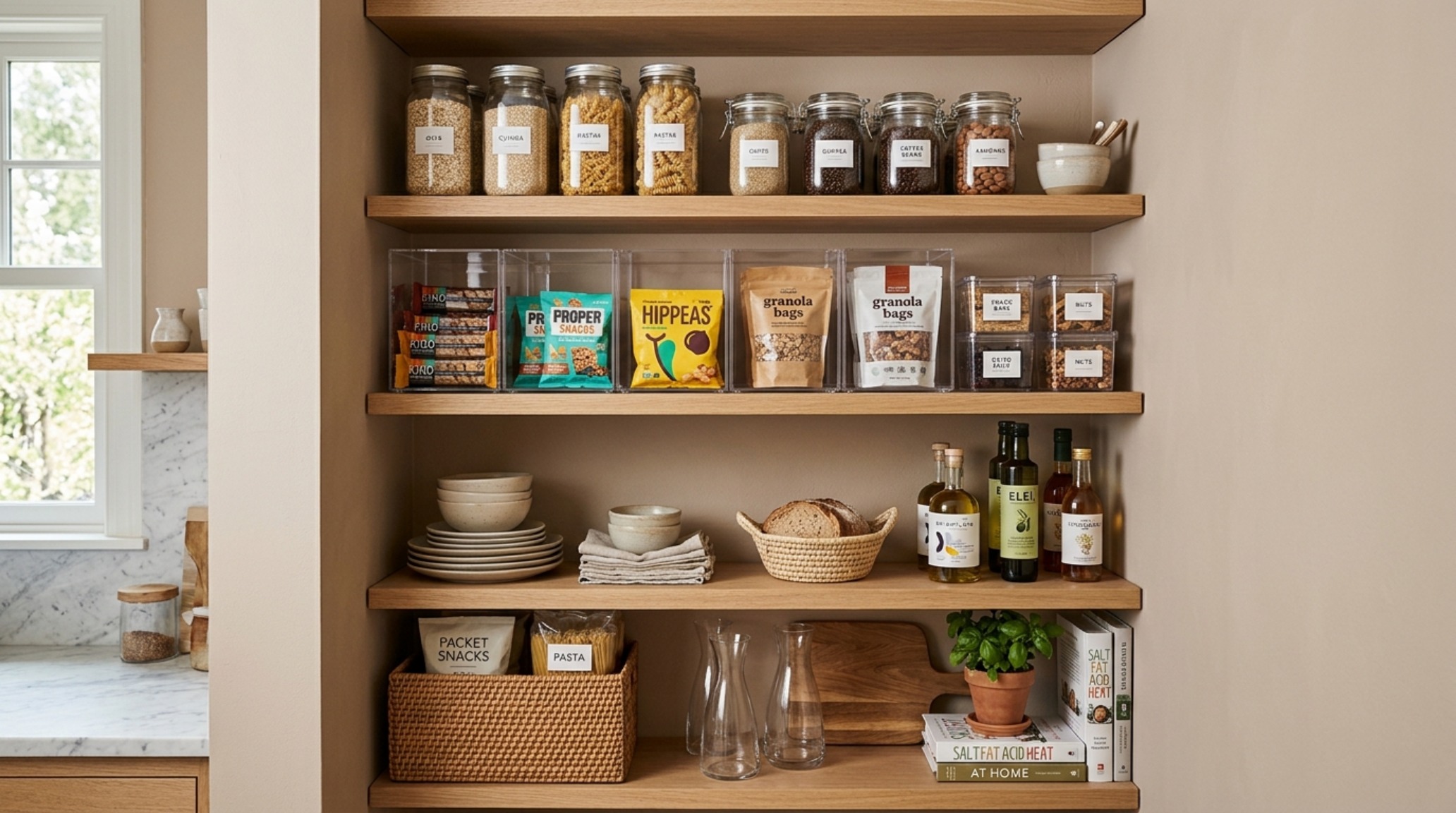
In traditional cabinetry, depth is often the enemy of order. A standard 24-inch deep base cabinet is a graveyard for forgotten grains and expired spices. To master small pantry organization ideas, we must embrace the 80/20 rule of shelf depth: 80% of your items should be accessible within the first 20% of your visual field. This requires a radical departure from standard shelving. By utilizing floating structural tiers that vary in depth—12 inches for the primary ‘reach zone’ and a mere 6 inches for eye-level spice galleries—we create a tiered stadium effect.
This staggered approach eliminates the ‘dark corners’ typical of deep closets. When the shelves are engineered to hold exactly what they intend—nothing more, nothing less—the pantry ceases to be a storage unit and starts to function as a curated library. We look for sightline alignment, where the most frequently reached-for items (the morning coffee ritual, the daily olive oil, the sea salt) reside between the hip and the eye. This isn’t just tidy; it’s ergonomic choreography. By reducing the shelf depth, we paradoxically increase the usable volume because every square inch is now visible and reachable without a flashlight or a stool.
The Structural Integrity of Floating Tiers
Moving away from the wire-shelf standards of the late nineties, modern micro-pantry design favors substantial, thick-profile floating shelves. A 1.5-inch thick shelf in a species like White Oak or a painted rift-sawn oak provides more than just a surface; it provides a visual anchor. These structural planes should be mounted using concealed heavy-duty brackets or integrated into the vertical wall planes with dado joints for a seamless ‘built-in’ look. When the shelf appears to emerge directly from the wall, it minimizes visual noise, making a cramped space feel airy and intentionally designed.

Leveraging Vertical Wall Planes with High-Performance Zoning
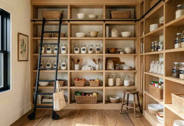
In a micro-pantry, the walls are your most valuable real estate. We often ignore the ‘negative space’ between the shelves and the ceiling, or the untapped potential of the door’s interior face. By treating the entire vertical plane as a functional grid, we can implement bespoke walk-in pantry hacks that feel like high-end millwork rather than a DIY project. Consider the implementation of a floor-to-ceiling recessed track system. This allows for total adaptability as your culinary needs evolve, shifting shelf heights to accommodate a new stand mixer or a taller glass decanter.
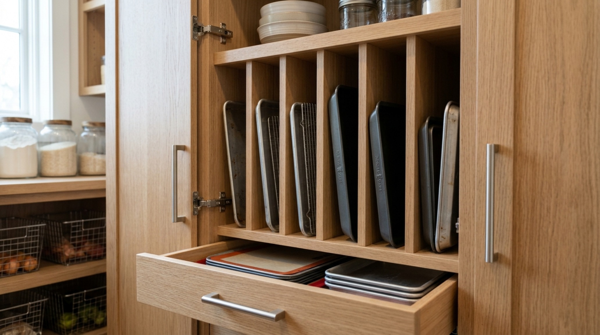
Custom-built zones for high-frequency culinary tools are essential. Instead of shoving a heavy Dutch oven into a dark corner, we engineer a reinforced pull-out tray at the 30-inch mark—the standard height for ease of lifting. Above this, we might see a dedicated baking zone with integrated dividers for vertical sheet pan storage. This transition from horizontal stacking to vertical slotting is a hallmark of interior spatial design that respects the physics of the kitchen.
The Art of the Backstock Strategy
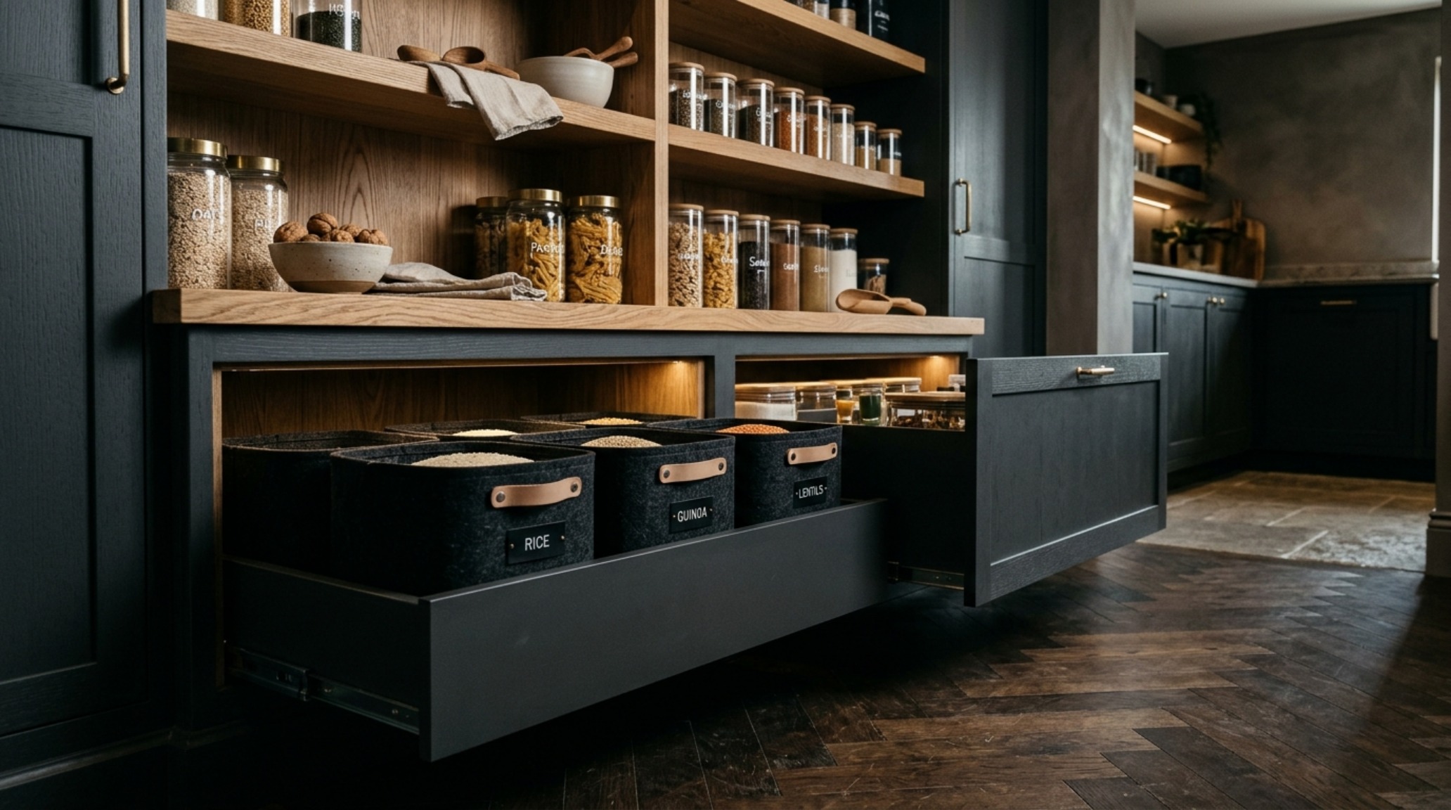
One of the most effective small pantry organization ideas involves the strict separation of ‘active’ and ‘backstock’ inventory. The active zone—the items used daily—occupies the prime real estate. The backstock—the extra bags of flour, the cases of sparkling water—resides in the lowest 18 inches of the pantry. We use heavy-duty rolling bins made of industrial felt or powder-coated steel for these items. This ensures that the bulk doesn’t clutter the sightlines, keeping the aesthetic focus on the curated, beautiful jars at eye level. By grounding the heaviest items at the base, we maintain a sense of lightness in the upper registers of the space.
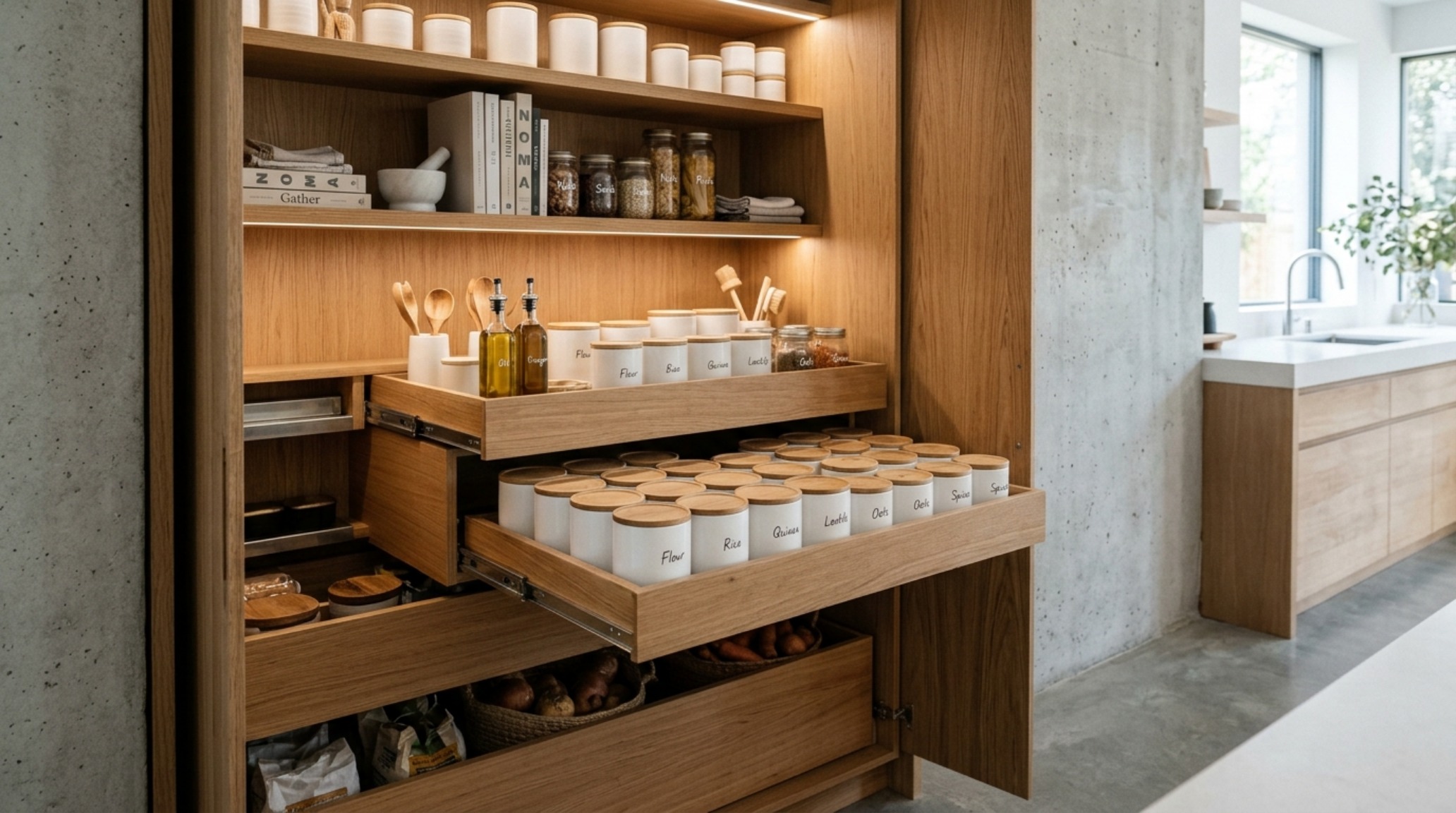
Atmospheric Engineering: Lighting as a Spatial Tool
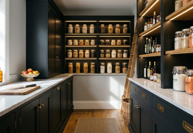
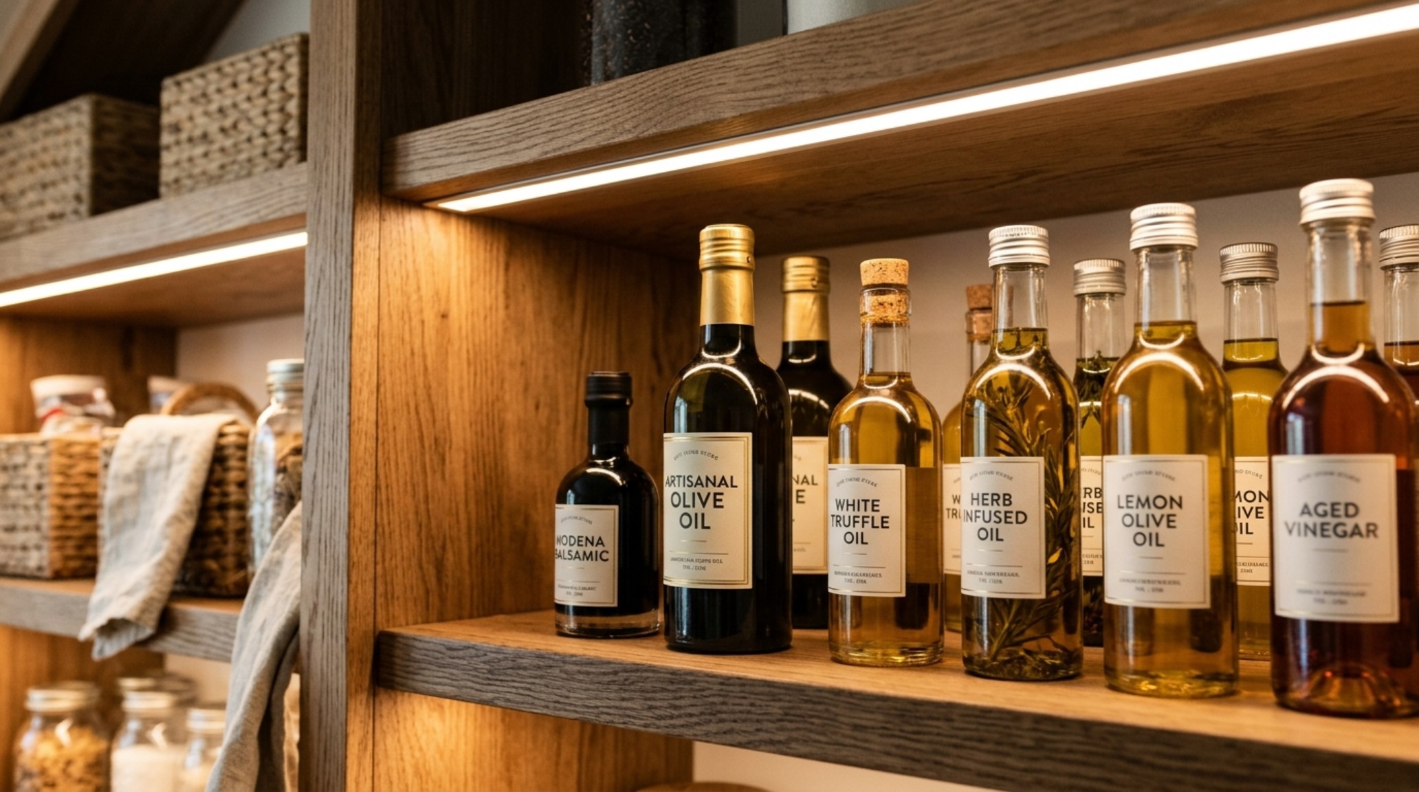
In architectural design, lighting is the silent narrator. In a small pantry, it is the difference between a claustrophobic box and a jewel-box experience. Generic overhead lighting creates harsh shadows that shrink the perceived space. To combat this, we integrate recessed LED channels into the leading edge of every shelf or along the vertical side gables. We specify a 2700K warm ambient glow for the general mood, but often pivot to a 3000K task light within the pantry to ensure the color rendering of fresh produce and labels is accurate.
High CRI (Color Rendering Index) ratings of 90 or above are non-negotiable. When you open the pantry door, the light should flood the interior evenly, bouncing off the surfaces to create architectural depth. This shadow-play—or rather, the elimination of it—makes the pantry feel twice its actual size. If you are working with a truly micro-space, consider a magnetic sensor that activates the lights upon the opening of the door, providing an immediate, high-end hospitality feel to a mundane task.
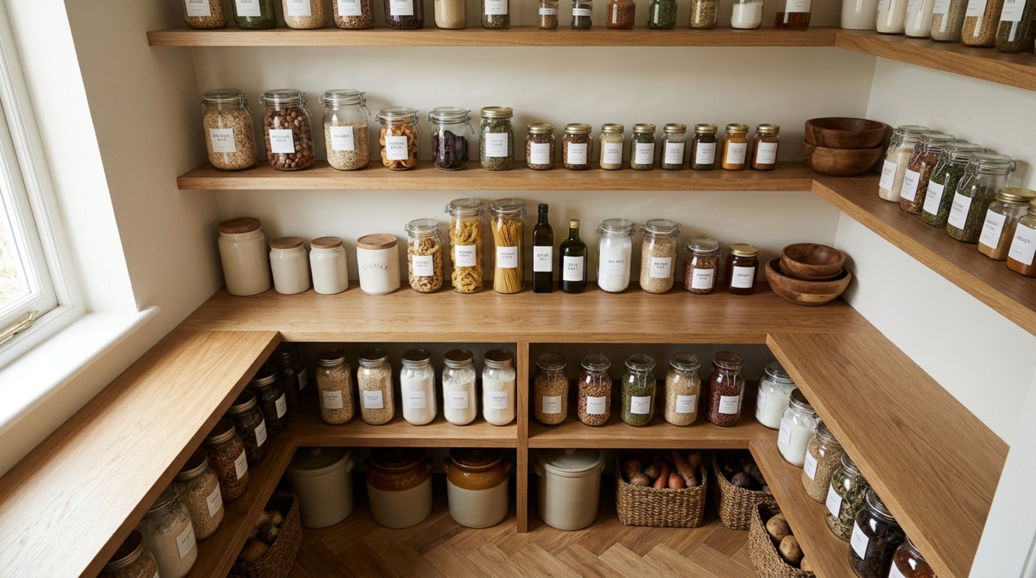
Quiet Luxury Materials and Tactile Grounding
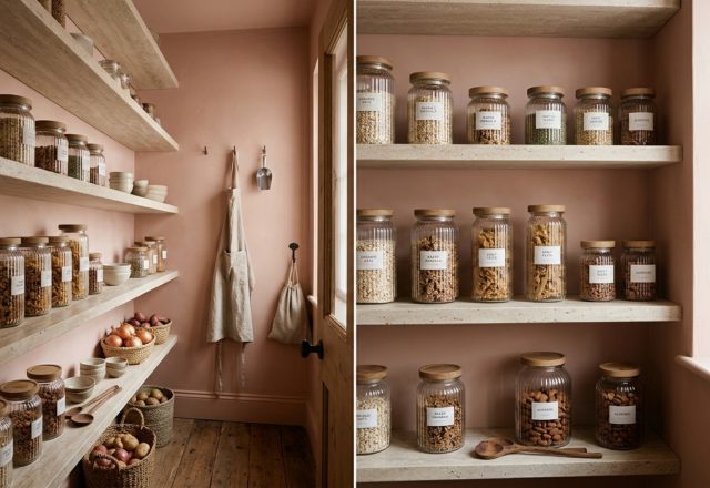
The materials we choose for small pantry organization ideas should echo the luxury of the rest of the home. We are moving past the era of cheap plastic bins and toward a palette of glass, wood, and stone. Clear acrylic bin organization systems have their place, but for a truly ‘Super Cabinet’ feel, we look toward fluted glass canisters with brass lids or hand-turned wooden bowls. These materials provide tactile grounding; they feel substantial in the hand and look beautiful even when the pantry is only half-full.
Color choice is equally vital. A dark, moody pantry in a shade like Farrow & Ball’s ‘Railings’ can create a sense of infinite depth if paired with warm wood shelves. Conversely, a light-filled space using Benjamin Moore’s ‘Swiss Coffee’ feels expansive and hygienic. We often recommend painting the interior of the pantry two shades darker than the exterior kitchen walls. This contrast creates a ‘recessed’ effect, making the pantry feel like an intentional architectural niche rather than a simple closet.
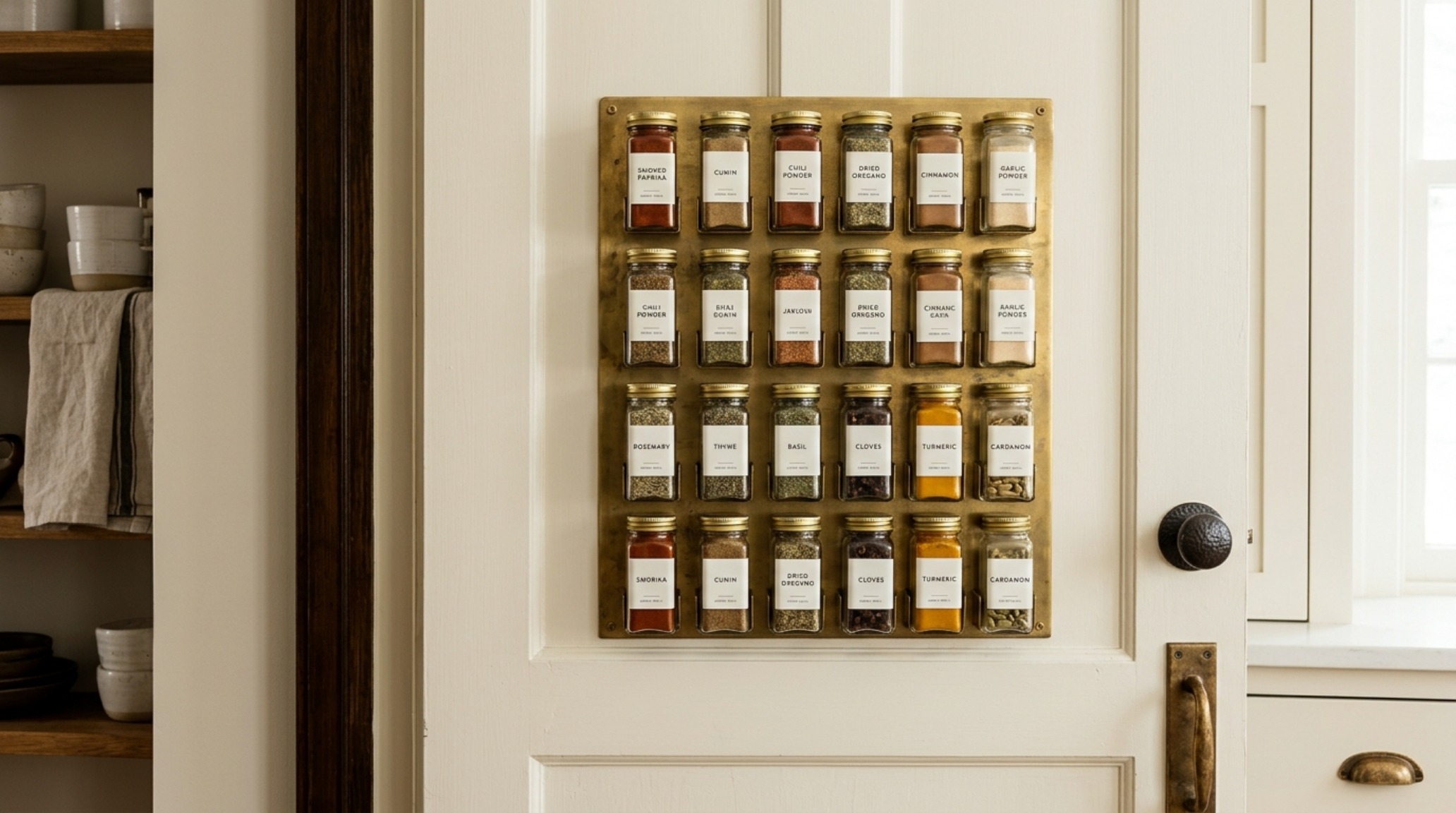
Magnetic Storage and Secondary Surfaces
Don’t overlook the potential of the pantry door. A custom magnetic pantry door storage system, finished in a matte black or brushed brass to match your kitchen hardware, can hold an entire spice collection or a set of high-end knives. This frees up the internal shelving for larger items and keeps the most used tools at the ultimate point of access. It’s about creating layers of functionality—each surface working in harmony to maximize the four-square-foot footprint.
Architectural Specification & Material Matrix
Curated tactile palette, spatial dimensions, and atmospheric lighting index for this design scheme.
Designing a micro-pantry is not about shrinkage; it is about precision. It is the realization that a well-engineered vertical plane can offer more utility than a cavernous, poorly planned room. By focusing on sightline alignment and the 80/20 rule of shelf depth, we transform a simple utility closet into an architectural gem. These small pantry organization ideas are the bridge between mere tidiness and a high-performance culinary environment. Ultimately, the micro-pantry is an invitation to edit our lives, choosing quality over volume and design over clutter, creating a sense of order that resonates far beyond the kitchen door.
Editorial Silo • Recommended Architecture Studies
- Ergonomic Mastery: Functional & Space-Saving Hacks with Small Pantry Organization Ideas — Archival Design Case Study
- The Sensory Pantry: Elevating Small-Scale Storage through Materiality and Small Pantry Organization Ideas — Archival Design Case Study
Architectural Inspiration Lookbook
A high-resolution study in spatial proportions, tactile materiality, and light choreography curated for enduring modern living.
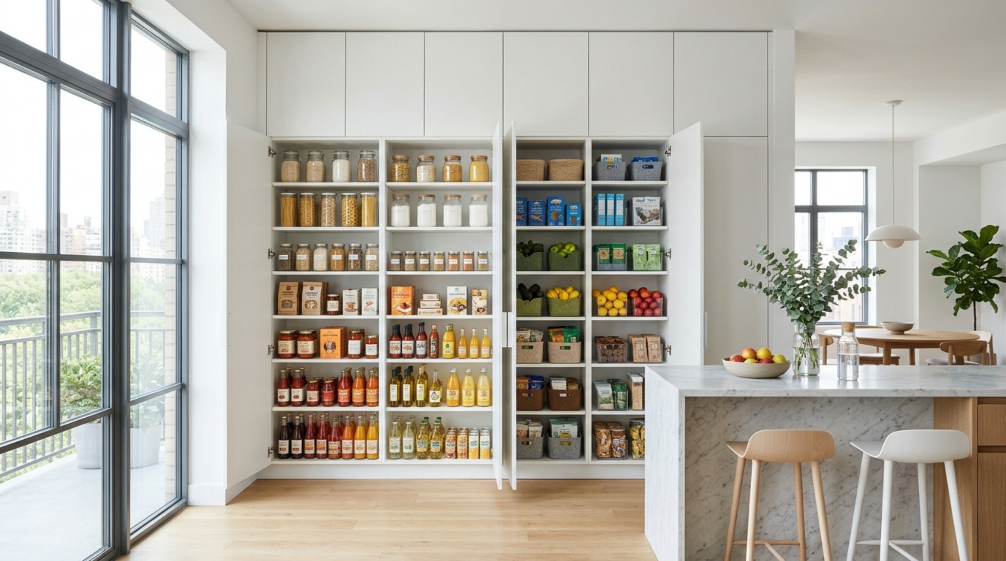
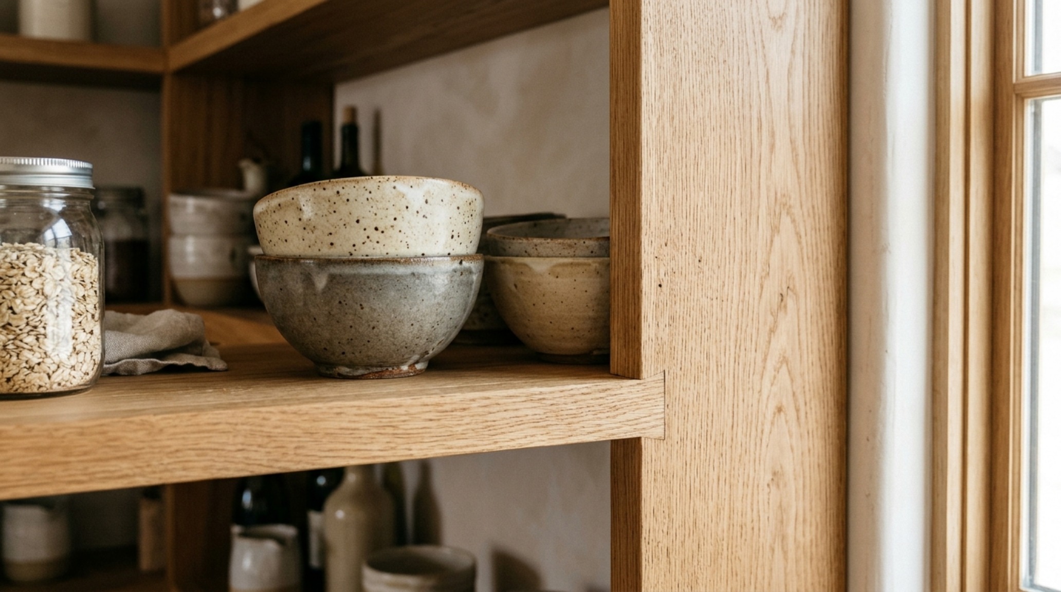
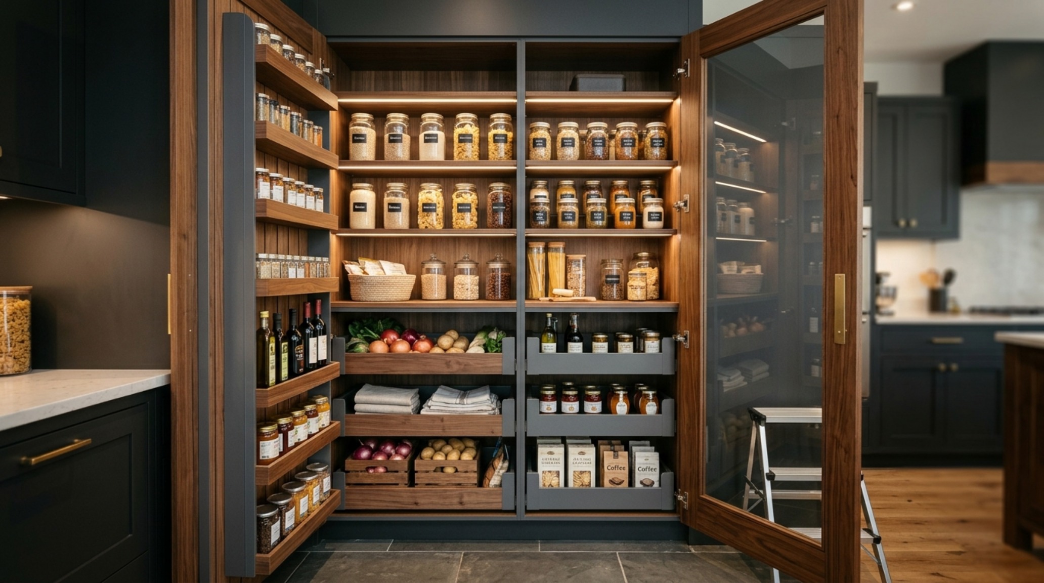
Curated Visual Lookbook
Design Gallery & Spatial Studies
A visual curation of architectural arrangements, lighting concepts, and material palettes featured in this space.