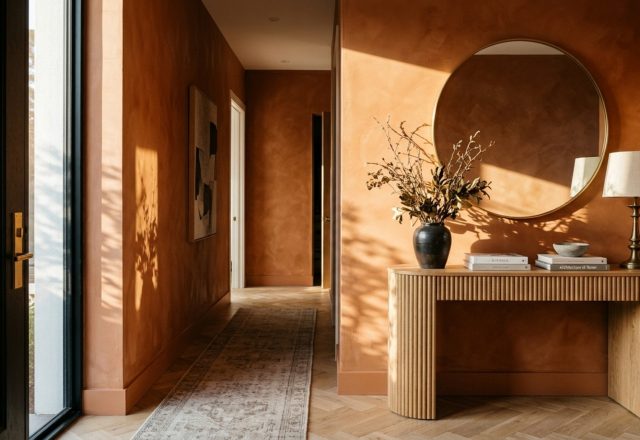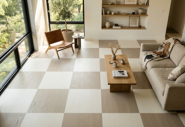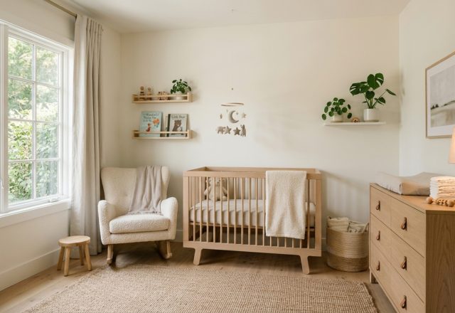
For decades, the gospel of interior design has dictated a single, unyielding rule for compact living: paint it white. The logic seemed sound—white reflects light, therefore it must expand space. Yet, as we inhabit increasingly dense urban environments, many are finding that the clinical brightness of a small, white-walled room often feels less like an airy loft and more like a restrictive box. The real secret to mastering compact square footage lies not in reflection, but in perception. By embracing dark paint color rooms decor ideas, we can manipulate the physics of a room, allowing boundaries to blur and corners to dissolve into the shadows, creating an unexpected sense of infinite depth.
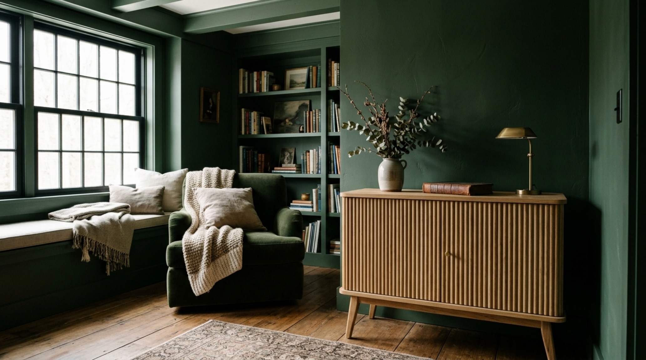
When we opt for deep charcoals, ink-washed blues, or the botanical weight of a forest green, we are participating in a sophisticated spatial hack. In a brightly lit, neutral room, the eye immediately registers every corner and every junction where the wall meets the ceiling. This provides the brain with a definitive map of the room’s limitations. Conversely, saturated tones absorb light rather than bouncing it back. This absorption causes the ‘receding effect’—a phenomenon where the walls appear to move further away from the viewer. It is a design strategy rooted in the same principles as the atmospheric perspective found in classical landscape painting, where distant mountains appear darker and more blurred than the foreground.
The Science of Receding Boundaries: Why Darker is Deeper
To understand why dark paint color rooms decor ideas outperform minimalism, we must look at how shadows function. In a small den or a windowless powder room, a pale paint color highlights the lack of natural light, often resulting in a dingy, grayish cast. When you lean into the darkness with a shade like Benjamin Moore’s ‘Raccoon Fur’ or Farrow & Ball’s ‘Studio Green,’ you are no longer fighting the architecture; you are enhancing it. The corners of the room become indistinct, and the transition between the wall and the ceiling softens, making the ceiling feel significantly higher than its actual measurement.
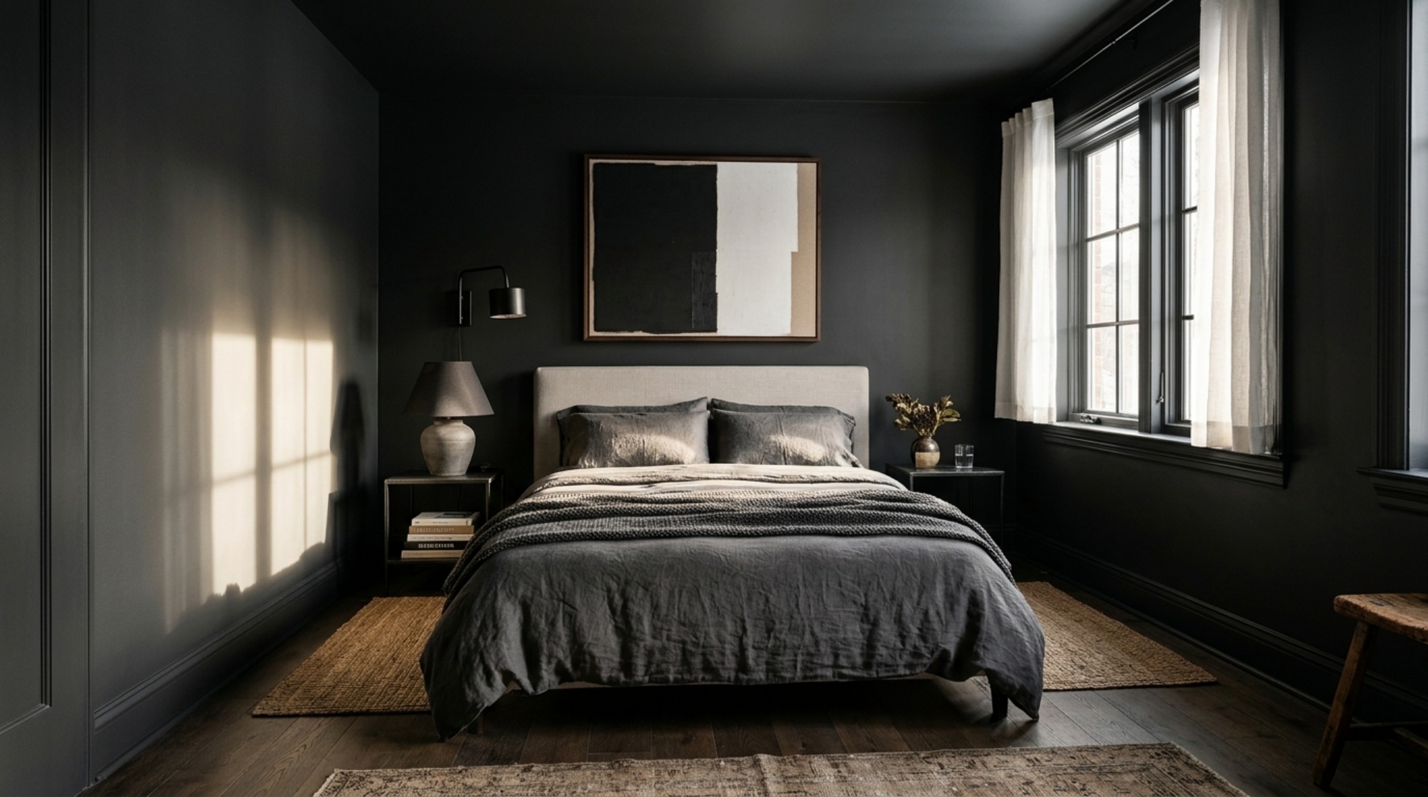
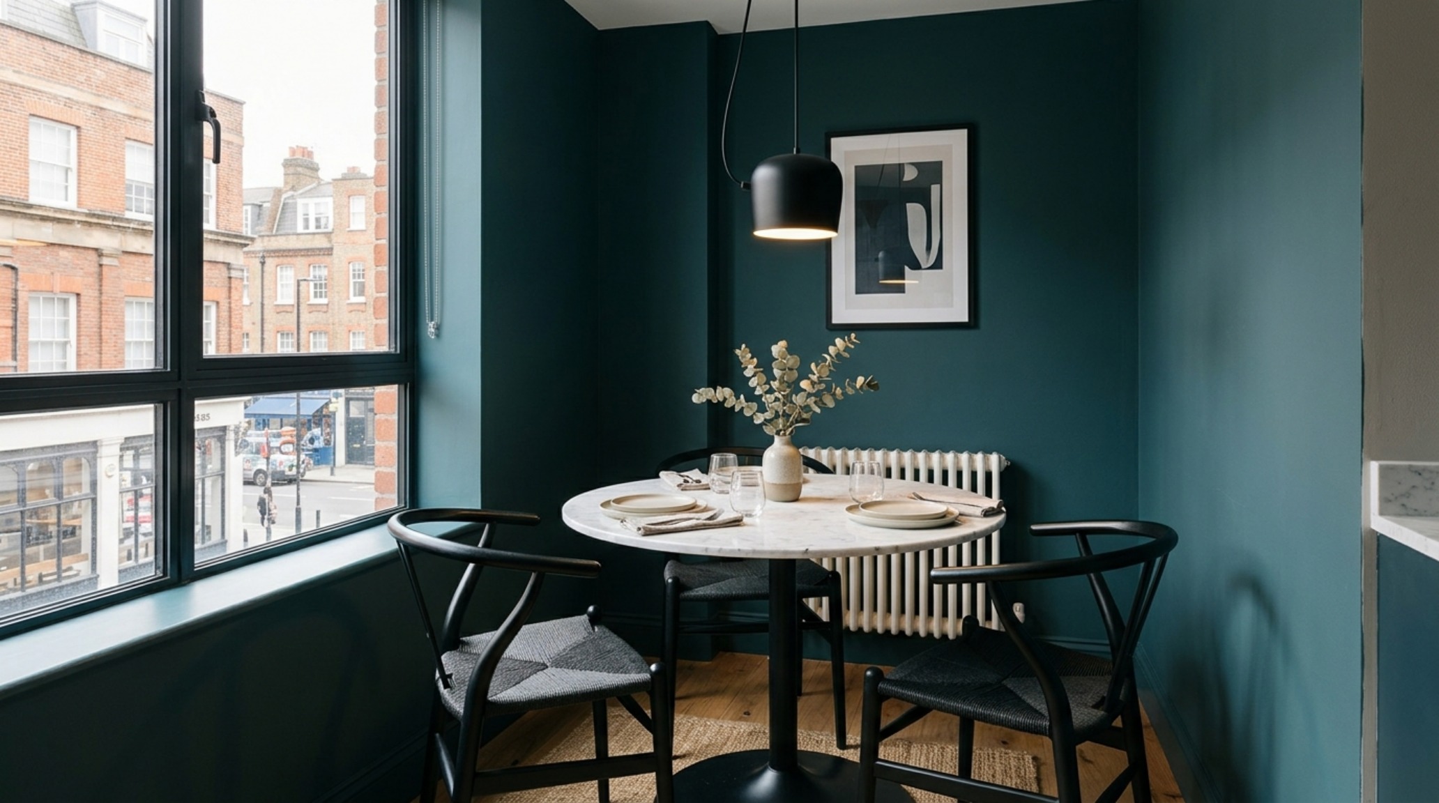
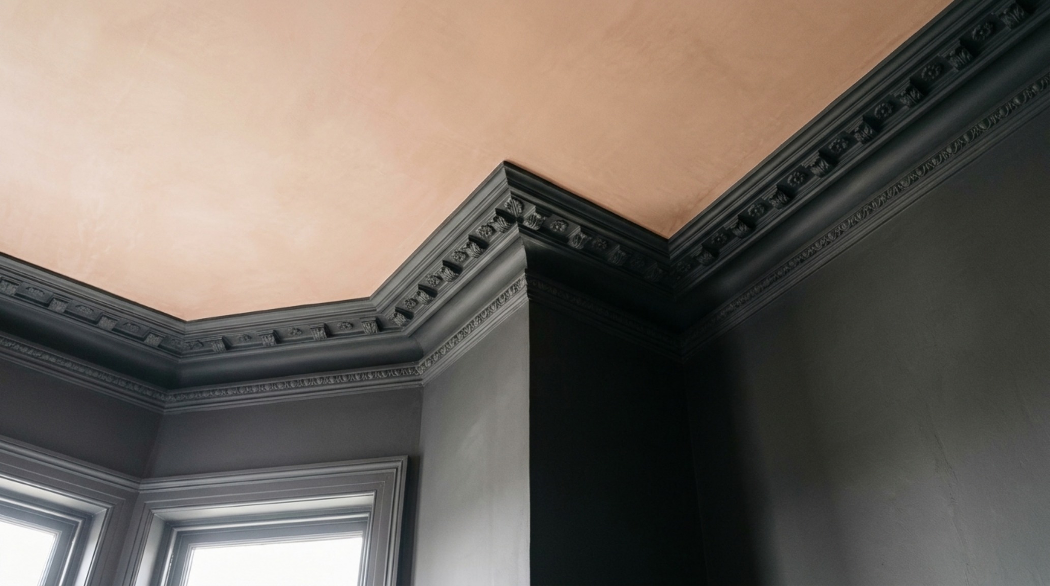
This effect is amplified by the ‘Color Drenching’ technique—a method where the walls, baseboards, crown molding, and even the doors are painted in the same uniform, matte finish. By removing the high-contrast white trim that typically outlines a room, you eliminate the visual ‘breaks’ that remind the eye of the room’s small footprint. The result is a continuous, immersive environment that feels expansive because the brain cannot easily find the edges of the container.
Architectural Color Drenching Techniques for Modern Living
Success with architectural color drenching techniques requires a commitment to the monochromatic paint trends currently dominating high-end European design. It isn’t merely about the color; it’s about the execution. For a small home office or a compact primary suite, applying a single deep hue across varying textures creates a sophisticated, ‘Quiet Luxury’ aesthetic. Consider the tactile difference between a matte-painted wall and a high-gloss door in the same shade of midnight navy. The color remains consistent, but the way it interacts with light changes, providing necessary visual interest without cluttering the spatial field.
When planning these transitions, architectural clearances remain paramount. Even in a moody, dark-hued room, you must maintain a 36-inch standard walkway clearance to ensure the space remains functional rather than claustrophobic. A dark room that is difficult to navigate will always feel small; a dark room with a clear 30-inch dining chair clearance and an 18-inch reach from sofa to coffee table feels like a deliberate, curated sanctuary. The goal is to create a ‘cocktail lounge’ intimacy where the walls feel like a soft embrace rather than a hard limit.
The Texture Matrix: Preventing Flatness in Moody Interior Design
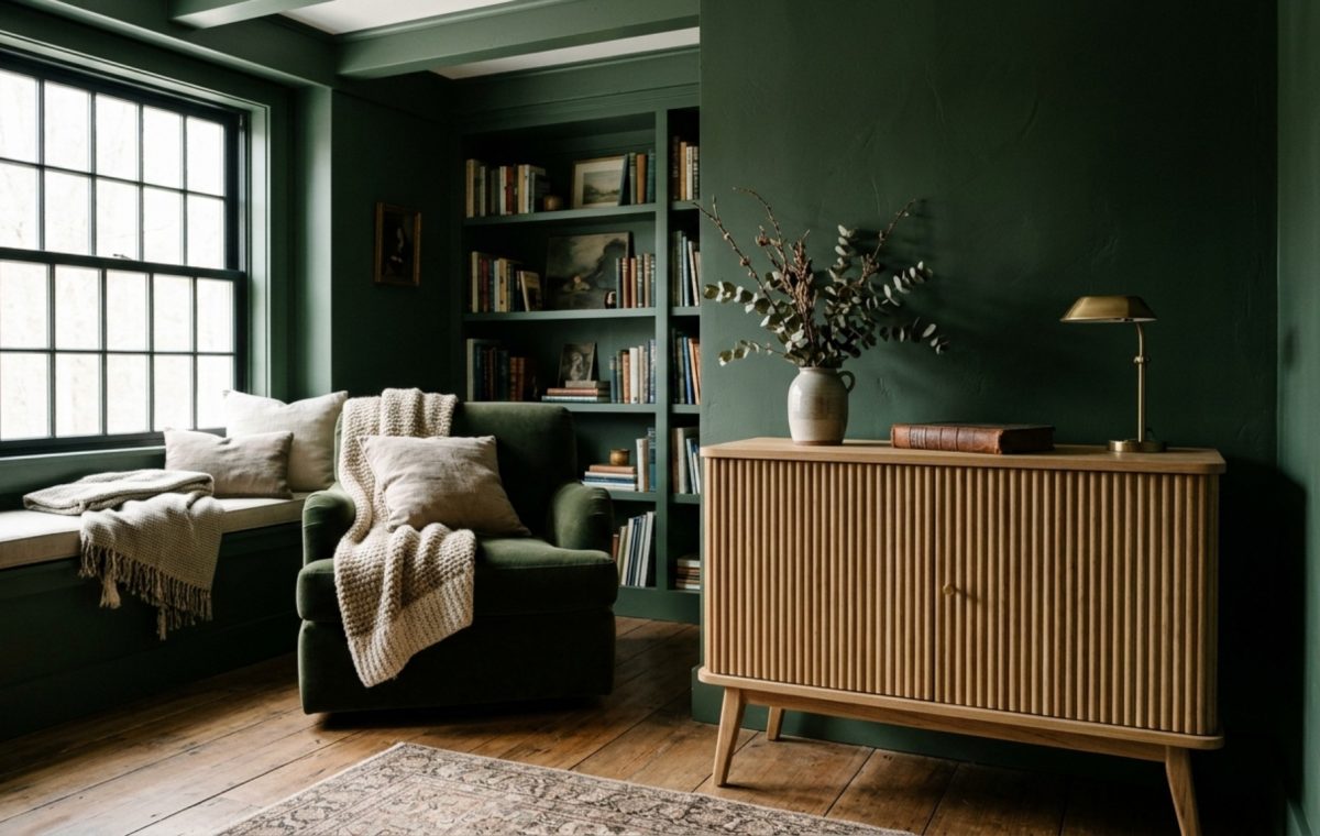
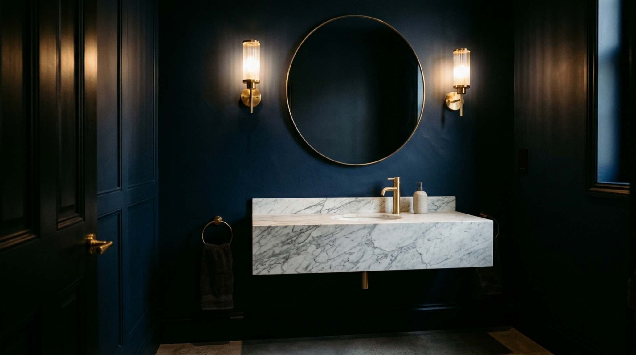
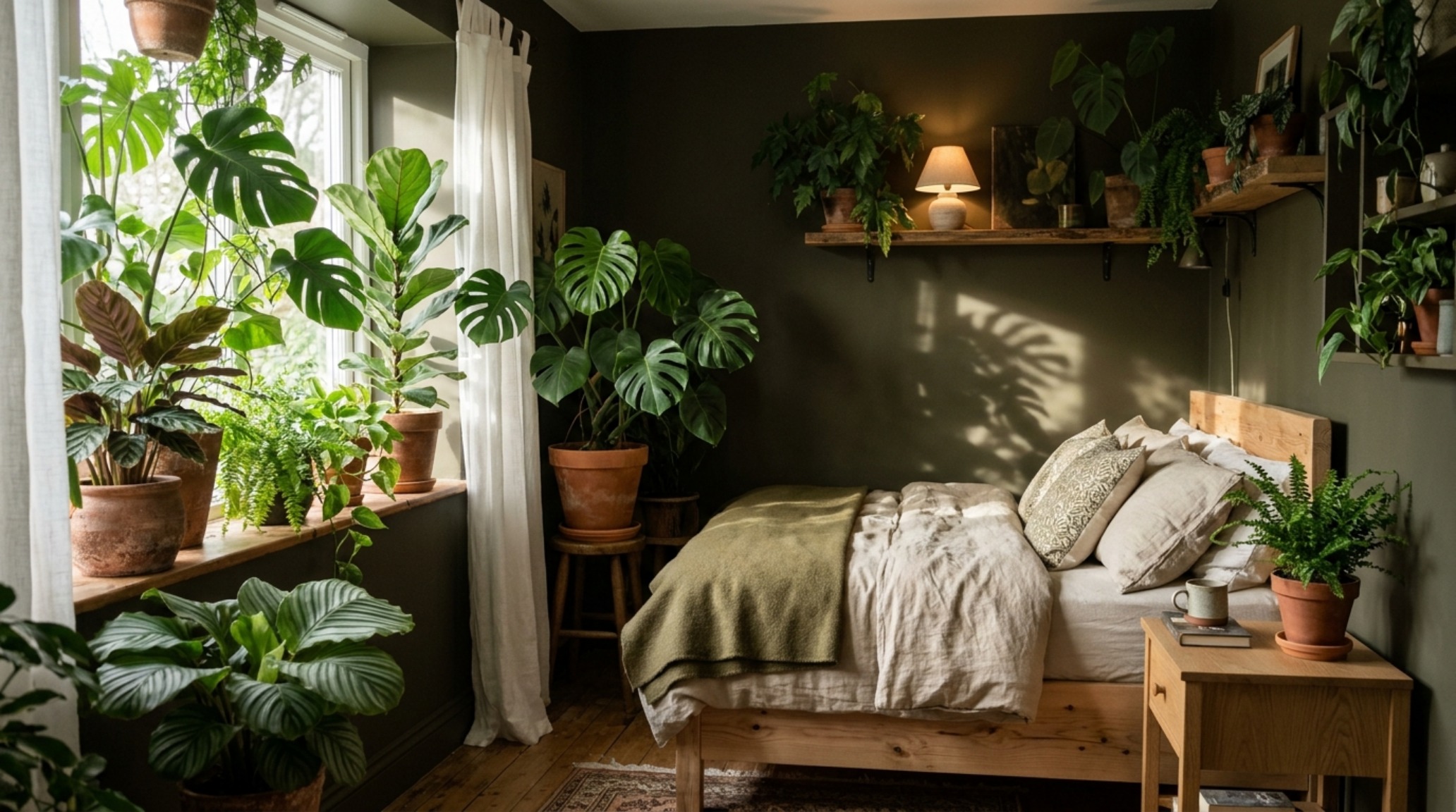
The primary critique of dark walls is the fear that the room will feel ‘heavy’ or ‘dead.’ This is only true if you ignore the necessity of tactile grounding. Moody interior design relies heavily on the interplay of light and shadow on varied surfaces. In a room painted in a deep charcoal, you must introduce materials that catch the light: a fluted white oak cabinet, a honed travertine side table, or a velvet sofa in a slightly different tonal value. These elements provide ‘relief’—small moments of brightness and texture that guide the eye through the space.
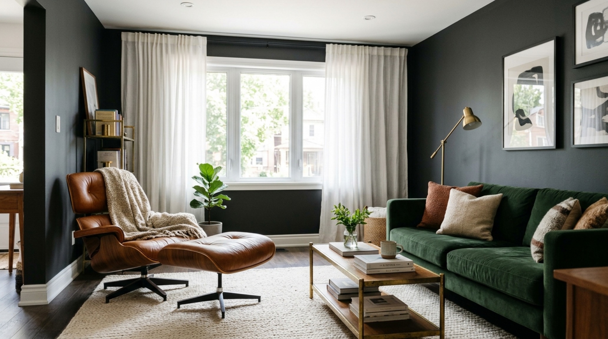
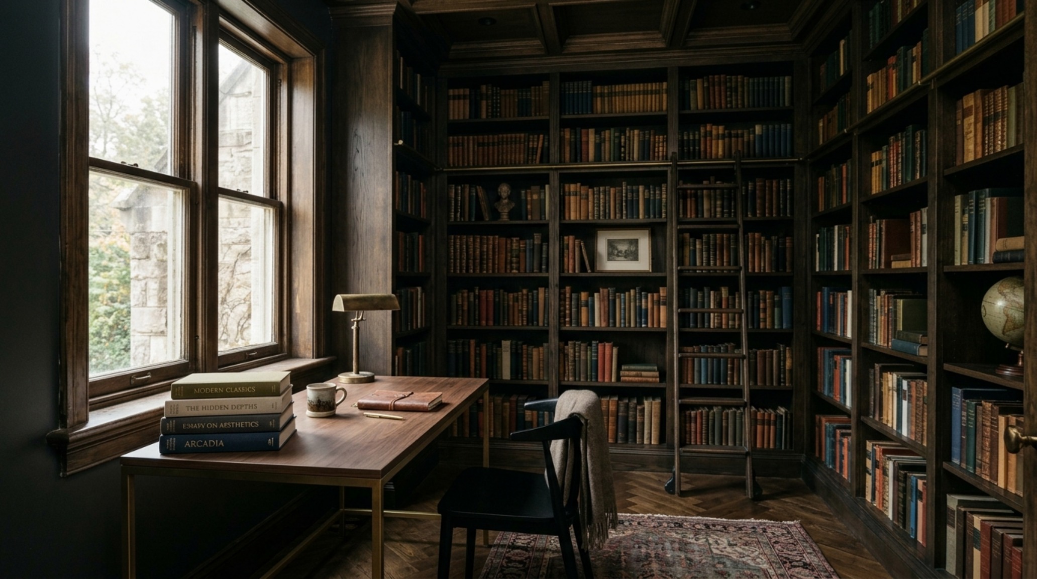
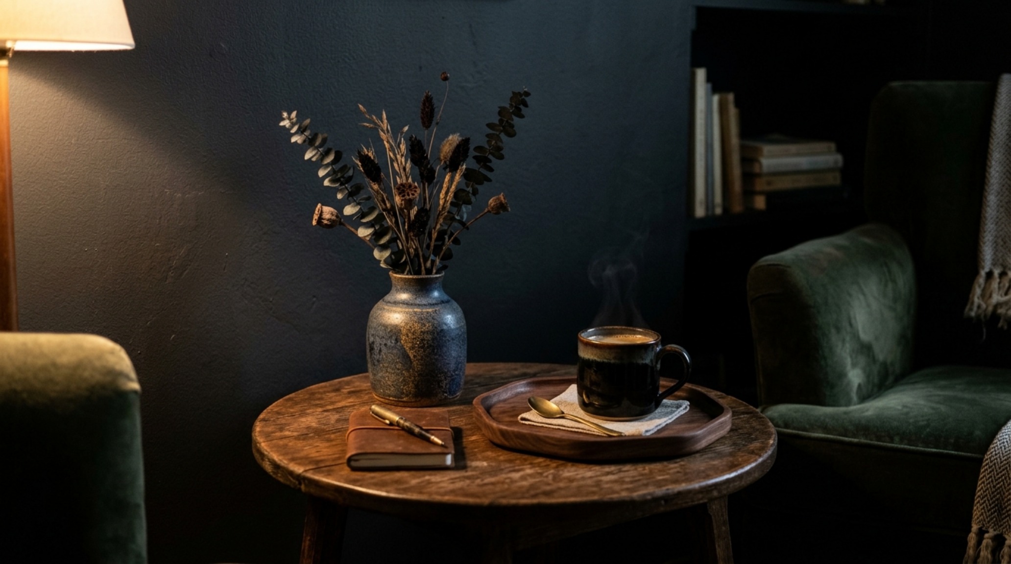
In a small living room, focus on the modern dark academia interior aesthetic by layering natural materials. A cognac leather chair against a black-blue wall creates a classic, grounded contrast. Use metallic accents like brushed brass or blackened steel to provide sharp, clean lines. These materials don’t just add style; they define the three-dimensional volume of the room. When the background is dark and receding, these foreground objects pop with a clarity that white walls simply cannot provide.
The Lighting Rule: From 2700K Warmth to Shadow Play
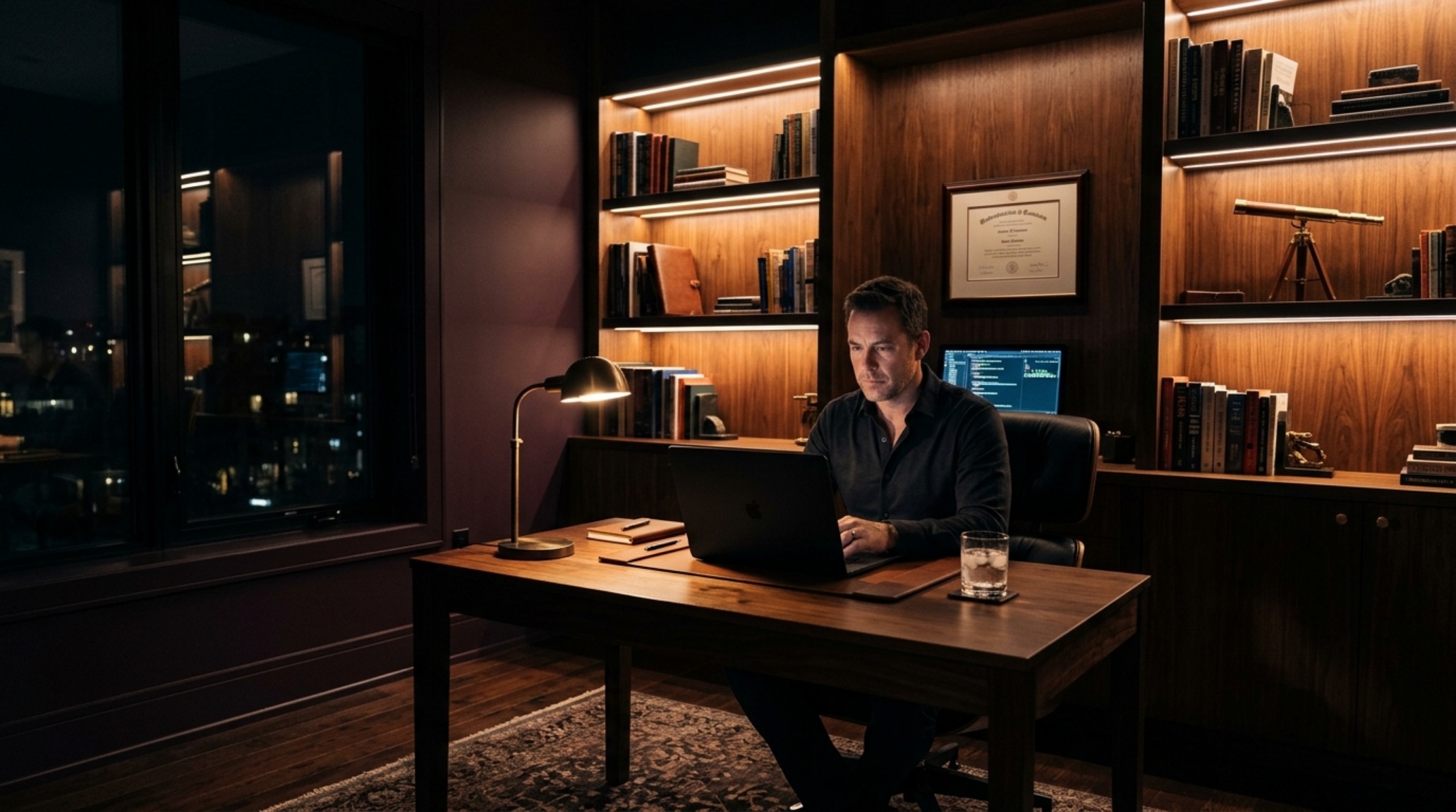
Lighting is the most critical component when implementing small room dark paint hacks. A common mistake is over-lighting a dark room with harsh, cool-toned LEDs, which turns a sophisticated palette into something that looks like an unfinished basement. To maintain the ‘executive-suite’ lifestyle feel, you must prioritize the best 2700K lighting for dark walls. This lower Kelvin temperature provides a warm, golden glow that mimics candlelight, softening the intensity of deep pigments.
Instead of a single overhead fixture, utilize a layered lighting scheme with high CRI (90+) ratings to ensure the colors remain true and vibrant. This involves:
- Ambient Lighting: Recessed cans or a soft-glow pendant at 2700K.
- Task Lighting: Focused 3000K light for reading nooks or desks.
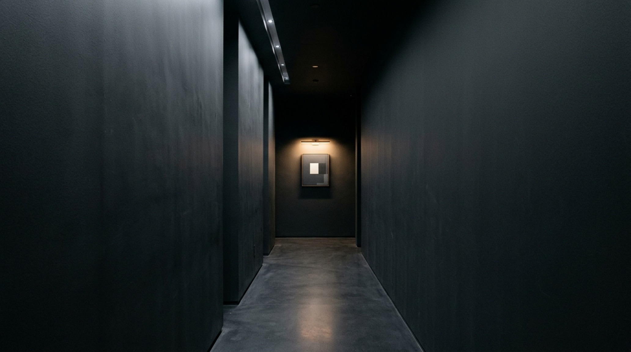
- Accent Lighting: Directional picture lights or LED strips behind a floating shelf to create ‘pockets’ of depth.
By intentionally leaving some areas in shadow, you create mystery. The eye is drawn to the illuminated objects, while the dark walls continue to recede into the background, effectively tricking the mind into believing there is more space beyond the light.
Material Synergy and Finishing Touches
While the walls do the heavy lifting, the floor and ceiling should not be forgotten. Many designers are now exploring Farrow and Ball moody color combinations, such as ‘Down Pipe’ walls paired with ‘Setting Plaster’ on the ceiling. This pink-toned neutral provides a warm, sky-like contrast that prevents a dark room from feeling like a cave. If you prefer a more cohesive look, a ceiling painted one or two shades lighter than the walls can maintain the monochromatic flow while adding a sense of lift.
Architectural Specification & Material Matrix
Curated tactile palette, spatial dimensions, and atmospheric lighting index for this design scheme.
The shift toward saturated environments represents a broader cultural move away from the performative sterility of ‘all-white everything’ and toward a home that feels like an emotional anchor. By implementing these dark paint color rooms decor ideas, we acknowledge that a small space doesn’t need to feel large to be successful—it needs to feel intentional. When we stop trying to ‘fix’ a small room with light and start celebrating its intimacy with depth, we unlock a form of architectural poetry that transcends mere square footage. The walls don’t close in; they simply provide the velvet backdrop for a life well-lived.
Editorial Silo • Recommended Architecture Studies
- Orange Paint: The Architectural Blueprint & Spatial Flow Guide — Archival Design Case Study
- Ergonomic Mastery: Functional & Space-Saving Hacks for Painting Floors — Archival Design Case Study
Architectural Inspiration Lookbook
A high-resolution study in spatial proportions, tactile materiality, and light choreography curated for enduring modern living.
Curated Visual Lookbook
Design Gallery & Spatial Studies
A visual curation of architectural arrangements, lighting concepts, and material palettes featured in this space.